
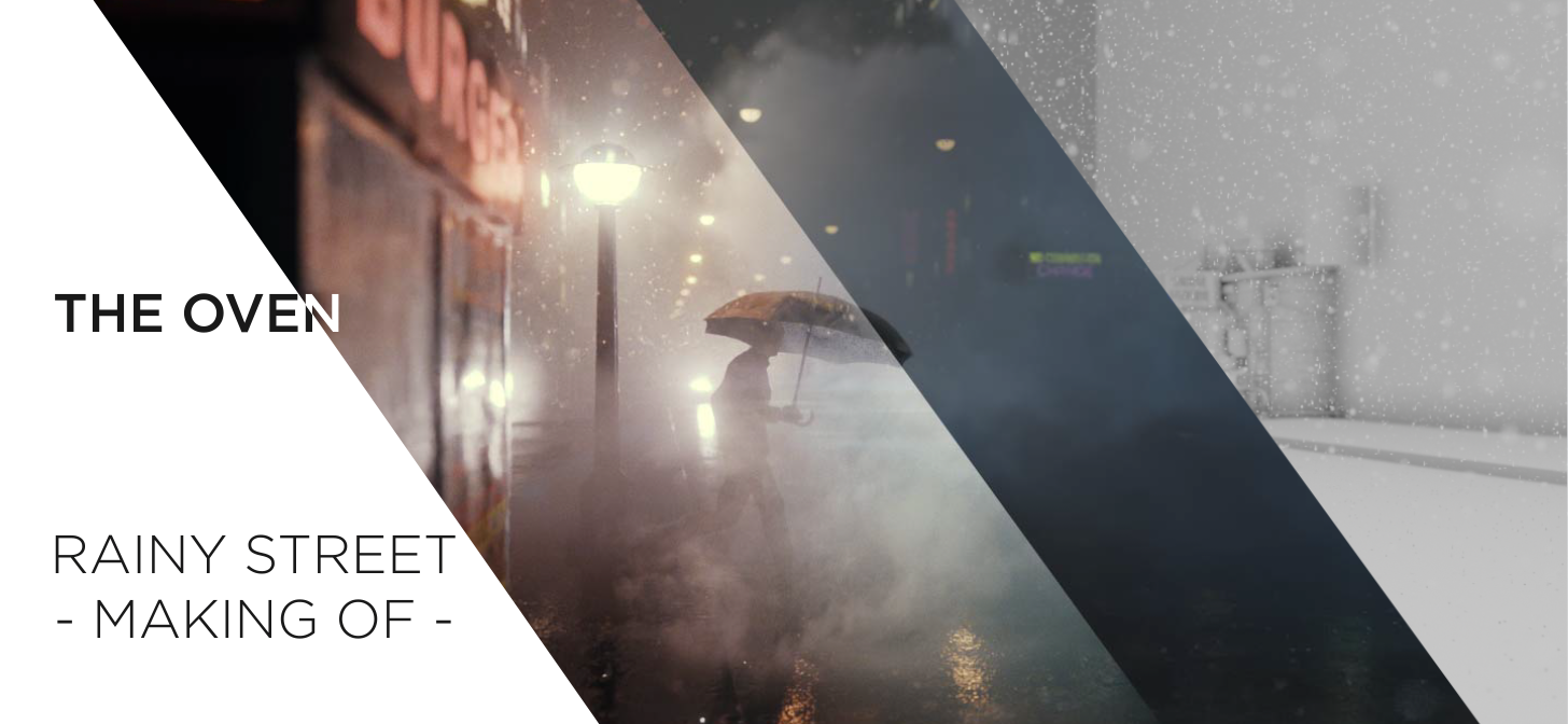
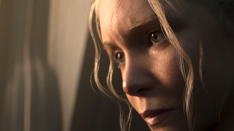
Behind the Scenes: Rainy Street
Hello!
My name is Bernardo Iraci, I come from Livorno, in Italy, but currently live in Warsaw, Poland. I also worked and lived for 3 years in Melbourne, Australia. When I was a kid I was in love with video games, since the time of the first NES, with games like Zelda and Faxanadu being among my favourites. I also really liked to draw, especially on my desk at school, which didn’t make my teachers happy for many reasons. I tried to open a 3D program a couple of times during my teenage days (the one I tried, I think, was called MilkShape 3D) and do a bit of modding for Half Life, but I guess I really preferred just plain old video gaming back then.
I never followed the artistic path in studies, as my degree in logistics and economics shows. However, during the last part of my time at university, I really felt I wanted to do something with movies/VFX and so I started playing first with After Effects and then Blender. This was about 12 years ago and since then I’ve been a self-taught 3D artist and compositing artist.
As in life, I always find it difficult to stick to a particular direction. I guess that’s why I became a 3D generalist with some shade of compositing. I am just too much attracted to every aspect of 3D and CG in general to specialize. I think this approach makes it harder to really shine in something, especially at the beginning. However, in time I have found it to be one of the most rewarding paths to take, especially since I am now a full-time freelancer. I feel that being a generalist allows me to be able to take on a wider variety of projects as a freelancer.
Before becoming a full time freelancer I worked in a few studios in Warsaw and Melbourne. Movies, VFX, ads, animated series, archaeological reconstructions… a bit of everything is my motto! :D Working in a studio is great because it gives you the opportunity to learn from other people, to see the mechanics of teamwork and a more professional pipeline. But I also enjoy the freedom of freelancing, choosing your projects and your schedule. It’s a tricky balance between all these elements, but at the moment I am happy living the freelancer life!
When I am not doing 3D, I either cook, watch movies, read a book, play video games, walk or play the guitar. I also like to hang out with my partner and friends, but COVID didn’t help in that regard lately. Luckily I live with my other half, so that makes it easier!
I’ll close this intro by saying that lately I have finally opened Instagram and Twitter accounts. I am preparing some more breakdowns/tutorials and I’ll be posting my work over there. Feel free to get in touch in case you have questions or requests!
“Rainy Street” making-of

Enough chatting about me, let’s get into the image. As I mentioned earlier, a few weeks ago I got on Twitter and, while exploring, I stumbled on the amazing photos of Dave Krugman and I was just blown away. I immediately felt the urge to recreate one of those in 3D.
The work was done completely in Blender and rendered in E-Cycles. I used a few models from KitBash3D and Viz-People, while the textures came from Textures.com and Substance Source, and a bit all over the internet. For the compositing, I used After Effects.
I was lucky enough to get my hands on a new computer at the beginning of the year. My old laptop wasn’t up to the task anymore and once I came back to full-time freelancing at the end of last year I was really struggling with it.
I have an AMD 3900XT with 32GB RAM and a NVIDIA 3090 GPU. The latter was expensive, but totally worth the money! And now it costs more than double compared to when I bought it in January, so I am really happy about my purchase!
Gathering references
Definitely the first step is always to get a reference. Or an idea and then get references. In this case it was just one reference and I wanted to recreate it as closely as possible, so that’s all I used. For every work, I think that trying to get clearly in your mind what you want to create is really important, and gathering references is very useful for that. Personally, I don’t have an enormous resilience to keep working on the same project for a long time, keeping up the quality and the motivation (which is something I think I have to improve about myself). A good preparation with references and some general thinking is really important to help with this. Just take a bit of time to digest the idea and how you’re gonna tackle all its parts: it can really help you to keep the time down and the execution as clean and efficient as possible. I think this is the perfect example: my reference was so good that it took me one afternoon and one morning to finish this image. Of course, it’s also because I used some pre-made models. However, getting your ideas clear before the start is key!
In case you want to put together a real mood board for your project, I recommend using something like PureRef, which is simple and to the point.
Process in Blender
Composition
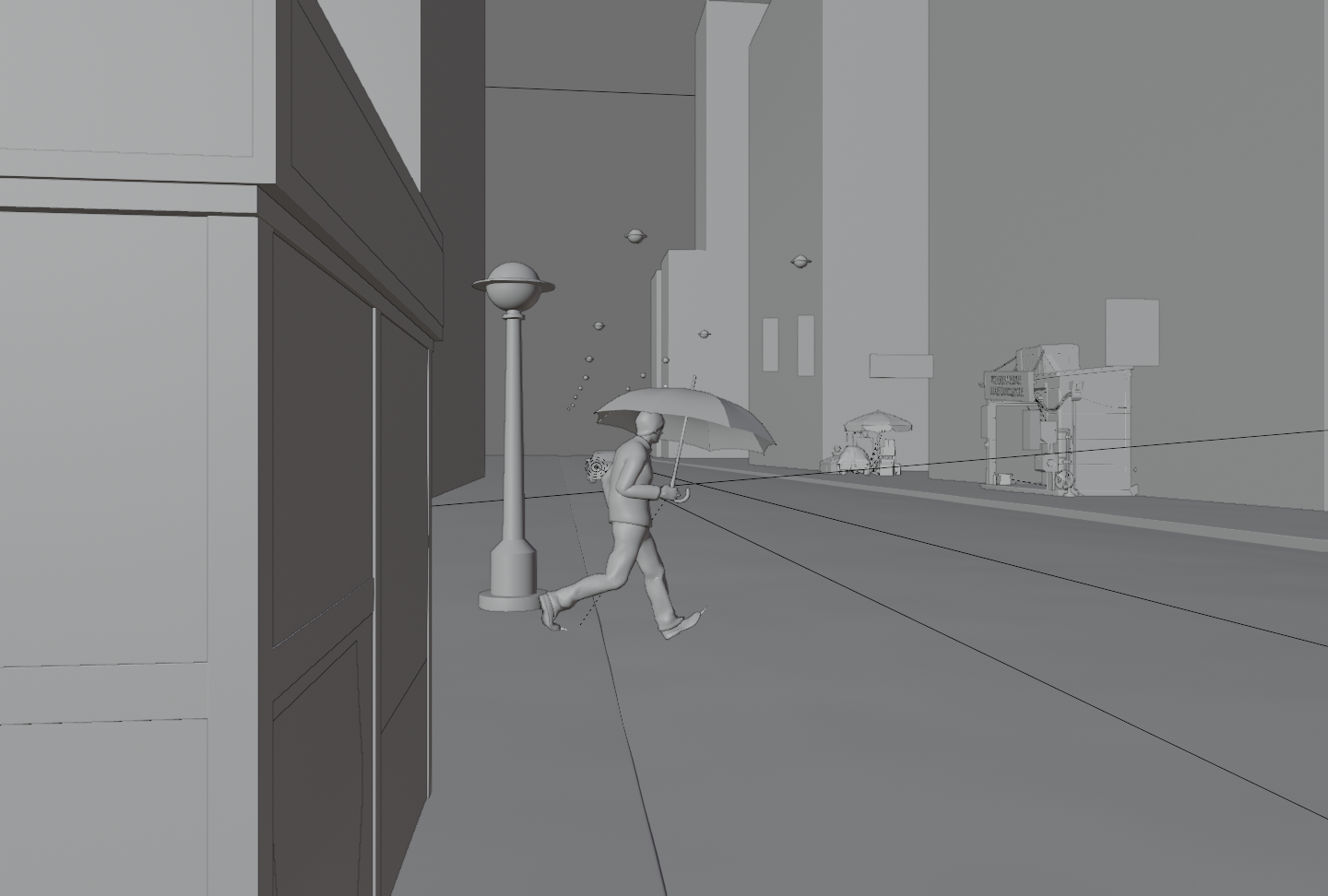
I personally find composition to be one of the most challenging parts of an image and one of the most important ones to either break it or make it. For this particular project, I was following an image very closely so the composition was already laid out. However, I think that composition should always be the first step of a work when you open Blender to start your project. Just figure the composition out using coarse geometries and volumes. You can even sketch out your image in 2D first if you feel more comfortable that way.
The image should “feel” right before you start digging into modeling, shading, and so on.
Once the composition of the image feels good, you can also try to play with the lighting, since this can have a big impact on how the image reads in terms of shapes and volumes.
Composition is an extremely deep topic, widely covered on the internet. People like Gleb Alexandrov covered it very well, but I encourage you to broaden your research. This is a universal concept of imagery that has nothing to do with the tool or medium you use, so you can really watch any kind of guide or tutorial that talks about image composition and you’ll be able to use that info anywhere.
Modeling
A few of the background assets are the free downloadable pack from KitBash3d and VizPeople. Don’t be scared to use assets from the internet. I was always trying to model everything from scratch because I felt that otherwise it would have been like cheating. I later realised, however, that a good image is about much more than making a good model. Obviously, if you are trying to showcase your modeling skills with a particular project, then you should (probably must :D ) model everything yourself. Otherwise, there’s nothing wrong with using a few assets made by other people (if the license allows it, of course! :D).
The character is coming from Fuse, which is a really nice free (because in beta) program from Adobe. It’s a character generator. I probably wouldn’t use it if you are looking for amazing close-ups of a realistic human being, but the quality is perfect for a project like this. You can export a character from Fuse to Mixamo (another Adobe service) and rig and even animate it with free motion capture animations. There’s plenty of material for this on the internet, so I won’t go too into details.
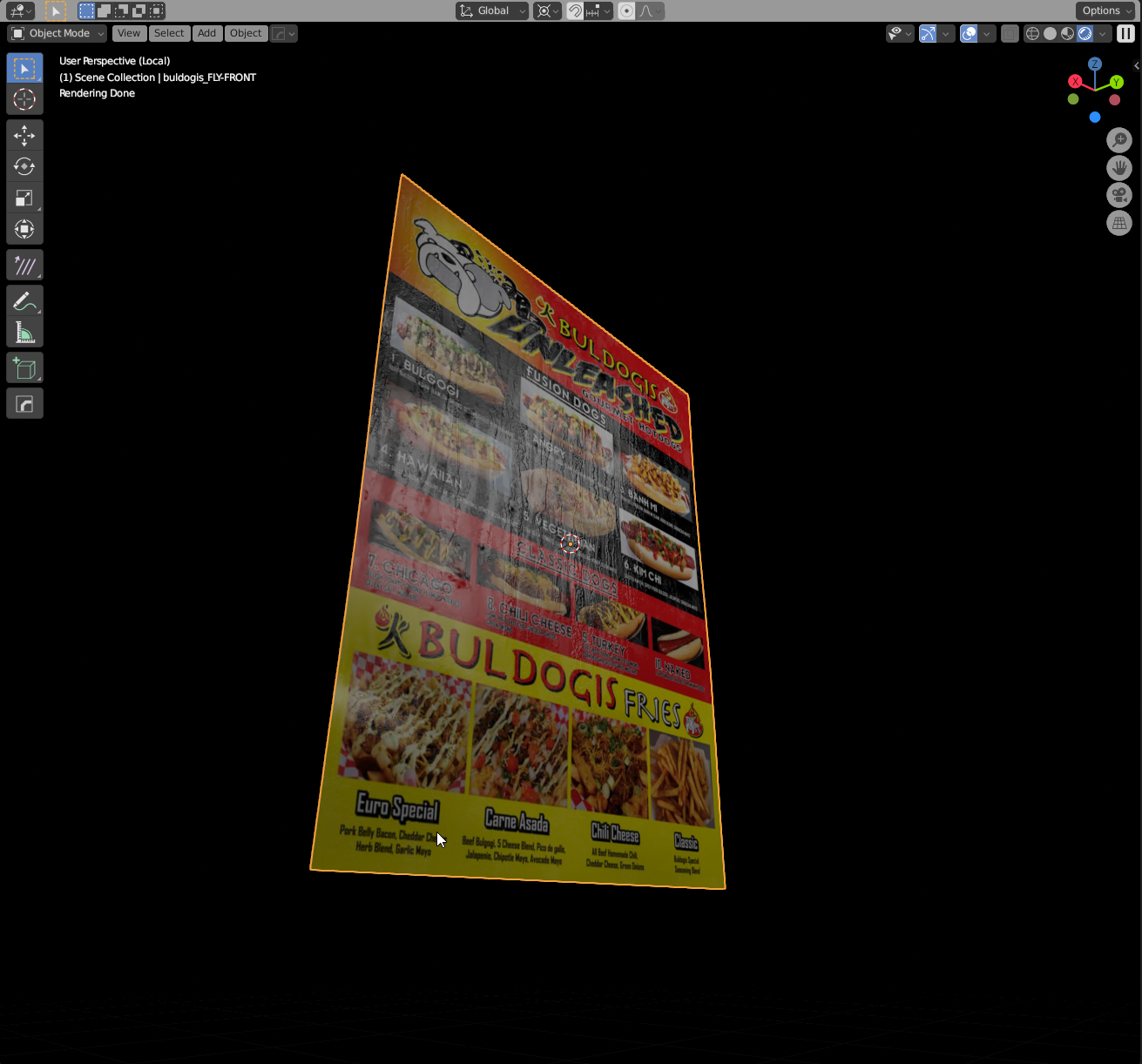
The most notable thing about the rest of the scene is the burger food truck, which was created with some simple extruding for the main shape. Make sure to always use some bevel so that the edges are never perfectly square.
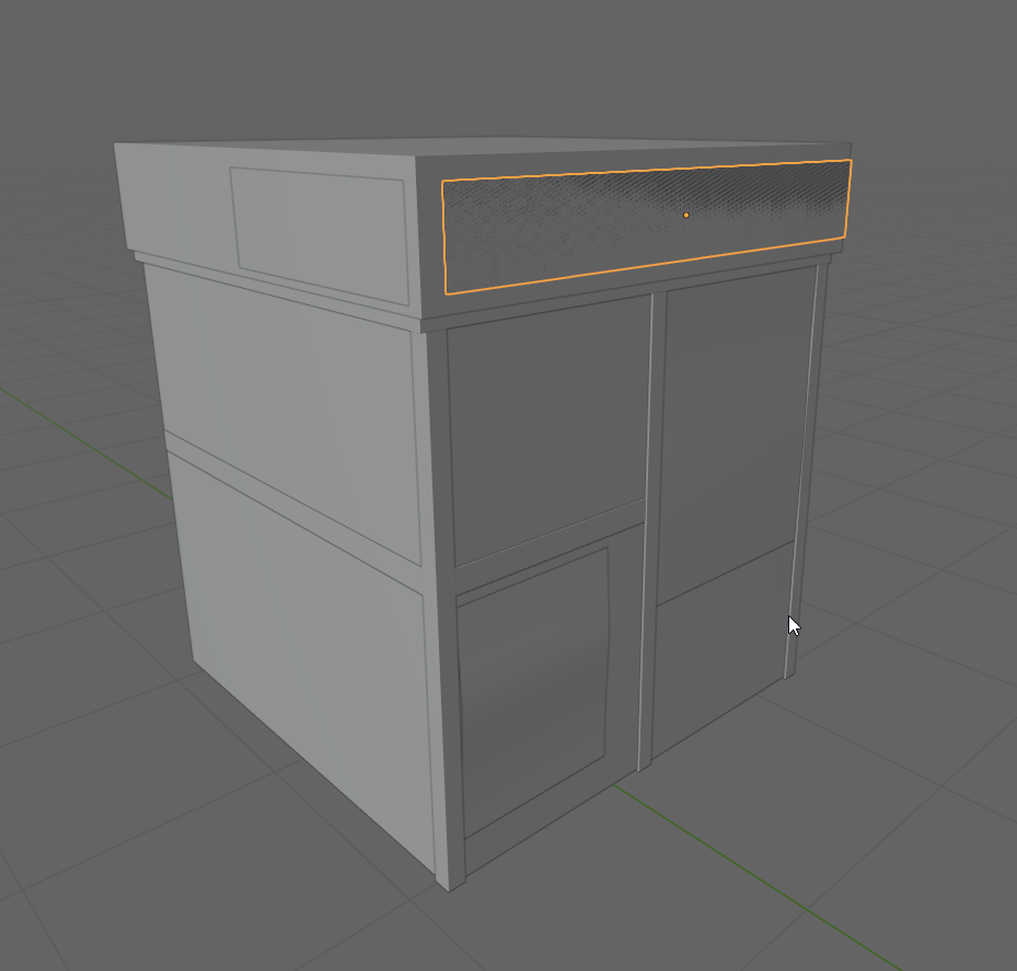
Then I created all the signs using the Import Images as Planes functionality in Blender with a bunch of textures from Textures.com, which is an amazing resource! For this particular approach to modeling, I recommend watching some videos from one of the masters: Ian Hubert. I am sure everyone knows him and saw his tutorials, but in case you do not and have not, do yourself a favor and go watch them, together with his amazing movies.
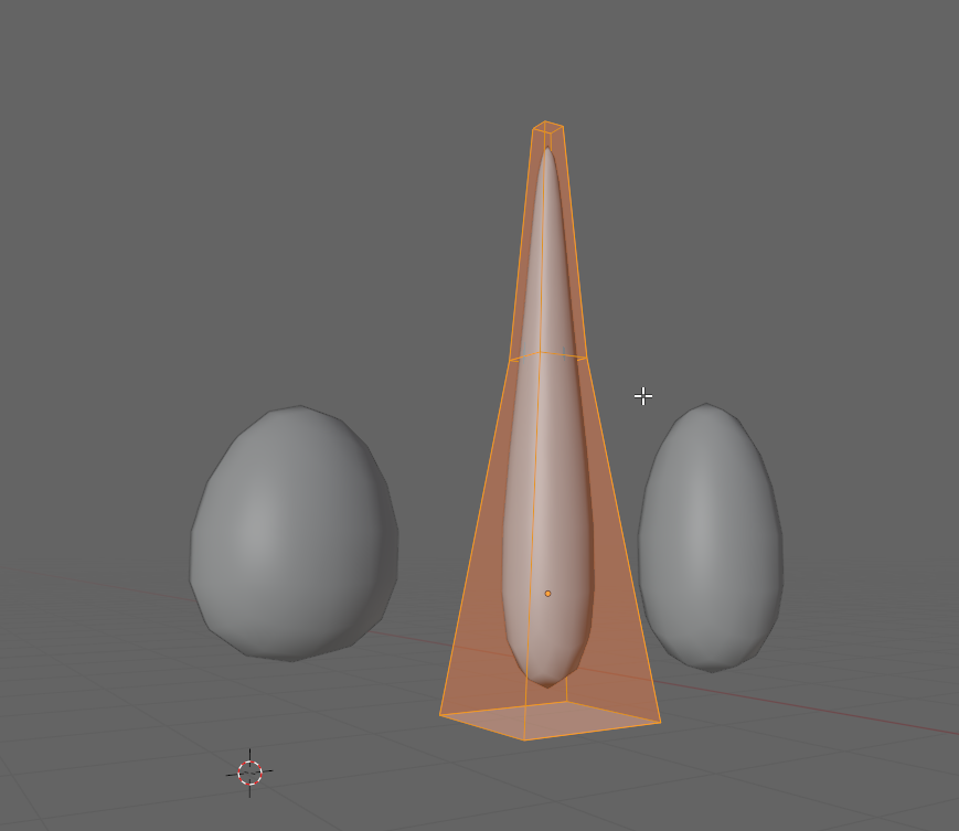
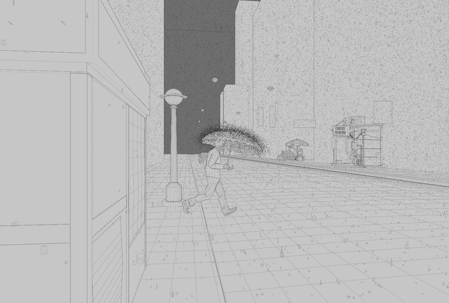
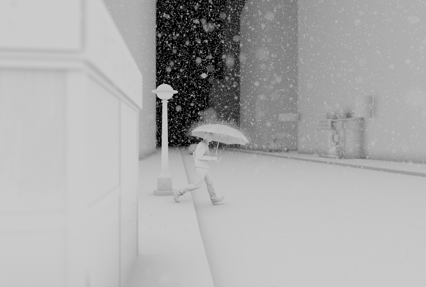
Last thing I wanna mention here is about rain drops! We can’t have a rainy street without some rain drops, after all, so first of all, let’s model some drops. I made just a few variations, nothing fancy at all and put all the variations in a new collection.
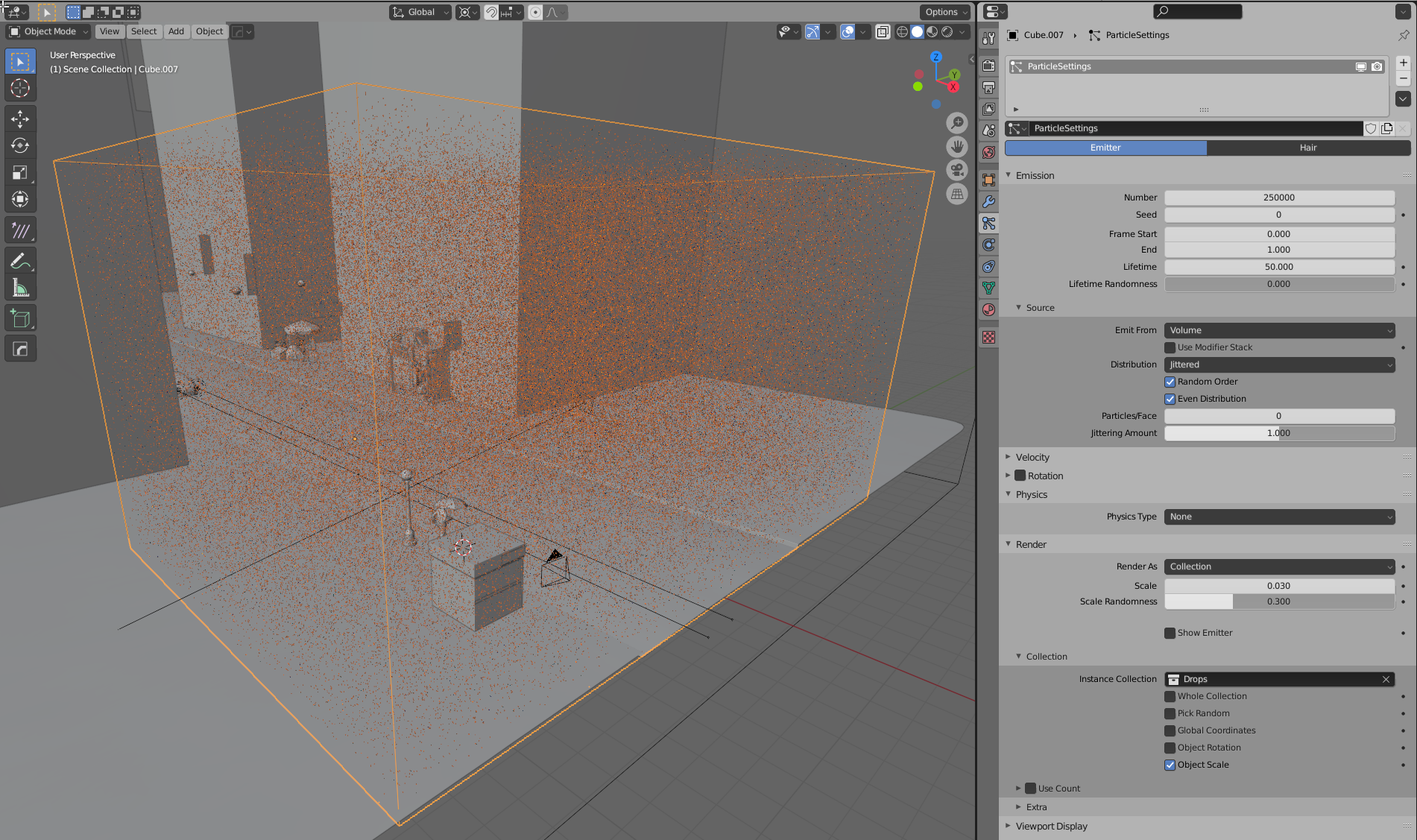
Then I scattered them in the air. I created a cube and placed it just in front of the camera. There would be a lot of geometry so I didn’t set it too deep in the scene where it wouldn’t be visible.
I added a particle system to it, set the physics to none and the emission source to volume. Then I made sure all the particles were emitted by frame 1 and set the number to 25000.
Finally, I set the particle render mode to collection and selected the raindrops collection. Voilà, it’s raining! The viewport can get a bit sluggish, so if necessary you can just turn the viewport visibility off for the particle system. I also recommend setting the emitter viewport visibility to wire.
I could have stopped there, but decided to push it a bit further with the rain. Rain will create little splashes when it falls on objects. Now… adding splashes to everything in the scene might be too much, but I thought it could be a nice touch to add some splashes over the umbrella of the character since they would play nicely with the strong backlight of the car headlights.
To do this I created a vertex group on the umbrella to limit the particles’ emission just to the top of it, where the rain would fall. Then I created a similar particle system to the previous one, but this time I left the physics on and set the emission source to Surface. I also gave it some normal speed and fiddled a bit with rotation. For rendering, I used the drops collections again.
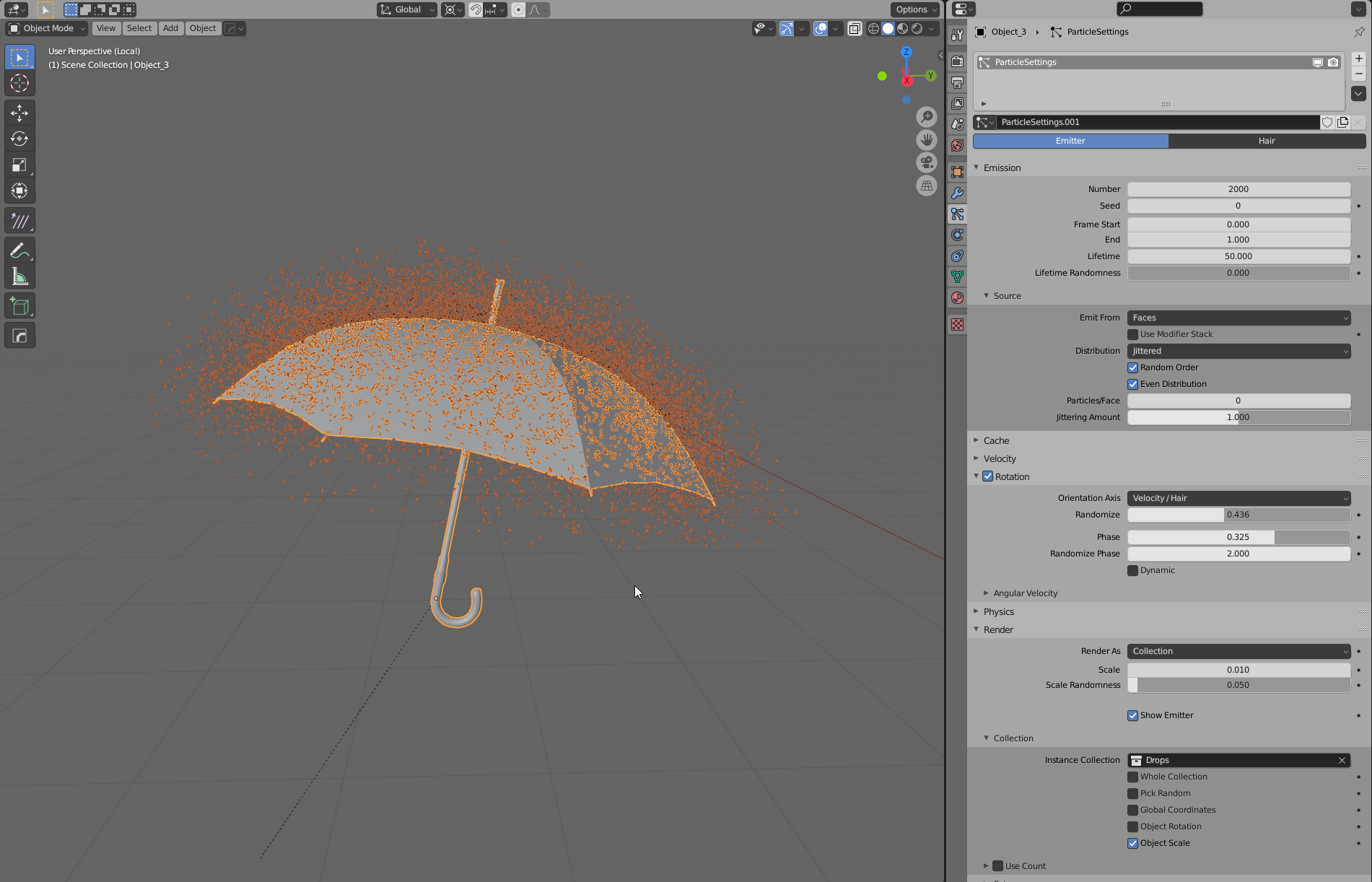
One last word about rain: don’t overdo it! We just wanna see its subtle presence, it’s ok if we cannot make out every single drop. Something like rain is especially visible thanks to its movement, which we don’t have here. However, if we overdo it by making the rain drops too big, we’ll ruin the effect. It’s ok to exaggerate things a little bit, after all that’s one of the beautiful things about CG, but sometimes a subtle effect is much more effective than one that is just “slapped” in your face.
The rest of the scene is literally a bunch of scaled cubes, planes, and a few balls suspended in the air. Those would be the street lights, for which I didn’t even bother modelling the cables. A valuable lesson that I learned in time is that often, less is more: there was a big chance that in a scene like this, the street lights’ cables wouldn’t have been visible anyway, so by not modelling them I didn’t lose anything in the final image, but instead gained time to work on more important things.
Lighting
For the lighting, I needed a dark environment lit by a lot of artificial lights and colored neons to create the nice colors and reflections of the reference.
There are three groups of light sources:
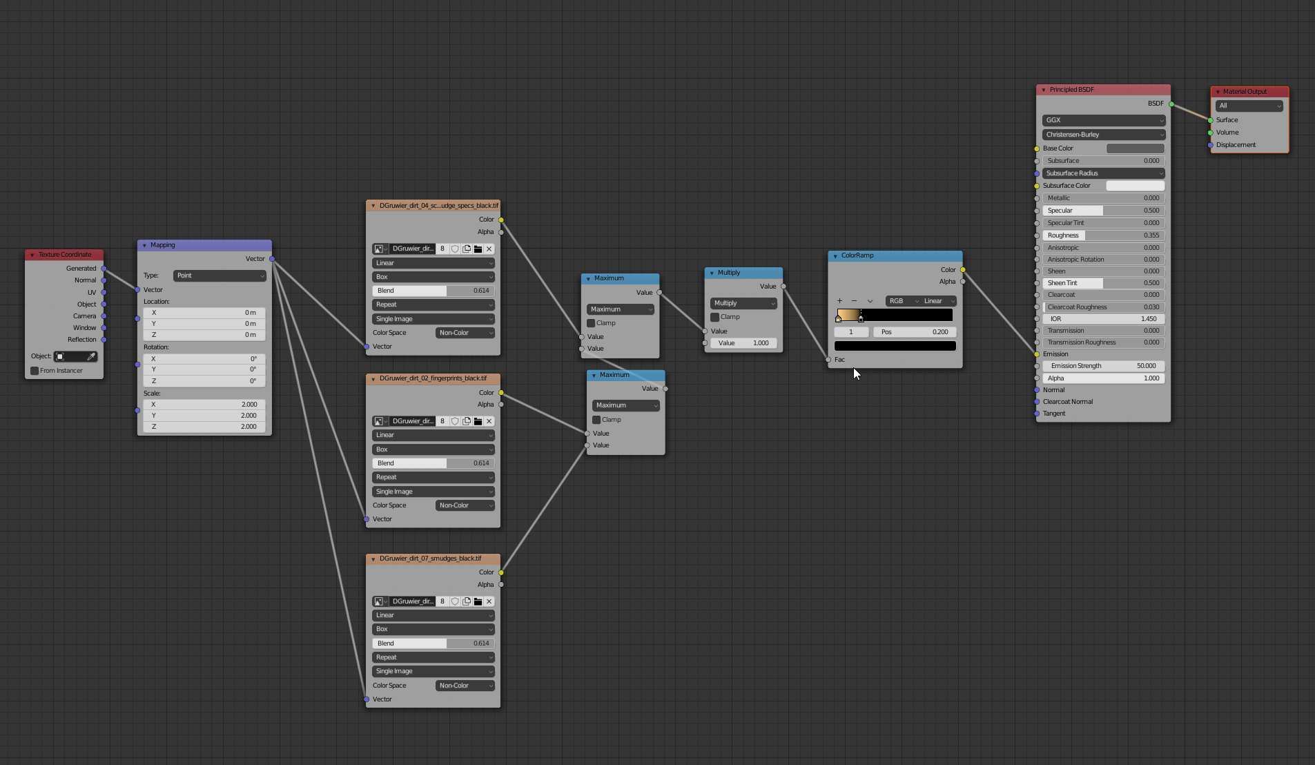
- The lamp posts, which are all along the street and one above the character (the floating ones :) ). This is just a mesh with an emitter material. To try and make it a bit more realistic I used some textures to break the emission surface, as in reality you’ll never have an immaculate material, especially on a city street during a rainy day.This is how the shader tree looks (I will talk more about the textures in the shaders section):

- The car headlights: Nothing fancy here. Just two spots light in front of the car model. The image plays a lot with silhouettes and these lights help in that regard, since our character sits right in front of them.
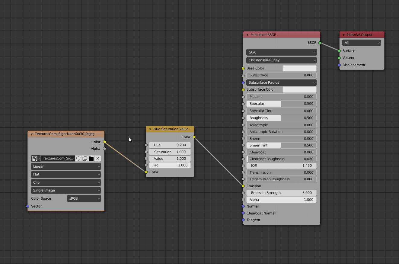
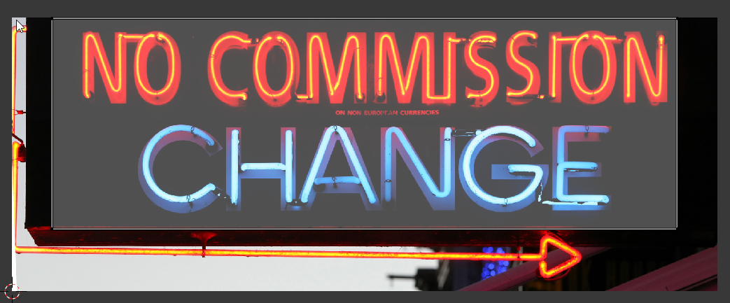
- The neon lights: A really important part of the lighting because they will give us all those nice colored reflections on the wet surfaces. Again, the Import Images as Planes technique here works really well. Just find a bunch of neon light textures on the internet, import them into Blender and then set up the material as in the image below. The trick is to have a black background around the neon light and adjust the UV coordinates of your textures so that there’s only the neon and the black included. Obviously, it won’t be the most beautiful neon if we get really close, but it sells the effect really well from a medium/far distance. Then you can use a HSV node to play a bit with the colors:

The texture seen with the UVs of the plane:
Finally, add a solidify modifier to give your neon sign some thickness and you’re good to go!
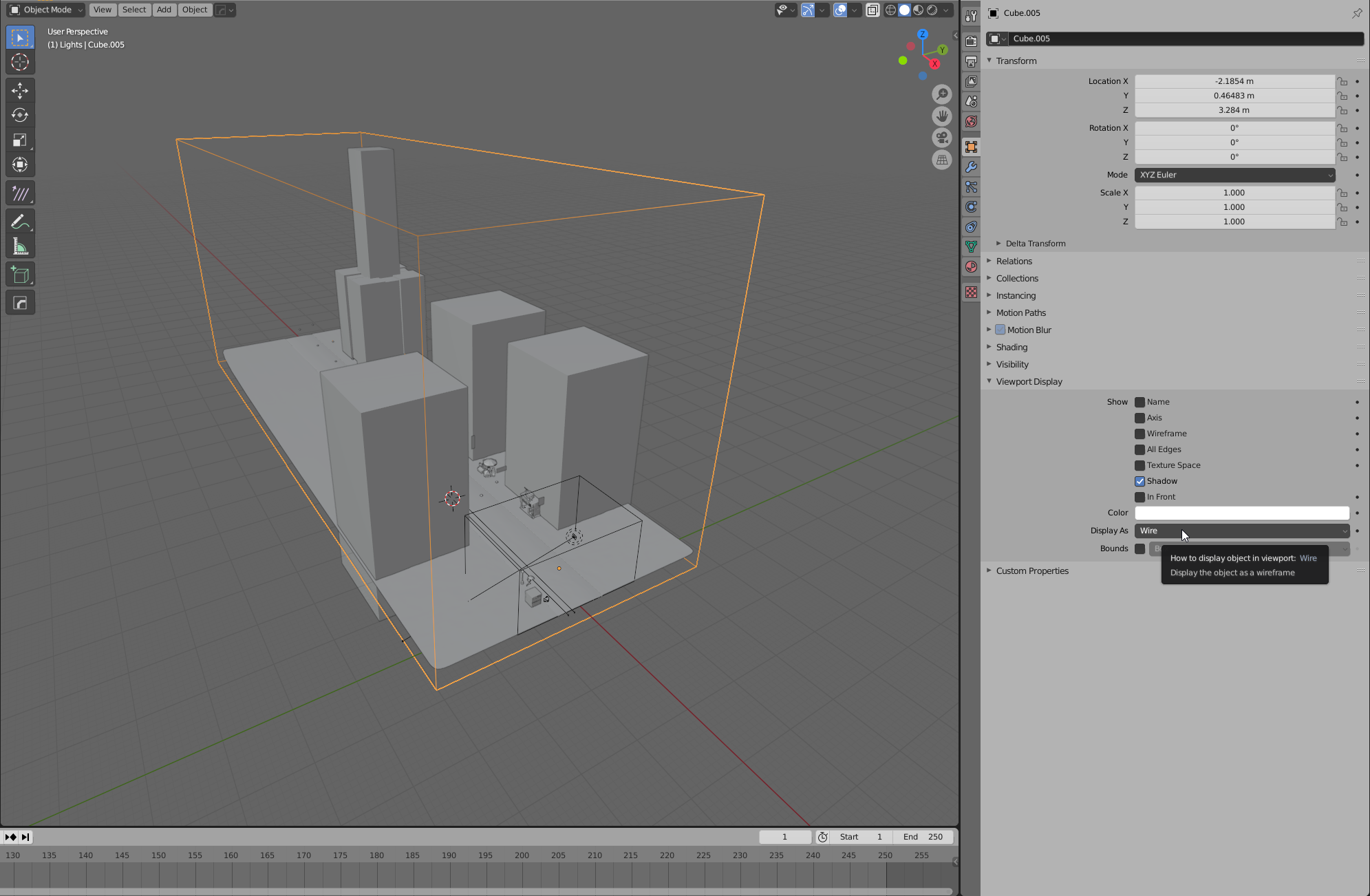
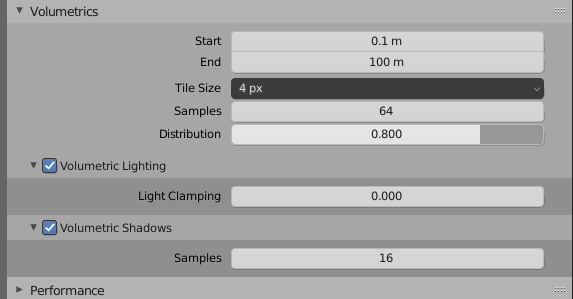
To give the lighting the final touch, we need some fog. It’s not a cool rainy day without some fog that embraces our scene giving it a nice atmosphere! We’re using some real volume in a cube here. Add a cube that will encapsulate the whole scene. I suggest setting the viewport visibility option to “Wire” in the object settings, so that the cube won’t get in the way in the viewport.
Then, we’ll set up a simple shader like this:

Cycles isn’t the best engine when it comes to volumetrics, but an homogeneous volume (meaning without textures) will render reasonably fast.
Shading
We’ve probably reached one of the most important parts of the image. Don’t get me wrong, I believe that for a 3D render to look good, every part of it has to be done right. However, for this particular image I feel the shaders are a really important piece of the puzzle.
Before we begin: turn on the node wrangler addon in the settings. This addon is a life saver when it comes to nodes. My favorite function? CTRL+SHIFT+click on any node to see its output. There’s a lot more, however, and I recommend learning the functionalities of this addon well! I am sure a lot of you know about this already, but I think it’s worth mentioning!
There are two aspects I want to focus on: the street shader and the imperfections of the surfaces in general.
The street covers a large part of the screen and it’s going to reflect all the nice colored lights we’ve positioned in our scene, since it’s wet. To start, get a hold of a couple of nice cement texture sets. Mine come from Substance Source. I mixed them using a procedural noise texture. This way we break a bit of repetition. In the image below you have the two sets of textures, from top to bottom: albedo, roughness and height.
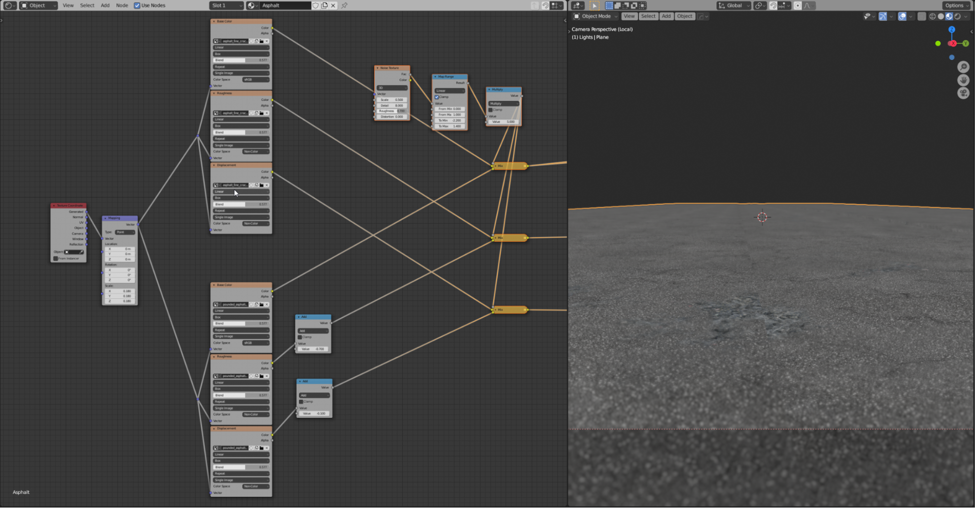
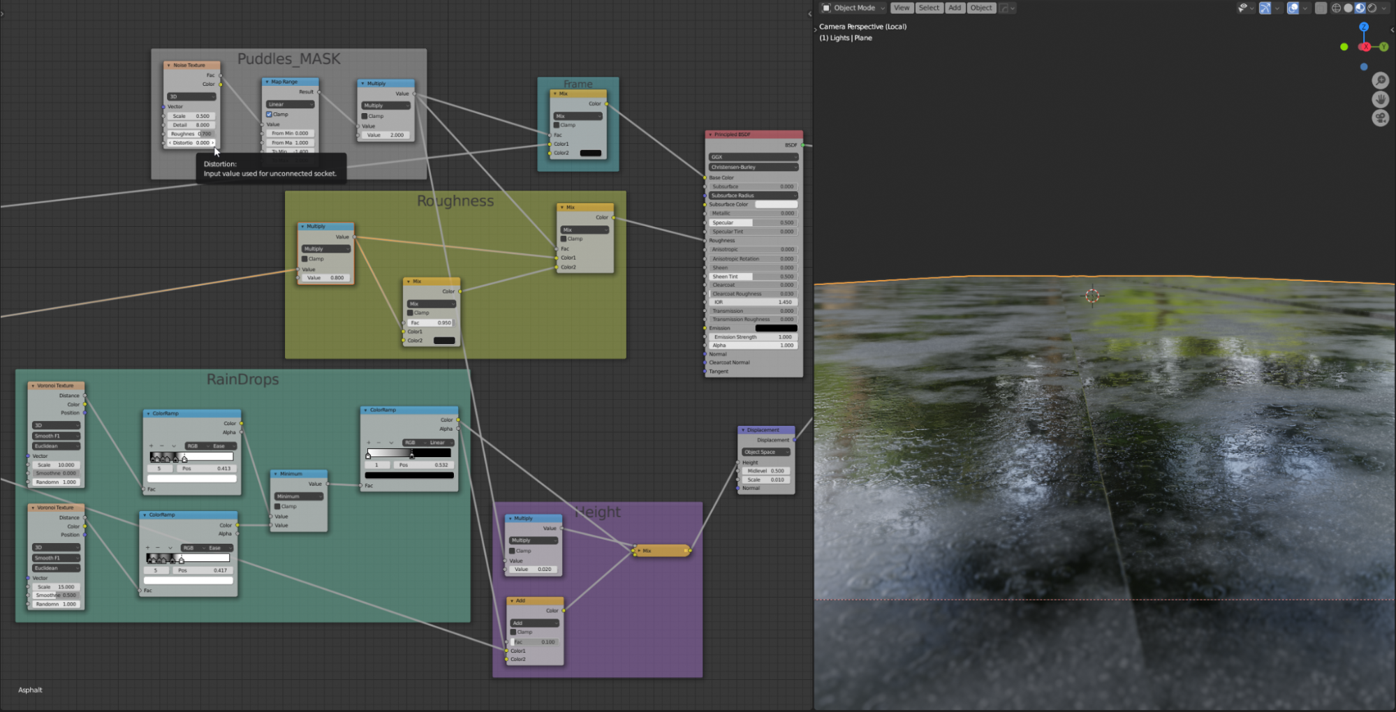
Now it’s time to create some nice puddles. When it comes to creating shaders I try to really break down how things work in real life. It’s raining, we have a street that has bumps, little holes and so on. The water is going to accumulate in certain areas affecting the color, reflectiveness, and bumpiness of the surface. Let’s start by creating a mask that will “guide” where the water is going to go. It’s a simple noise texture with a map range and multiply node to tweak its look.
This texture is going to drive:
1. ALBEDO: we want to mix the output of our albedo maps with a black color using our mask as a factor. This isn’t probably physically accurate, but darker colors enhance reflections, which is exactly what we want for our puddles.
2. ROUGHNESS: a water puddle is going to be much more reflective than asphalt, even when this is wet. We want to use the mask to make the roughness map darker in the areas where the puddles are present.
3. HEIGHT: while the asphalt is bumpy and uneven, our water puddles will have to be basically flat. They are not really deep, so maybe some of the bumpiness of the asphalt will still emerge here and there, but definitely the bumpiness needs to go down in those areas. We can even get a bit fancier here. Since it’s raining, we can create some rain drops using voronoi textures and some color ramps tweaking. This will create a texture that is even except for those rain drops. This is what we’ll use for our puddles.
Remember that when you use a mask to mix stuff, you can use a math node set to multiply to tweak the intensity of the second input. The concept here is: black will show input 1, white input 2. All the values in between are gonna be a mix of the two inputs. I used this technique for the height, so that the puddles wouldn’t be perfectly even, but would maintain a little bit of the asphalt bumpiness.
Now I want to focus not on a particular shader, but on a more generic concept that, in my opinion, can really improve the realism of CG shaders: imperfections.
We’re on a city road during a rainy day. All the things sitting around are going to be wet, dirty, scratched and more (you probably don’t wanna know about all of it :D ). They definitely cannot look clean. No object in real life is perfectly clean, let alone in a scene like this.
So I think every CG artist needs to have a good set of dirty textures in the archive. There’s a lot of stuff that can be found on the internet. Just grab yourself some nice packs from Textures.com, Poliigon, Substance Source, Quixel, Gumroad… whatever! It’s an investment that will make your renders shine! (Well… kind of. You don’t want them too shiny. :D)
Let’s have a look at our burger truck again. I said I imported all the signs as images. This is how those imported images looks out of the box:
Boooooring!
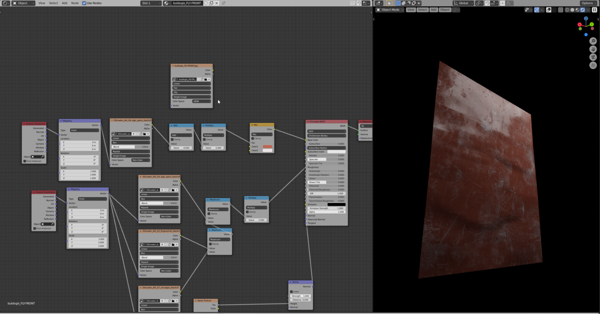
Let’s now use some of those surface imperfection maps. This sign is probably wet, scratched, dirty… in CG the best way to add those things is to play with the roughness. Remember: white is perfectly matte, black is a mirror. Using math nodes (Add and Multiply) can help you to achieve the desired values. Using the node wrangler addon can be really helpful here. Also, when mixing the images I like to use a math node set to “maximum”. You could use a color add node and that would also be fine, but there’s a risk that some pixels will be too bright. The Maximum math node will just pick the highest value between the two images for each pixel, without adding them, so it’s a bit safer in that regard.
You can also play with the bumpiness, but I recommend doing so just for the broader details. Here I used a soft noise texture to make the sign look not perfectly flat. I even added some slight variation in the geometry itself. Go easy here! We’re looking for subtle things: as always, try to think of how a real sign like this would look. Even better, look for some references.
This is how the node tree looks:

And this is how our sign looks now… that’s much better I think! See how all the effects are not too strong. Experiment with the settings, intensities, and so on.
If you want, you can even use the imperfection maps to play with colors, depending on how “grimey” you want something to look. For example:
Finally let’s talk about the smoke. Most of it is added in comp, which we’ll cover in the next session. However I also created some in Blender. I think there are 2 ways here (well… 3, but I think simulating smoke here might be a bit of an overkill):
- Using the new VDB objects and importing some nice external VDB cloud, or smoke, or whatever. Again, plenty of packs you can find on the internet.
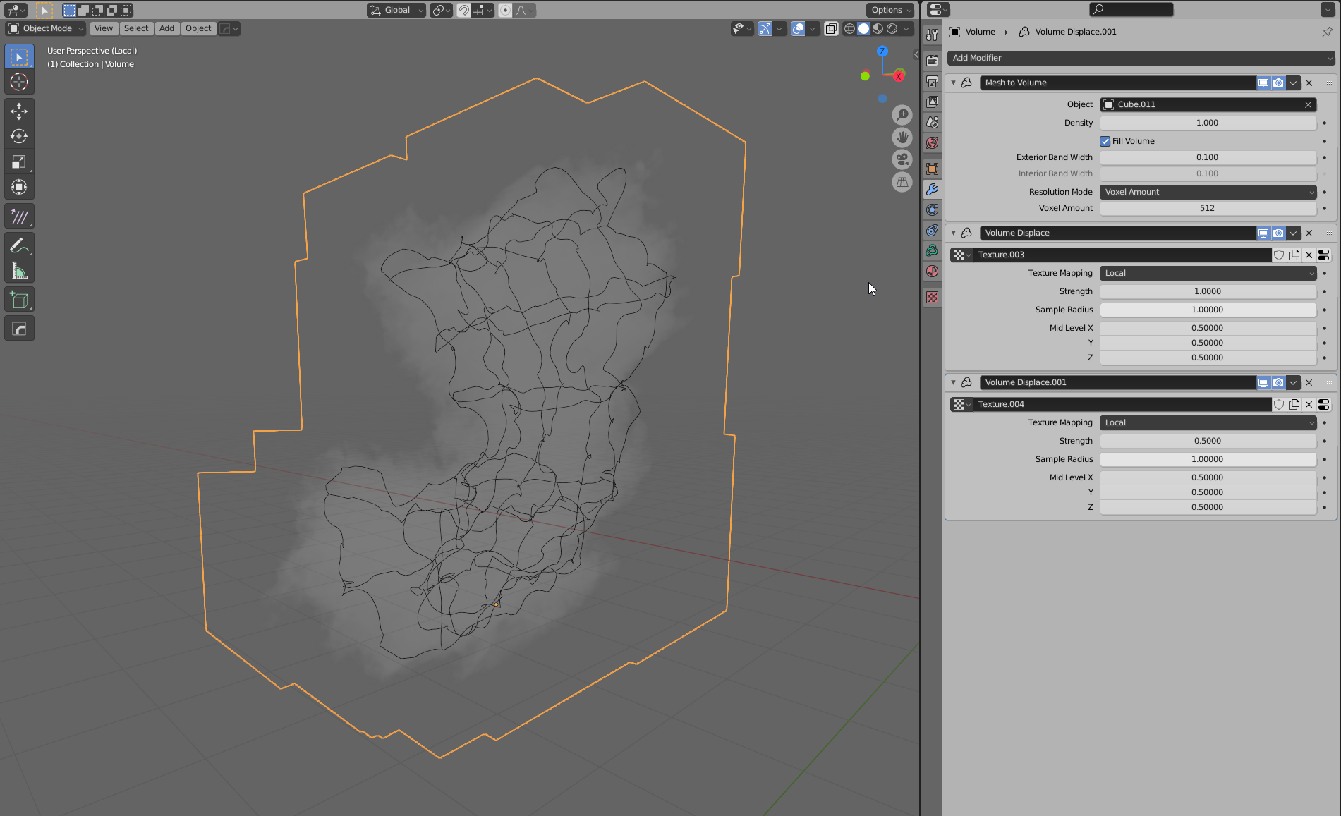
- Again, using the new VDB objects and the mesh to volume modifier. Let’s have a look at this option!
First let’s create a very simply shaped mesh. It should follow the general shape that we’ll want our smoke to have. Here the idea was to have some smoke rising from a manhole on the ground and very slowly moving with some wind in the air. Then we’ll use some modifier to give enough polys and displace the surface so that it looks more like smoke. Remember to turn off the render visibility as this mesh will just help us create the volume, but we don’t want to see it in our final render. I also recommend turning the viewport visibility off for all the light paths and setting the mode to wire or bounds, so it won’t get in the way in the viewport.

Now let’s add an empty volume object and add the mesh to volume modifier. Let’s select the mesh we created earlier and increase the resolution a bit. Don’t push it too much or your viewport will get slow. Finally, let’s displace our volume using a couple of displace volume modifiers. I used two variations of a simple cloud texture to drive the displacement. The shader is a simple principled volume.
Render and Compositing
The only thing I want to mention about the render is that despite being on a 3090, I rendered the smoke in Eevee. :D For my render, I used some VDB clouds that, for some reason, were just killing render times. The solution with the mesh-to-volume modifier is better in terms of render times, but anyway I wanted to touch up the smoke in compositing and the Eevee volume looked good enough.
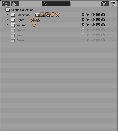
To set up the render with the two engines, I created a linked copy of my scene. It’s a bit like creating a new render layer, but it gives more control over what different settings you want to have. Before doing that, however, it’s always good to make sure we have all our collections well organized. We can change them later, but with linked scenes it’s a bit more complex to do. The smoke needs to be placed in a separate collection from anything else. Let’s turn the smoke collection off in our main scene.
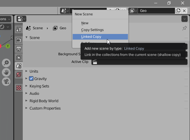
In the new scene, change the render engine to Eevee. Other than that, I just changed something in the volume settings.
We also need to make sure our scene collections are set up correctly. In the smoke scene we just want to see our smoke, although the rest of the environment should still affect the look of the smoke. For this we’ll turn on the “indirect only” and “holdout” options in the outliner for the rest of the collections. Remember that if you have nested collections, those settings will have to be manually turned on for each collection inside, as the parent collection won’t override their settings.

Now let’s go back to our main scene and go to the compositing section. You can do all your compositing in Blender, but for this project I’ve just comped the smoke over the main render in Blender and then did the final compositing in After Effects. Make sure to add a new render layer (add > input > render layer) and choose the smoke scene we created earlier in the scene menu of the node.

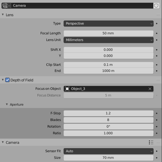
One more thing! Let’s add some good depth of field to our scene in the camera settings, focusing on the character:
Finally, in After Effects I added some photobash smoke, did some color correction, added some lens flare and glow to the image. Nothing that couldn’t be done in the Blender compositor.
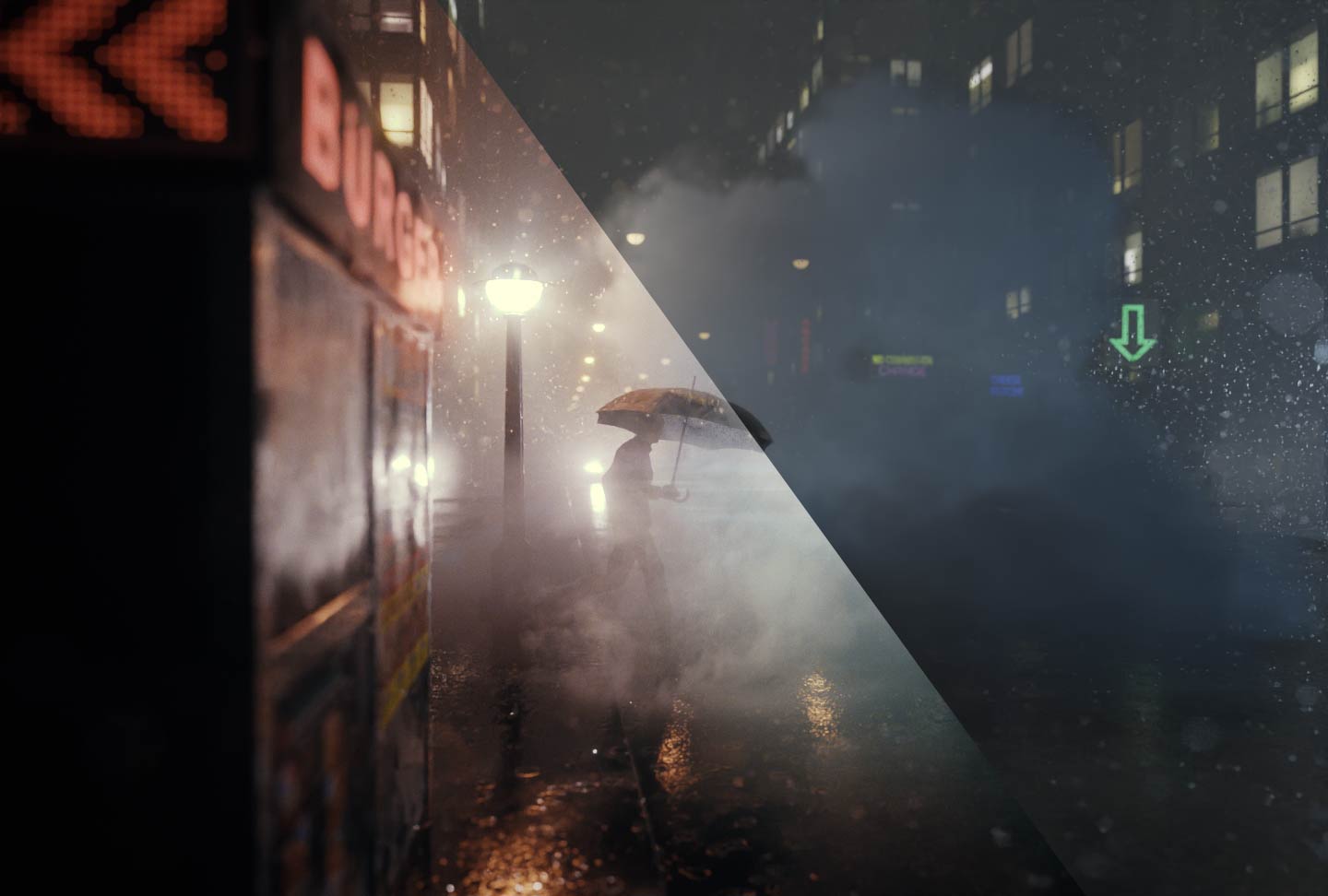
This is a comparison between the render out of Blender and the composited image:


Closing words
I think that’s it! I mean… we could be talking about a ton of other things about this image but then it would become a book rather than an article. :D However, in case you have any questions don’t hesitate to reach out to me!
I also plan to create more breakdowns and tutorials, so keep an eye on my accounts! :)
I really hope you enjoyed this article and see you next time!
Bernardo
About the Author
 Bernardo Iraci, 3D baker at the oven
Great article, very well illustrated and explained… The end result is a beautiful rain scene.
Grateful for sharing.
Waiting for more
very very Osm Article Sir /Ma’am
Blender 2.9 3D Addon Install(DoFollow Backlink)
I normally don’t read artworks like this. But your’s caught my eye. It was a great read getting to know your process. Love your thoughts on being a generalist btw.
Kudos!
That is a beautifully composed image – thanks for the insight, Bernardo!