
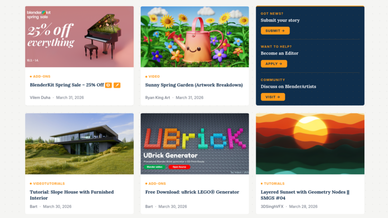
Trying out a ‘featured news’ slider
On a typical day you’ll see between 5 and 10 news posts here on BlenderNation. While this is great, it also means that news disappears from the homepage really fast, making news that is truly important or interesting hard to find.
In an effort to make important stories stick around a little longer (and to give them a bigger spotlight), I’ve now added a ‘featured news’ slider to the homepage. The drawback is that the regular blog column is now pushed further down – I guess a large daily art header isn’t a regular feature on most sites ;-).
What do you think? Does it make it easier for casual readers to read the top news, or is it more annoying for you to keep up with the regular news flow?
Cheers!
Bart
Yep. Noticed it. I like it. It keeps buzz-worthy news around longer, which sometimes gets buried to newer updates.
I don’t mind the *strenuous* task of an extra scroll down to reach the articles. In fact, it may save me some hunting.
Nice touch, Bart. :)
I just have to put this link here: http://iampaddy.com/lifebelow600/ :)
RIP “Fold”.
That was a great read, thanks
Hey, I really like it.
Helps to distinguish between real Blender-effecting news and things like new reels, tutorials, images etc.
One point for improvment:
The zoom-effect is a little exaggerated on the main-article (the big picture) from my point of view.
I like the featured news’ slider. 5 stars
I’m a big fan of sliders too. I like it!
Looks good. Just need to insure that there is enough focus on what you want in order to get the most ROI for your real estate. Also, it may be worth noting, the more you have available, the harder it is for people to find things. I honestly would say mark on your Google analytic the day you launched this new feature and check to see who your CTR behave.
It looks clean, however. I agree with Spunkly on the zoom. I’d tone it down a ton and just make it a subtle effect. It’s pretty jarring.
Thanks Tadd. I agree, the zoom is a bit much. I’m having a hard time figuring out how it’s done though :) If anyone can offer some help that would be great!
Bart, I tried to look into your JS and CSS files to see if it was in those, but I don’t see the JS file for the slider. It looks like it’s a flex slider set up, so it’s probably in a function in the JS. Usually that’s editable in the plugin settings, but I don’t know which plugin you’re actually using (flexslider is used in a lot of plugs!)
I do web development as a day job, so I can probably dig through your code. Email me and we can chat more.
To help you, we would need to know what WordPress plugin you were using.
It’s part of the theme I’m using, not a separate plugin. I was expecting it to be a CSS or jQuery setting?
Okay, what theme are you using? Is it custom, from WordPress.org, or bought from an outside source?
I don’t know that the theme you are using is using jQuery, because WordPress includes it by default. It may be a CSS property, or a JavaScript library.
Ok, so your using the Smart Mag theme. The zoom setting can be changed in your child theme. I haven’t used this theme, so I don’t know what the setting is, and the links I retrieved from
http://themeforest.net/item/smartmag-responsive-retina-wordpress-magazine/6652608/comments?filter=all&site=themeforest.net&term=zoom&utf8=%E2%9C%93
aren’t working.
I don’t have an account to get into the forums, but it should be at this link if it is available.
http://theme-sphere.com/forums/topic/image-zoom-on-roll-over/#post-135
Hey BILLDSTRONG,
that tip was great, thanks! They offered a few lines of CSS to stop the zoom effect and it looks just SO much better now. Thanks for taking the time to fix it!
Your welcome. Happy I could contribute something back for what you do for the community.
I am having some trouble loading the site on my mobile device (the pictures won’t show for the news). I am using an Android HP Slate and have not had this problem before.
I can’t verify it on Android, but on iOS devices it works fine. Can you share a screenshot?
It’s looking good on my Nexus 5 (Could’t figure out how to take a screenshot). Have you tried using the Google Chrome browsers Developer tools? It has a nifty feature to simulate how websites appears on different units.
I’m pretty indifferent to the slider, but thought I’d offer some input.
I’ve seen some sites that will order their stories on their main page by how many people
are reading/commenting on it. I realize that isn’t ideal for what you’re trying to accomplish, but then
I thought about how to tweak that to work better for you. What about a ‘story ranking’ variable that’s hidden of course, so that you could allow stories to stay on page 1 if a lot of people seem interested, but you could also have another value that you could set when posting the story that keeps it there regardless of traffic/activity. And/or a ‘time limit’ that you could set that would keep a story on the main page (or certain position on the page) for a certain amount of time, or until a certain date. You could also combine these ideas and only allow stories that get a high ranking due to activity to stay on the first page for a certain amount of time.
The problem I’ve seen when ranking stories by comments is that on busy days with lots of entries, some stories instantly get pushed to page 2 before enough people notice it. Hence the ‘time limit’ idea.
I doubt any of this is practical for you to implement, but thought I’d put it out there. It could help you reclaim some space at the top of the page. Just had another idea pop in my head, so might as well type it too.
What about a small ‘strip’ between the header graphic and the advertisement? You could put ‘important’ stories there from a static list, or using some sort of ranking as previously mentioned. Again, just thinking about reclaiming that space, and a small list would accomplish that while accomplishing the goal of keeping important stuff up top.
And while I’m typing, more stuff pops in my head. You could also change the header graphic area to be a slide show. One slide could be the header graphic, and others could be what you currently have in the slider. You could also put ‘buttons’ in the bottom corner to navigate through them instead of just using a timer. Or don’t make it a slide show per say, but put some navigation buttons on it that says something like ‘top stories’, so you can click that and the header graphic changes.
Again, I doubt any of this is practical….maybe I’m just bored or too jacked up on coffee.
Also, I’ve long wanted to ask if you could implement an auto-refresh feature to blendernation so that when a new story is posted, the page automatically refreshes. I imagine that could cause other issues that I’m not thinking about, and as for ads, I’m not sure if changing ads on an auto-refresh would earn you more, cost you more, etc., but it would be nice not to have to manually refresh to check on a new posting.
Thanks, keep up the good work.
Hi, thanks for the input, but that would be a very radical change :) It’s more a Digg or Reddit approach, one that might work fine there, but BlenderNation has a different function – it’s not a community voted news site, but a curated list of important stories from the Blender community.
I must admit I really didn’t notice those new “featured news” at all until now – probably due to a phenomenon called “banner blindness”. A common thing people have been developing for quite some time now. It just “feels” like a typical ad banner and so I probably subconsciously ignored it. I’m sure I’m not the only person ;)
Marco
A quick update – looking at my analytics it seems that the slider doesn’t actually do much for the featured articles. Regular readers probably skip it as they’ve already seen the articles. Ad revenues have also plummeted – this may be due to the slider, but could also be due to external factors. I’ll now disable the slider for a bit and see how that impacts my income. Stay tuned :)