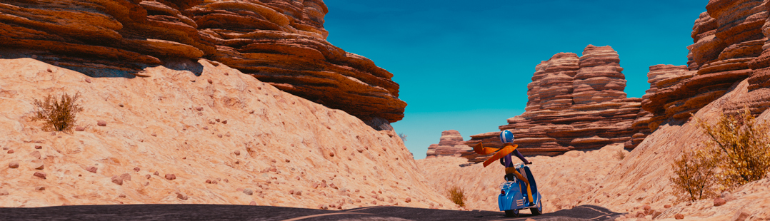
I rather dig this helmet that sickgrey posted on DeviantArt.

I rather dig this helmet that sickgrey posted on DeviantArt.
I have a LONG history with Blender - I wrote some of the earliest Blender tutorials, worked for Not a Number and helped run the crowdfunding campaign that open sourced Blender (the first one on the internet!). I founded BlenderNation in 2006 and have been editing it every single day since then ;-) I also run the Blender Artists forum and I'm Head of Community at Sketchfab.
9 Comments
Cool image, but from a practical pov, when I look down, I can't see below my mouth. I wonder if the person in the helmet would be able to see those lower icons.
as the surface isn't touching the face, you'd be able to see it as much as you'd be able to see your finger an inch or few away from the bottom lip.(if they were under the nose,however, it would be harder to see and if the wearer was wearing glasses that might also obstruct vision
Ah, I wear glasses, so my viewpoint is skewed toward that direction.
ah. in my case I tried putting my finger where the icons probably would be to see what it would look like
It's nice you guys had this conversation, I had it myself while building the helmet. In retrospect, I should've built the ui more around the eyes, the icons in the mouth aren't a good idea.
Cool work. I like the design but somehow it reminds me of the pixologic helmet tutorial on their site. Of course, there are big differences between the two designs. At least you can see out of this helmet. It just reminds me of it. None the less great job.
http://pixologic.com/zclassroom/homeroom/lesson/helmet-design-with-joseph-drust/
Thanks! I've actually used Joseph Drust's helmet for reference, just wanted to create a Blender version of that one.
gimme two too
Nice? Nice^^
I like it's a bit rough polygonal forms, they are aesthetically pleasant.