Behind the Scenes: Nieuport 17 Biplane
INTRODUCTION
Hi Blender people, I’m Taliesin River, from British Columbia, Canada! I started learning 3D on my own in 2019, through many awesome tutorials on YouTube. I’ve dabbled in many aspects of 3D and am always trying new things but at the moment, most of my experience lies in the realm of modeling and texturing.
I’m now working as a freelance 3D generalist, which is giving me some great opportunities to learn workflows and software that I might not have otherwise.
INSPIRATION
This isn’t the case with most of my projects but for this model, the choice to create a biplane was more a logical one than creative. Before I started the project, I had just spent a couple of months in Maya and 3DSMax, improving my skills in traditional subdivision modeling. So after moving back into Blender, I wanted to do a big, detailed project that would test my 3D modeling skills. With consideration, I eventually decided a biplane would work well—not only was it large and complex, it was also very different from any models I’d done before, so it presented an exciting and rewarding challenge.
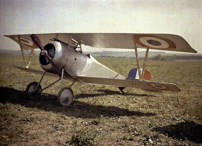
I went with the Nieuport 17, specifically because I liked the look of it and it best fit the image I already had in my head associated with the word “biplane.”
The process for this was complex, but I’ll split it into three sections here: modeling, texturing, and environment design/rendering.
MODELING
As with most of my modeling projects, I started with large parts and slowly progressed to smaller and smaller details.
In this case, the biggest parts of the plane were the body sections and wings; for these, I started with ordinary subdivision modeling, blocked out the major shapes and then refined them using edge loops and edge flow adjustments.
For the body panels, I also used a solidify modifier and additional subdivision modifier to give them thickness—solidify to add the thickness, and then subdivision to round it off on the edges.

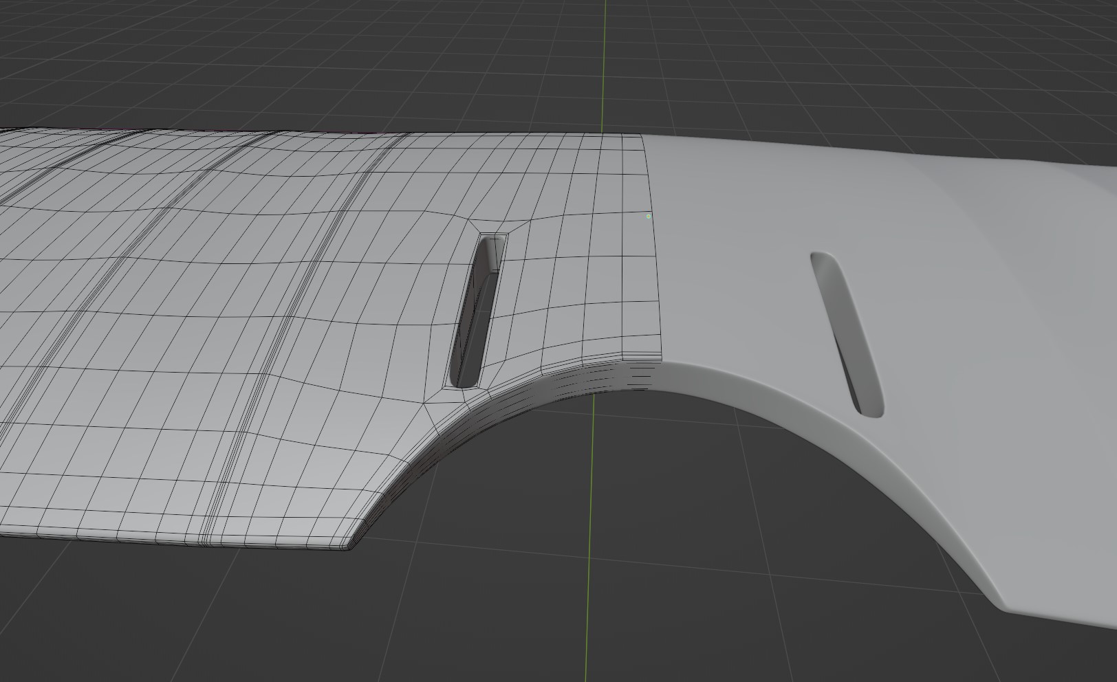
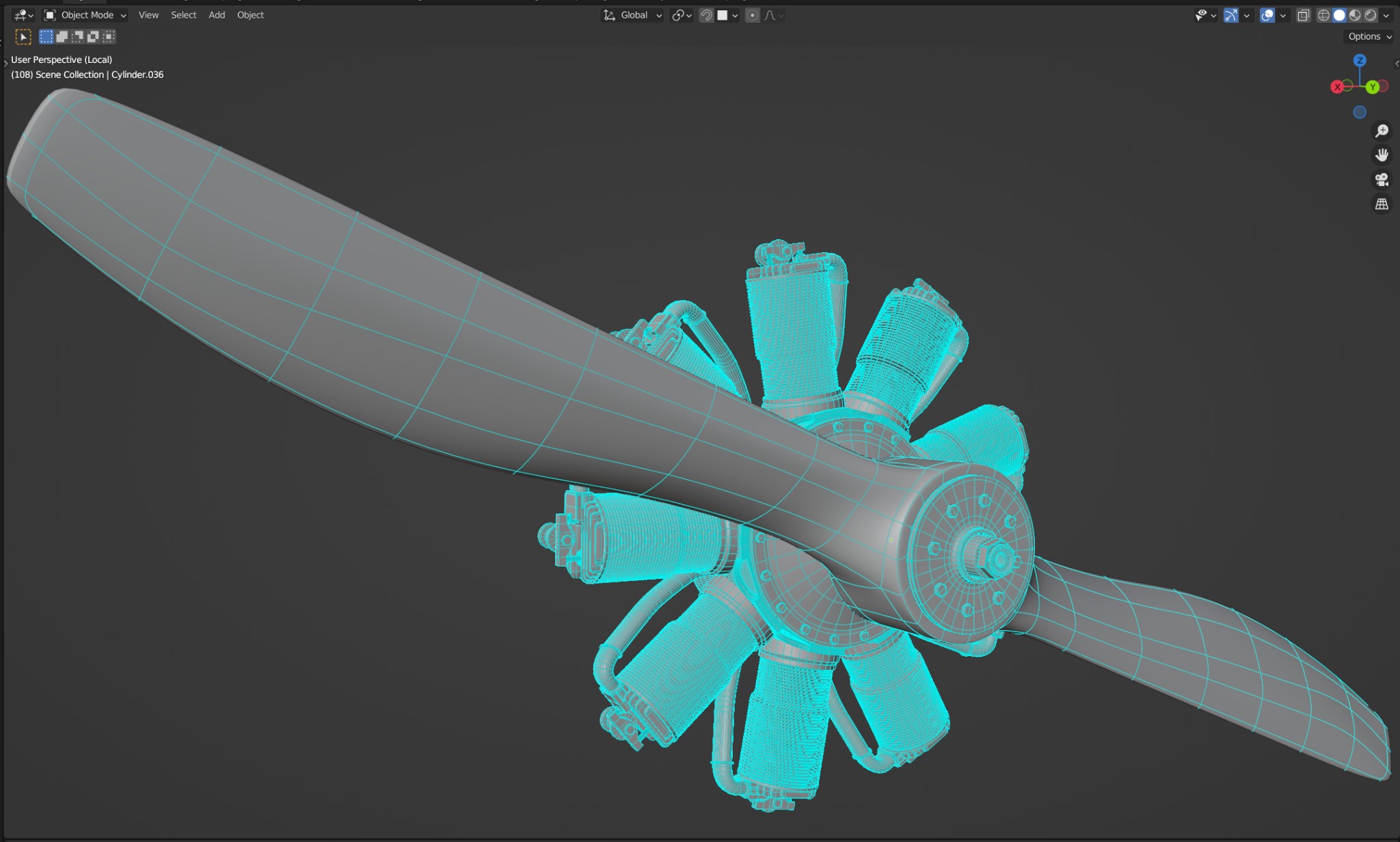
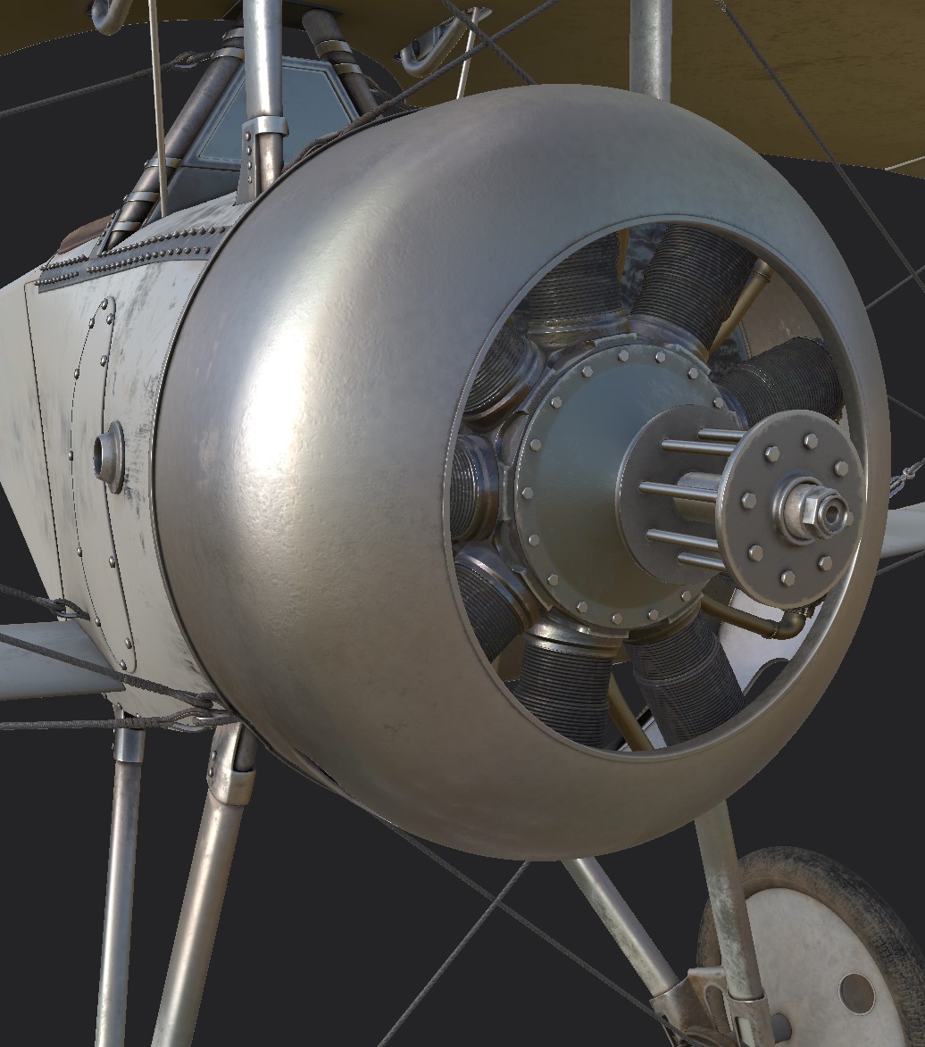
The wings (top wings, specifically) posed more of a challenge than the body, being solid 3D shapes instead of flat panels. I created the basic shape using the same simple subdivision process as the other parts which was easy enough, but these wings also have two little cutouts where the bars controlling the ailerons rotate through the wing, and these were more tricky to create. I ended up applying the subdivision modifier at a low subdivision level, cut the hole using a Boolean operation, manually adjusted all the vertices around it to fix the edge flow, and applied another subdivision modifier on top to smooth everything out. The topology wasn’t technically perfect in the end, but I don’t think it affected the look of the plane so that’s still a success in my book!
The small parts were probably the most time-consuming part of the modeling process, just because of how many of them there were. I used a couple of different, fairly simple processes to make them.
For ones that required smooth curves (like the gun body and propeller), I used basic subdivision modeling. The Loop Tools addon helped a lot with these parts, especially Relax, GStretch, and Circularize. I would definitely recommend Loop Tools to anyone doing subdivision modeling. It ships with Blender by default so it is very easy to start working with.
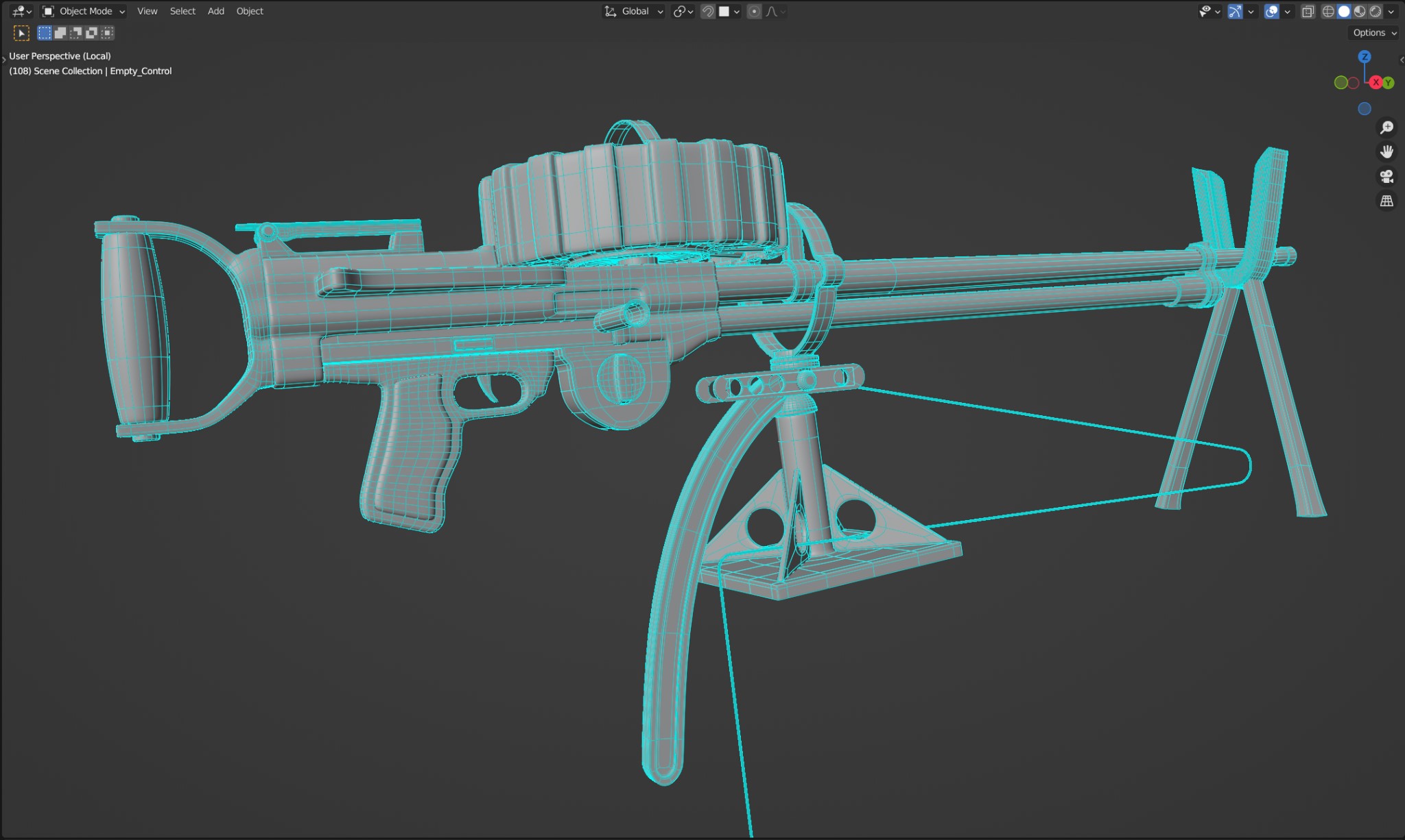

For all the other small models, I modeled fairly rough shapes and then used Bevel modifiers to round off the edges. For parts this small, I wasn’t too worried about edge flow and I don’t usually bother connecting the geometry islands together when that would have been time-consuming; that kind of thing is essential for models that will appear large in a scene, but when the entire part is only going to take up fifty pixels in the final image, there’s not really much point.
TEXTURING
For this project, I knew I wanted high definition materials, so I decided to try out using UDIMs which I had never done before. UDIMs are powerful because they allow you to essentially extend the UV map into as many sections (or tiles) as you need, while still only using a single material. This is especially advantageous when setting up textures in something like Substance Painter (as I did for this project), because it treats the UDIM materials just like any other single material, allowing you to paint freely between the different UDIM sections. This is much easier than what I would have done in the past to get higher resolution, which would have been to split the model up into several different materials, each with their own separate set of layers and textures.
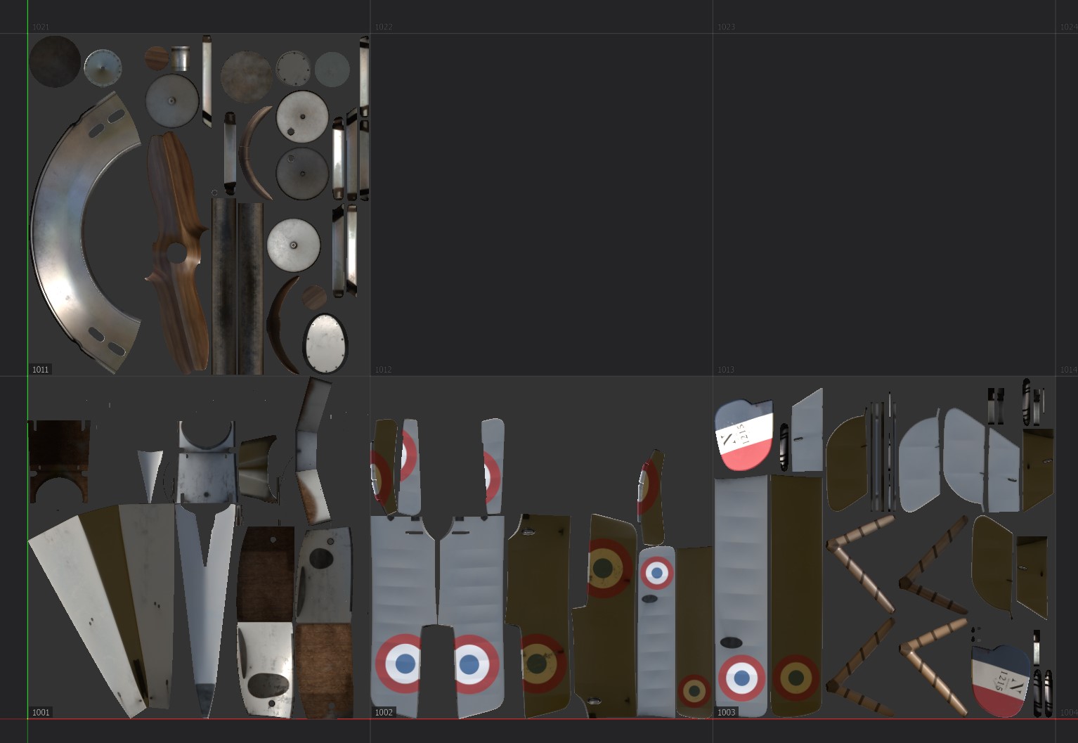
In terms of the actual texturing process, it was actually fairly basic. For each different material on the plane, I created a layer group which was masked to a specific area using Substance Painter’s Polygon Fill tools. I then built up each material using various layers of colors, grunge, and photo textures.
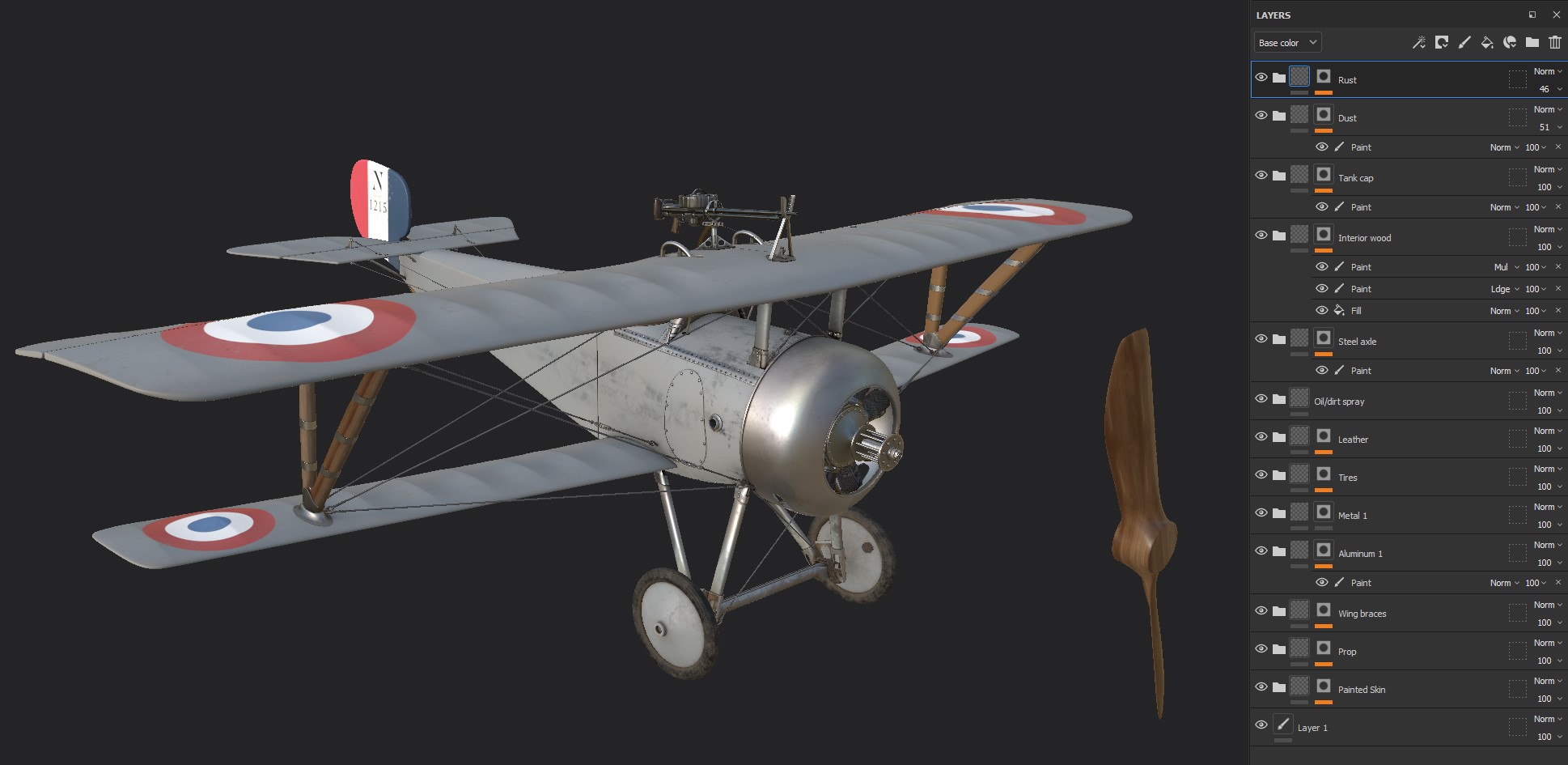
For me, the most interesting thing I tried out was to add just a tiny bit of color variation to all the metallic materials, especially the parts that would be heated up a lot (like the engine). It’s barely noticeable, but I think it adds just a tiny touch of realism.
I don’t take credit for this idea though; I originally heard of it from Adam Savage on his Tested YouTube channel, in regard to real-life model making, and decided to try applying it to my digital work as well.
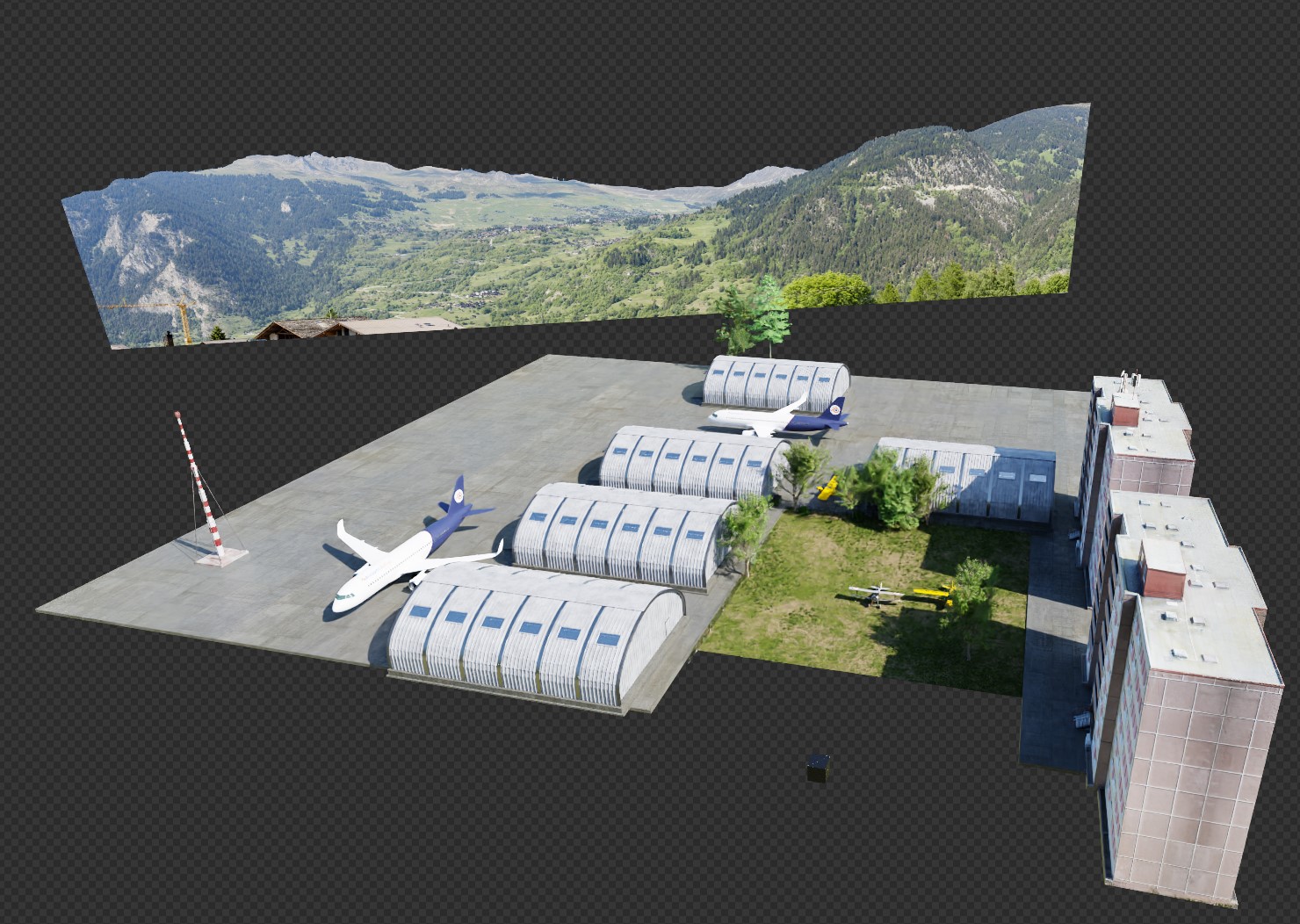
ENVIRONMENT
There are three main things I’m paying attention to with an environment like this: details, randomness, colors, and tones. I’ll go over those steps below.
Details
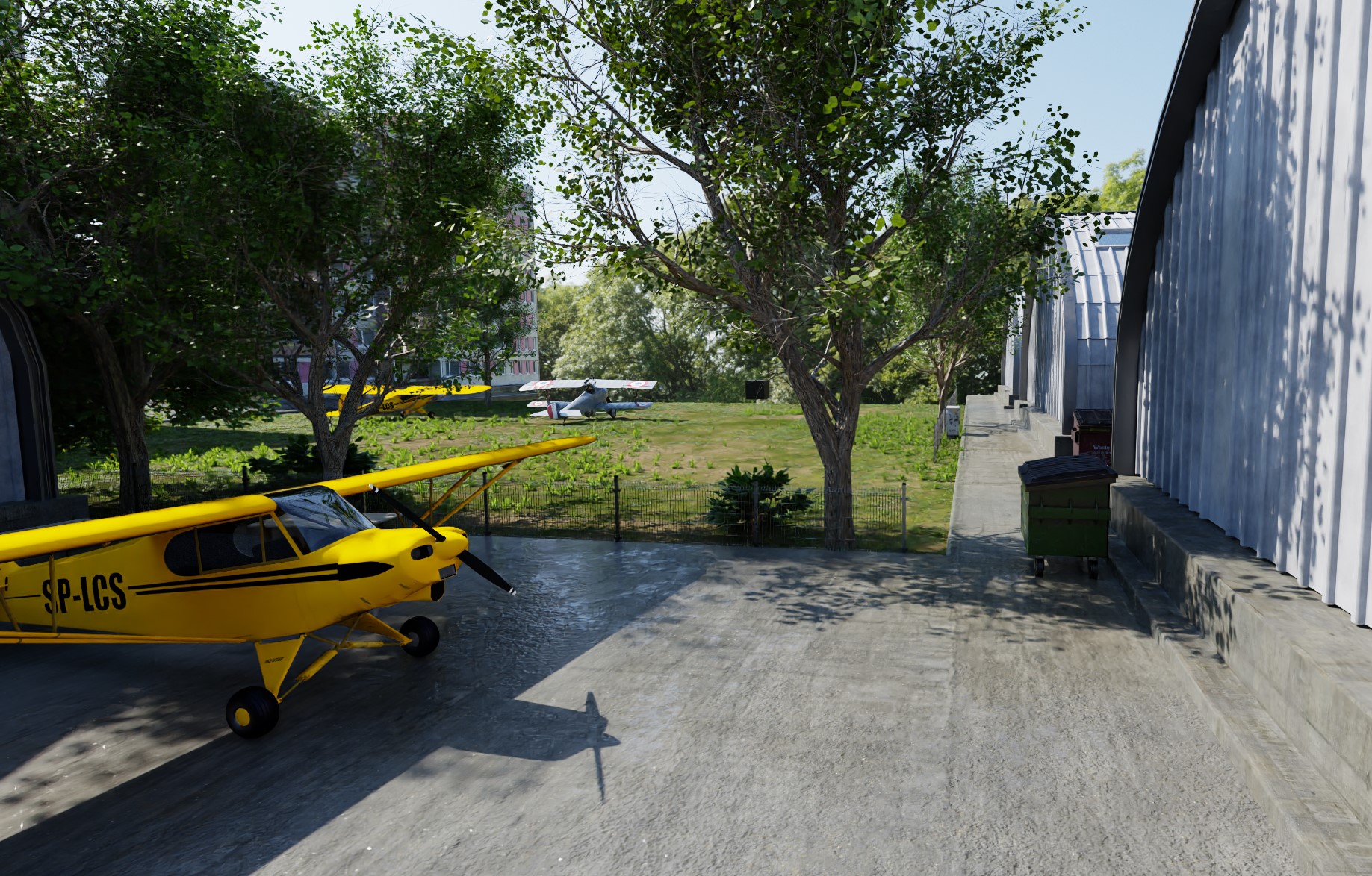
One of the biggest things I made sure to do for the environment was adding plenty of details. When adding detail in a scene like this, more is always better (as long as they make sense).
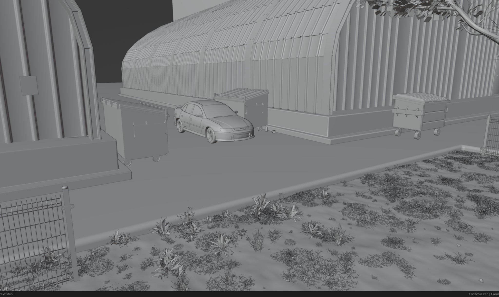
I sourced most of the things in this scene for free from BlenderKit, modeling very little myself—creating each little background object by hand would have taken weeks, and the results would probably have been worse anyway. Free models aren’t always very high quality but for a scene like this, it doesn’t matter much since they appear very small in the background. Just like on the biplane model, as long as all the details make sense in terms of context, scale, and placement, the technical quality isn’t that important.
Randomness
Real life is messy, so I try to emulate that for scenes like this. I added garbage on the ground, a car parked between the hangers, dirt on the concrete, an electrical box, and more—not for any reasons in particular, just because they make the scene more believable.
Colors
In scenes that involve plants and natural assets like this one, getting the colors to match up with each other is very important. By default, textures will come in all sorts of brightness levels and hues (depending on where and when they were made), which tend to make scenes look disjointed if used without adjustment. To solve this problem and make everything look more cohesive, I like to use a Mix node set to “Overlay” placed after the Color/Diffuse texture, which allows me to subtly adjust the color and brightness of any material to make them match my intended look better.
Making the colors match makes a big difference, but it’s only half the battle. In nature scenes (or almost any photoreal scene, really) it’s important to add slight color variations as well, otherwise things start to look too clean and monotonous. I do this by making duplicates of the plant materials and use the same method as above to slightly vary the hues (but not too much; I don’t want to undo the work I did in the previous step).
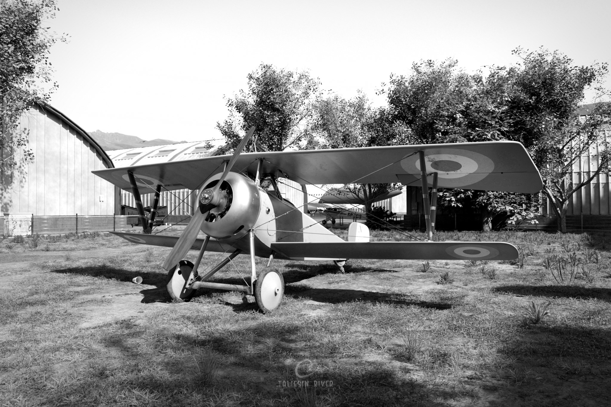
Tones
Where photorealism is concerned, the tones of an image are one of the most important things I consider. By tones, I mean the brightness levels of various parts of the images, like direct sunlight and shadow on various materials.

To get these looking just right for scenes like this, I generally look at real-life photos of scenes with similar materials and lighting conditions, and try to adjust my scene to replicate the brightness values in the corresponding areas by adjusting things like sunlight brightness, HDRI brightness, and Contrast/Exposure/Gamma in Blender’s color management tab.
For this scene in particular, I also adjusted it slightly afterwards in Affinity Photo to get the shadows and highlights exactly how I wanted them. I sometimes put a black and white filter on the image as I’m editing, because it allows me to focus solely on the tones—if the black and white image doesn’t look realistic, the full color version probably won’t either!
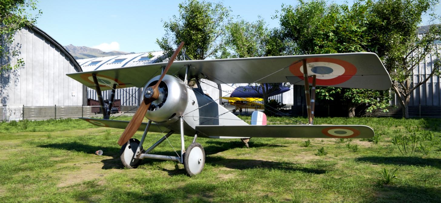
NIEUPORT 17 BIPLANE
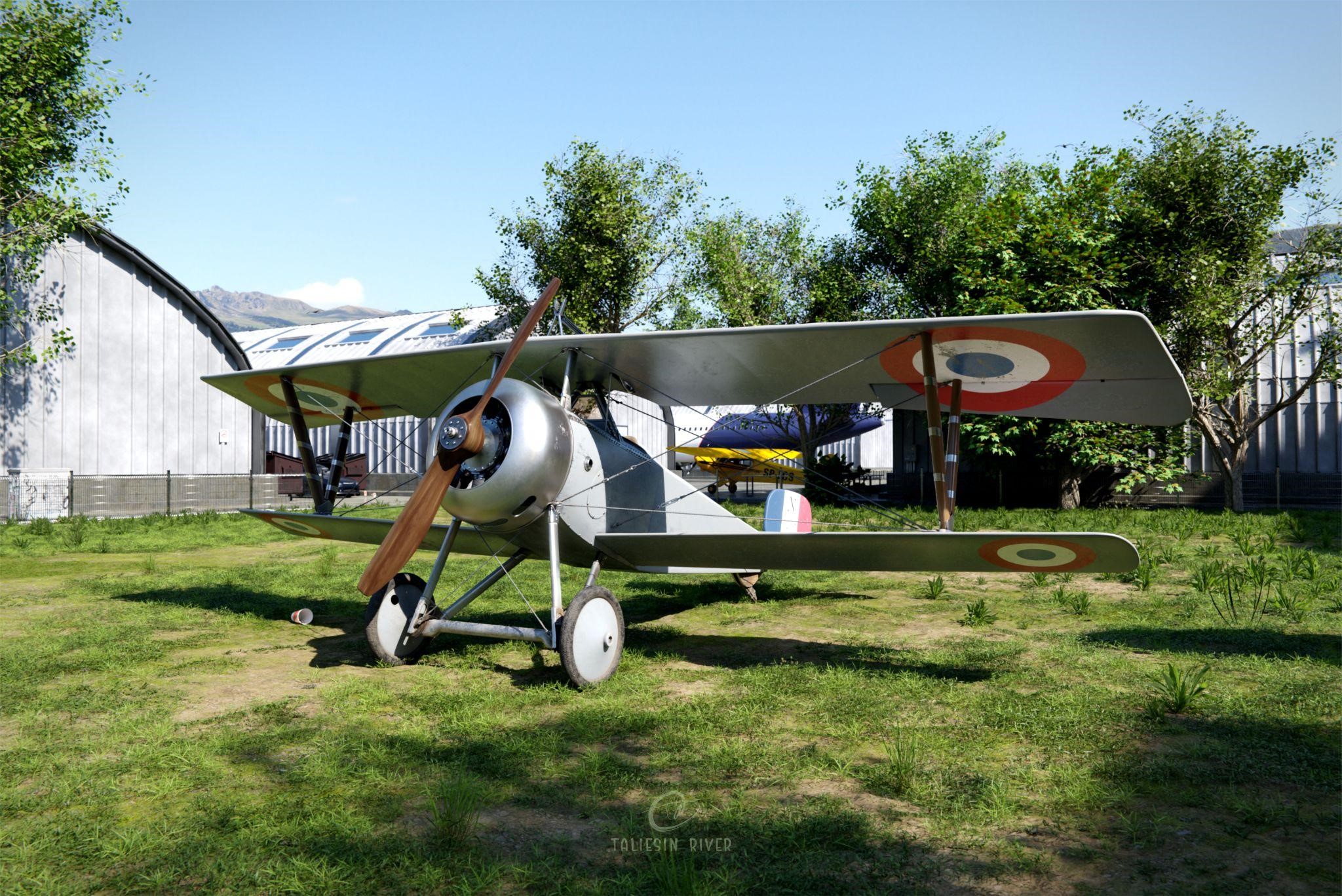
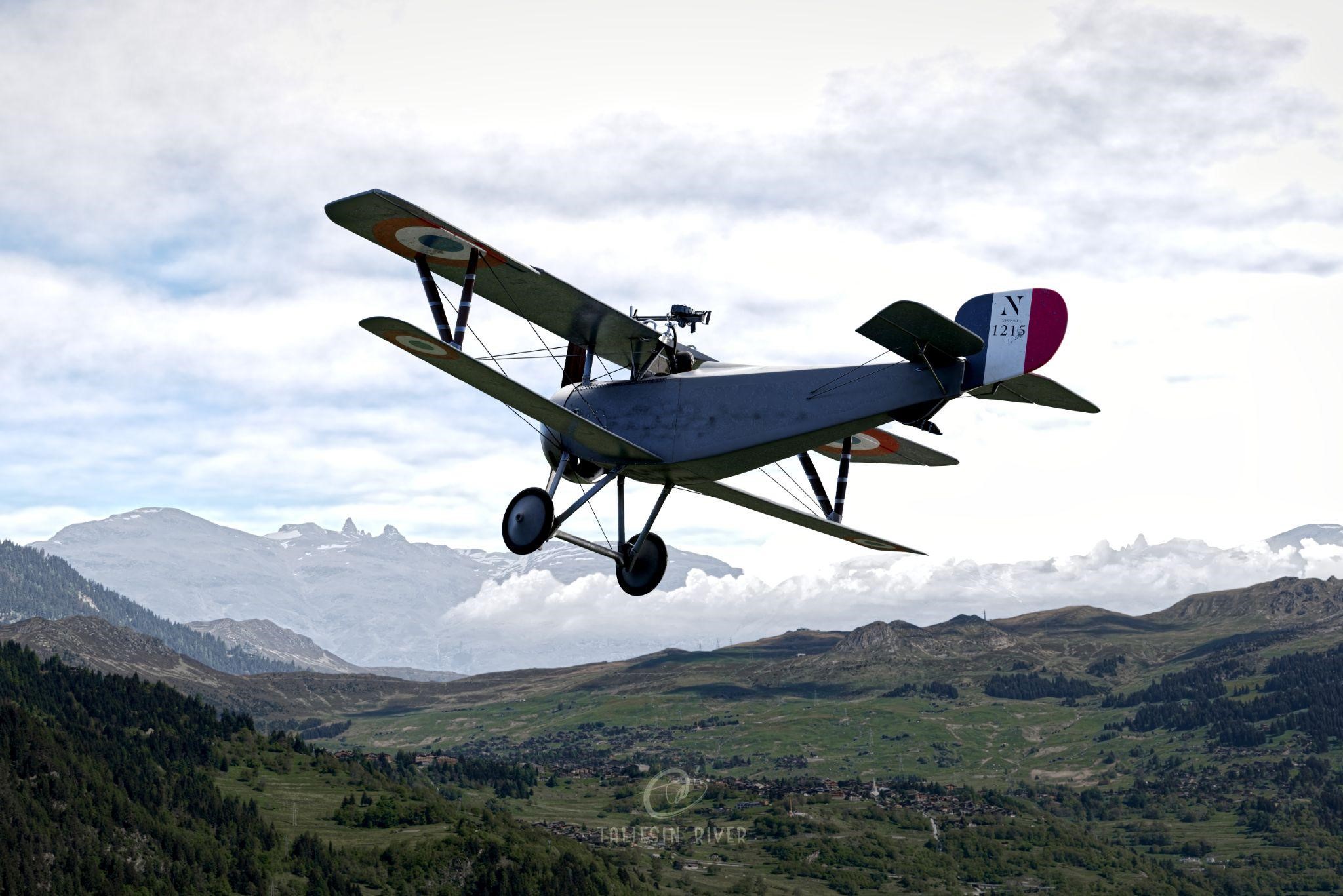
These are the results! I ended up setting up two different scenes for this image, one landed in a field as though at an airshow, and one in flight with landscape and cloud images making up the background.
There are certainly aspects that could be improved, like the propeller material and scale accuracy of certain parts, but I learned a lot and am generally happy with the result.
Thanks, have a good day!
About the Artist
Taliesin River, a 3D generalist from British Columbia, Canada. Currently working as a game asset artist.
Excellent! Well written. This break down was gave me a lot of ideas. Thank you for sharing your process.