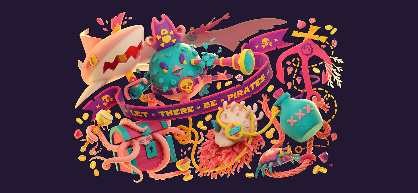
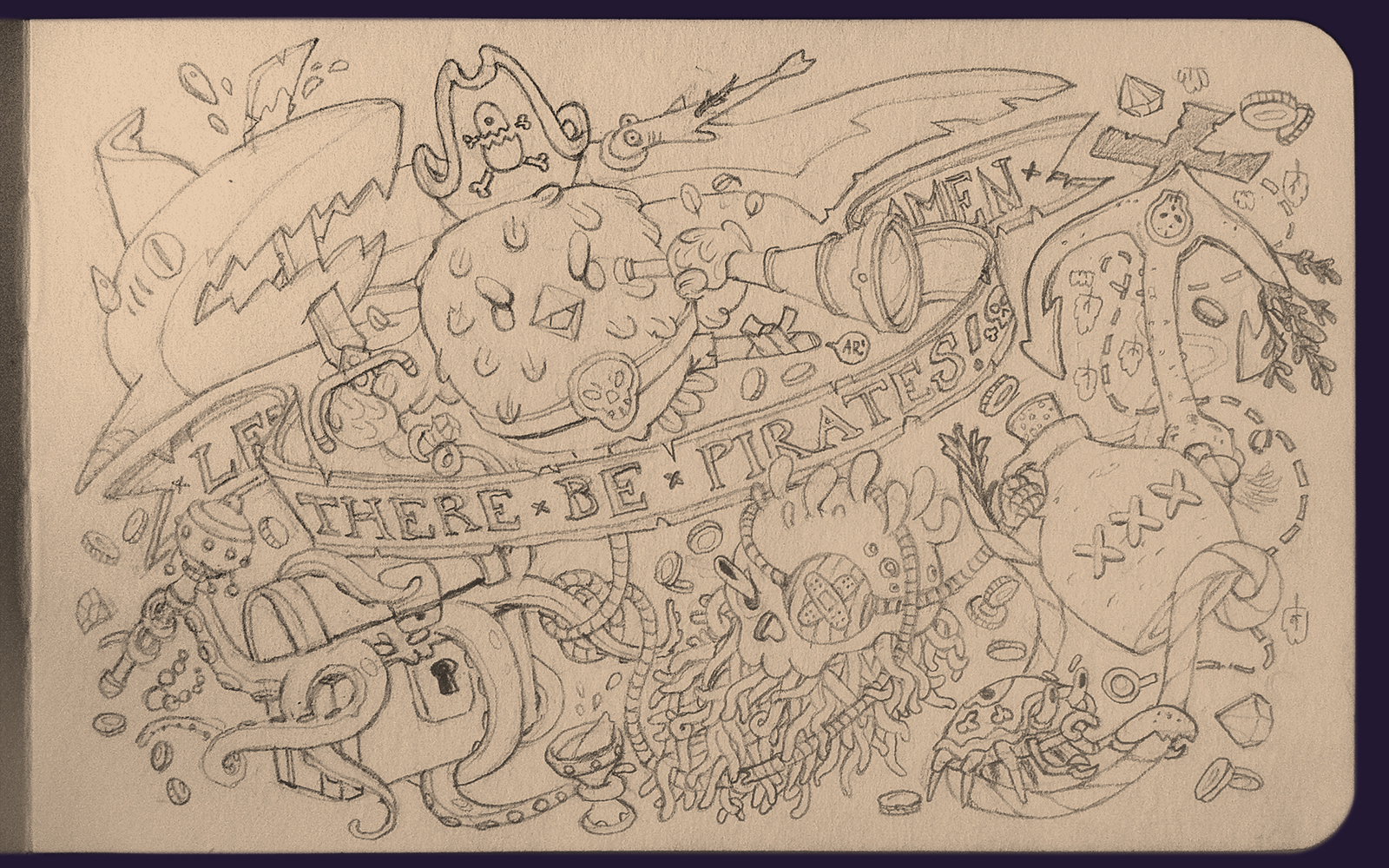
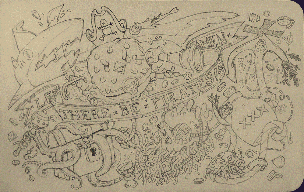
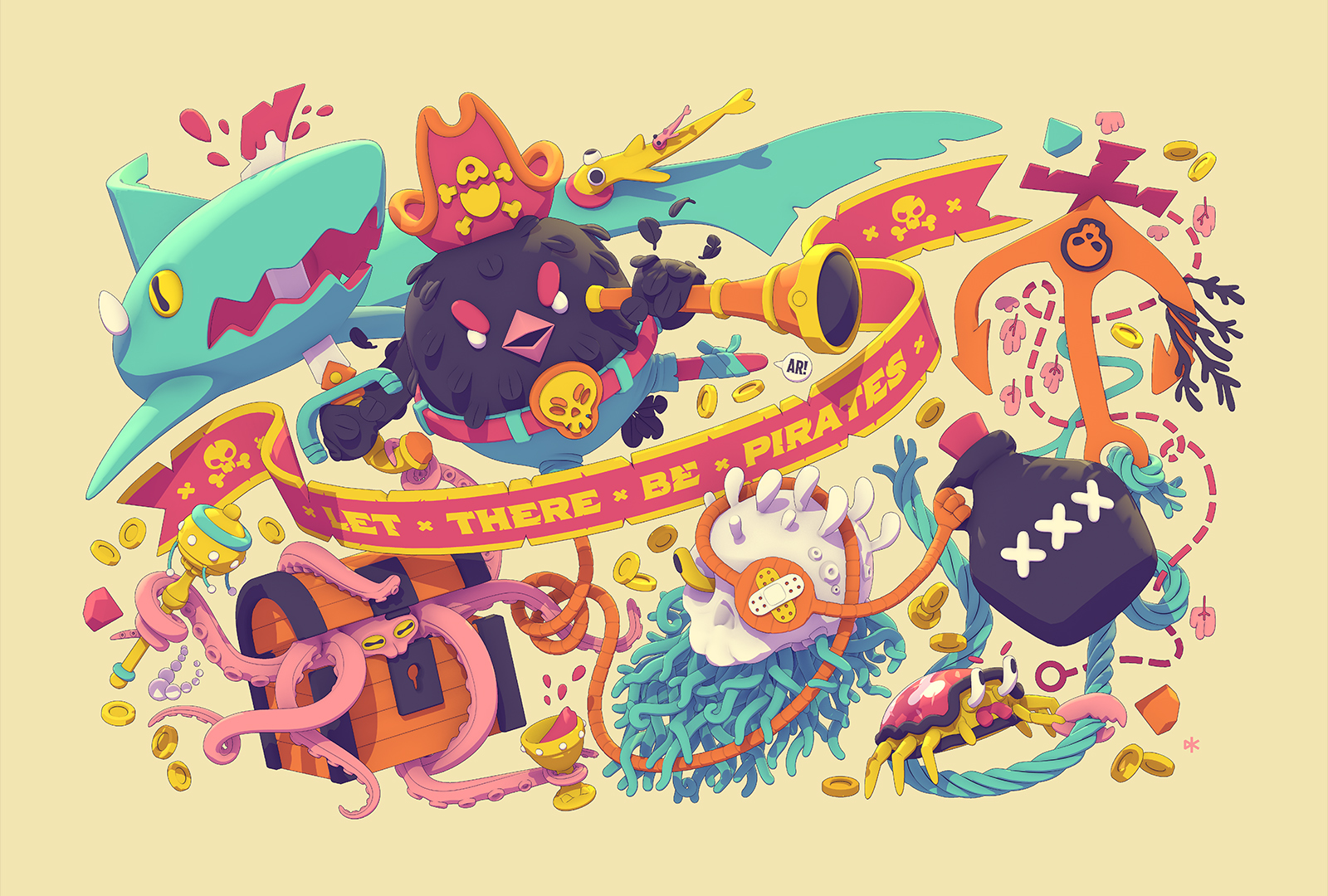
Behind the Scenes: Let There Be Pirates
Hi! I’m David Kozma, a freelance character designer/illustrator from Budapest. I worked in game development for around 8 years and VFX (compositing) for 3 years. Before choosing freelancing, I was a 2D art lead at Gameloft Budapest and helped to create games like City Mania and art directed Disney Getaway Blast. I also made 2 indie mobile games (neither of them is available anymore, unfortunately), Sky Tourist and Soap Dodgem.
I am (or was?) preliminarily a 2D artist and I still love to do my own concepts and vector illustrations, but recently I realized my long-time 3D hobby could become much more to me. My new focus is to become a 3D illustrator.
The first 3D software I used was 3D Studio R4 on DOS. Yes, I’m old. Back then my computer couldn’t handle Windows so when the first 3D Studio Max came out, I couldn’t make the jump instantly. When I finally had a new PC with Windows on it I hated Max’s interface and instead learned the much more friendly Lightwave. I used it for a few years then sadly I dropped 3D for a long, long time.
My first contact with Blender was at a small game dev studio. The 3D guy used 2.4x there. I remember being amazed by the XYZ axis lock but I hated, haaaated the interface so much. I used it to create some 3D UI elements and that was it. Then years later at Gameloft, I needed 3D software to create mockups and guides for the other artists. I didn’t have any 3D licenses so I took a big breath and installed the then-current Blender 2.76. After a painful 1-2 weeks, I was hooked for life. :)
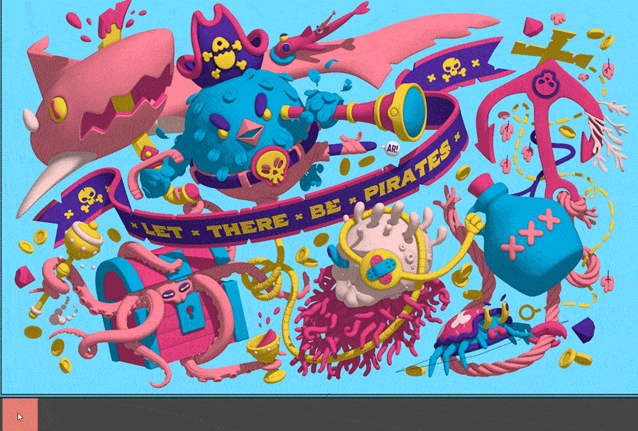
The image I’ll talk about started as a pretty small pencil sketch in my Moleskine sketchbook.
The pirate theme was random—I think a peg-leg-looking line inspired it—but I also happen to just like pirates.
I always thought the composition was nice. I tried to create elements flowing parallel or even intertwined with each other to increase complexity and I also filled up all the negative spaces with tiny details.
The idea that it should be 3D came early on. When I started, I thought it’ll be fairly easy, they are just simple shapes… ha, wrong. I hit obstacle after obstacle.
Finishing it had to wait until my Blender skills got way better.
Once I stopped for a long while just because I couldn’t figure out the round-cap curves under the skull. That part is so intricate that if I had to model it with anything but a great procedural method I would have died. So I stopped, obviously.
Then at one point, Zuggamasta put online different solutions for this exact problem and I got excited again for the image. And here we are.
Just to make things more complicated, I challenged myself to make the illustration as close to the original sketch as humanly possible. I think I succeeded at least at that.
1. Modelling
I wanted to keep everything as easy on geometry and as procedural as possible.
Here’s a wireframe to demonstrate this:

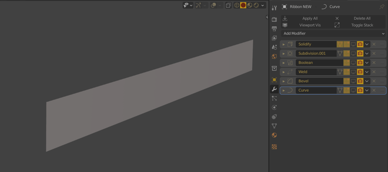
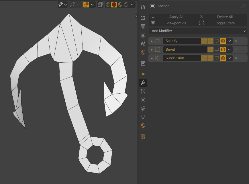
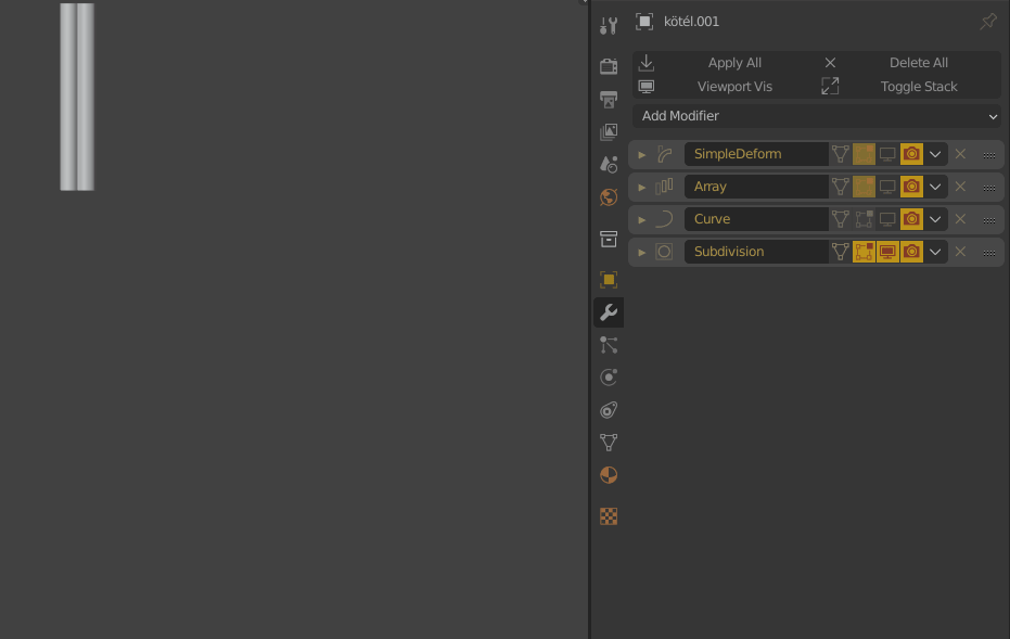
I used modifiers extensively. It’s such a great workflow.
The four most useful ones for me are Mirror, Bevel, Solidify, and of course Subdivision. In this particular project, the 5th important one was Curve. I used it for dozens of tentacles, limbs, a rope, and a ribbon. With these, you can create pretty complex-looking shapes from just a few flat polygons.
I created a few animated examples to show this but most of the objects were built up similarly.
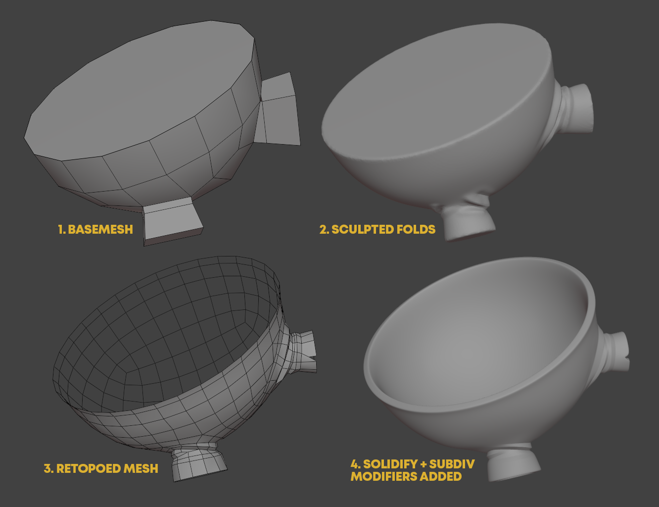
The bird’s pants were an exception. I couldn’t find a better way to make them look like I had imagined them than to use the classical sculpt + retopo method:
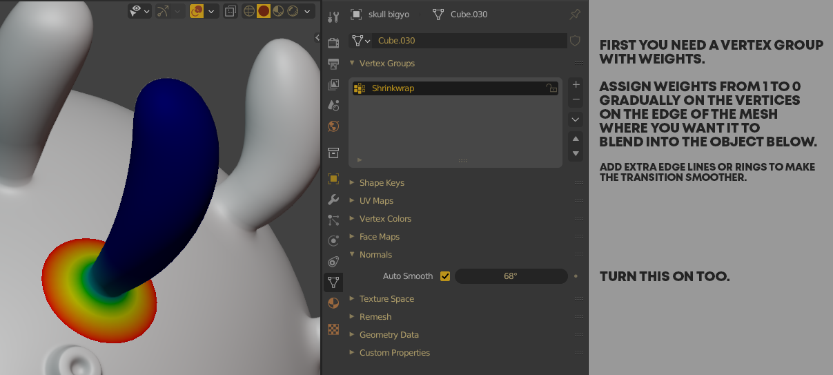
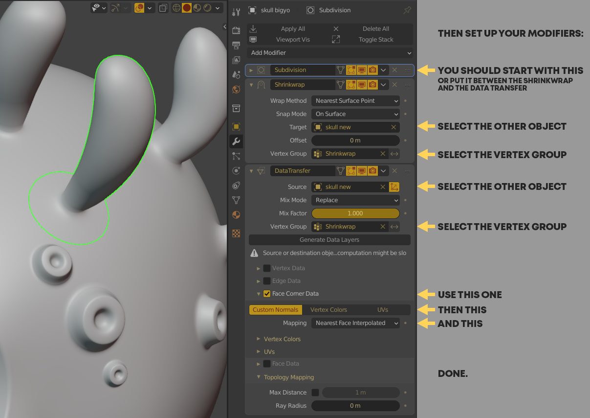
Then there’s a trick I learned from an old 2.7x hard surface tutorial. To keep things simple I didn’t want the protruding elements of a particular mesh to be extruded from the base mesh. Instead I faked them being a singular mesh with modifiers and a weight map.
Here’s the skull with the bits on top of it for, example. They look like one mesh but they are all separate.
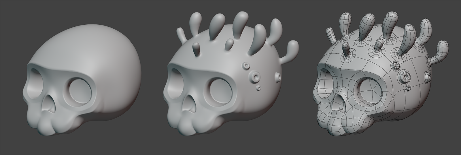
For this effect you’ll need a “plug” mesh with open edges so you can create a blend between the plug and the underlying “host” object.
I detail this method – again – with screenshots:
There’s one little problem with this method, though. It doesn’t work well with SSS.
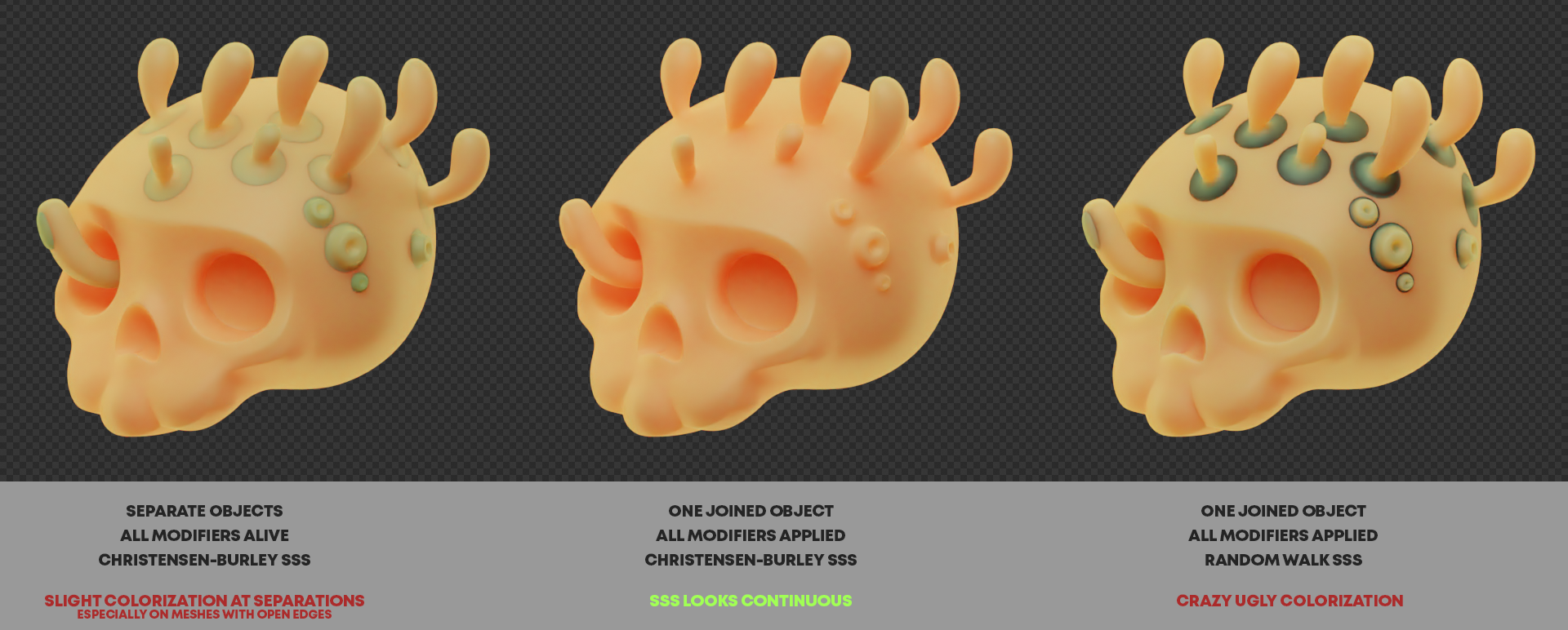
So the old Christensen-Burley method gives me an all-around OK result IF I apply all the modifiers and join the objects as one.
For the new and much better looking Random Walk SSS, however, this is not enough. That formula uses the real volume of the meshes to calculate SSS so it cannot deal with open meshes at all, unfortunately.
That’s a good-to-know limitation but I still advise using the edge shrinkwrap method to simplify some otherwise complicated modelling tasks—or if you just want to keep the base object nice and smooth.
I used this trick on 3 different parts of the image. Check out the wireframe again and find the other two.
2. Rendering and Compositing
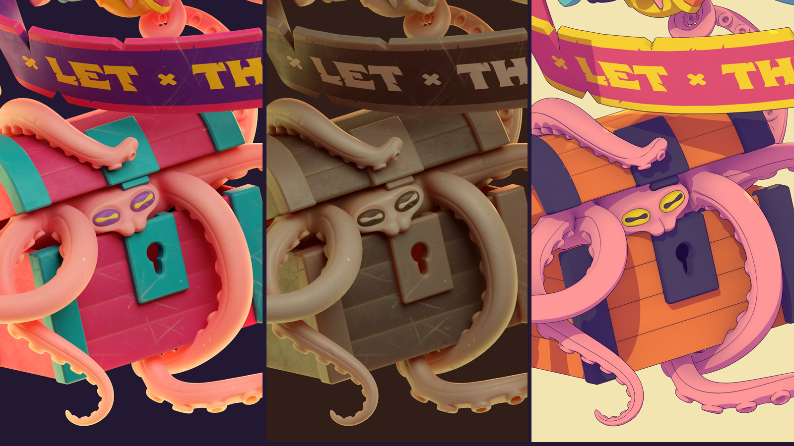
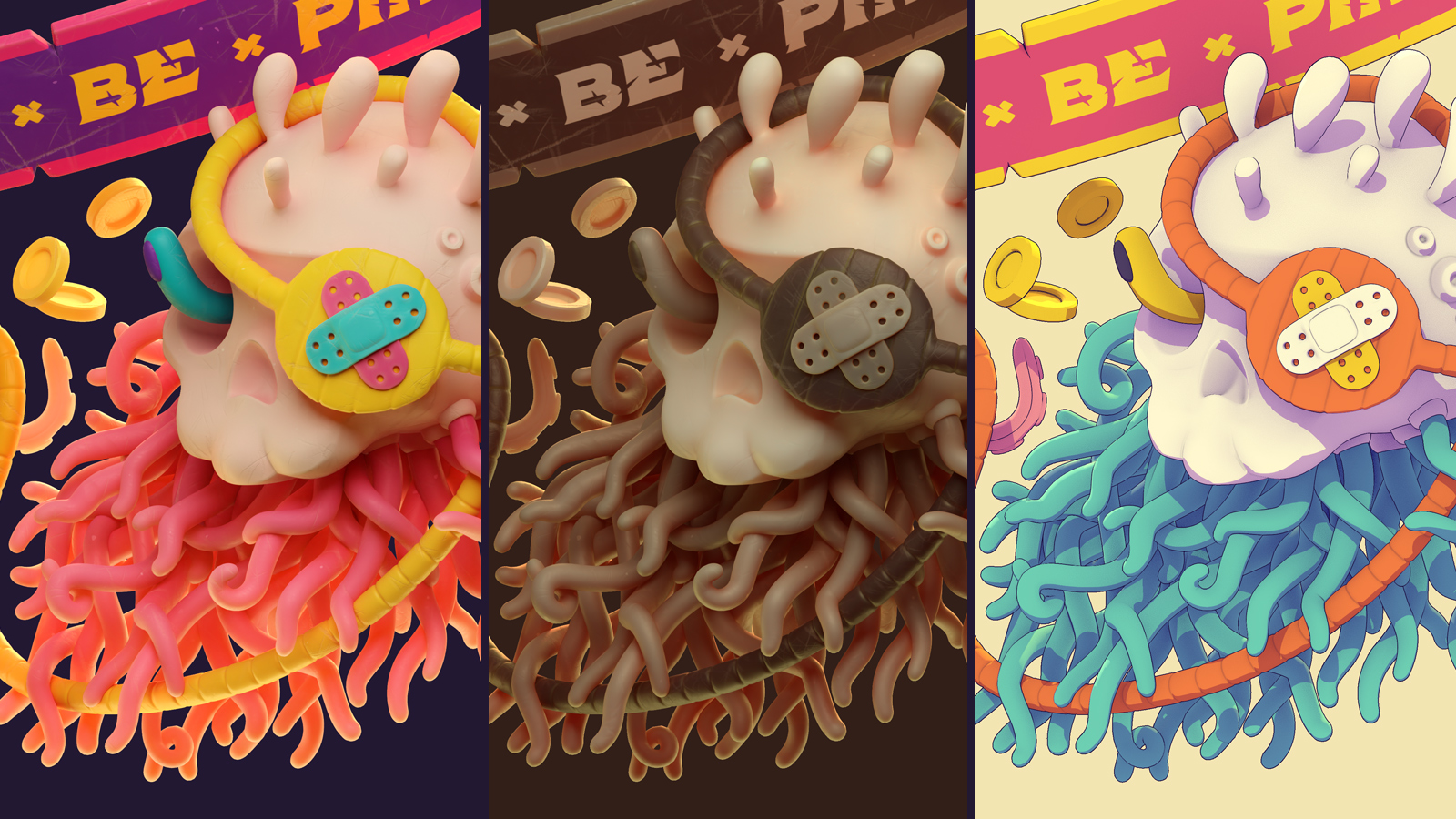
The left, colored version was the original I created. It needed a lot of tweaking and time but its shading and rendering was still pretty straightforward.
I used the amazing BLego Shader from DoubleGum for all surfaces and after setting it up to my liking I mixed it with SSS, Mist and a separate Edge Highlight pass.
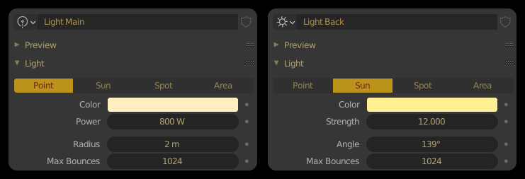
I burned many hours to find and use a good looking HDRI but nothing was good enough so in the end I only had 2 simple lights with the settings below. And that was it really.
In the monochrome version only the colors were set up differently.
What might be more interesting to the community is how I created the NPR version.
So I’ll talk about that process in more detail.
First, I guess you should see it in full.
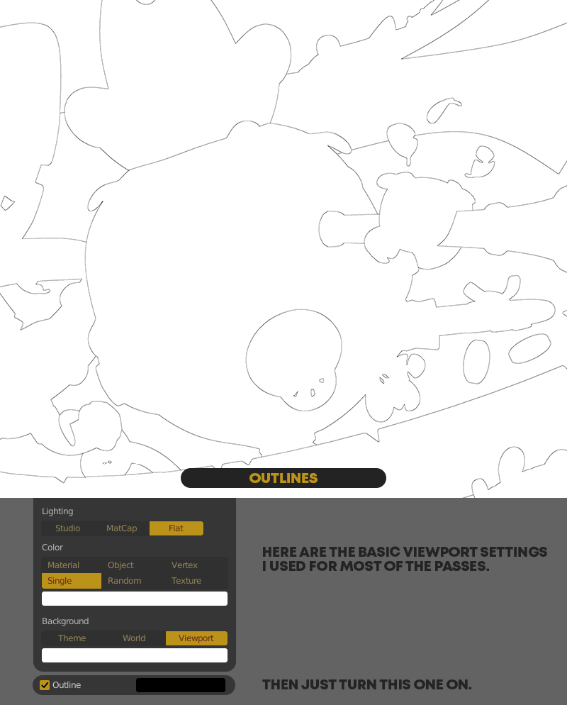
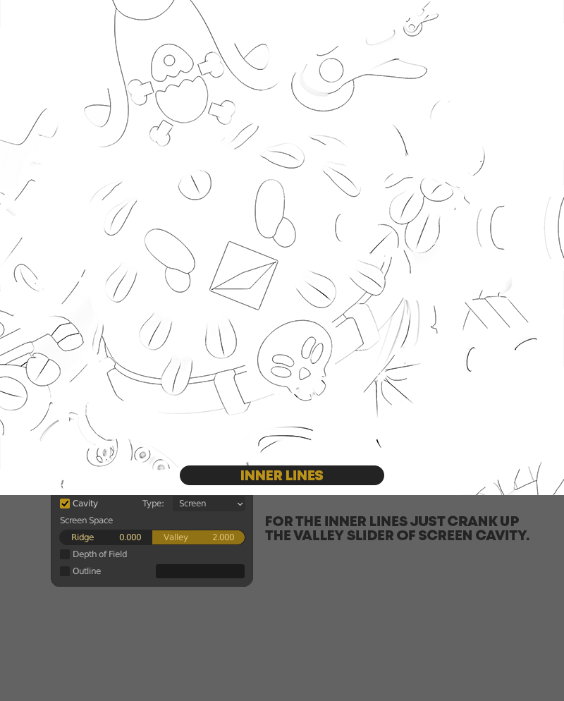
To create it, I rendered different custom passes from the Workbench Engine—with the one twist that I didn’t use the Workbench Engine for it.
Instead, I tweaked my shading in the Viewport Shading dropdown menu in the 3D view and then used the “Viewport Render Image” option in the View menu. I even mapped that action to F11 because I have never used that shortcut to just open up the render window, which it would by default.
I’m not sure why but the UX of doing everything in the 3D view is much more comfortable for me than tweaking the same settings in the Properties of the Workbench engine.
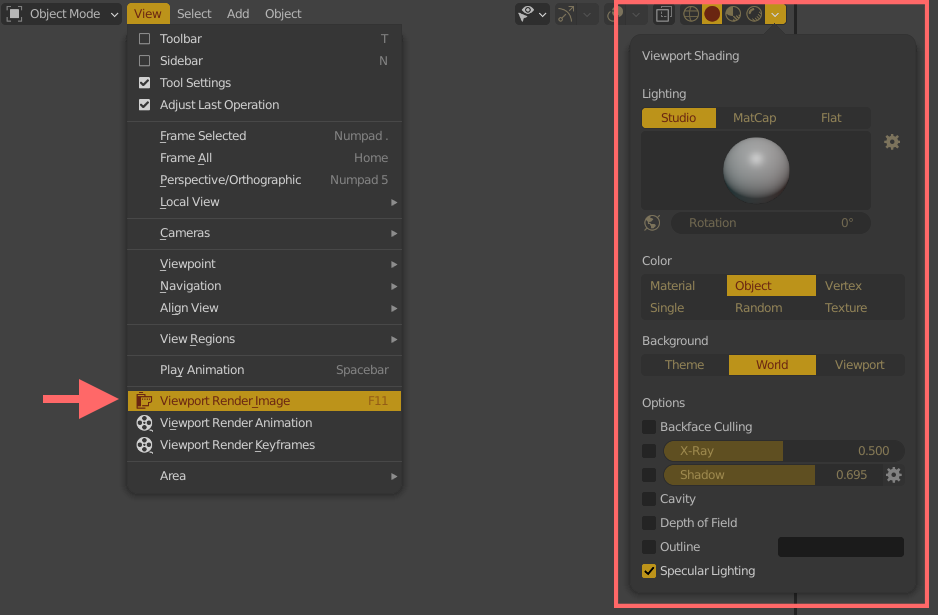
If you have set up a camera and you are in camera view, then it will render out the whole image with this command even if you are zoomed in on a segment of it in the viewport. If you are not in camera view, it will capture exactly what’s currently visible in your viewport.
If you have a % set in your “Render Dimensions”, the command will use that, too, and render accordingly. For example, my dimensions were set to 1900 x 1200 px but at 400%. In this case “Viewport Render Image” will correctly output a 7600×4800 px image. (Thanks devs, you are amazing.)
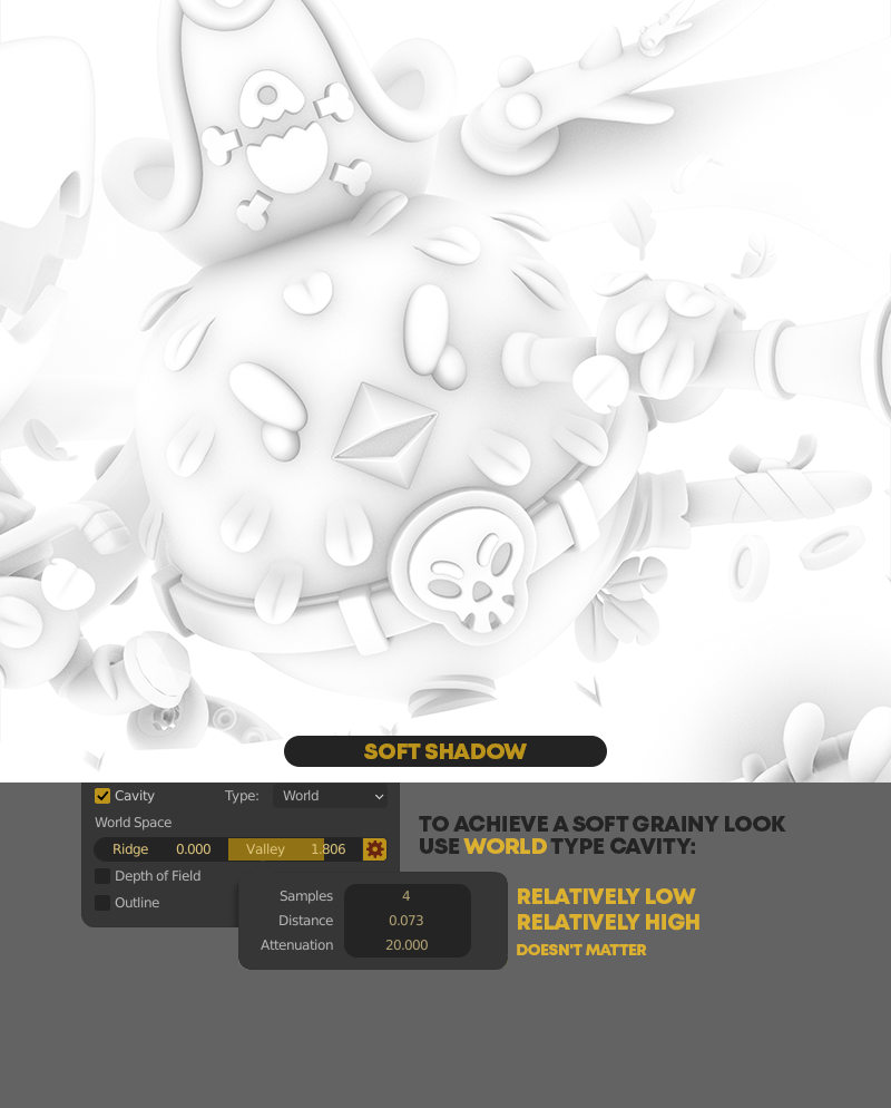
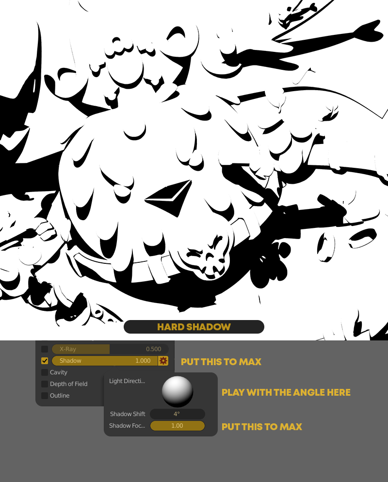
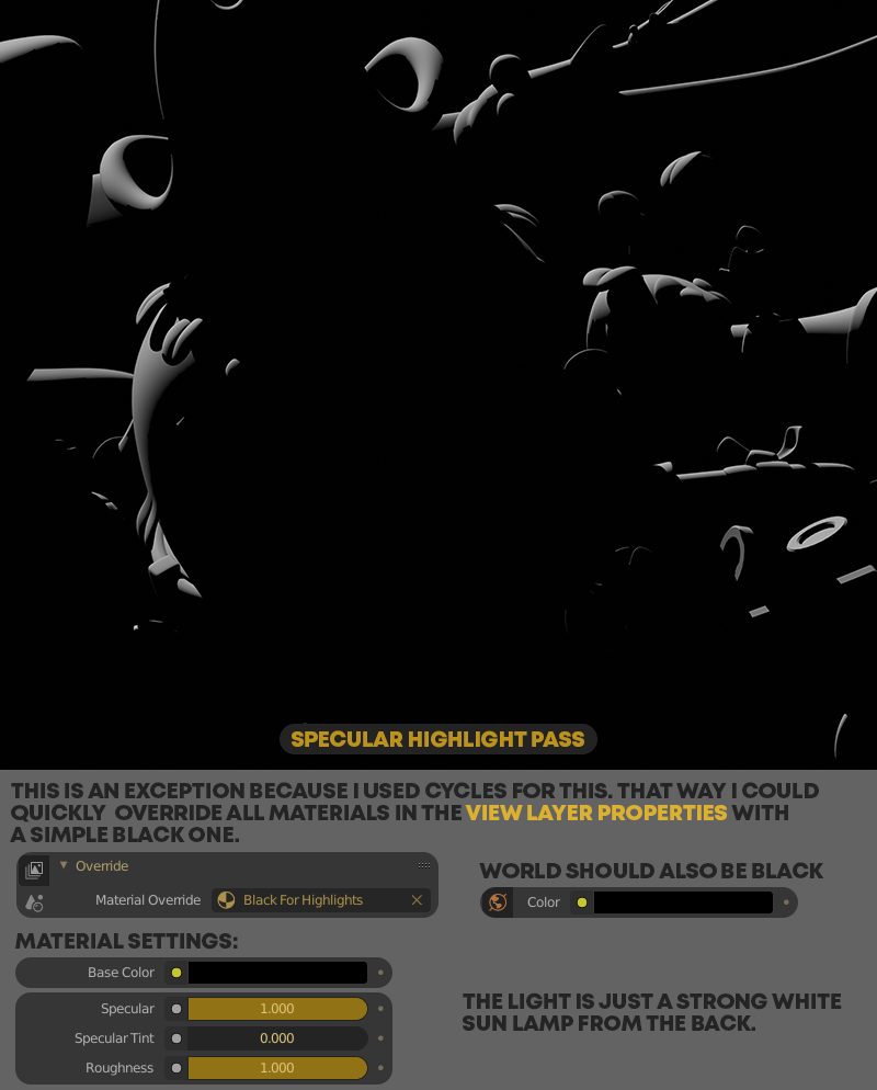
After this, I used Photoshop to composite the passes.
Here’s my layer palette—I marked additive layers yellow and multiply layers purple:

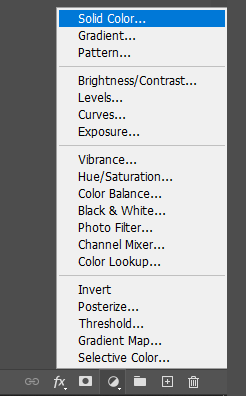
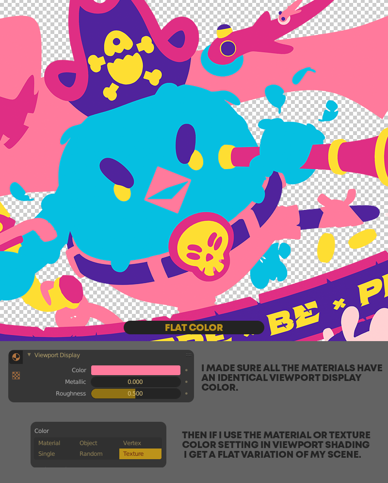
I love using color layers for their intuitiveness, so all the black and white passes are copied into mask channels of Solid Color layers. This way I can easily change the color of the pass to change the effect dramatically, and also—if needed—I can increase or decrease the contrast of the mask separately from its color.
Usually, I use different purple hues for darkening layers and yellowish tones for lightening layers.
In the end, I merged the 2 passes of the outlines. I could have done it by saving them together straight from Blender but I first wanted the flexibility to be able to change things independently.
Changing the original colors was important because I didn’t want to just replicate the first image in a flattened form—I aimed for a similarly colorful but different look. Early on, I fell in love with the dark version of the bird and adjusted everything to work with that.
For the coloring, I used the same Solid Color layers, and I just simply picked color sections with the Magic Wand tool (if Contiguous is deselected it will select all of the same colors on the layer) and made the masks of the color layers white in the selection. To accomplish this, first you have to invert the default white masks to black. Just click on the masks and hit Ctrl+I to do this.
Here’s a gif showing how the different layers act on top of each other, building up the final image:

3. A nice trick
Because I used my reference image extensively, I really needed an easy solution to subtly change its visibility without always searching for it in the Outliner and changing it in the Properties panel. That would have made my process way, way slower.
So I invented a slider—similar to how animators use in-3d-view panels to control some parts of the rig.
In short, I created a tiny cube, set up a separate 3D view for it then used a driver on the opacity slider of the Reference Image to make it follow the cube’s horizontal movement. Easy.
The longer, more in-depth explanation is below:
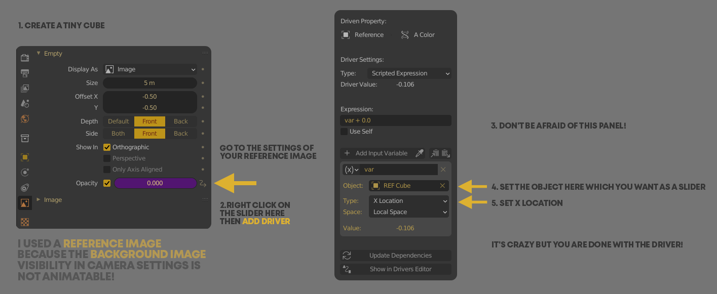
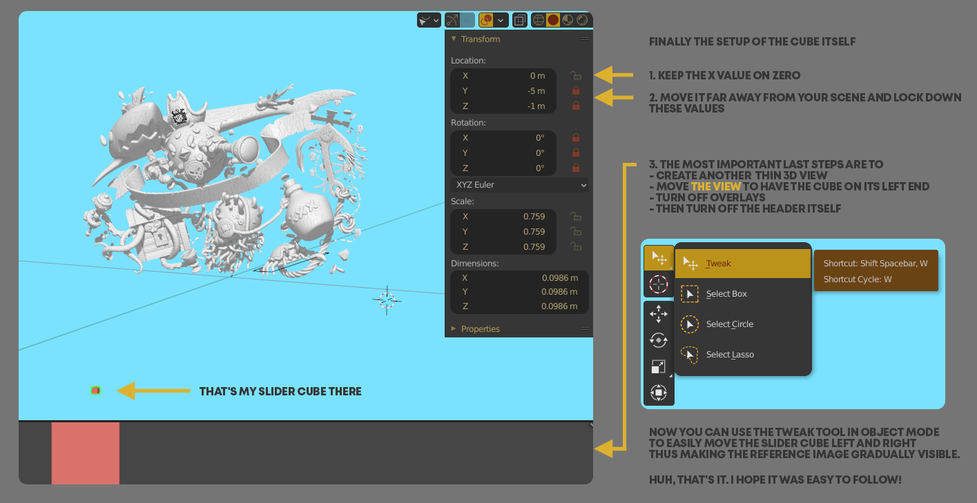
I had to play a bit with the size of the cube and how much I zoom into this thin bottom view because I wanted the 100% visibility of the ref image to be around the right end of the screen. This I just eyeballed.
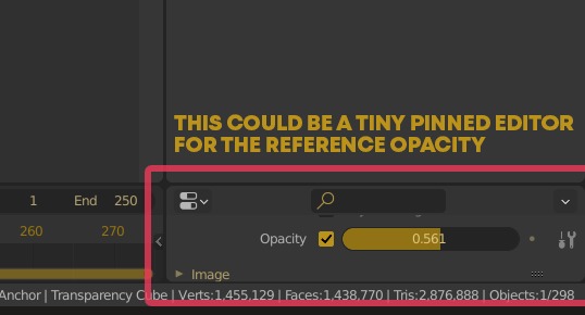
I was pretty proud I figured this one out by myself but now that I write about it, another easier solution came to my mind. Well, I will share both then. :)
You could just duplicate the preferences editor, pin the ref image properties and make this editor thin and small. Finally, just scroll in it to only see the one parameter you need and you are done.
Blender is versatile!
But I loved using my solution, it helped me a lot. And the whole process of creating this image was about blasting through different, difficult-looking obstacles or even creating new ones by being overly perfectionist. I learned an insane amount by finishing it.
Thank you very much if you’ve kept reading to the end. I hope you all found something useful in this little article.

PS: If you’d like to try out my (WIP) Blender theme you saw in the article, you can download it here.
About the author
 David Kozma, Illustrator and character designer
Amazing work, love it! Love the fact that you’ve been able to keep it sooo close to the drawing. I have another possible solution for the ref image – since you aren’t doing any animation, why not simply animate the opacity of the reference image over 100 frames, then when you are at frame 50, for example, the ref is at 50% opacity?
Hi Wayne, Thanks a lot!
I was expecting other solutions in the comments and you kickstarted it with a great one.
As I wrote – It’s amazing how versatile this program is.
Wow, thanks for this indepth breakdown. The final image is pretty amazing. Definitely lot’s of good info in this article. Thanks!
Awesome!