About
My name is Ng Jowie and I live in Singapore. Currently 20 years old, I am now serving National Service for the next two years, spending my free time playing video games and working on personal artworks during the weekends.
I started learning 3D as a hobby when I was 13 due to a spark of interest, but gave up on it soon after as I thought that it was too difficult for me back then. I then tried again at the age of 16, seriously this time, and then there were more tutorials available for Blender, which made it easier to learn. Initially, I wanted to model and create characters, but moved on to other scenes as time went by. At that point in time, as I got fairly into 3D, I went and studied a course called ‘3D Interactive Media Technology’ from a Polytechnic here. Right now I am trying to learn and improve on natural environments as I found that I am pretty poor in that aspect. I am also keen on studying human anatomy for characters that I have in mind.
I would now consider myself an amateur at best at 3D art. My goal right now is to be able to create artworks from scenes that I have dreamt of in the past. While I do go off track by attempting all sorts of scenes from characters to creatures to environments, instead of focusing on one thing, I feel that I can gain more experience through experimentation and choose what I want to pursue in the future.
Deepwood Anomaly
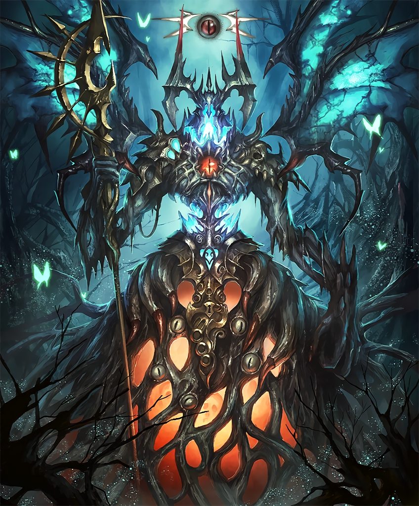
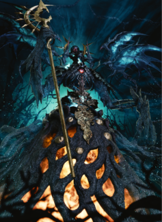
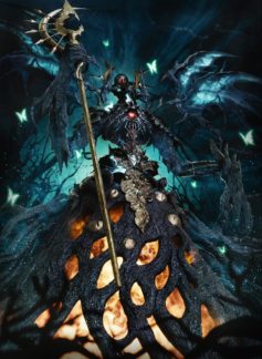
Originally, this project was for an art competition from the subreddit of the game that it’s from, Shadowverse. However, after procrastinating here and there, I wasn’t even halfway finished on the deadline, and the project ended up becoming something I wanted to finish because of the amount of time I had already spent working on it. When I first started, I used its original art as reference and after looking and studying it for a while, realized how many details it had. It was the first time I was doing something of this scale. So, I got to work.
Creating the Main Body
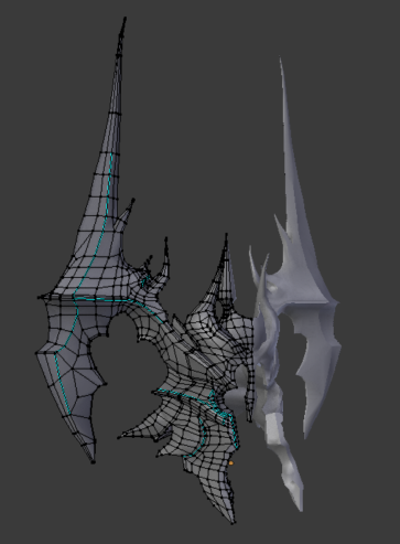
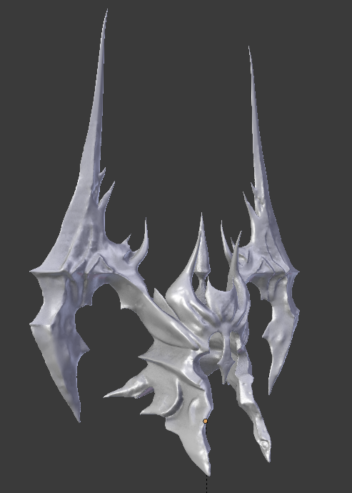
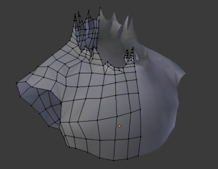
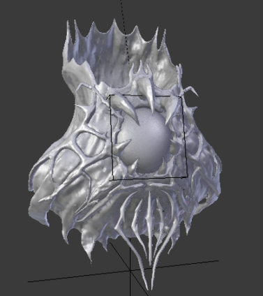
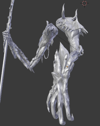
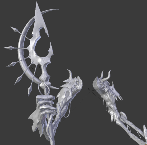
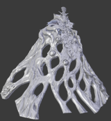
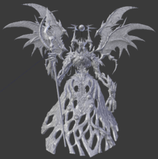
My main workflow was to create one portion of the body at a time, modelling the general shape, adding details via sculpting with dyntopo, then adding materials and textures to it.
I started modelling top down, from the head to the abdomen. It was a pretty time consuming process for sure and as I was still juggling school work when I started on the project, I only had some time to work at it when I was free, making its progression mind blowingly slow. Nothing much more to add here as the process was repeated for all other parts of the body while referencing from the original art.
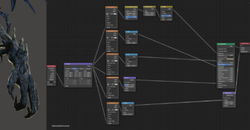
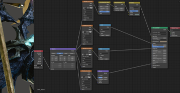
Finally done with the base model, I started with the body’s materials and textures, using various wood and rusted metals from Poliigon. At the same time, I also added a HDRI and set the color management to filmic. It was at this time when v2.80 just got released and I decided to bring the project over from v2.79 to familiarize myself with the new hotkeys and UI. Granted, it became more of a chore as my pace slowed down due to the various differences between the versions but it was a good experience anyways. I did not use EEVEE, however, as I still have not tried it out as of yet, so I stuck with cycles for this project.
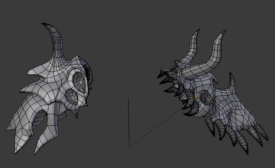
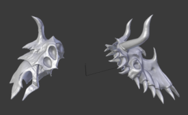
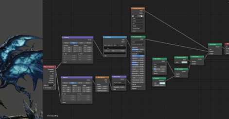
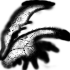
For the wings, I used Photoshop to create a factor map, separating two materials and giving the wings their look. For the details, I used a lightning brush and changed the size/rotation of it to make it look more natural.
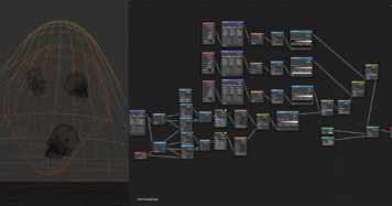
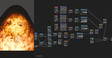
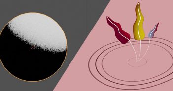
The orange core, on the other hand, uses spherical blobs and procedurally generated noise that I referenced from Creative Shrimp’s Space VFX course, while the skulls were models I downloaded from CadNav.
Background, SFX and Lighting
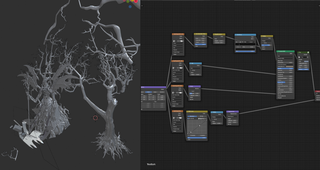
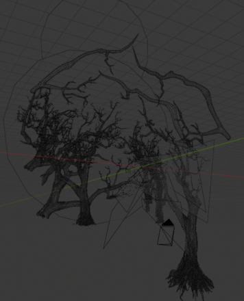
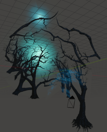
The tree model was from CadNav as well, and by rotating, scaling and cutting out branches of the model, I could create a decent looking background for the scene with just one model.
Initially, I had wanted to make the forest be more pronounced and the night sky visible in the background covered in fog to create a creepier atmosphere while better showing the location in which it resides. However, it did not work out well due to my lack of experience in this field. Hence, I resorted to a flat, black background and worked from there, which turned out pretty fine in the end.
Planes and circles were used for the additional ‘lighting’ and fog, mixing various textures and playing around with the Noise and Mapping nodes. These were also added on various points on its body, aside from the environment.
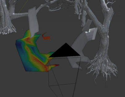
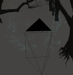
A particle system was weight mapped and added to a low poly cut out I quickly modelled to give a higher variance of randomness to the particles which are simple icospheres, aside from the usual settings of random size of particles.
Compositing/Post-processing
And that's it. After adding some glare in Blender’s post processing, I played around more with the color and lighting before hitting render, then did final touches in Photoshop, further adjusting color, adding focal lights and vignette to emphasize areas more amongst other minor adjustments such as sharpening areas of the body.
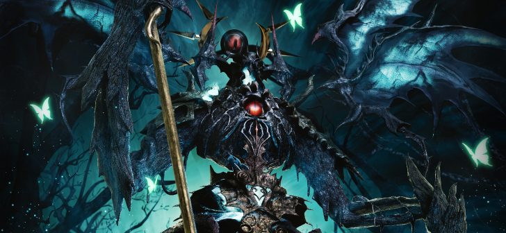
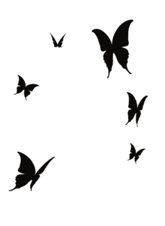
The glowing butterflies were created using a silhouette image of a butterfly wing, mirrored to create a butterfly, then creating multiple variants of it by rotating the wings before changing its color and adding a glow to it in Photoshop. Below are the Before > After photoshop images for Deepwood Anomaly.
While I am satisfied with this long project that I took up by myself and finally finished, I do believe that some areas can still be improved on, mainly composition of the scene, its environment and overall lighting of the creature. It was a good experience, putting everything that I had learn from Blender thus far the past few years and pushing myself to create something of this scale which I have never done before. As straightforward as how I wrote this article to be, it really wasn’t, as I had to backtrack and adjust many materials, textures, lighting and maps, all of which took a chunk of time. I enjoyed the process a lot and I’m sure that it can be improved with experience.
Critique and feedback are much appreciated, of course, and I hope you enjoyed reading behind the scenes of Deepwood Anomaly.
About the Author
Ng Jowie, 3D Artist

12 Comments
Great work !
What a cool concept of modeling a character. Seems you started modeling the base using a poly form or some kind of box model. Nice outcome and well done!
Looks good! Look like an illustration more than a 3D rendering.
Really love it ! Also a very creepy and detailed character design u got there :-) May i ask how u achieved this painterly look of the image ?
Uhm . . . the first picture was the original illustration he is using as a reference. His work is at the bottom and is actually quite inferior compared to the illustration.
Quite inferior?? Sorry but his art is quite good, its quite a complex scene. Getting such a scene 1 on 1 is almost impossible
Compared to the illustration. The final 3d image is okay but the reference illustration is just great.
The reference illustration is just better in every way. Comparing the two, the 3d version is clearly inferior.
Unless you really think the original illustration is the inferior one and the 3d version the superior one of the two.
Do you mind elaborating on it? I would like some critique and areas I am able to improve on.
Do you mind elaborating on it? I would like some critique and areas I am able to improve on.
Well, to be honest, I'm not that great with 3d either and my PC can't actually handle a scene like this. I tend to do cartoon-ish stuff because they don't require a lot of resources.
Still, I do observe some thing in your work that could be improved upon.
Your color choices for one is too cold. The blues on the original illustration has a green/yellow tint to it. The flame is more red than yours. The body of the is more of desaturated green while yours is a slightly more saturated blue gray. Maybe a little color correction could help?
There is also the lighting. One of the most problematic is the flames doesn't actually throw that much light. In the original illustration, you can see the flame casting a red orange glow onto nearby things like the staff, the arm and the body. Your model is also too evenly lighted. The original illustration has sharp shadows that helps make it look dramatic and menacing.
And, of course you can do a little cheating. Actually, a lot of cheating. Not everything in your image have to be 3D. Send your image into photoshop and do some overlays, glow effects, painted highlights, painted details, etc.. You can even do things like fake lighting to do that orange glow from the original illustration. Photoshopping could help push your art to higher levels.
And by the way. Your work is not bad. It is actually good. It was actually unfair to compare it to the original illustration, but it is not bad.
And Hope this all helps.
Thanks for the critique!
The color was intentional — I should have written it in the post itself but I had a lot of trouble trying to have the colors work well if I followed the reference entirely. My intent was to create a more realistic version of that creature with what I could do in 3D, hence the different textures and colors because I found that it looked better with the image and character being more gloomy and less flashy in general with a sense of dread.
As for the flame, I actually lowered its brightness and reduced its saturation manually in both blender and photoshop because it took too much attention from the image if I had it any brighter; people wouldn’t notice the smaller upper body and head at first glance. I do understand that the color of the image itself is too flat however, as I was trying to create a filmic feel. I didn’t do a great job seperating the creature and background apart because of it.
Like what you said, I also do agree that it could be a lot better with more photoshopping. I do not have much experience with it and while I did some color corrections/glow, they were mostly minor edits. I could probably cut off more stuff from 3D like the cyan auras and fog and have that be made in photoshop instead as well, apart from what you mentioned.
I will definitely take note of the points you have mentioned. Thank you again for replying!
Well, the colors isn't just cold, they are also too saturated. It makes your version looks a bit cartoony than usual.
As for the flame attracting too much attention, again, it is the problem of the lighting. Your figure is lit too evenly. The lower part of the figure should be in the dark while the upper part should be lit strongly. This puts emphasis on the head and makes the flame glow visible without it needing to be very bright (because it doesn't need to compete with other lighting).
And since you are basing your render on a 2d illustration, then you need heavy use of photoshop. The original image uses a lot of cheats like strong specular highlights from illogical sources, blue rim lights, again, from illogical sources and of course the strong orange glow that is physically impossible. And it is these cheats that makes the image look great.