Deadpool 8 bit
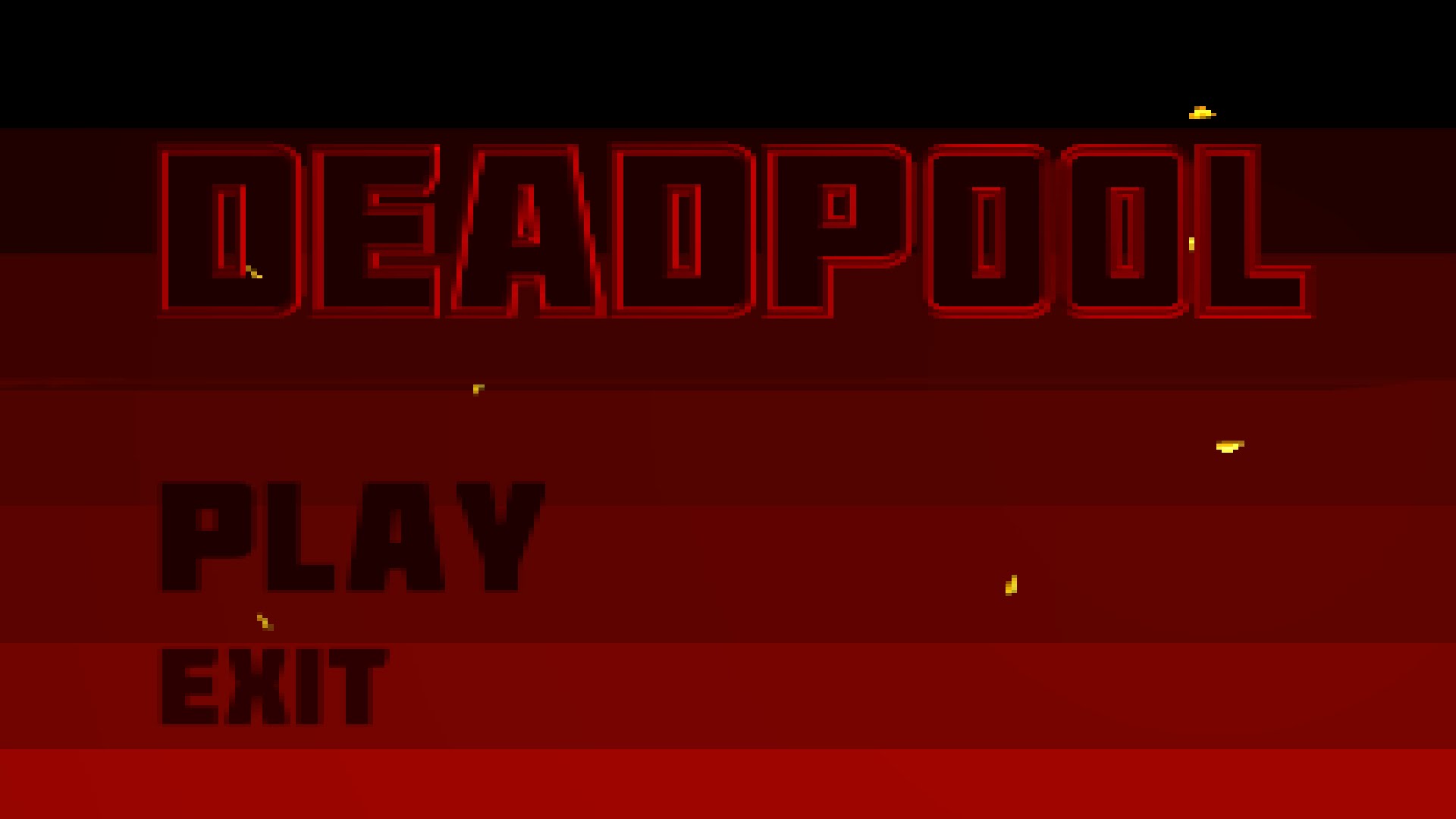
By Draguu.
Author
Bart
I have a LONG history with Blender - I wrote some of the earliest Blender tutorials, worked for Not a Number and helped run the crowdfunding campaign that open sourced Blender (the first one on the internet!). I founded BlenderNation in 2006 and have been editing it every single day since then ;-) I also run the Blender Artists forum and I'm Community Lead at n8n.
Advertisement
Ads help pay for running BlenderNation. Please consider adding us to your allow list.
Good job, Draguu! One critique would be that the “8-bit look” is a tricky aesthetic that is achieved with a few key components. I don’t claim to be an expert, but here are my recommendations in no particular order to help you hone your look.
1. Color palette. Early systems couldn’t display many colors at a time, so I’d be careful to be very selective to not choose too many colors and be careful with gradients (as blending from one color to another can easily take the viewer out of the experience by being too colorful (displaying more colors than an 8-bit system would technically be able to). Along with gradients (and though I expect this was rendered and down-resed) I’d look into hand-dithering between colors.
2. Resolution. The NES would normally display a native resolution of 256×224. Now, I understand that is tiny nowadays, but it is still easy to mimic. You may have to sacrifice small details (like the line between the baddies’ teeth), but by having more blocky assets might sell the look a little better.
3. Scale/sampling. So, I expect either you rendered small and upscaled your render or you rendered large, scaled down and scaled back up. An “artifact” of that process is the scaling algorithm trying its best to guess where lines are and blurring colors between objects to give the impression of a smooth line between those objects. You don’t see too much of that in 8-bit games. You see hard lines between characters and the background, screen text overlays and the background, etc. Whatever program you used to scale your renders, I’d look into changing the scaling algorithm from Bilinear or Nearest Neighbor to None. That will preserve your hard lines while giving you the blocky look you are going for. To be safe, though, when scaling without a resampling algorithm, scale down using a factor of 4. That way, the program can easily collapse 4 pixels down to 1 without trying to cram an odd number into 1.
Keep up the good work and I hope to see more of your work!