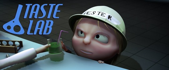
 Hi, Chris Burton here back with another little movie. This one's about a little girl who has to test out soft drinks made by two rival chemists. All done in 2.5 Alpha 0.
After I finished Mite! last year I got a lot of useful feedback, telling me to work on my lighting and texturing, so I've tried to focus on those more with this one.
My main attention though, as always, was with the animation, because that's what I love. The story's pretty basic, but the premise gave way for a lot of fun inventing ways to keep the characters interesting, and hopefully it's enjoyable to watch. I'm getting some requests to do some tutorials, so I'll have a look see what I can do. Thanks!
<object width="853" height="505"><param name="movie" value="http://www.youtube.com/v/VgnTxZElfIw&hl=en_US&fs=1&rel=0&hd=1"></param><param name="allowFullScreen" value="true"></param><param name="allowscriptaccess" value="always"></param><embed src="http://www.youtube.com/v/VgnTxZElfIw&hl=en_US&fs=1&rel=0&hd=1" type="application/x-shockwave-flash" allowscriptaccess="always" allowfullscreen="true" width="853" height="505"></embed></object>
52 Comments
Amazing! I really enjoyed it =)
And Alpha 0 is like crapware compared to newer revisions...
(damn it, install that disqus already, Bart xD )
I thought it was cute but there a few large issues I noticed. Excuse me as I go all film school for a moment.
Everything up til 1:17, absolutely pitch perfect beautiful! Then...well then, the rival scientist is....mad? Wait what?? Aren't these guys competing? Shouldn't he be like ridiculously happy right now? Or is he mad because he made the girl sick? It just makes absolutely no sense.
And then you're good again til 1:37, you set up that the girl is in front of the large researchers desk watching him, but then "whoah, a wipe!" and all of a sudden shes in front of the skinny scientist? You need to give at least some kind of a cue to the audience that this where she is now, it's just felt really weird to see her in front of one desk one minute and then the next second shes 20 feet to the left.
On a more technical level, I've noticed this ever since your WIP on BlenderArtist, but there these weird white artifacts around the large scientist beard that get kind of distracting. And the girls hair at the end is missing shadows I think, it looks very strange and bright.
But other than those few things it was really cool, nice style too.
Keep it up.
Chris.
Love the character animation! Nice style and concept. But please raise the resolution of those shadow maps!
Great story line and the animation is much better this time around! I enjoyed it very much!
A few things you might have a look at:
- Buffer shadow resolution is woeful...they really let down the look.
- Rim lighting was very nice but your key lighting was a little dark in some places. I wanted to see more detail, despite the moody atmosphere you were going for. Maybe it was just my monitor settings?
- Try a higher sampling rate (in render panel or Full OSA in materials settings) for the cloth material on the chemists to reduce the moire effect.
Think about lighting colour and value to help tell the story...a little darker and less saturated for the nasty chemist and lighter and more saturated for the good guy. Little things like this can really help with the initial "read" of the situations. It took a little while for me to register that the first chemist was a good guy...maybe a softer, more appealing (think Santa) face might help with this. You did really well with the other guy, giving him a Dick Dastardly look made him "read" very quickly.
Things I liked were:
- The sugar rush sequence...very funny how you built that one up.
- The "angry badger" ending. Was unexpected which I appreciated!
Very well done!
very good, very entertaining. kinda reminds me of the pixar shorts before the feature film.
The animations, expressions and the storyline are top! Aside from some, already mentioned, artifacts this is one of the best movies from the community i saw.
A lot of fun, with great use of colour and lighting. I loved the moment he plops the umbrella in the evil drink and it just disappears if a puff of flame. Great work!
Love it, thanks for sharing your work! The lighting and characterization are wonderful. I noticed some tips for improvement above that I agree with; in addition I have to say that the SSS effect is a little too pronounced for my tastes and distracts from the facial expressions.
But that could just be me :-) Anyway, awesome job!
Hi!
I like the animqtion, its very pronounced and cartoony. But i didnt notice the rivalty that much.
It looks like to a pixar's short film, one man band, with a little girl and two men, a fat and a slim...
But that's very fun, good work !
I disagree with Chris W up the top. I thought after we had established that it was a Soft Drinks Lab the narrative ran really well. I was a little confused at the begining of the film so maybe you could reveal the Soft Drinks Lab earlier? I would have revealed it around 0:40 before the other scientist but thats just me.
In the end you achieved something that a lot of people don't. Shadow buffers and materials aside it was a very watchable and entertaining film and that is worth more than all the technical stuff in my view.
One thing I'm dealing with is the Blender Renderer. It always looks like the Blender Renderer but its quick.
Well done and look forward to another.
Hi everyone, thanks for the feedback - especially the advice about the lighting and SSS.
Hands up - was a bit of a mistake to write about their rivalry in the blurb. The rivalry isn't mutual: it's more about the thin guy trying to get one over the fat guy (the fat guy just wants to do his job).
EXCELLENT animation style! Loved it!
very very very nice. good story, good sound, good modelling ---> enjoyed it very very much,
greeting form holland.!
Amazaing ! I love this style of animation. The story is fun. I watch with pleasure. Expression this fat scientist is great. I'm waiting for tutorials :P.
Greetings
Nicely done.
Great! Very good story , picture and sound.
Really, REALLY great work, Chris. I'm so impressed. Every aspect was solid, from the story to the shot design, timing/pacing, lighting, music. You've got some serious talent!
Great!! :) Congrats!
Luca P.
I'm blown away. Don't know where to start. I loved your models, I loved your timing. I loved your story line. I loved the use of depth of field (some serious compositing here, I'm assuming).
Man, I really feel like a TalentlessHack now.
Love it! The story line feels JUST like a pixar short. I was so caught up in the story line that I didn't even notice the lack of detail in the shots. The only thing I didn't like was the fading out of everything when the girl drinks. I think it would have looked better to leave everything there, but turn off all the lights and have a spotlight shining on the girl with a halo.
Really great fun to watch and I also learned a lot from the critiques offered. Thanks to all.
Great. You have excellent taste and it's very well done from a technical and entertainment standpoint. Please disregard finite criticisms - the fastest way to kill anything creative. This was very well done.
So that was how mountain dew was made?
awesome! :D i really liked the animation - like the tall guy's nose springing on the counter top, lol :)
really awesome!
That was awesome!
My only crit: Why don't they have eyebrows?
Worst movie ever!
"Too much love will kill you" ;)
GREAT!!!!!!!!!!!!
some times turned special!!
congrats!!! :)
I really enjoi this movie.
Good job.
i am willing to play a role in your next blender movie
btw i am good at playing bad guy 's part
the one who always ends in jail!!!
loved it ...liked it...yes it's great!
Love it!!! Perfect timing and excellent animation. I understad about low resolution shadow maps, I have a slow computer and hate to wait hours for a simple frame... I also notice something doesn't work on the expressions of the little girl, but it can be a problem of topology (for example her smile has something disturbing... maybe it's too narrow). However it's a great short movie and it's impressive how rapidly you are learning and improving your technique (I'm referring to Mite! and The New Guys: For The Winnings)...
Keep it up!
Woo Hoo!!! Great job! Keep 'em coming. They're getting better every time!
and you are recommanded on youtube too!!!!!!!!!!!!!!!!!!!!!!!!!!!!!!
Bravo ! I love it !
Really there is not much to say that hasn't been a list of my nitpicks which can be found in most others comments
-White artifacts
-clothing texture
-SSS
white artifacts are distracting
clothing texture not so distracting but just enough to draw me out
and the SSS was just flat out to overdone for me
with all of that being said you have by far exceeded anything I have ever done
and deserve a medal for your hard work I actually enjoyed this animation alot
I even chuckled a little at the last bit. great work it takes alot to even put a smile
on my grimace, cantankerous, grumpy face so cheers to you good work 8/10.
-2 for those three problems mentioned above.
hahaha great work xD
love the part where the litle umbrelle is put in the drink and the cloth just burns xD
nice! i think the sss is a little to much
really amazing
Very nice work! There are some valid crits that others have made, but all in all this is really very impressive stuff!
I was also going to comment about this being the invention of Mountain Dew, but I see adam beat me to it.
I'm not gonna say "too much", the SSS is downright CREEPY!!! You don't want to get too fleshy with the cartoons, it gets... again, CREEPY!
Other than that, honestly, this is a very, very, very refreshing short. To me, it is closer to pixar level: not technically, of course,(as it has been pointed out by people far more experienced than me), but in the way that pixar films stand out from, for instance, dreamworks films. It shows a cinematic grace, a knack for acting, camera work and general storytelling, that's sadly absent from some graphically superior films.
two thumbs up!
I've watched a lot of animated short movies on the internet, and I've come to the conclusion that animators can't write. I simply love it when I come across one like this, that has a storyline that makes sense, likable characters, and eye-catching design. Great job!
I'm thirsty!
The sugar-high bouncing off the ceiling effect shouldn't have been such a 2D straight line.
Does 2.5 make your animations funnier?
I'd really love to see what happens if this guy joins forces with Endi. This short movie and the previous one have excellent animation and storytelling but lack in the visuals department, while Endi's movie has an amazing look but is weak in animation and direction.
I bet that these two guys would really make a "pixar quality" short movie if they work together ;-)
Made me laugh. I agreed with the first three posters on possible improvements, but I really liked the story. Simple but to the point, and very funny. I've seen some that just sit there. They are boring. Yours isn't, and thats what keep people like me watching. The pacing was good. There were a few places where things were discontinuous (re-read the film-school report from before), but in general it followed a pretty logical line (meaning that there wasn't a lot of of ambiguity). Some of the special effects were great, and well placed (melting umbrella was GREAT, not just from a technical particle physics point of view, but added to the story). Story was 10/10, timing/continuity was 8/10, light was 6/10, effects 9/10. So go get build 28395 or later, and make another one already!
how long and how many people involved to complete this animation? Do u find it easier to use 2.5 compared to 2.49b? i really enjoyed it.
I didn't understand that Jester was a girl until the credits.
Why Jester has no eyebrows?
The achievement is technicaly "honest" but i didn't enjoy the short and really dislike the design.
It´s great realy super
Wooow ! it's crazy ! animation is perfect !
Great job !!
The animation for this was most impressive, well done.
But I couldn't help thinking throughout the entire short that it was a Pixar knockoff. The story was absolutely identical to the previously mentioned One Man Band and the character design felt, to me, to also have a Pixar feel that lacked creativity.
Still, really well done and I can appreciate the work that was clearly put into this.
I had the same pixar plot association, but it did not bother me at all. Liked some of the small touches for animation such as looking at "tester" sign before commiting to fate...
Made my evening better, thanks.
@irve You're welcome :)
About the pixar parallels - although Pixar is obviously an influence on my work, I'm certainly not trying to make knockoffs. I can see the similarity with One Man Band, but as far as I can tell it only extends as far as the characters being two adults and a girl, and I definitely didn't have it in mind or knowingly copy it.
Anyway, thanks again for the continued encouragement and critiques - it's definitely giving me some ideas on what to focus on next.