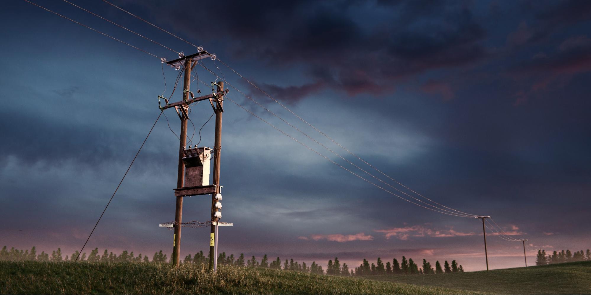
Behind the Scenes: Utility Pole
Introduction
Hello, I’m Joe; I have been using Blender regularly for about seven years and I am self-taught in 3D art. I have spent large amounts of time practising fine art and I am studying it as one of my A-level subjects.
Living my entire life on England’s East coast, I have recently applied to universities in the UK in order to study visual effect CGI. The quality of applications to visual effect courses have improved spectacularly in recent years – as a result, it is important that I have an equally interesting and technical portfolio to showcase and it is for this reason I created the image.
I hope it will be an interesting read, it certainly shouldn’t be taken as an ideal method or process since there are certainly more practiced people than me, but an insight into my rambling thought process while creating the image.
With this render, I started out with many reference images of a utility pole close to home, I started by reproducing the subject as closely as possible. At this point I just wanted to have a subject which I could compose into an image later.
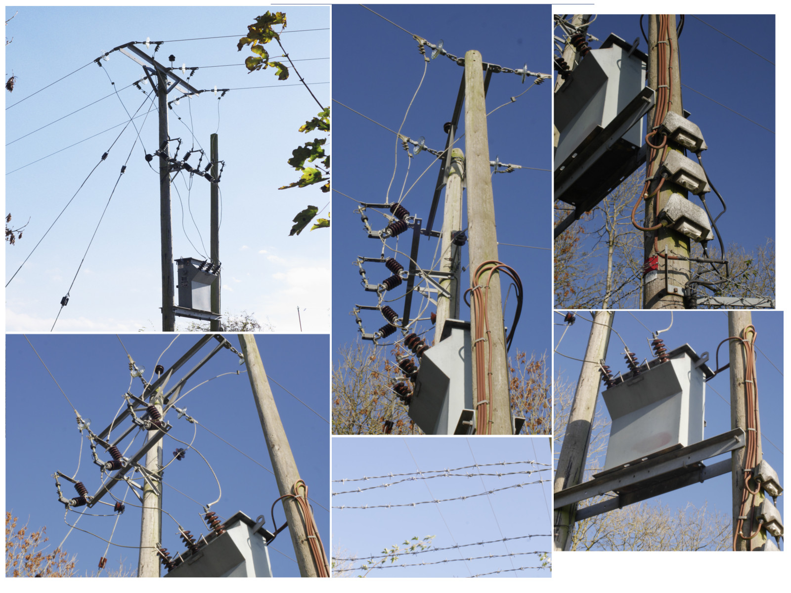
There was no need to go about drawing any profile views before modelling since I had covered pretty much every important angle with the reference shots, so I jumped straight into modelling.
With no final image in my mind before I started, it made the most sense to begin by building up the utility pole solely on photographic reference. Modelling became the project’s major focus – making sure that each piece was coherent with its connections and that its scale and orientation made sense. Specific pieces such as the barbed wire required a different approach (the processes involved will be discussed later on).
A utility pole has a surprisingly large number of intricate parts. The bevel and boolean tools were heavily used to keep a clean work-flow in creating each piece, as is the case with most hard-surface modelling.

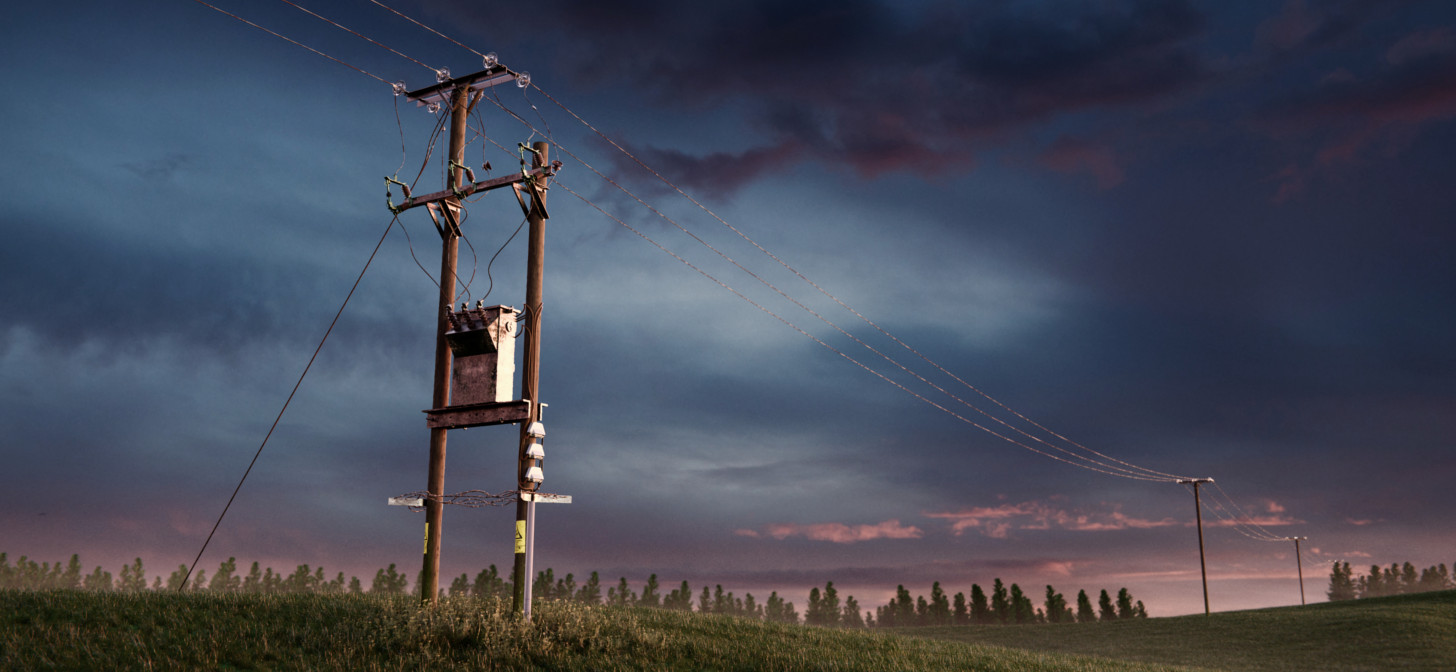
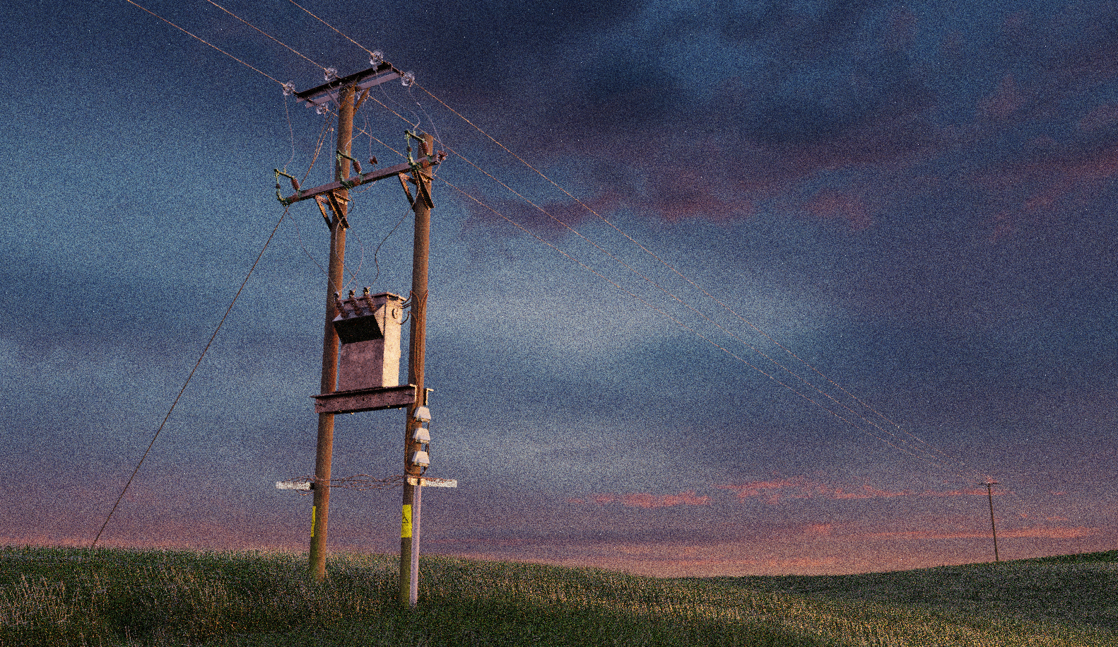
The utility pole, shown above was not really the most complicated to recreate, however there was a surprising amount of details involved, which if they were not included, would detract a large amount from the scene. Most of the intricacies are barely visible in my final render, but I imagine it’s better to have an overly detailed model than an under detailed one as I may end up using it in other renders!
I did however alter the position of the middle bar mainly because I found that it looked more interesting when the bar bridged between the two wooden poles as oppose to branching off only one pole.
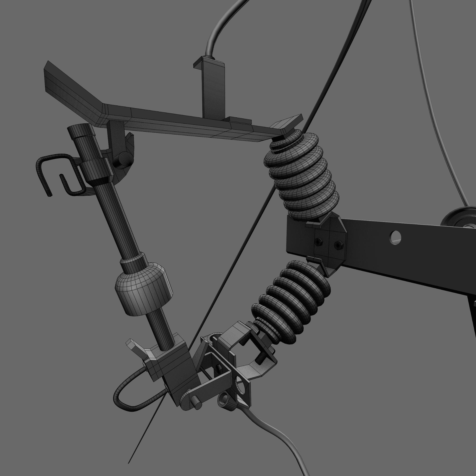
I found that working from largest pieces to smallest pieces was a methodical approach. For example, in the above image I started with the bar and then the disk things (I’m sure they have a name), the nuts, bolts, plates and so on. Each piece added was an individual object modeled in a separate layer then moved into position.
After each piece was connected, the base materials were applied and then the whole section was joined together. It’s maybe not the least destructive method of creation, but it was easy to organise.
I used micro-displacement on the wood to give it a bit more of a realistic surface. This was actually a fairly late decision which came about whilst experimenting with lighting setups; with any sort of harsh lighting it always appeared too smooth, even with normal maps and after adding randomness to the faces in the edit mode. The obvious answer was displacement and I think it improved the look of it significantly (despite adding lots of render time….).
Barbed Wire
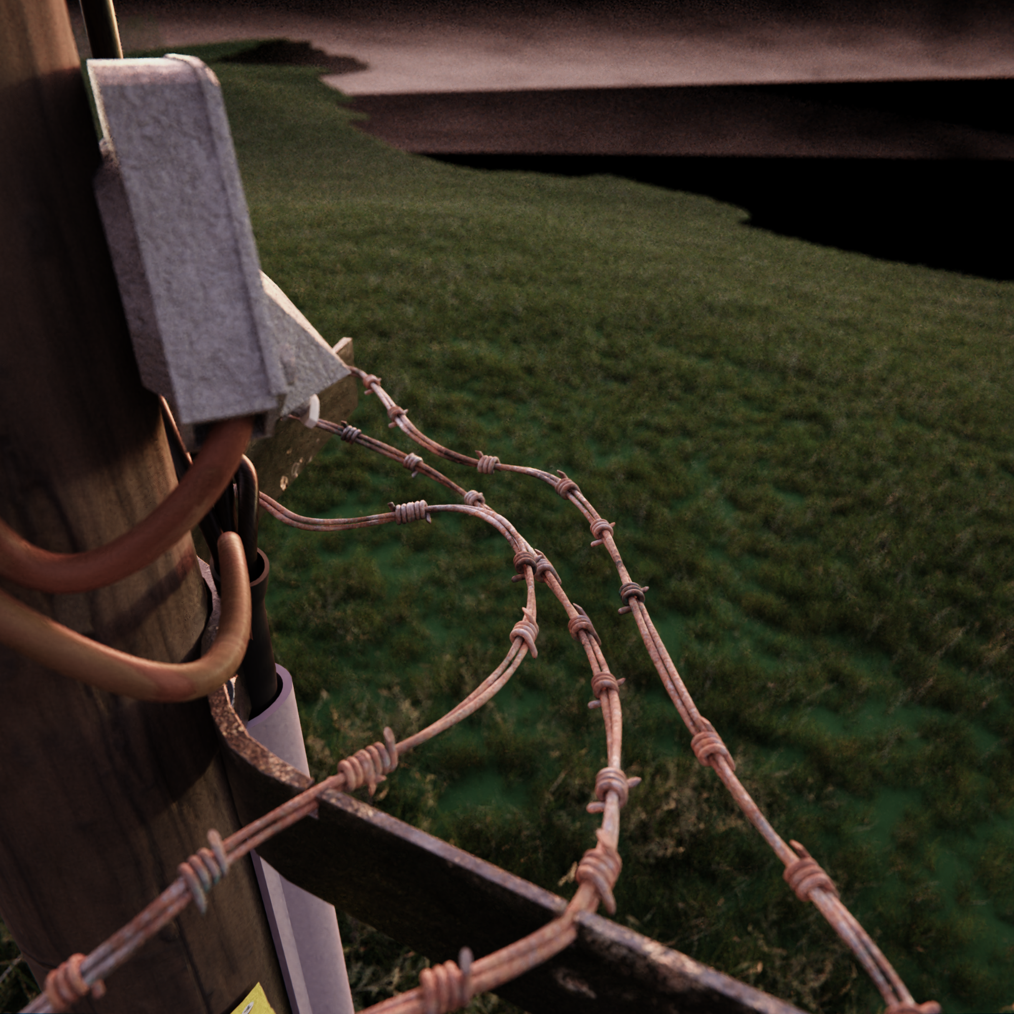
Barbed wire is a really useful asset to have and so I created it in a way which meant that it could be adapted to fit any curve. This was done through the use of modifiers. In fact, the barbed wire had been from a project earlier in the year.
The barbed wire is comprised of two separate meshes, the first of which is the long twisting piece made from two circles with the modifier setup shown below. This method has proven to be a very powerful and useful way to creating wire.
The second mesh is the actual twisted barbs spaced out along the first mesh. The barbs were placed using a simple array along the bezier curve , which shapes the wire, at regular intervals.

This process, combined with a curve to shape the wire, allows for a nice amount of flexibility and I recommend trying it for anything similar.
Composition, grass and materials
These three things were modified at the same time whilst I was deciding what direction each element should be heading in to have an interesting final render.
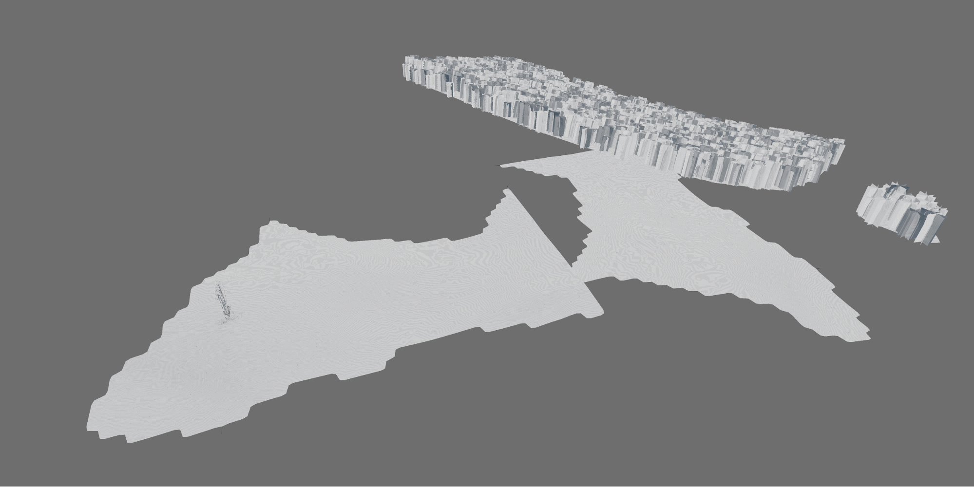
The above image shows how the scene is laid out, with the two grasslands and the two tree planes; both used particle systems to place the respective grass and trees. To save render time, any faces which were not near the camera frame were deleted from the grass planes; this reduced memory usage since almost all the grass in the scene is on camera.
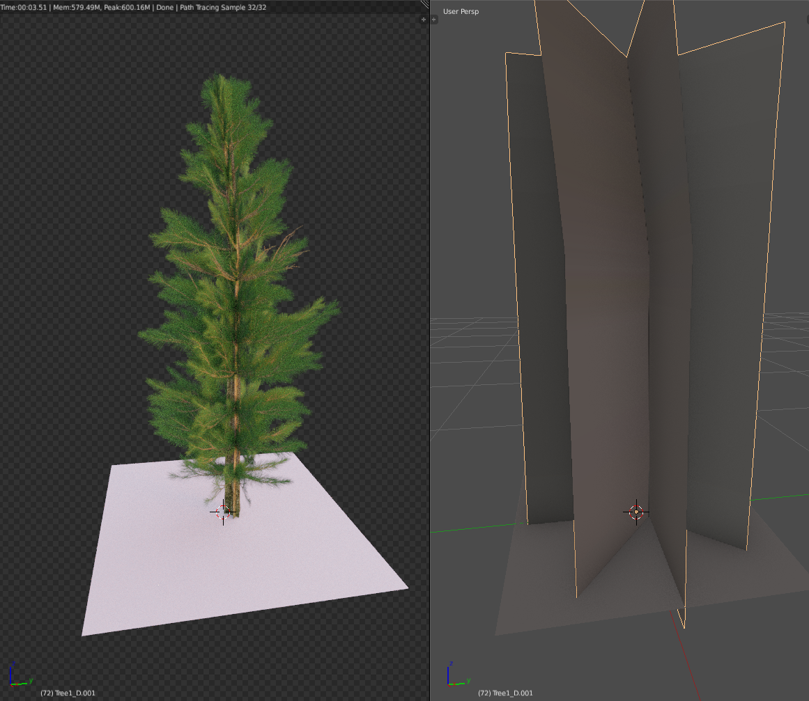
The trees are simply billboards in the background, which are actually made from a model of a pine tree that I modeled a while back. Since they are far in the background and will be blurred by DOF there was little point wasting memory and render time using a detailed mesh.
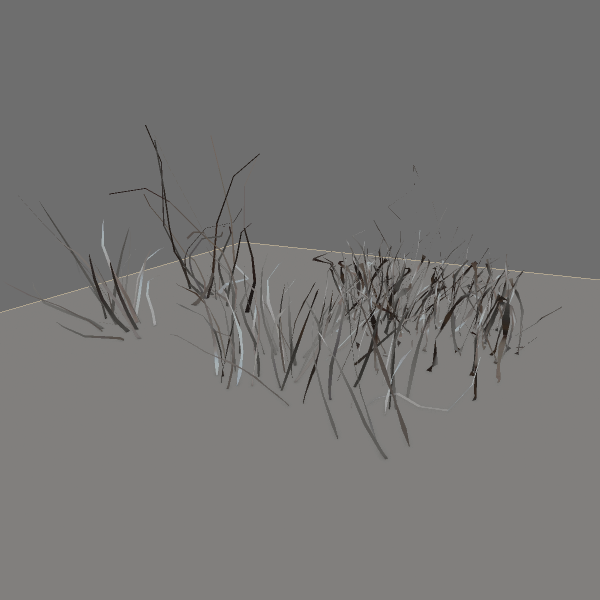
In addition to the trees, weeds were also added:
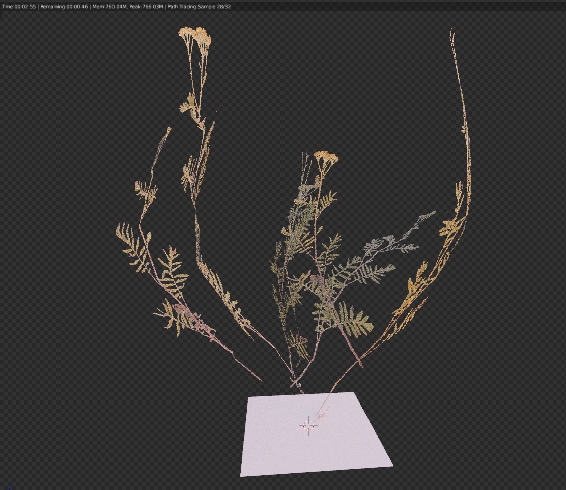
These, placed around the base of the poles, add realism. It was suggested to me that I place weeds under the utility pole and add a random colour shift to the grass. Unfortunately I neither have the time nor patience to re-render the scene to add the random colour shift, which is annoying to me. It’s such a simple thing but would add a lot to the scene.
I did add the weeds, though, and I feel that made a big improvement!
Whilst I was making the grass planes I was working out my composition:
It was during these early tests that I was editing the materials. I find it is always good to start by searching Textures.com for materials similar to what I am after and downloading the PBR textures and putting them simply over the object without much thought. On its own this can look clinical and boring, so another search for some rust or moss follows shortly thereafter. By carefully placing these textures in areas such as edges or recesses, a much more lifelike result is achieved. Although the look could be further improved by additional hand texturing, in this case I thought that the effect would be too small for the hours that it would require. In hindsight, however, the wooden poles could have probably done with some more ‘dirtiness’ (I’m not sure I’ll ever be happy with a final piece!).
Once I had settled on a composition I hit render with a simple compositor set up:
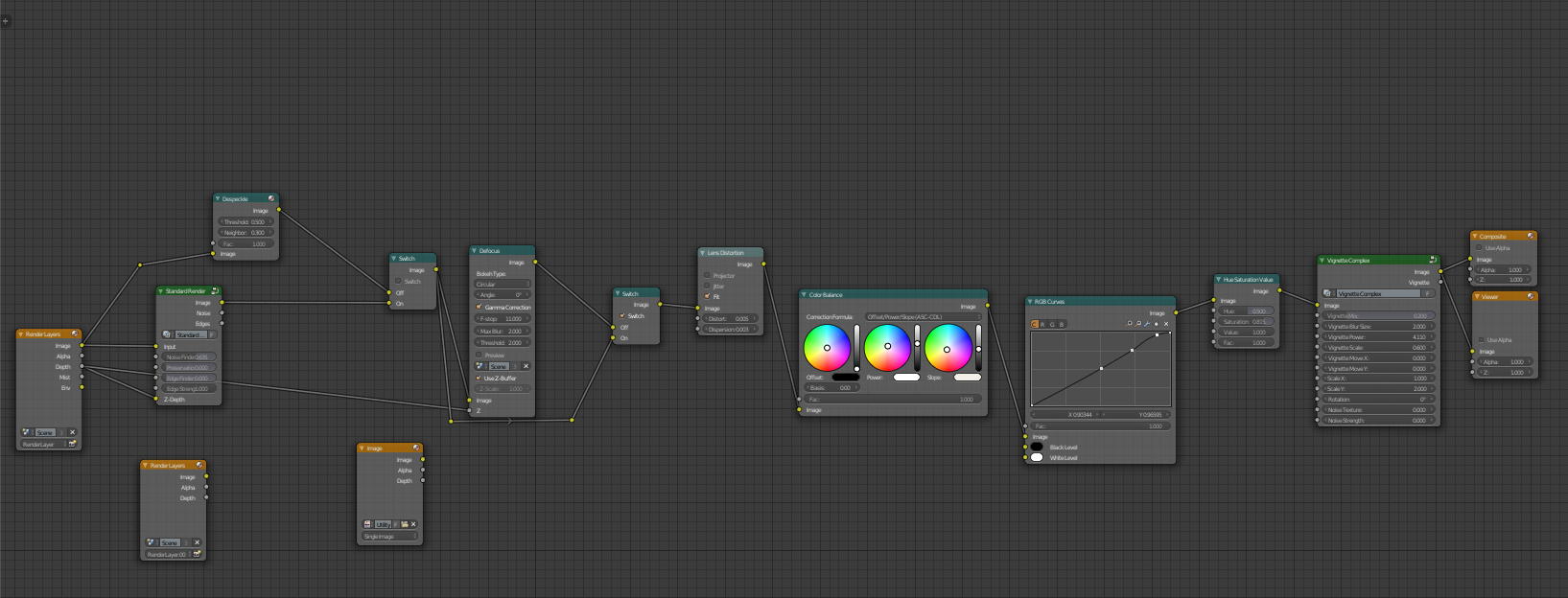
Mostly the compositor setup, shown above, was to add some defects to the lens through distortion, colour aberration and colour correction, it leads to a more believable resulting image.
I find that a large amount of 3D art work ignores distortion from a camera lens and it often leaves an image feeling like something is missing. If the render is meant to look real – as if it were taken by a real camera – the characteristics of a real life camera should be used. So some barrel or pincushion distortion should be added as well as colour aberration in the corners, effects which Blender has neatly built in!
On another note, the actual setup of the camera is important; to have a natural looking setup a focal length and aperture should be picked which would makes sense. There are no camera lenses with an aperture below 0.7 so it wouldn’t make sense to use 0.1 as a value. And focal lengths do not really exist above 1700mm (as an absolute limit on a 35mm sensor format). Equivalence should be accounted for when different sensor sizes are used. For example, a 50mm lens on a 35mm sensor is equivalent to a 25mm lens on a micro 4/3 sensor. A more thorough explanation about equivalence can be found here (and of course this is by no means a hard rule, but it is something to consider for realism).
After completing the compositor setup I thought it was done… and then the kind people on the BlenderArtist forum suggested some improvements, such as reducing the length between poles and adding the weeds. I added them and I got my final image. After using GIMP to clean up some areas, such as the wooden pole protruding through the warning signs, I can call the project complete!
About the Author
 Joe Dowling, Student from the UK
Links
- Joe’s Artstation – Still in the works!
- Joe’s Google+
- Joe’s Portfolio – Portfolio pieces for universities (also still under work ) if anyone was interested…