The ins and outs of low poly design

Jesse Davis dives into low poly design. Originally published on Blenderer.com.
Low poly is amazing. It’s an entirely different style that’s become quite popular. While the low-detail design might look easy, don’t be fooled. It takes hard work, a bit of know-how, and experience to get everything right. This article will help you improve your low poly scenes by covering:
- Objects
- Color
- Detail
- Composition
- Lighting
With these five skills, you’re bound to see your low poly scenes flourish.
Objects
It’s hard to make a scene without objects. Making those objects right can be even harder. When doing low poly work, the first thing you should do is find or draw yourself a reference. It doesn’t have to be a state-of-the-art masterpiece, as long as it shows what you want in a way that you can model off it. After you have a reference, consider how low poly you want to go. This largely depends on your own style and preferences, so you shouldn’t follow strict rules here. As long as you can see your scene is low poly, it’s low poly enough. If you’ve got an object and think it’s too high poly, try if you use the decimate modifier. This doesn’t always work, but it’s worth a try if it can save you a ton of remodeling work.
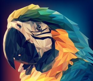 When using less detail, you run the risk of creating a boring object. Details are, after all, one of the easiest ways to keep a viewer engaged. With low poly, you can still use this, just with a slightly different twist. A detail is a part of an object that’s slightly different from the rest, and that’s something you can take advantage of. The difference with ‘regular’ objects here is that you vary the size of different polygons, as you can see with this parrot here. Creating slight dents in your model can do wonders as well, as this will add shadows, and life, to your object once you get your lighting done. As always, don’t overdo your details. Too much and your viewer will see them as ordinary pieces in your work instead of small differences meant to stand out.
Asymmetry is something else you can use to make your models more interesting. This is something you have to be careful with, as some things just are symmetrical. A low poly face doesn’t leave much room for asymmetry, but lots of other things do. Just look at the tree at the top of this article. You can even make symmetrical objects appear asymmetrical by rotating them towards or away from your camera.
As you can see, there are lots of options to make your model engaging for viewers. There are, however, also ways to destroy your low poly effect. Don’t use a bump map or anything else that creates unwanted detail. Curves are okay, as long as you preserve that simple look.
Color
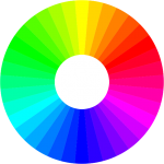 As always, colors make or break your art. Whether you’re making one object or an entire scene, the colors will be the first thing people will see. This makes it crucial to get them right. Even though you’re making low poly art, the general rules of color stay the same. In short, don’t use too many colors and make sure your color scheme is pleasing to the eye by using the right colors together. To do this, take a look at the color wheel and remember that opposite and neighboring colors are compatible.
Now, for low poly. You really need to optimize if you want a stunning color scheme. Because you’re using less detailed models, your colors shouldn’t be any different. A little detail here and there is good, it keeps your scene interesting. Just keep in mind that how more detail you use with your colors, the less of a low poly look your scene will have. Use one color per face and a maximum of 4 colors per object, preferably less. Before adding another color, ask yourself whether it adds value or not. If it doesn’t or you’re in doubt, don’t add it or try using a different shade of a color you already have. Not only will this make everything less complicated, it’ll also add depth to your model or scene. Just remember, with low poly less usually is more.
Detail
In low poly art, you need to spend some extra time on the details. It might sound weird at first, but since you cut out a lot of features you’d usually have it’s important to choose what to keep and what to let go. Like everything else in low poly, your details have to be optimized. Every time you add a color, increase the poly count or even use an extra shader, ask yourself if your scene really needs it. Don’t make a low poly scene with the details of a high poly scene.
This mostly goes for objects, as you should keep details in your scenes. A lot of low poly scenes end up looking empty, which isn’t engaging for the viewer. Add the objects you’d usually add to your scenes if they’re not too small. In a bedroom you should, for example, make the teddy bear and leave out scratches on the door. This keeps your scenes full enough without stepping away from the low poly art style.
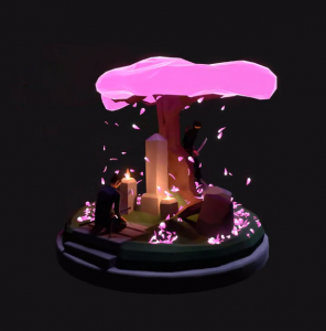
Take the blossom in this render for example. It’s pretty detailed, yet the scene still looks low poly. If the scene didn’t have any blossom at all it wouldn’t be as good as it is now. The trick is to add enough features to keep your scene interesting, but make these as low poly as possible.
Composition
Composition in low poly scenes is the same as in your regular scenes, so if you already know how to do this you can skip ahead to lighting. If not, here’s a little help.
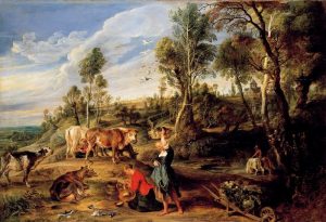 First, you need something to grab your viewers attention. This usually is an object that stands out because of a contrasting color, special lighting or special placement. In this painting, the girl with the red top stands out because she’s in the foreground of the image and wears a red top. She grabs your attention, then giving you the opportunity to l0ok further through the scene. You can replicate this kind of effect by giving something a high saturation value. Don’t do this too much in your scenes though, as it’s very stimulating for your eyes. If you give your scene enough places where your eyes can rest, people won’t look away.
When you’ve got something to catch the eye, you need to give everything in your scene a good position. For a little help with this, open Blender and go to Camera -> Display -> Compositional guides. These divide your scene into a couple of fragments when you look through your camera. Try to add something visually interesting to each of those fragments, so every part of your scene is visually interesting. You’ll also want to vary the density of your scene. Try placing more objects at one distance from the camera than another. If you do this, your scene will be more engaging and look natural.
Lighting
When you’ve got your whole scene set up or finally finish the last work on your model, it’s time to add some light. Good lighting makes your scene come alive and contributes to the emotions you want to evoke in your viewers.
 To make your scene come alive, you have to make sure you’ve got plenty of shadows. Try to use soft shadows that are mostly from one light source. You almost never see completely dark shadows in real life, so avoid using them in the digital world.
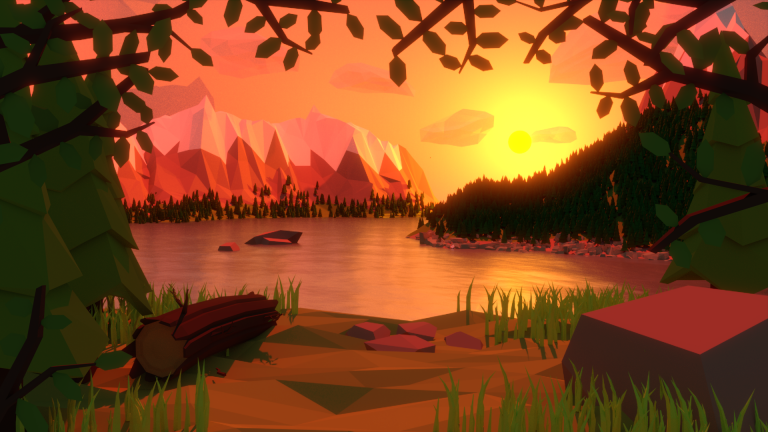
For the emotions, colored lights are your best bet. Take this scene by Andrea Algeri. The red light from the sunset gives the whole scene a cozy look. Imagine what this scene would look like if it had a moon, giving everything a slightly bluish tint, and you know why colored lights are so important.
The biggest mistakes you can make when lighting your scene/model are:
- using too many lights. If you don’t really need it, don’t use it. Make sure you have a specific purpose in mind before you add a light. You can use a main light that lights your whole scene, a backlight to soften out the shadows and accent lights to draw special attention to important parts of your scene. For softer shadows, use bigger lights.
- setting your lights too bright/dim. When your colors become white because of the light, go back. Too much light in your scene is a waste of all the work you did when picking a good color scheme. If you go too dim people are going to have a hard time seeing what’s portrayed in your scene and what colors you used, giving the same problem.
Objects, Color, Detail, Composition and, Lighting. We’ve had them all, so now it’s up to you. Go and make your next amazing low poly scene!
See you next time,
Jesse Davis