Before It’s Too Late
By Sebastian Zapata.
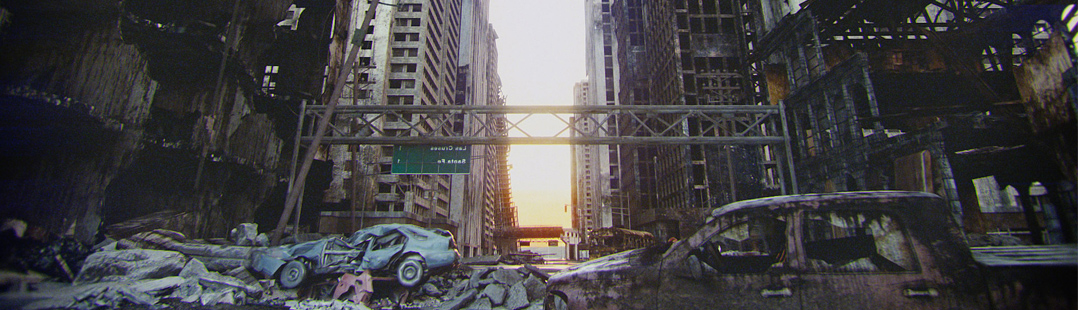
One of the stills from the short film “Before It’s Too Late” .. https://www.youtube.com/watch?v=sZ2WoeONijU
By Sebastian Zapata.
One of the stills from the short film “Before It’s Too Late” .. https://www.youtube.com/watch?v=sZ2WoeONijU
By Sebastian Zapata.
One of the stills from the short film “Before It’s Too Late” .. https://www.youtube.com/watch?v=sZ2WoeONijU

Let me start by saying that I really love this piece. The level of detail presented is just fantastic. I only say this because I don’t want you to feel that I’m trying to pooh-pooh all over your work. I like it. I really, REALLY do. That said, if I may offer up a few observations.
1. While this is a lovely piece, I’m not quite sure that I’d call it a “short film” per se. There’s no real narrative trough line. It might well be a spectacular opening to a much larger piece, but it doesn’t say a whole lot on its own. It is, at best, a moment in time captured.
2. A few smaller visual elements look a little off. Namely:
– The broken glass on the car doesn’t seem quite right. I’m not sure if it’s the texture of the accumulated dust, the fracture pattern, the actual glass material, or whatever. It stands out as being a bit out of place – almost like an old console game.
– The fur on the teddy bear, I feel, doesn’t look finished. The fur density should maybe be higher, the length a bit longer, and the strand width could be thicker. I’d probably have added some deeper dirt marks or scorching. Additionally, a little fur clumping might have increased the realism.
– The hard edges on the assault rifle feel, perhaps, a little too hard. A tiny bit more rounding. Also, the wear & tear at those hard edges looks too uniformly beaten up. An obvious extrusion of a profile shape has made it so that the magazine is now a permanent part of the body, which also looks wrong.
– A few object have a slight low poly look. I could be mistaken though
3. The billowing smoke stands out as looking flat out wrong. As a lifelong New Yorker, I lived through the 9/11 destruction and can tell you that this just doesn’t look right. It looks more appropriate for a candle than a building.
– There’s not enough noise to the smoke. It’s smooth when it should look more perturbed.
– The scale of the smoke is too great. It should be smaller, which would give it a greater apparent density. ATM,
– The smoke color also doesn’t seem right. Again, I refer you to the 9/11 destruction. A lot of that smoldering smoke was either very light gray or plain white. The darker grey and black was most present at the moment of impact, which isn’t that unsurprising when you consider the burning fuel.
– Some of the smoke rises too quickly
4. Where are the people? Certain elements like the teddy bear or the cars suggest that there is or was life on this world. The total absence of people seems odd. This piece, as a result, lacks a human face for us to connect to.
5. Rusted out objects like the abandoned (?) plane stand out against a destruction event that seems very recent. The two elements seem at odds with one another. IOW, if the destruction is very recent then why are the planes and cars rusted out? If those elements are very old then why is there still smoke coming off of the buildings? See what I mean? BTW: IS that plane long abandoned or recently crashed. If it’s the latter then the wreckage is in way too good of shape. If it’s the former then I’m actually surprised that there’s no glass in the windshields.
Overall, there’s an astonishingly high level (and quality) of detail here. That’s why some of those things above stand out so much. When something looks so very right, the smaller things that look so very wrong stick out like a sore thumb.
Again, excellent work. Not really a short film, but still pretty great proof of what an obviously accomplished Blender artist could do. Thumbs up.
Is the texture for the text on the green highway sign reversed too?