
INTRODUCTION
Hey! My name is Matt Robertson, or Renzatic if you prefer. If you absolutely have to attach a title, I guess you could say I am a 3D generalist, although I don't do it professionally yet nor do I have any formal training.
I consider myself an intermediate hobbyist. I am comfortable with Blender, model for fun, am well-acquainted with the basics, and can usually get around without too much stumbling, although I still have much more to learn.
INSPIRATION
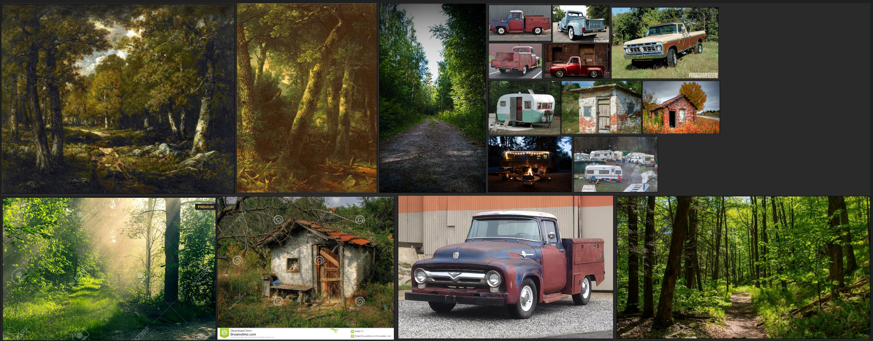
I've always loved exploring the woods as a kid. I was fortunate enough to grow up next to a huge abandoned farm, filled with all kinds of old barns and buildings to explore. For a 12 year old, it felt like a whole world of adventures right at my fingertips. These memories and the thrill of discovery, always having something new and weird to share with my friends, drive me to try and recapture the magic I felt in my youth.
My desire to explore later led me to try urban exploration, photography, and even joining an old friend of mine on amateur ghost hunting tours (we never found any ghosts, but we had a run-in with a goat!).
This led me to try my hand at 3D modeling, which over time has sparked my interest in telling stories through my renders. Although that may come later, for now I'm more focused on learning and understanding the 3D aspect.
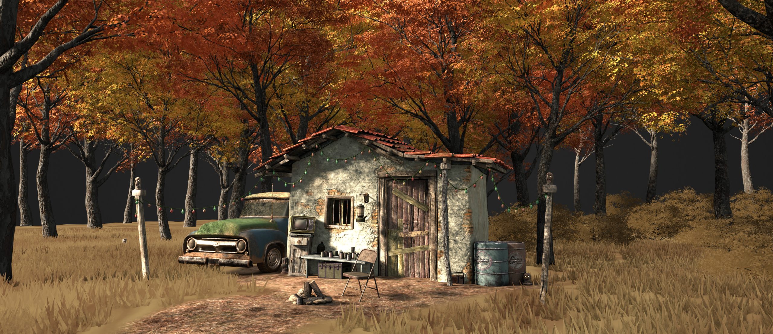
The first thing I feel I should mention is that I started this specific project with a concept in my head rather than a concrete plan. My idea was of a solitary building in a large field, surrounded by trucks, campers, and tents, with a single bonfire burning in the center, creating a mysterious yet festive and welcoming atmosphere. The concept was of a modern gypsy caravan settling down for the night, framed in portrait-orientation with the scene at the bottom and panning up to a starry night sky above.
In the end, I had a landscape-oriented shot of a solitary building located at the edge of the woods on a crisp early fall morning. I like to think of it as the same scene, but shifted deeper into the field towards the woods and captured after most of the caravan had already left.
PROCESS
So, how did I end up with results that are so markedly different from my original intentions? This happened because of a process I have favored for several years, which I have honed over time. I like to call it Futzing Around™ (I would normally use a different phrase, but for the sake of keeping a family-friendly atmosphere, we'll roll with that particular "F" word), and a willingness to sacrifice some ideas and previous efforts to achieve a better final image.
First and foremost, I considered this project to be experimental, taking it on mainly as a learning experience. I gave myself no deadline for completion and assumed from day one that I had all the time in the world to experiment with different styles and lighting techniques. I tried everything from a fully PBR-based scene to heavily stylized NPR, and everything in between. The final image is actually something of a mix and match, with the grass and foliage primarily or partially stylized (which I will illustrate later), while the more solid objects use full PBR stacks. The more I found something I liked, the more I adjusted it and the surrounding objects to fit together stylistically. It eventually coalesced into the image you see above, nailing a painterly look that I had attempted to achieve in the past but could never quite manage.

Despite the excessive time investment, the Futzing Around™ paid dividends in the end. It gave me a better understanding of what works and what doesn't, and provided me with several ideas for approaching my next project.
I believe I've covered the vagaries of my unstructured approach to design, but what about the specifics? The workflows I used to build the various components of my scene, rather than the theory behind it? I think the best way to broach this subject this topic would be to analyze the design process for each individual part.
THE WORKSHOP
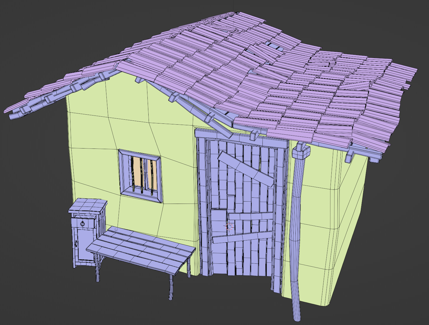
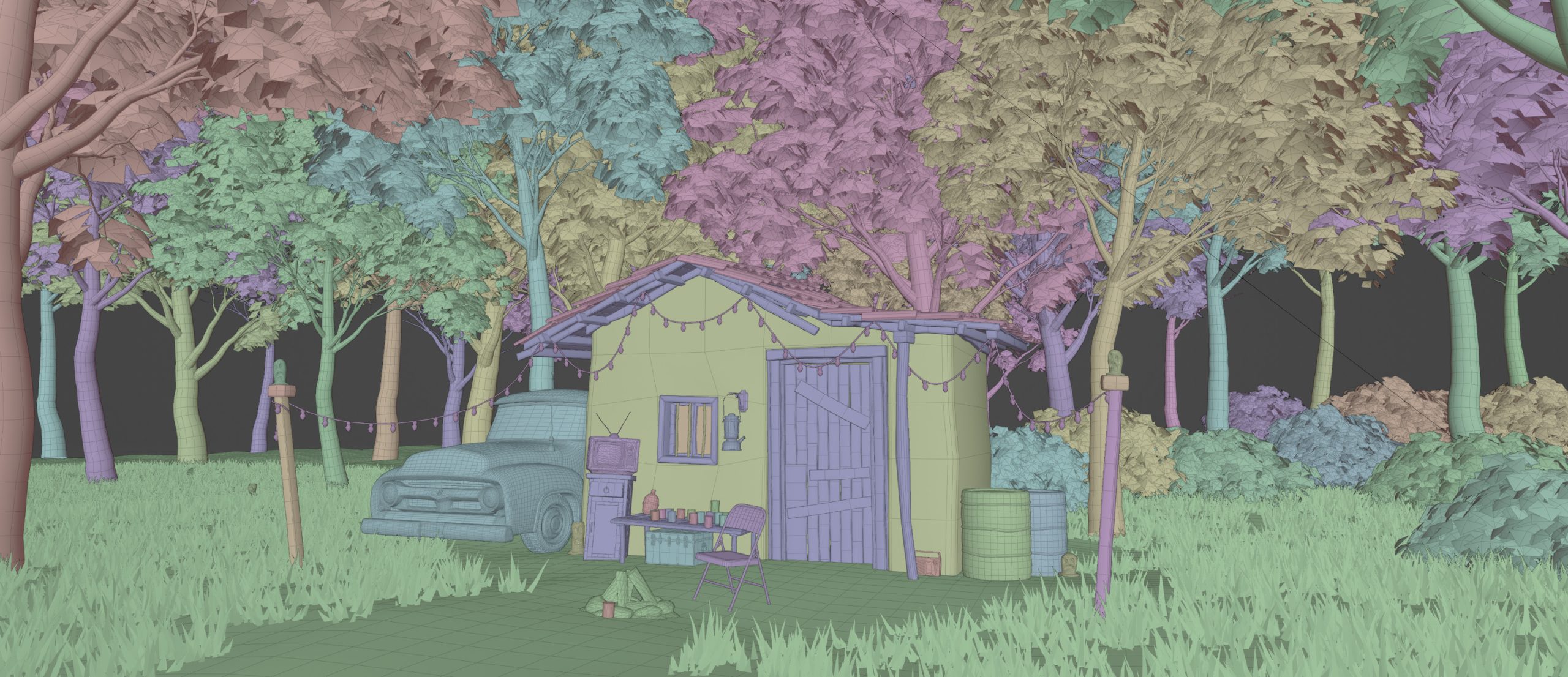
The underlying geometry of the building is as simple as it can be, with just bog standard box modeling, nothing more. The final result was around 34,000 triangles, with most belonging to the roof tiles.
In fact, the roof tiles are the only real exception, as they were created using array and curve modifiers to develop and twist the various rows. Some tiles were rotated by hand to achieve the disheveled, exposed-to-the-elements look
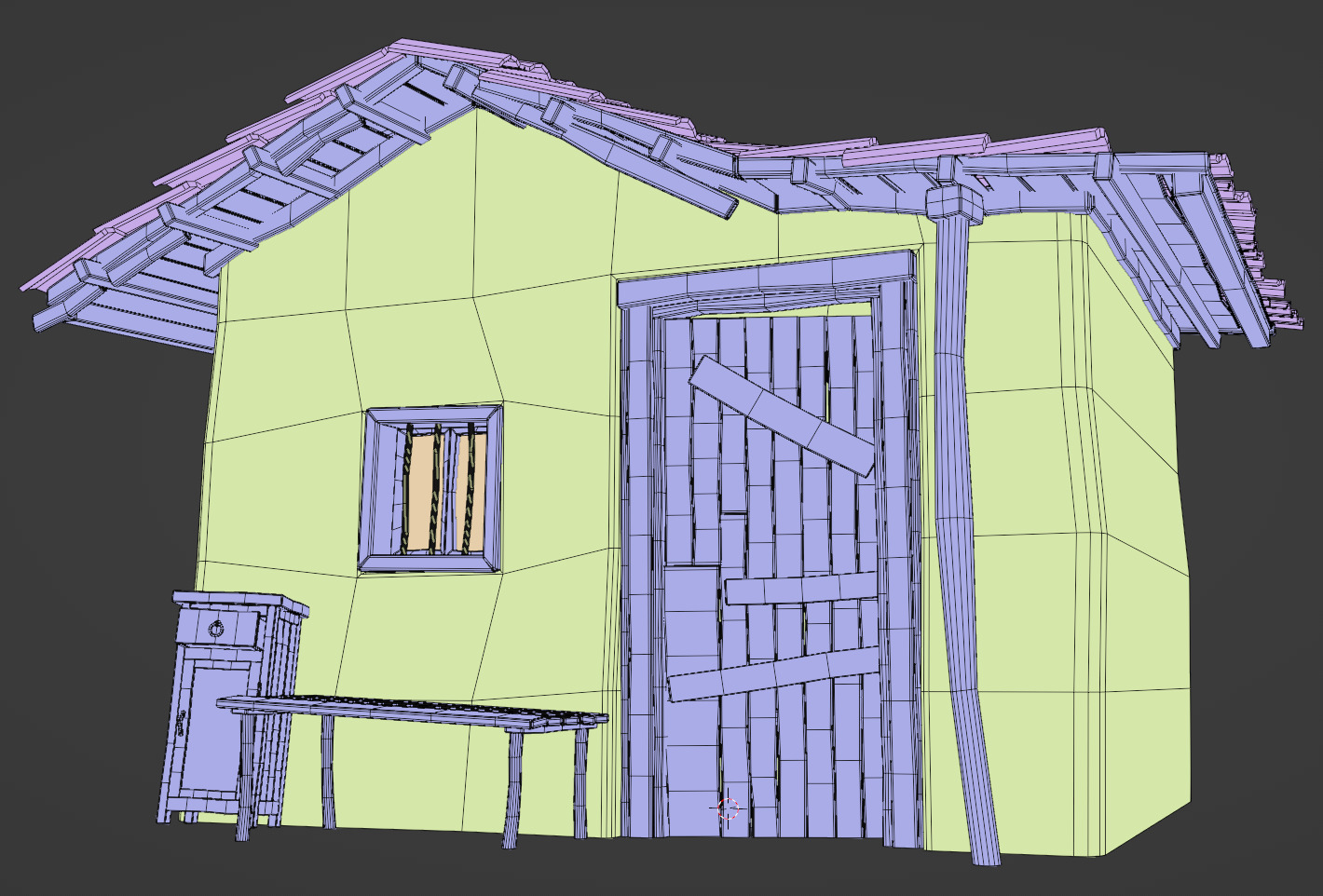
One thing I like to do, especially for older buildings and other aged objects, is to make my angles and edges slightly misaligned or crooked and never leave any sharp edge unbeveled, so things don't look too CG perfect. If you're aiming for a more realistic look, you'll want to keep things within the realm of reasonability, but a bit of random noise can go a long way towards making you models appear more interesting and lived-in.
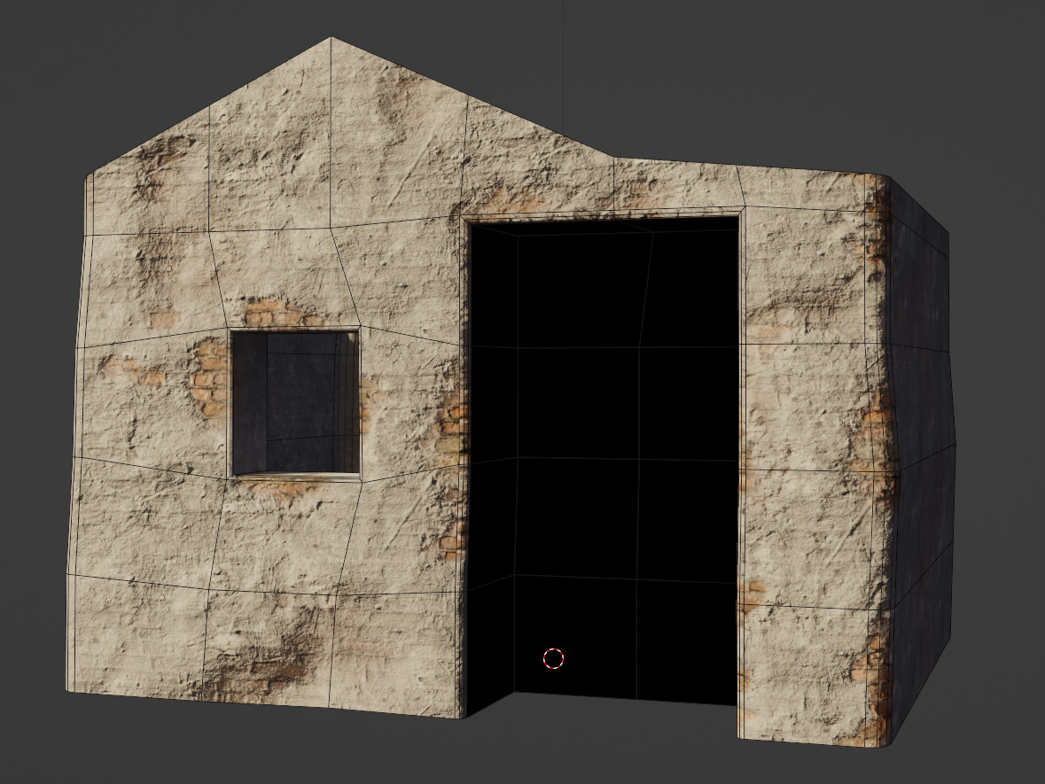
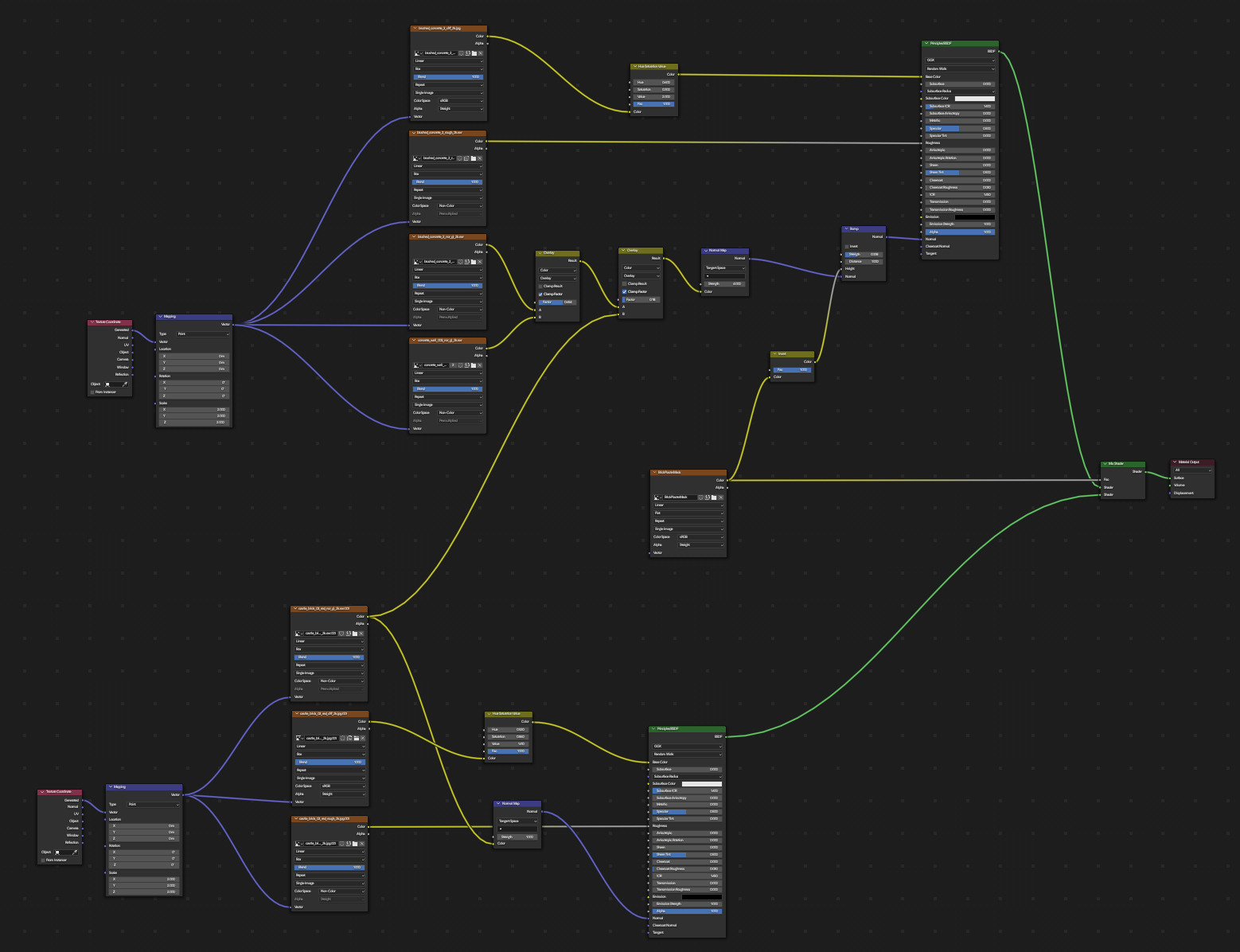
The texturing is where things get a little more interesting. In summary, its two PBR stacks - one for brick, one for concrete - each run through their own Principled BSDF node and are box-mapped onto the surface of the walls. Individually, they look like this.


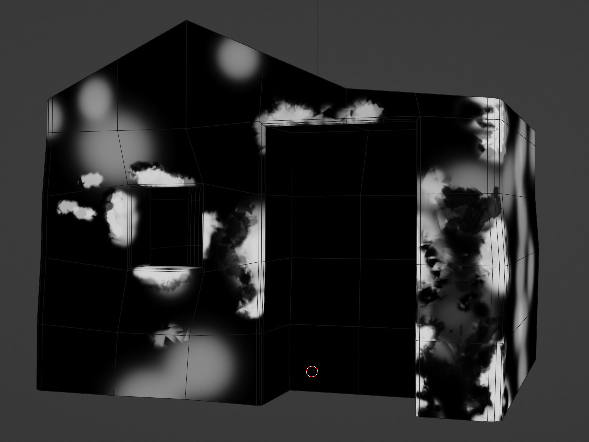
I then unwrapped the wall geometry, ran both surfaces through a Mix Shader, and used the UV Map to paint a mask image, as shown in the Alpha Mask picture.
Upon finishing, I realized two things:
One, the concrete didn't look like it was plastered over concrete. This was easily fixed by combining the concrete normals with the brick normals through a color overlay node, and allowing just a small amount of the brick to poke through it.
Two, the concrete lacked depth. Fortunately, I found a handy tutorial on Blender Secrets that showed me how to use my mask textures to add depth by combining them with normal maps through a bump map node. This tip was a lifesaver. You can check it out yourself below:
The final result, once everything was combined, looked like this:
And here is the node tree:
Texturing the wooden parts of the building was even easier. I simply unwrapped all the various wooden pieces, slapped a nice PBR wood texture onto them, copied and pasted them three times into three separate materials, and used a Hue/Saturation node to tweak the colors.
Finally, I used Fluent Materializer, an addon I am more than happy to plug, to texture the roof tiles and then baked the results down to a texture stack for use in Eevee.
THE TREES
The subject of trees is close to my heart as I have expended a tremendous amount of time and effort over the last couple of years trying to find a way to create cool-looking trees without having to pay for anything. My Blender expenditures come primarily from my beer and video game fund, which I have to use sparingly so that I have enough for both beer and video games. (Priorities, right?)
Initially, I used Maxime's Modular Trees with a custom leaf generator for all my tree-related needs. It's an excellent add-on, but over time, I found myself wanting something that would provide me with a little more granular control.
This need is what served as the impetus for my first fumbling forays into the world of Geometry Nodes. I won't recount the entirety of that arduous journey here, but with a ton of help from the Blender Artists community (shout out to Zorro Weaver, Josephhansen, Skuax, AlphaChannel, and probably tons of other people I really should be acknowledging), a very long list of handy YouTube tutorials, and specifically Местный ЛИС's geo node setup (which I still think is unparalleled when it comes to creating simple but great-looking trees.
I was able to bang together a fairly simple Geometry-node setup that produced decent results without having a high polycount.
But what's a 3D tree without its materials? For the bark, I found a simple solution: the RC12 Fantasy Tree Generator. It provides an excellent procedural bark material that can be easily tweaked to my every whim and need.
Finding the right leaf material was more challenging. I wanted a stylized look that was realistic but not photorealistic, and painterly while still capturing light realistically. After a good bit experimentation and agonizing over minute changes, I finally arrived at a solution that I was satisfied with. I was inspired by the simple yet effective trees in Melissa Perl's watermill scene. Though they're nothing more than a straight top to bottom gradient attached to an emission, they still give this neat, woodsy feel to her scene that I liked.
I used this approach for my tree canopies, creating a gradient attached to an emission node for the shading.
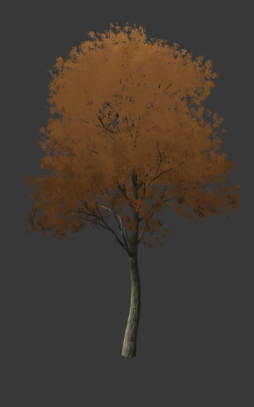
And after combining it with a standard Principled BSDF setup through a Mix Shader, I finally achieved the desired outcome: trees that were neither fully stylized nor photorealistic, but had a strong painterly quality.
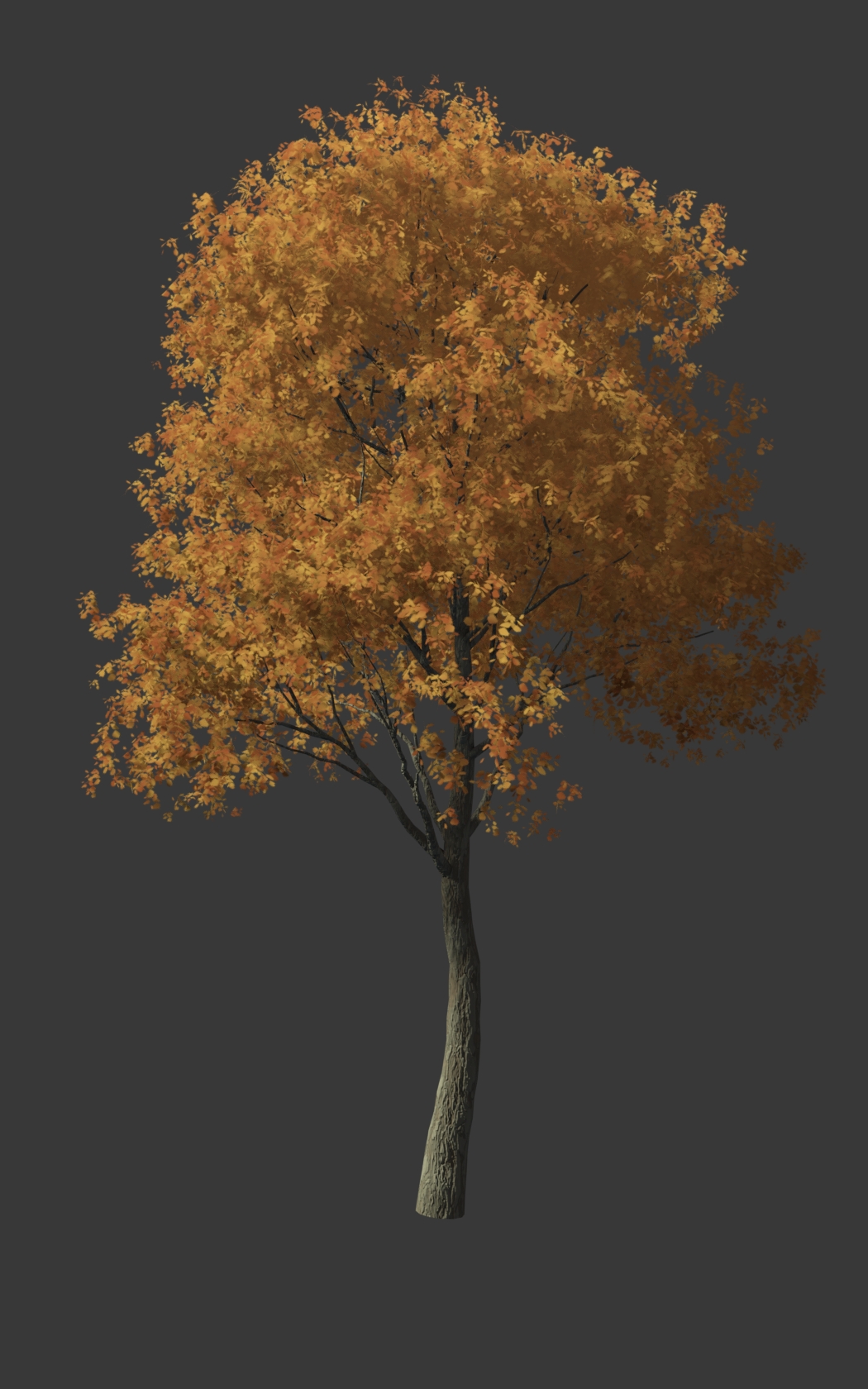
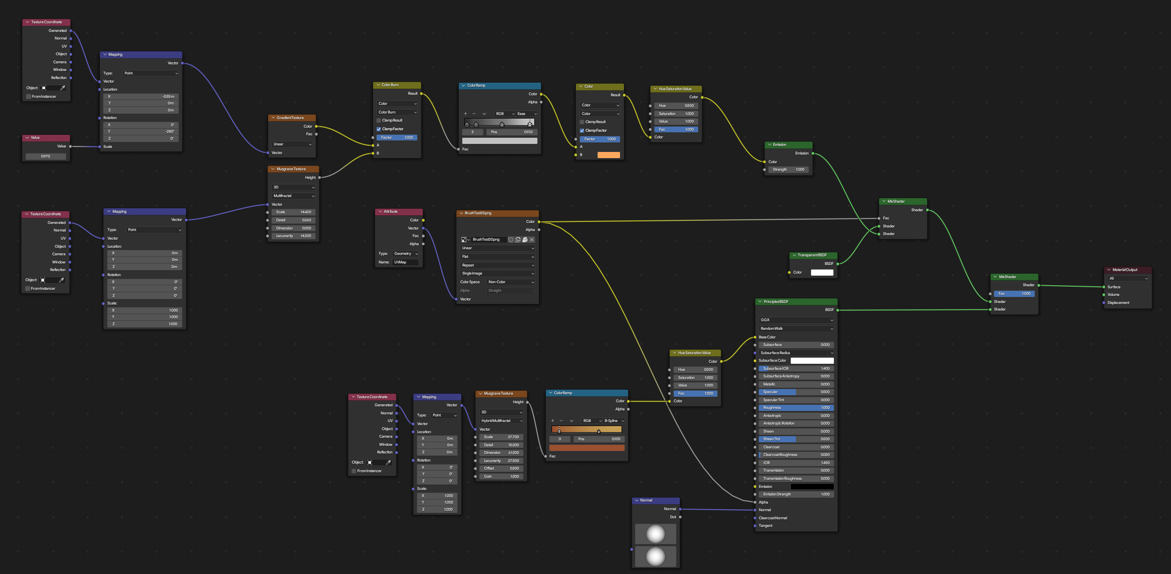
Here is the node set-up of the material.
THE TRUCK
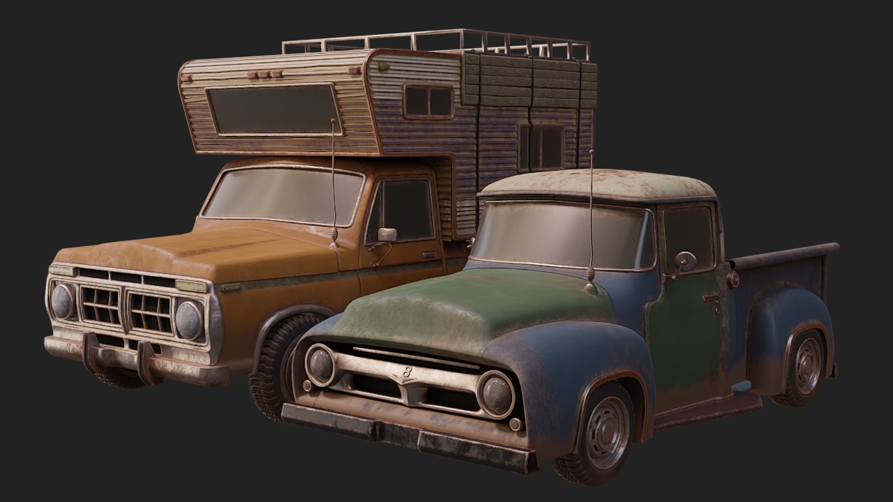
I regret having to leave out most of my campers and vehicles, as I had put a lot of effort into them. In the end, only the old-fashioned classical truck felt like it truly fit the scene to me, so it was the only one I kept. The others wait in silence, hoping, praying that one day they will get their chance to shine.
The truck that remained wasn't anything extraordinary in terms of design. It was only the third vehicle I had ever created, and I followed the standard processes I had picked up from a number of tutorials previously. If there was anything notable about my process while building it, it was that I decided to rely on my eye instead of blueprint planes. I assumed that I wouldn't be able to capture every angle and detail perfectly, and this approach would give the truck a more appropriate, stylized look for what I had in mind.

Surprisingly, it worked as intended. You can recognize the make and model of the vehicles I used as a reference, but they are far from an exact replica. I believe that the lack of perfect realism is what made them fit in with the rest of the scene.
The texturing was completed using Fluent Materializer, and it was also the first time I used UDIMs in a model.
THE LIGHTING
It goes without saying that the lighting is what makes or breaks your render. All the fanciest modeling and texturing tricks in the world won't save you if it's lit up with flat, boring blandness. To create an appealing render, you need bright spots to catch the eye, shadows that flatter the scene, and, most importantly, the one thing that no render can ever be considered complete without:
FOG, or atmospherics, if you want to sound a little more scholarly and academic about it.
My render is dead simple when you get right down to it. The lighting consists of nothing more than a single sun lamp plus whatever touches are contributed through the environment gradient. So what does it look like without the fog?
It's a box on a bumpy plane with some skinny trees scattered about. Big whoop, right?
However, with a bit of fog, it transforms into a small house at the edge of a mysterious forest on a crisp fall day, lit by the morning sun. It disguises the fact that the woods actually ends just a few feet away.
To put it simply, fog is cruise control for cool.
Once you come to terms with the basics of the Principled Volume, you can add so much to your scenes with a minimal amount of effort, and get away with doing a lot with a little. You can make your lights bloom, darken your corners, evoke whole seasons, all with the help of this one tiny, magical little node.
I wanted the sun to appear to be coming from the left, angled down slightly, where fewer trees lie to prevent breaking up the light. For this, I needed to set the anisotropy of the fog volume to appear thickest at the left side, amplifying the light there. To break up the fog, make it seem less like one contiguous sheet of cloud cover, I threw a Musgrave texture attached to a Color Ramp into the density slot, giving me nice little splotches (though in retrospect, I should've stretched it out a bit).
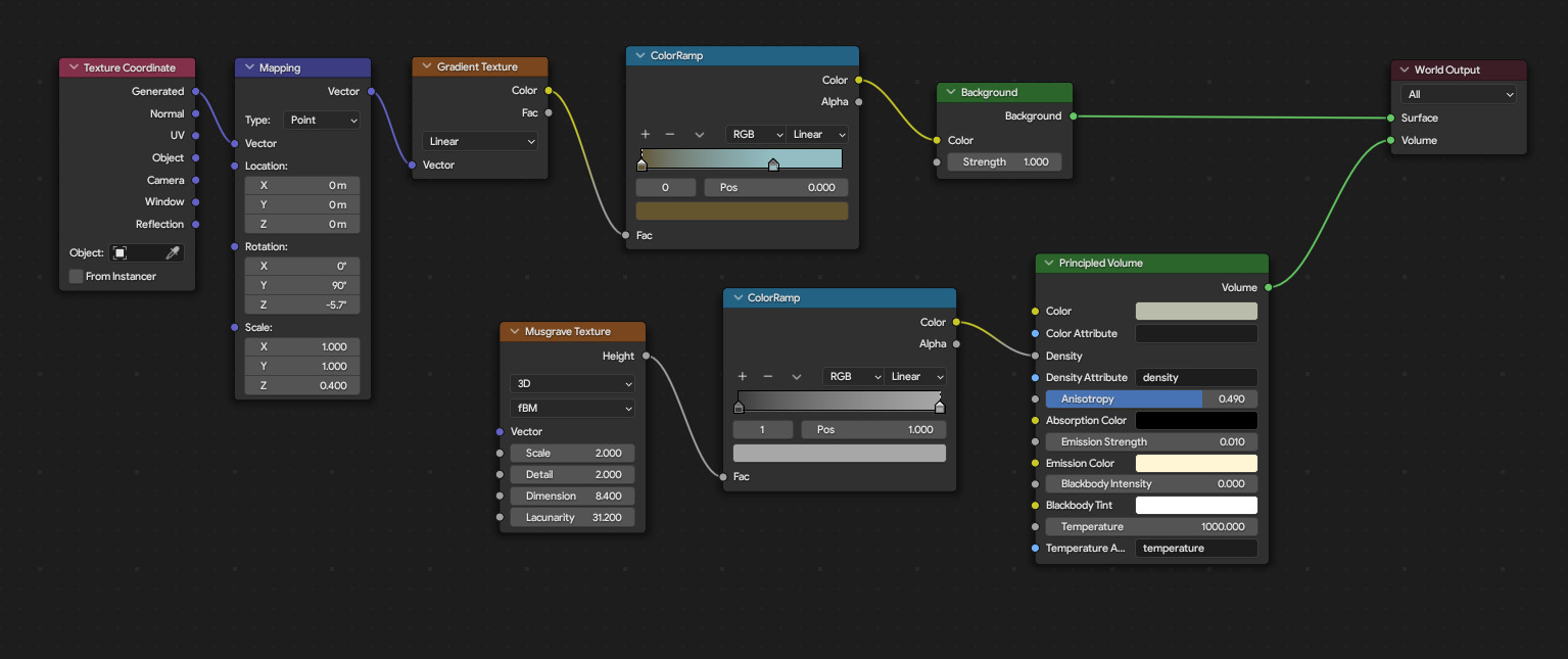
The final touch was adding the slightest amount bit of yellow emission to the volume, making it look like the sunlight is being diffused through the fog, rather than outright blocked by it.
RENDERING
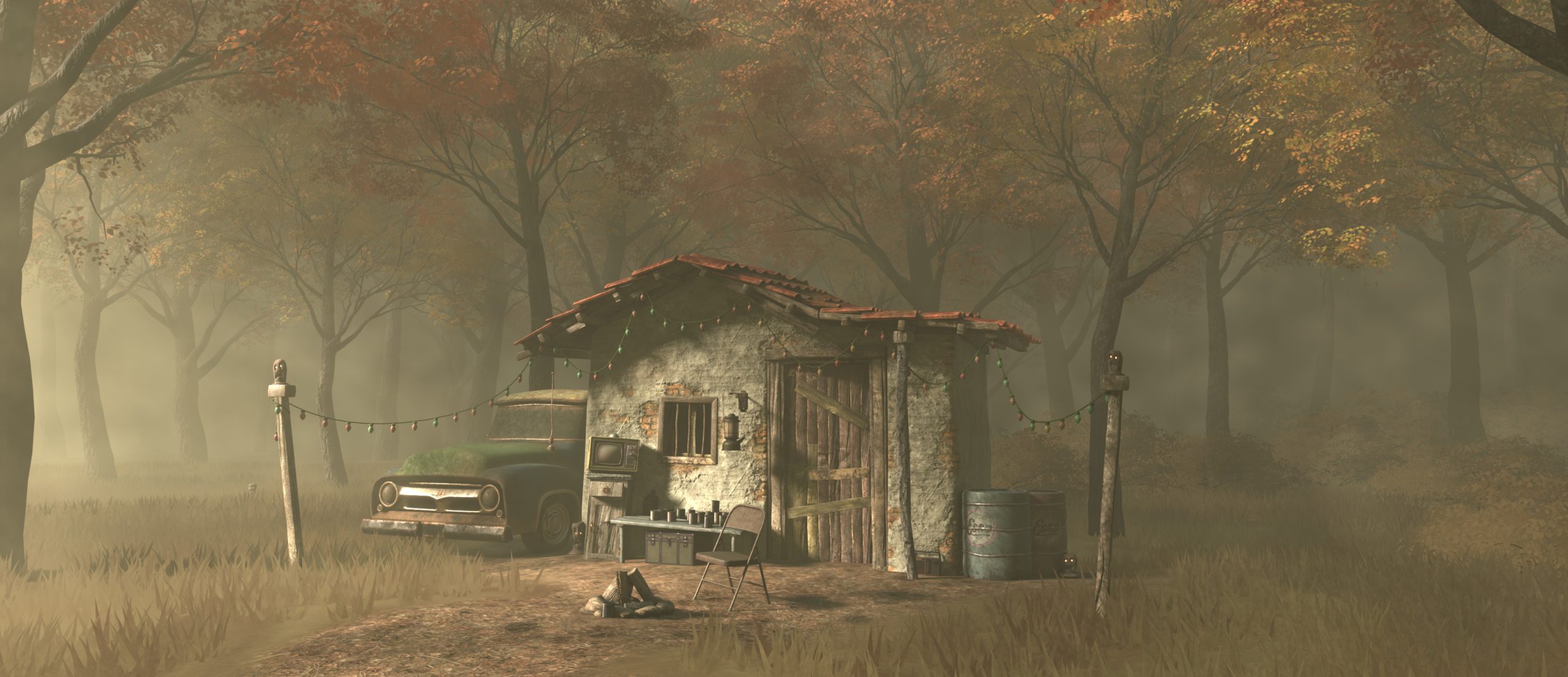
Below is the raw render, straight out of Blender:
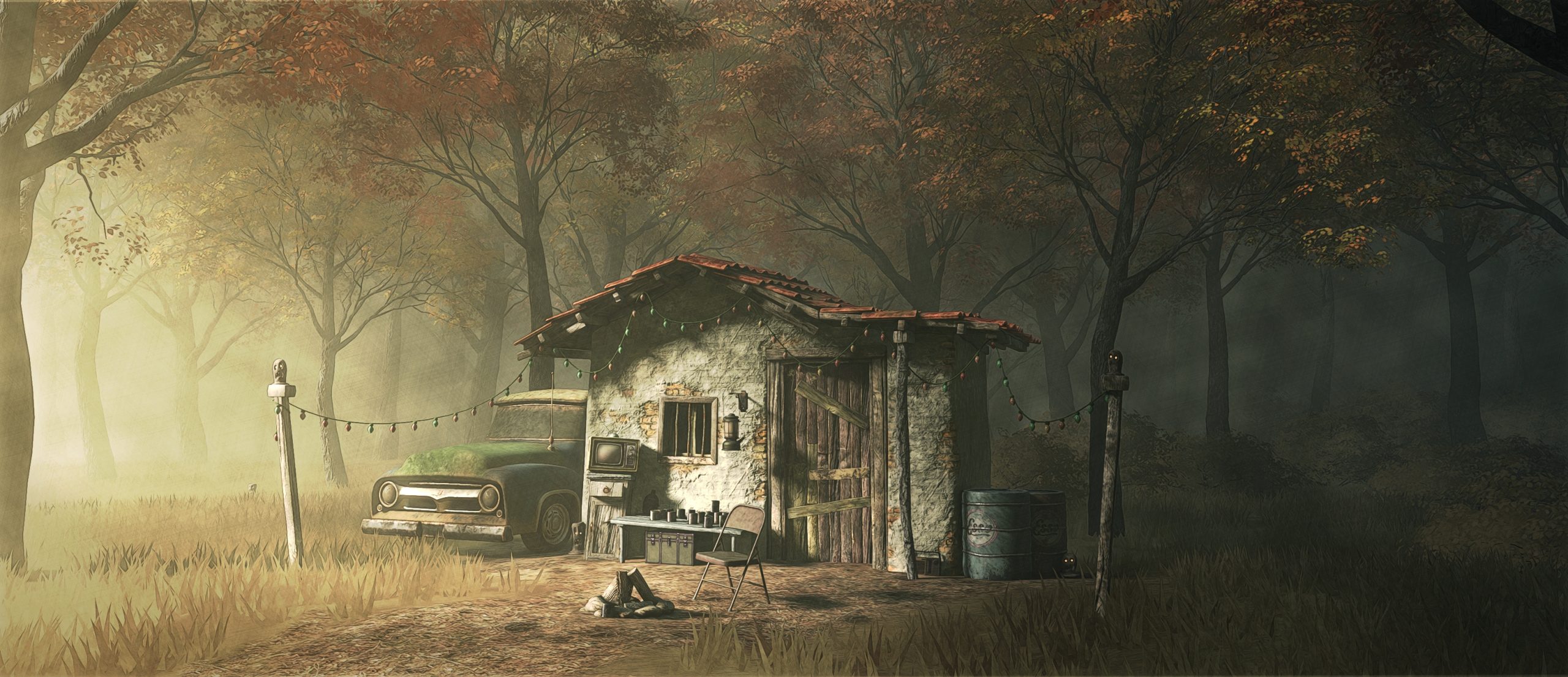
The rest of the lighting work was done in Krita. I added a white gradient along the left side of the image set to overlay to bloom the sunlight even moreso, a blue gradient along the right side to further cast that side of the forest in shadow, then ran it through the usual Levels and HSV adjustments to bring out the colors and contrast. The final touch was running the image through a couple of simple G'mic filters, Sketch and Pencil, which I then multiplied over the base, and set the opacity down low, giving it a sketchy, bolder look.
And the finished product...
WORKSHOP IN THE WOODS
Thank you for reading, I hope you enjoyed this article.
Have a nice day!
About the Artist

Matt Robertson, a hobbyist 3D artist living in the grand state of Georgia, USA.
1 Comment
Hi Alina,
if you would like to add a bent shape to your buildings to give them even more expression, please kindly take a look at the image gallery at https://blendermarket.com/products/matchstick - thank you!