

INTRODUCTION
Hi, I am Satyaki from India, currently living in Germany. I have been using Blender since 2015, though I've been doing digital/3D art since 2013. I am a self-taught artist and currently, I am using Blender as my go-to modeling and rendering toolset in my workflow.
INSPIRATION
I stumbled upon this art challenge held by Atomhawk titled “Forgotten Creation.”
So, I started brainstorming ideas. At this stage, I thought of mixing 2 completely different timelines and cultures.
The first one was the Terracotta Temple of Bengal, India (I come from around this place.)
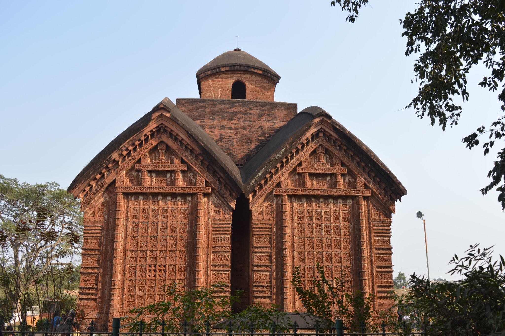
(photo credit: Shatarupa Dutta, CC BY-SA 4.0)
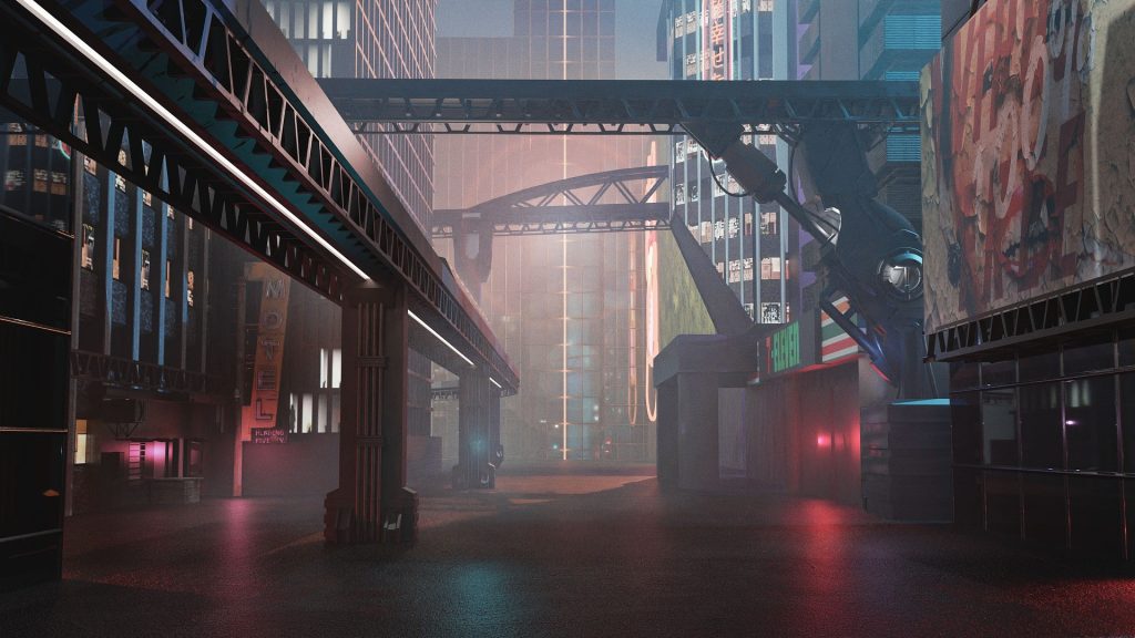
The other one was a cyberpunk.
Now my main challenge was to mix these two completely different genres and tell a story in the final render.
I thought of a concept where humans dared to harness the power of an ancient energy or weapon, only to be destroyed by the same power. All that remains is the ruins.
I thought of a tropical forest as the base of the set design for this concept.

(photo credit : Hanna Groß from Pixabay )
PROCESS
So, I started to brainstorm different ideas that fit the subject and collected references (a lot of them as usual).
Then I started with the concept designs. I used Clip Studio Paint as my drawing app for making the concept art.
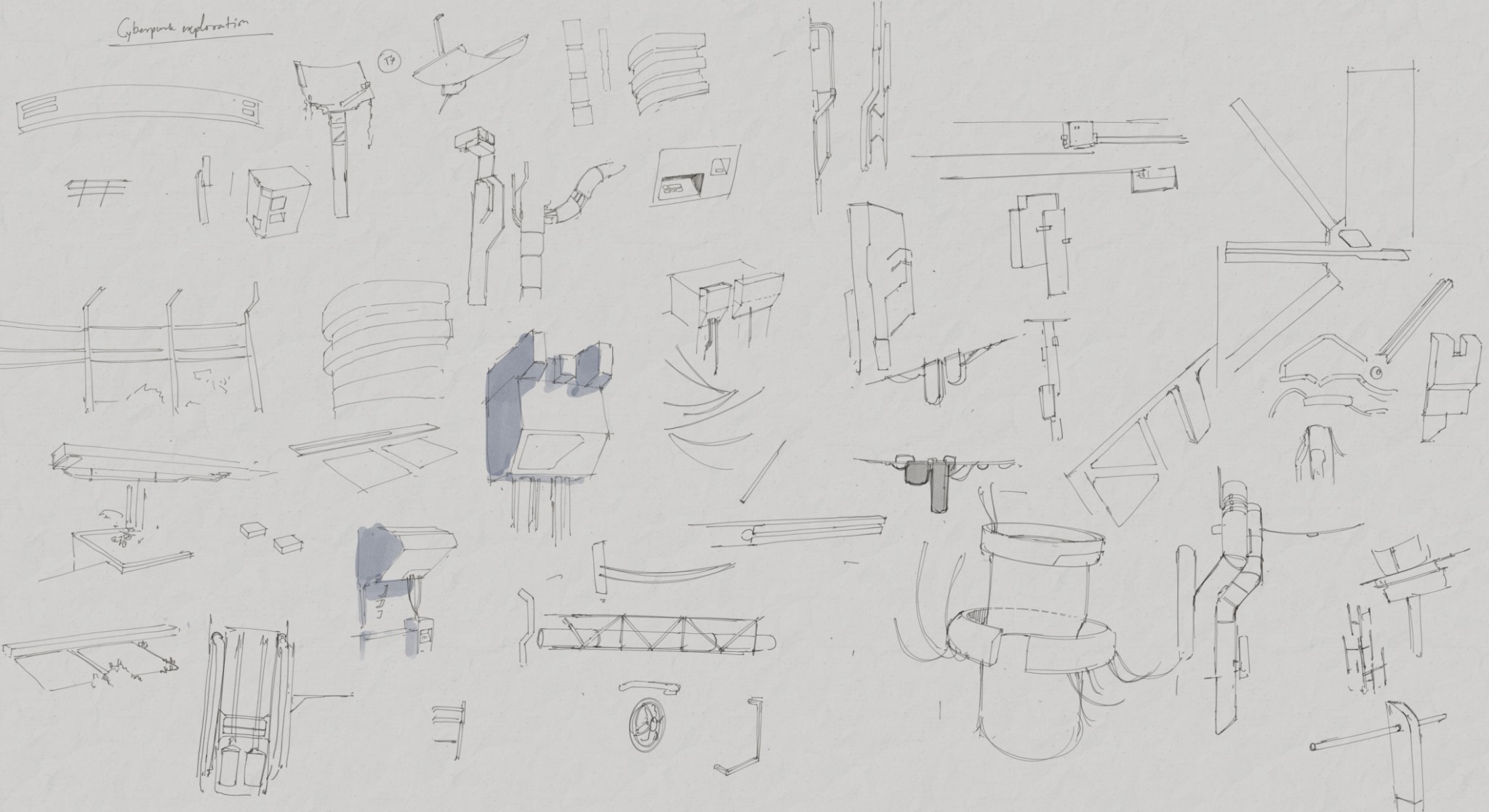
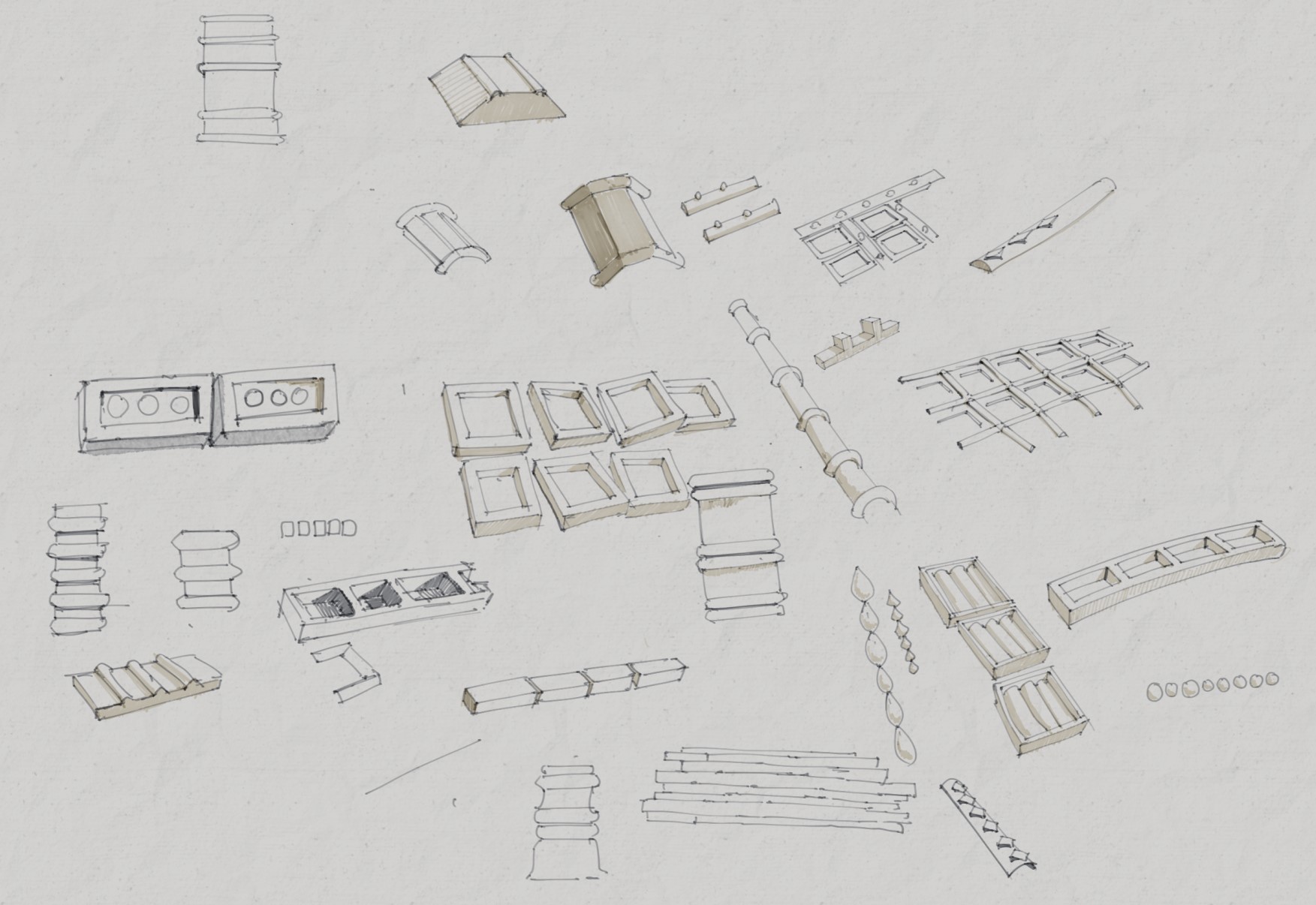
I always start with building a visual library by sketching from references, and I try to understand the elements of the design language from the references. These are very rough, and I think it serves the purpose.
The below sketch was done to explore the cyberpunk element of the scene.
Next, I started with designing some small thumbnails on the composition of the whole scene in high contrast grayscale. This helped me stick to the plan for such a month-long project. Early planning was very important to finish this in time.
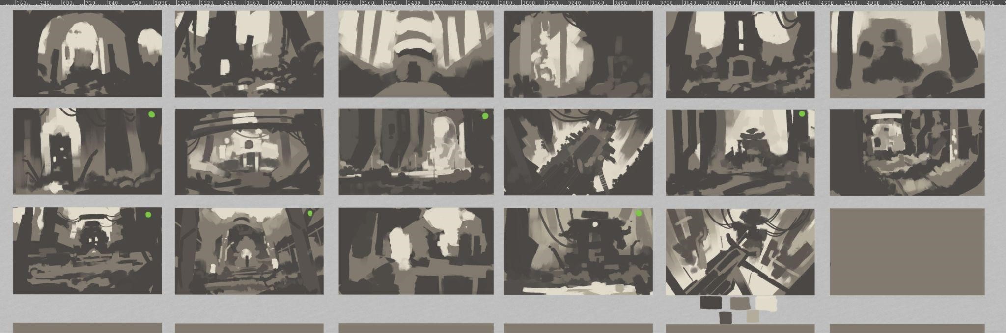
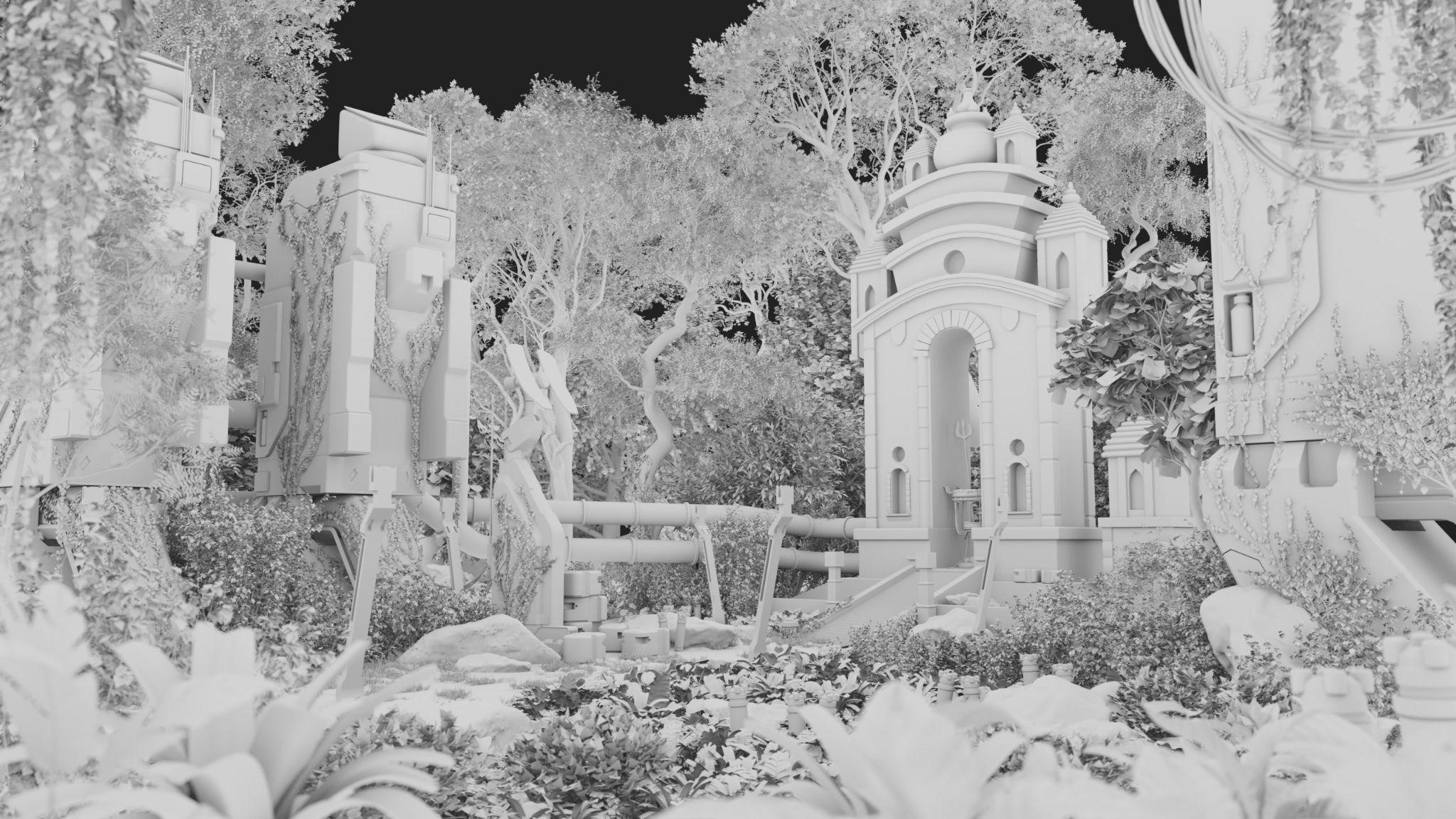
I chose one of them (out of the images with green dots) and made white-boxing in Blender. This was just a guideline of light and color value relationships.

DESIGNING THE PROPS
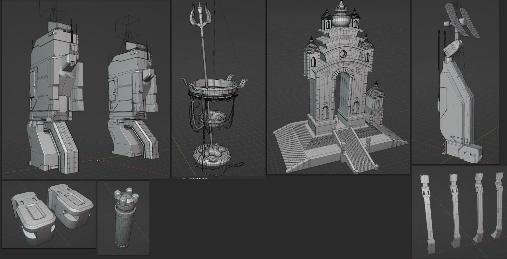
Since the temple is the center of attraction, I tackled it first.
I started with thumbnails, then a low poly base in Blender and a sketch-over on the screenshot of the low poly. The whole process is as below:
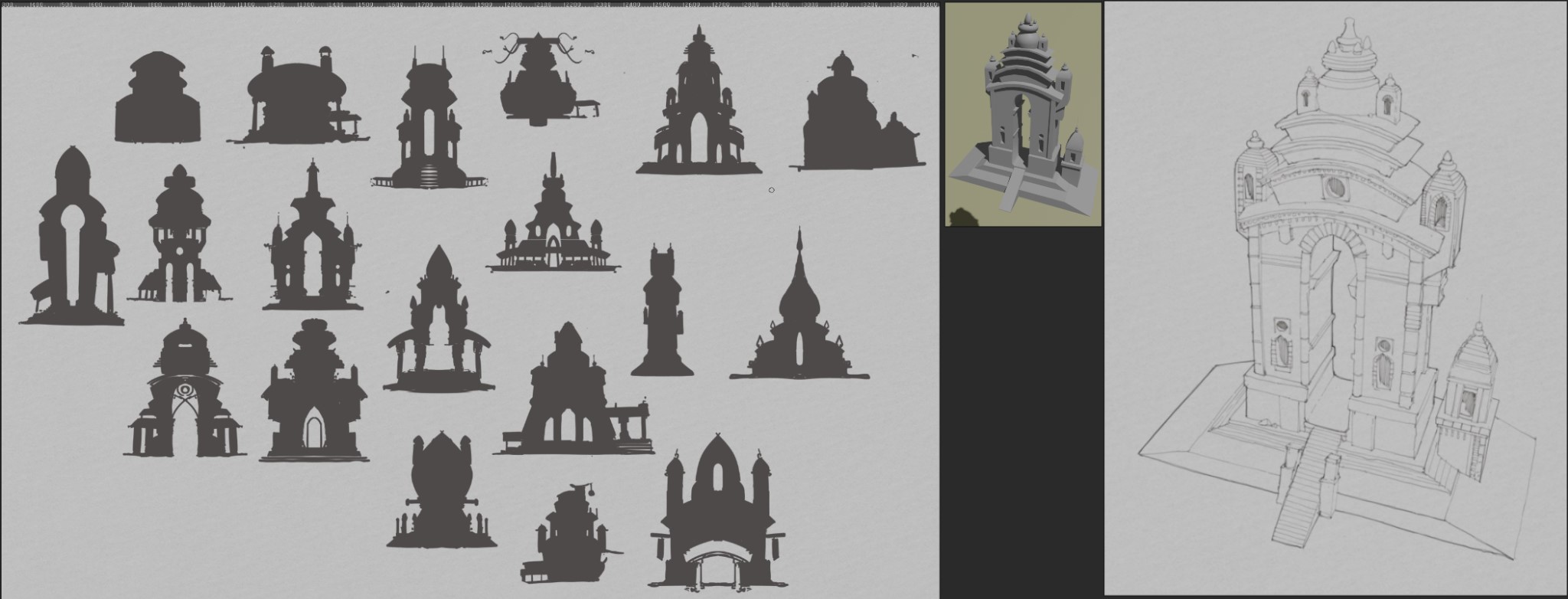
The control tower/communication radar/ power harness: I followed the same steps for designing the other props.
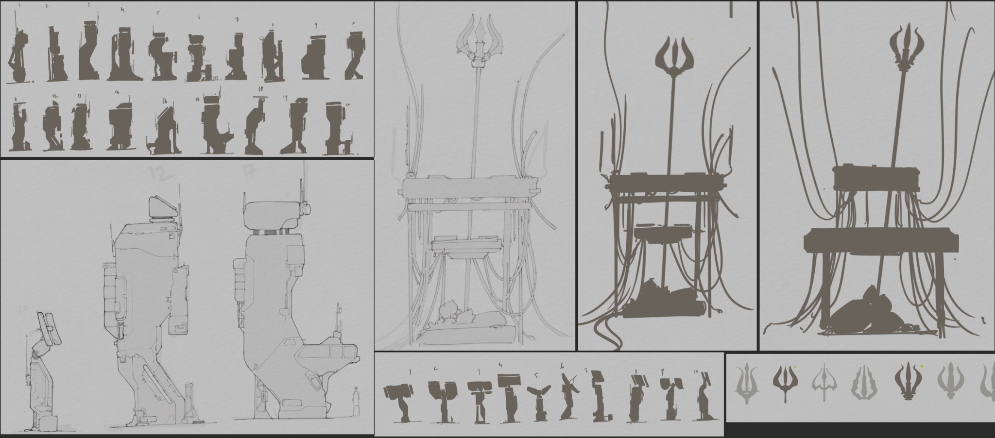
For all the other props, I straight up started with modeling and figured out the design on the go. I will get back to them later.
COLOR
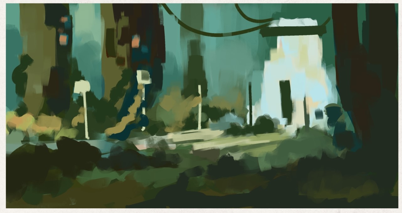
For every art, I spend some time exploring some color schemes. I generally make some color swatches of the color scheme and some thumbnail color sketches.
Below is the result of this exploration. I had not figured out the design of the props yet, therefore it was very rough and blocky. It just defines a guideline of color for the props.
Now that the color scheme is set, I started with defining the colors of my props. Below are the colored concept designs of the props:
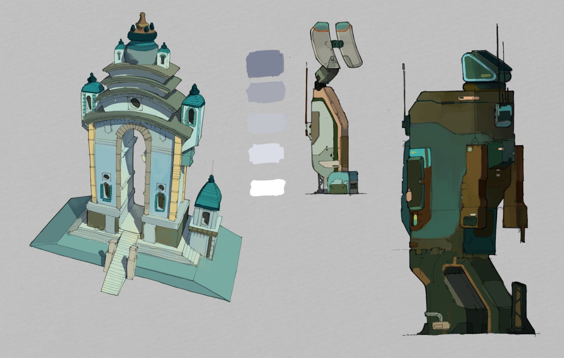
Figuring out color is very important for the project to stand out.
MODELING
Boxcutter and Hardops were a big help here.
Also, I recommend Arrimus3D’s YouTube channel for general modeling tutorials. Even though he works mainly on 3Ds max, the knowledge is easily transferable to Blender.
I use modifiers a lot during modeling, especially mirror, solidify, and array wherever applicable. It speeds up the modeling process.
I did not require to make my models subdivision friendly, so I skipped cleaning up the boolean mess for many of the props.
TEXTURING
UV: I used Blender to generate all my UVs. I also used UVPackmaster Pro 3 to pack the islands. Blender does a decent job of packaging, but UVPackmaster Pro takes that to another level.
Making UVs for all of these assets is a time-consuming process. But without good UVs, the texturing would be very hard to manage.
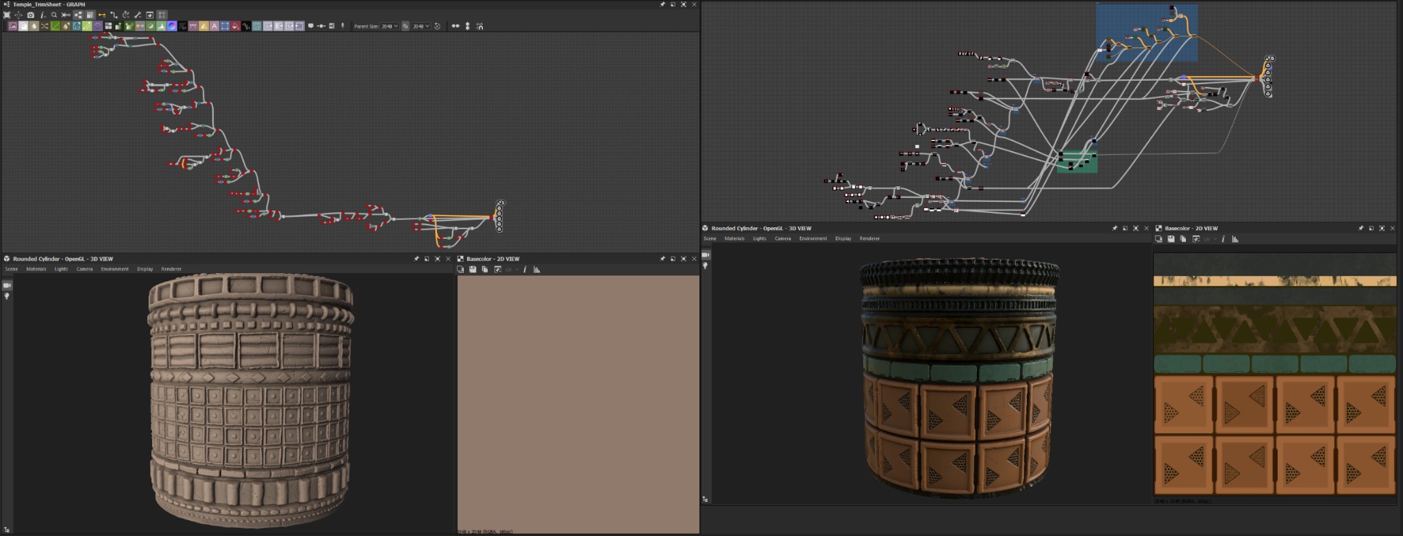
TRIM SHEETS: While figuring out the visual library of these temples, I quickly realized that a trim sheet would be necessary to quickly add tertiary details for the models.
Generally, trim sheets are used for memory optimization. Here, I used it as a design palette. I made some quick visual library sketches for the details.
Then I fired up Substance 3D Designer, and started making the trim sheet. It was my first time making one, so trial and error took some time, but I finally got what I was looking for.
This tutorial helped me alot for this: Create Detailed Tile Trim Textures in Adobe Substance Designer w/ Javier Perez | Part 1: Stone/Brick
I made two of them; one for the temple and one for the sci-fi floor. Below are the trim sheets in substance designer:
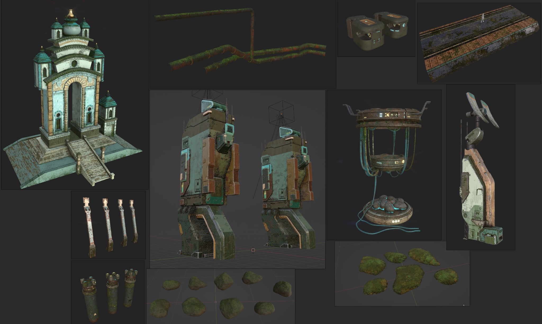
TEXTURING IN SUBSTANCE PAINTER: Texturing is a very iterative process, and it takes time to figure out what looks best.
Anyways, I took my time and below are the results of it.
I used normal maps of the trim sheets on the temple and the layers were so many that it started to lag. So I had to export the textures and re-imported them into a new project in Substance Painter to continue the process.
SET DESIGN
After finishing up the shader setup for all the assets, it was time to integrate them all into a whole i.e the environment.
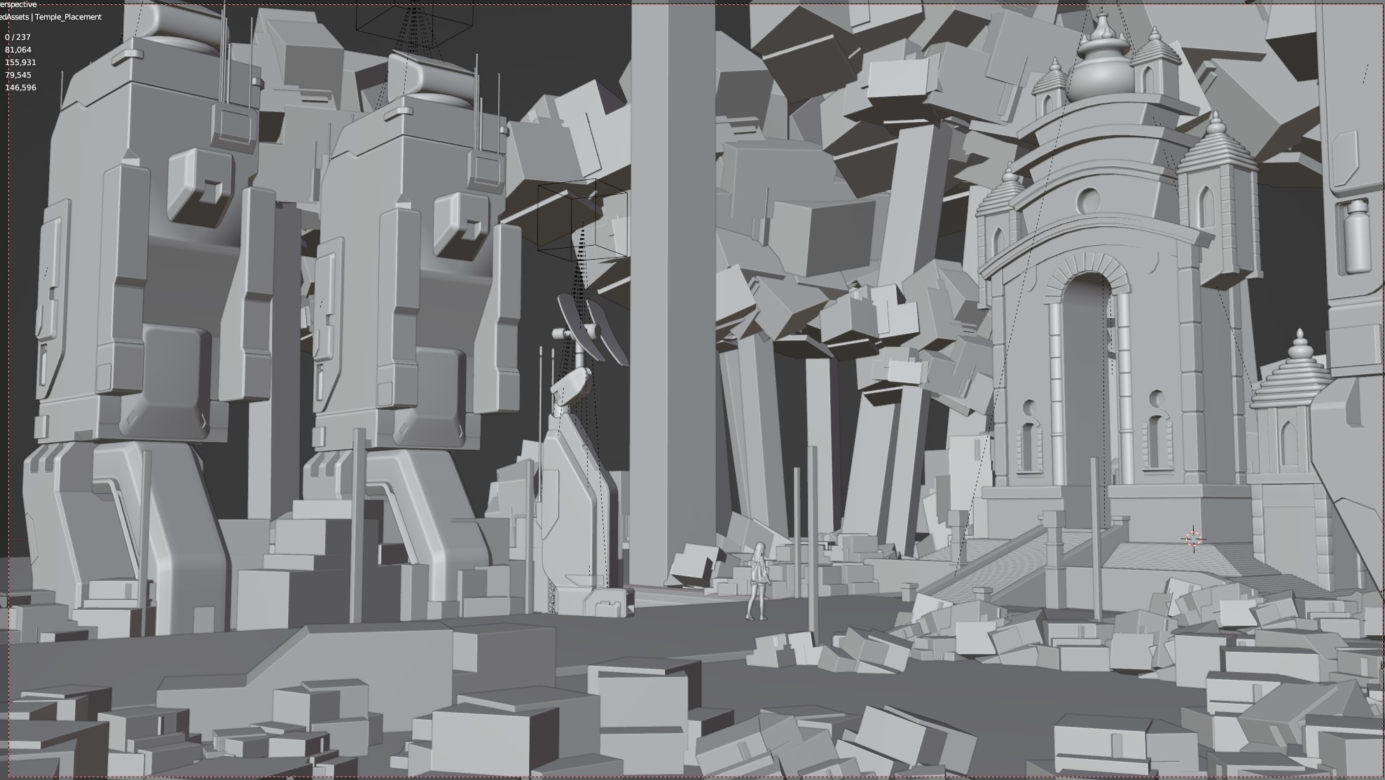
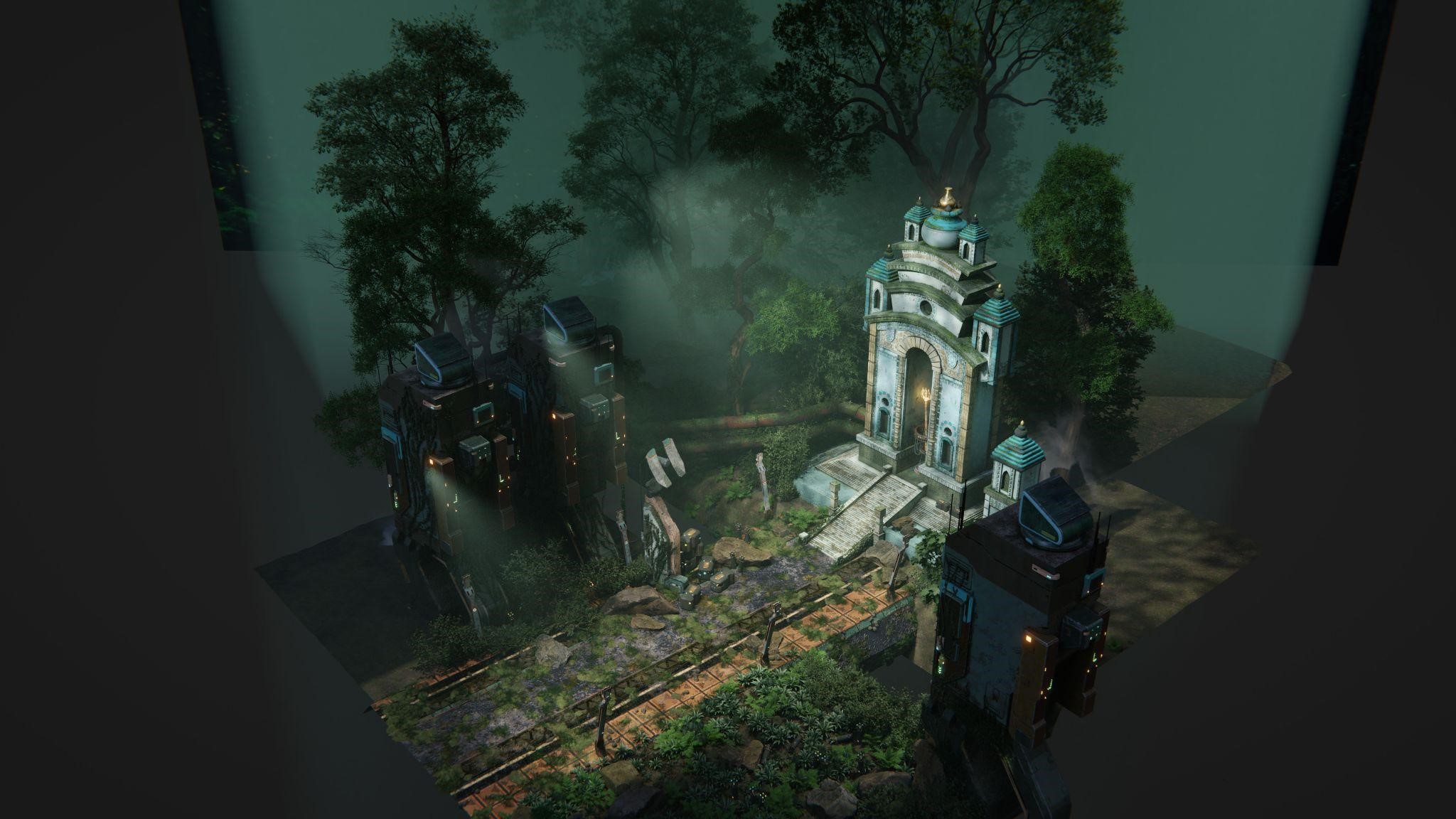
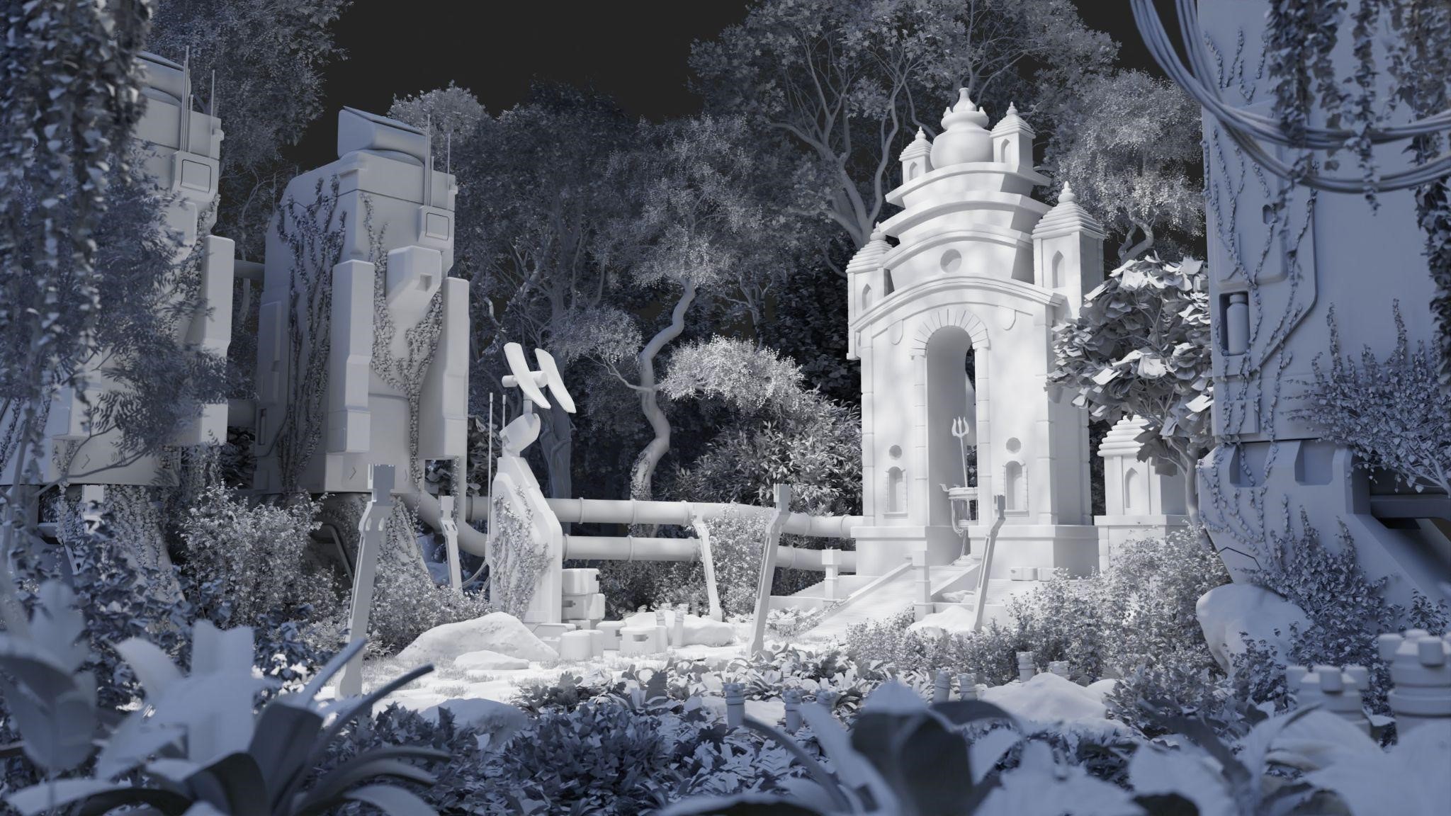
Using the whiteboxing as a guide, I placed my camera at the initial stage of the process. This is where I started placing the main assets into their places:
VEGETATION
Foliages were the binding factor for this environment to look alive. Also, foliages are costly in terms of hardware/resources.
I used several paid add-ons for this.
- Botaniq: For distant foliages. It is a large library of various plants. This plant library is most suitable as a filler, and not as a hero plant. They have gorgeous vines though.
- Grove 3D: For making custom trees. I made the twigs myself and made some trees out of it. This is a great add-on for making photorealistic trees with a lot of parameters to tweak.
- Scatter 5: Scatter is really good for quick distribution of assets on the ground. It has its own biomes libraries which comes in handy. Also, it has a lot of features (most of which I never used).
I also imported some plant models from Polyhaven and used them as foreground elements.
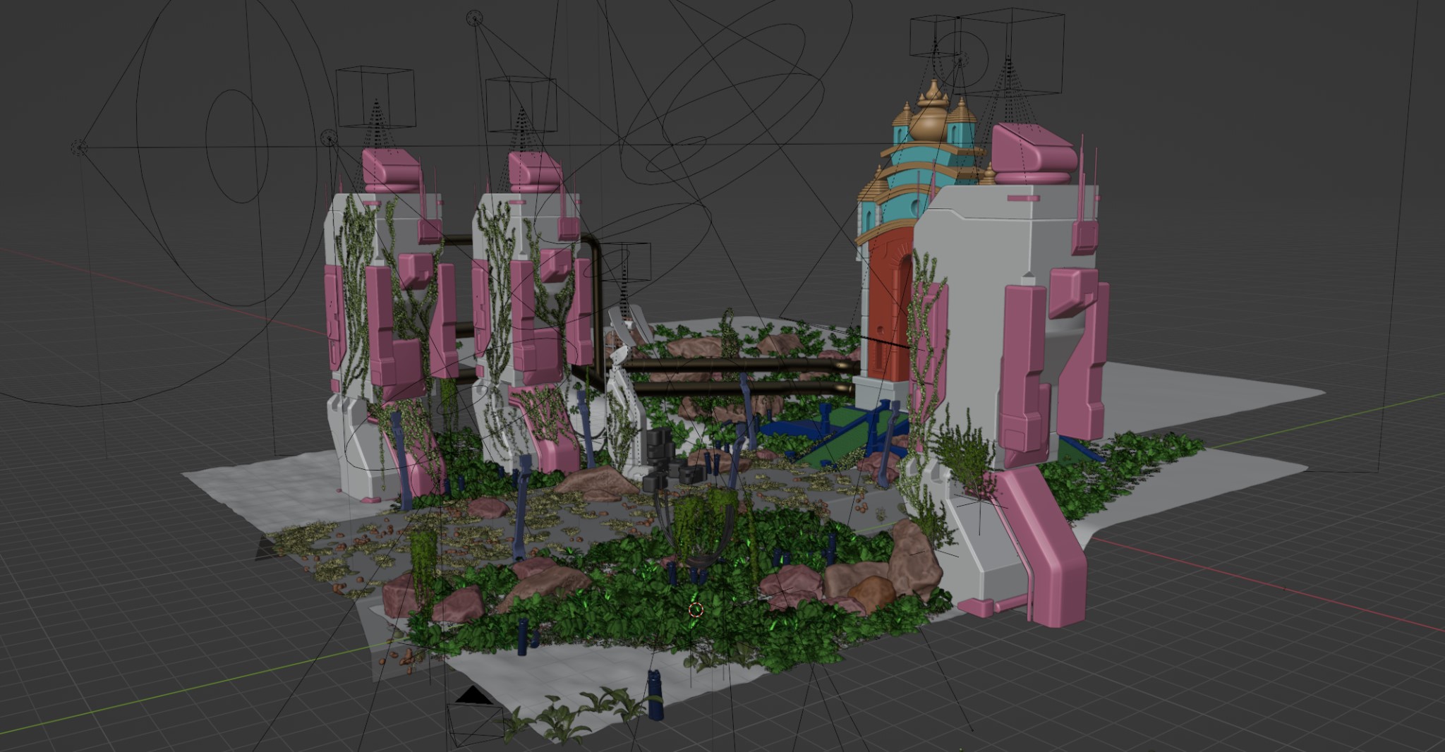
After tweaking with all these amazing add-ons, I got this:

A set design with the foliage and assets.
LIGHTING
In my opinion, lighting is the single thing that alone can make or break the final product.
I followed the thumbnail I made during block-out to design the lighting.
I started with an HDRI with 0.1 intensity; it’s just something for the shiny materials to reflect.
I used an image of a jungle for the distant background of the environment. Here I started the light with just the HDR and a Backdrop.
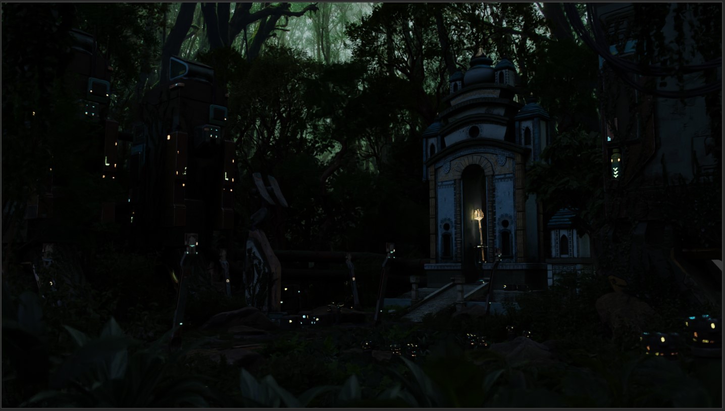
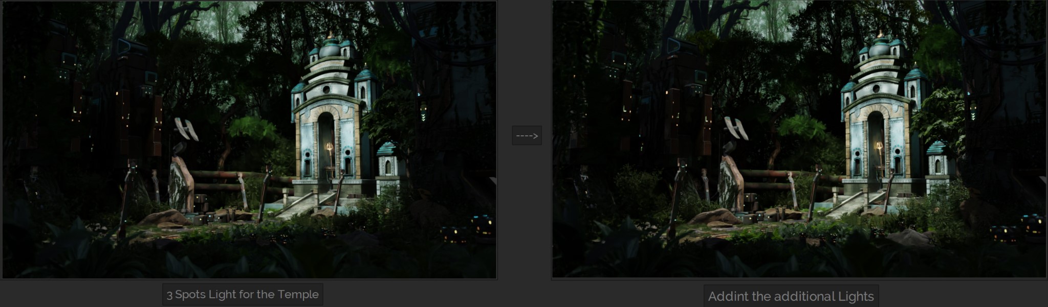
It started like this. Then I added 3 Spot lights for the Temple, some lights to make the nearby vines translucent. I used some light for the contour of the towers.
I additionally added a sun with a blocker just for the road. Below are the lighting without volumetric,
It’s a good start. But environments don’t look realistic without an atmosphere.
So I added 2 cubes (one in front, and the other in the distance) with a volume shader and placed it in front of the camera and made sure it covered my whole visibility.
I also added some 2D planes as cloud texture to add some mist to the environment.
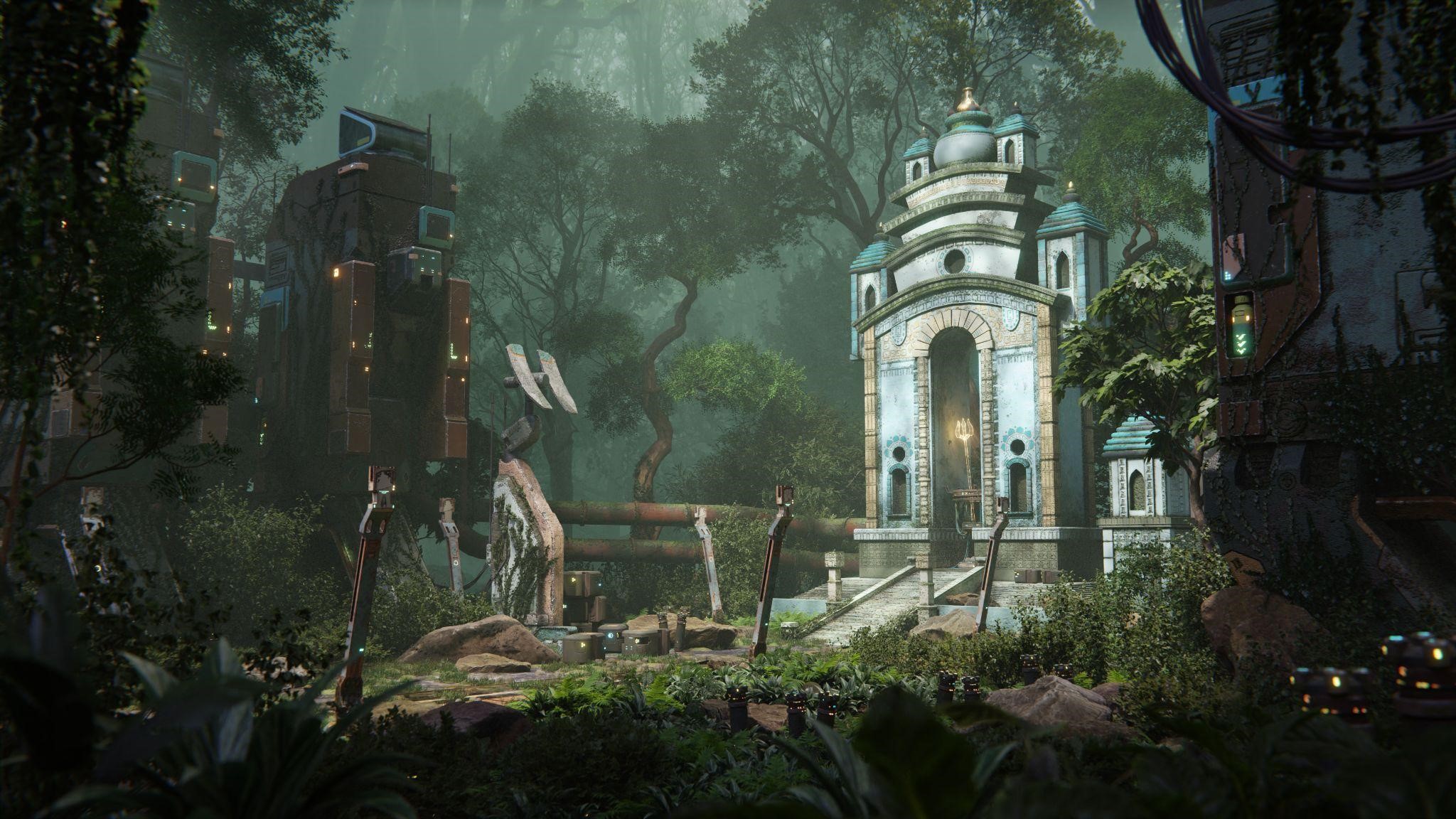
After adding lighting with volumetrics, now we are getting there: (lighting with volumetrics)
POST-PROCESSING
Now that my image was finalized, I started working with Blender's compositor.
Normally, my post-production steps are very simple. I add vignette, glare, and small lens distortion.
This time, I wanted to explore the color correction/color balance too. For that, I wholeheartedly recommend Chocofur’s YouTube course regarding this. I learned to use scopes too from that tutorial.
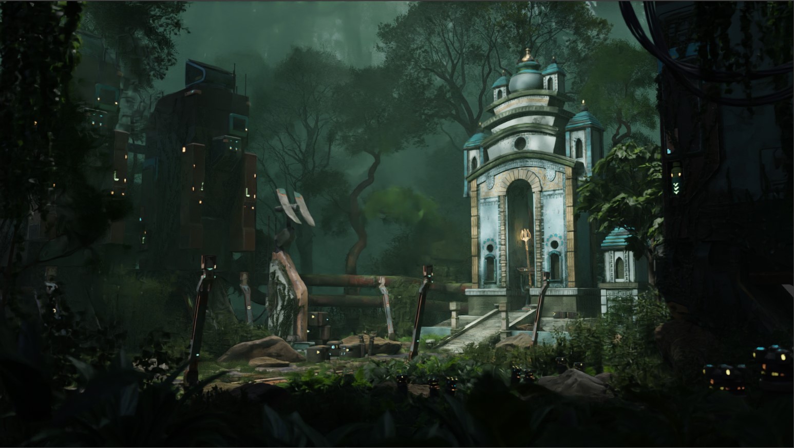
This is the end result after post production in Blender:
Then I did some little brushing in the opening of the windows.
FORGOTTEN CREATION

Thank you for your time, I hope you enjoyed reading this article and learned something new!
Have a nice day!
About the Artist

Satyaki Mandal, a 3D artist from Germany. He is currently pursuing a career in the field of game art.
2 Comments
What an excellent breakdown, thank you! Great scene, and thank you for the tutorial suggestions.
Thank you so much for the kind words!