
Blender 3.0 Gets UI Facelift

Pablo Vazquez has been unleashed! After adding the colored noodles a couple of weeks back, he is back with some more UI changes, this time implementing his long worked-on UI face-lift for the milestone Blender 3.0 release, as well as more node-based visual enhancements.
A la Node
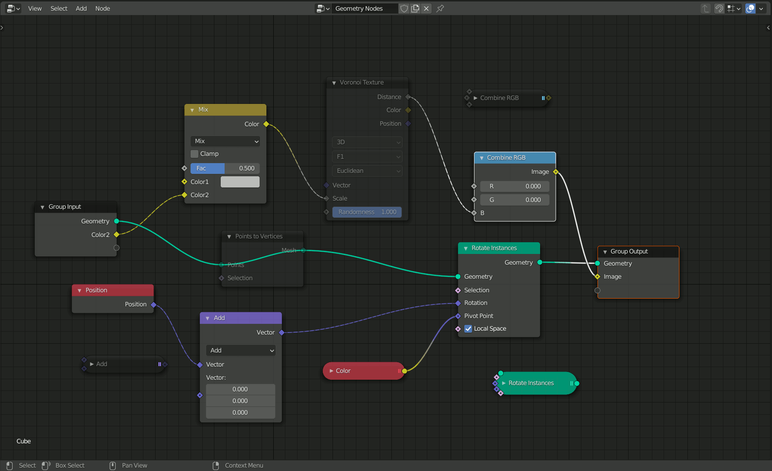
The nodes’ design refresh aims to reduce visual noise and increase readability, as well as address multiple other issues. Here’s what Pablos’ description of the changes:
Issues to solve:
- The header background is currently drawn using a theme color fully opaque, this limits the colors we can use because the node name/label is drawn on top.
- Hard-coded transparency makes nodes hard to read. The node backdrop already has alpha so if the user wants it they can set it. This patch uses alpha from the theme.
- Better muted status indicator, instead of simply making everything transparent and the wires inside red, draw a red outline around the node, darken the header and backdrop.
- On muted nodes, display wires behind the backdrop to not interfere with text/widgets inside the node.
Nodes:
- Darken header to improve readability of node label.
- Draw a line under the header
- Thicker outline.
- Do not hard-code transparency on nodes, use the theme’s node backdrop alpha component.
- Use angle icon instead of triangle (to be consistent with the changes to panels)
New-I
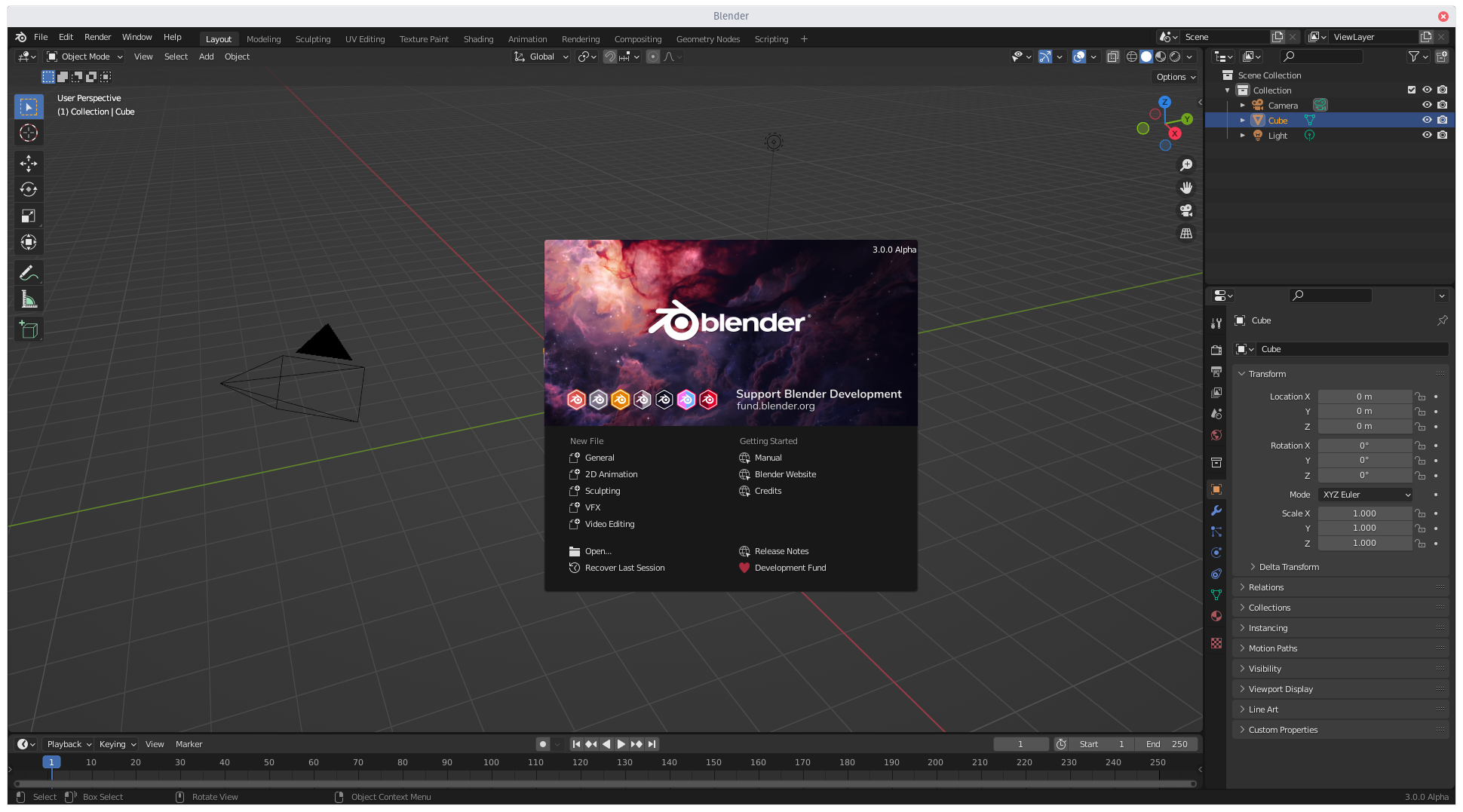
Pablo wanted to mark Blender’s milestone 3.0 release with a theme refresh, one that wouldn’t alienate regular users, but rather enhance and work along the lines of the popular 2.80 theme redesign. Here are the changes according to Pablo:
The theme for Blender 2.8 was well received but presented a few flaws.
- Transparency on menus and tooltips reduce readability
- Mismatch on certain colors, especially outlines of connected widgets
- Active/open menus highlight was not prominent enough
- Header background mismatch in some editors
At the same time we can make use of new features in 3.0:
- Make panels look like panels again (like in v2.3!)
- Make use of roundness in more widgets
- Since nodes are no longer hard-coded to be transparent, tweak opacity and saturation
- Tweak colors for the new dot grid
Check out Pablo’s latest Blender today to see him walk through these changes:
Download the latest Blender daily build to check out these changes first hand!


Us old people appreciate readability improvements. Contrast helps.