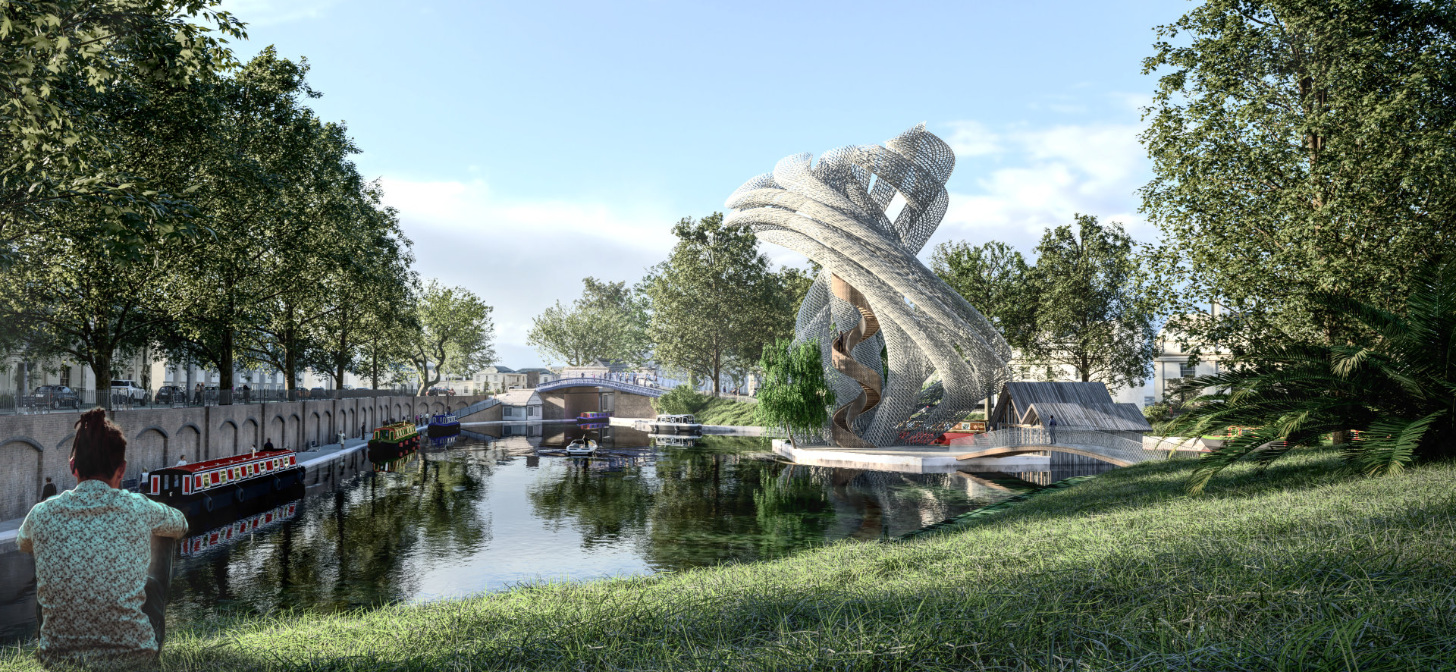
Behind the Scenes: Tower in Little Venice
About me
I am a project architect working on medium-to-large projects at HOK in London. I tend to to work during the earlier stages of design, where I am responsible for turning the client’s requirements into an architectural vision. I love the impact of architecture and the potential it has to improve people’s lives and the urban environment.
I am also an avid Blender user since 2007. I use Blender daily alongside Rhino, Grasshopper, Revit, the Affinity Suite, and lately Krita. The lucky younger staff in the office that work with me have to learn how to use Blender professionally as well, and typically, they tend to be pretty happy to pick up Blender.
I also run UH Studio and UH Studio Design Academy. UH Studio focuses on smaller and visionary projects that bridge my interests in the intersection of design and technology. The Design Academy is primarily focused on raising awareness for alternative architectural workflows with Blender and other software.
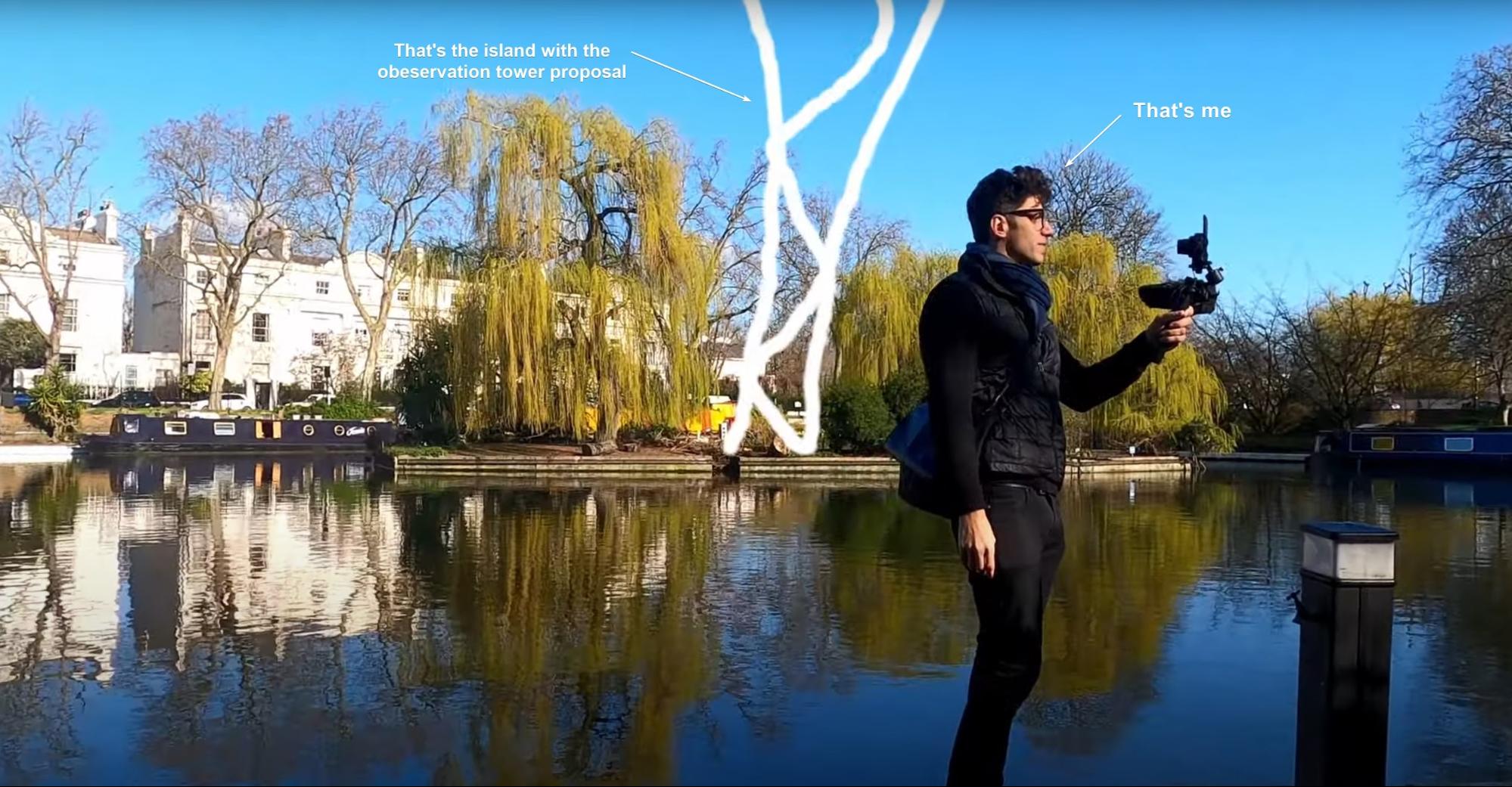
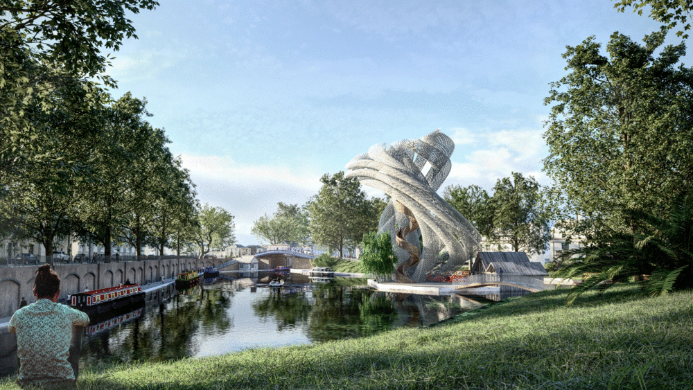
The idea
I was inspired to create this project based on my daily cycling commute through the canal and I always thought that the wide-open area would be perfect for an observation tower.
Here is a video describing the architectural concept:
Portraying the project
Here is a video walkthrough of the process:
The base
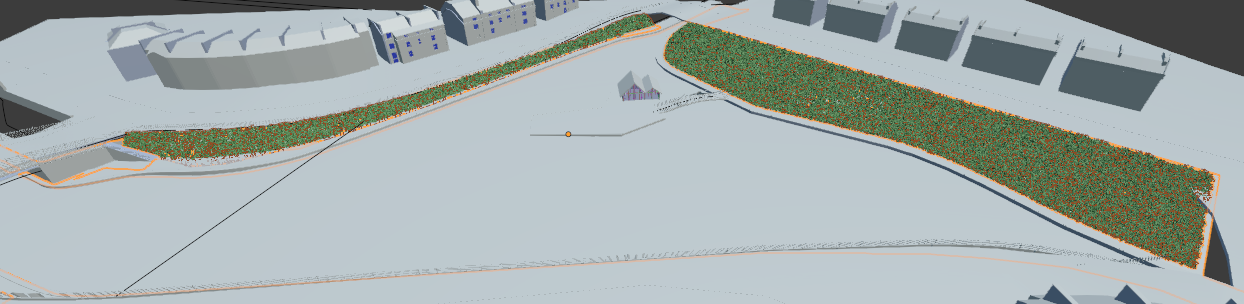
To start being able to visualise the project, a satellite image was used as a base. Luckily, satellite images of London tend to be fairly high resolution, so they make a good starting point. The image was imported into Blender as a plane and scaled to the right size.
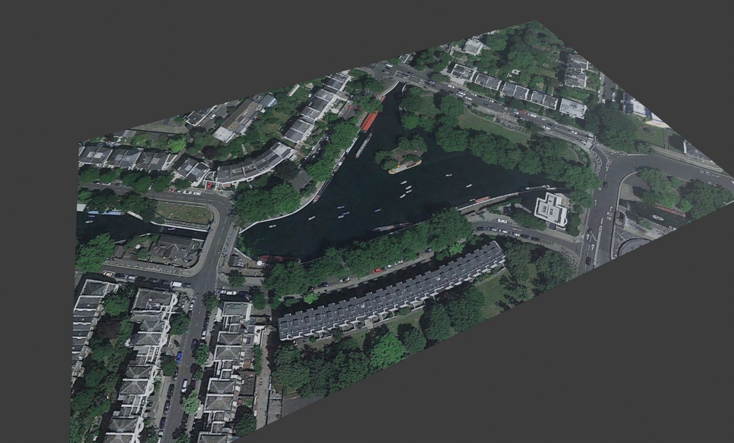
Then, the image plane was edited and cut into separate parts using the knife tool. I had to experiment with the UV texture coordinates in order to have multiple objects aligned correctly with the satellite image. As I was working on this before the new transform UVs tool was introduced in Blender (and if you are curious about this new tool, check out this video here), I decided to use generated coordinates to be able to edit vertices and edges without worrying about distorting the UVs and the satellite image location. When I started separating the cut elements into different objects, the objects had to remain in the same place, where the faces were only moved in edit mode. This workflow seemed to work well, as long as new objects were created by separating them from existing objects.
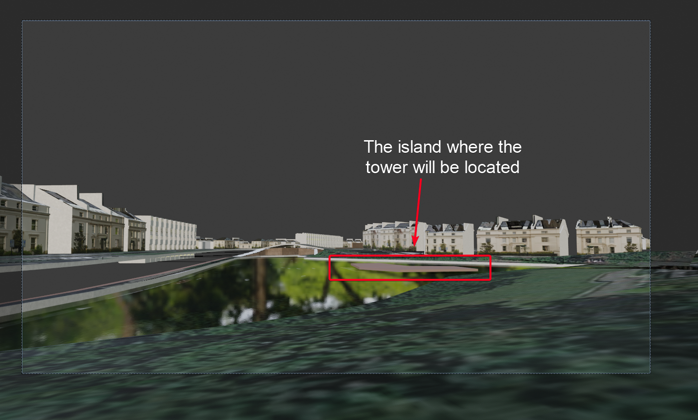
The site is a bit more complicated than the typical site because of the canal and the additional levels associated with it. It took a good bit of work to get the elevation levels of the street, bridges, and the canal correct. I was initially thinking that this would be the base of the course I recently introduced on using Blender for Architectural Design, but after realising that it’s probably not the simplest first point for new Blender users, I decided it would be best to carry on with the project professionally and generate another topic for a course (video trailer, in case you are interested, is available here).
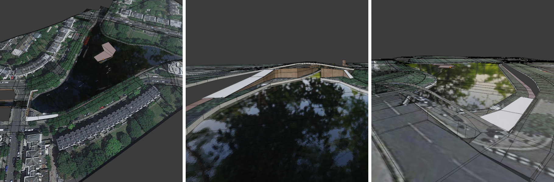
Context buildings
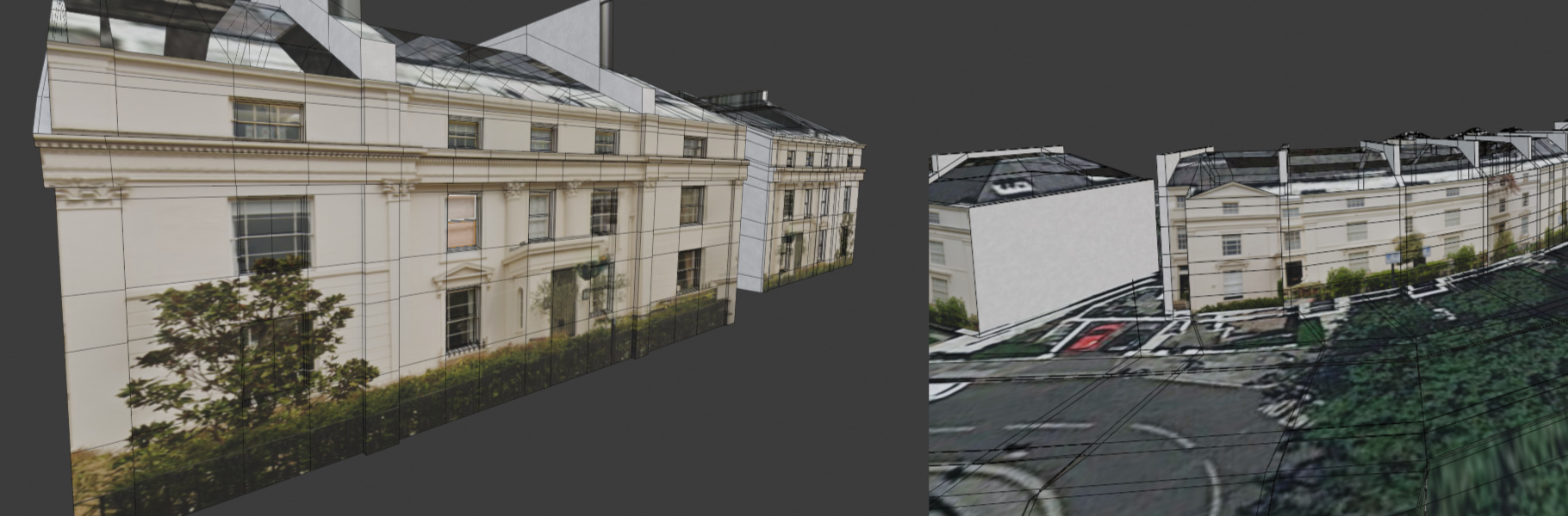
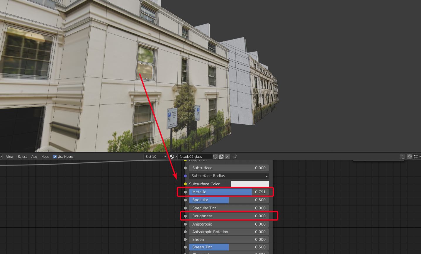
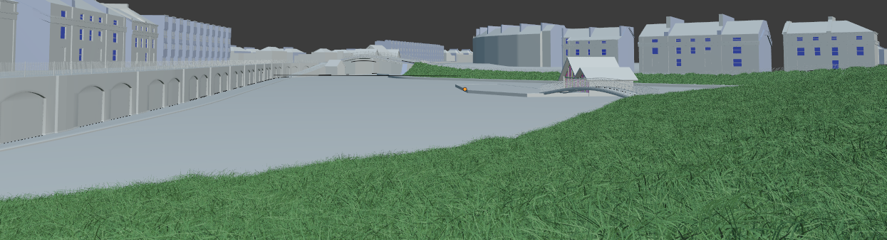
Once the levels were in place, it was time to start modelling the context buildings. The process is a continuation of the streets and levels, where the satellite footprints of the buildings were traced with new faces and then separated from the streets object. Then I used images I had shot and Google street images to map onto the facades. Since the Georgian Terrace houses repeat, I repeated some of the textures around. The modelling stayed basic, with only building protrusions and some windows being extruded and refined. The material settings are fairly basic. Since most of the buildings are white, and the glass is typically darker, I used a colour ramp to create contrast and add reflectivity to the dark parts that usually represent glass. This added a hint more realism to the context.
Camera view
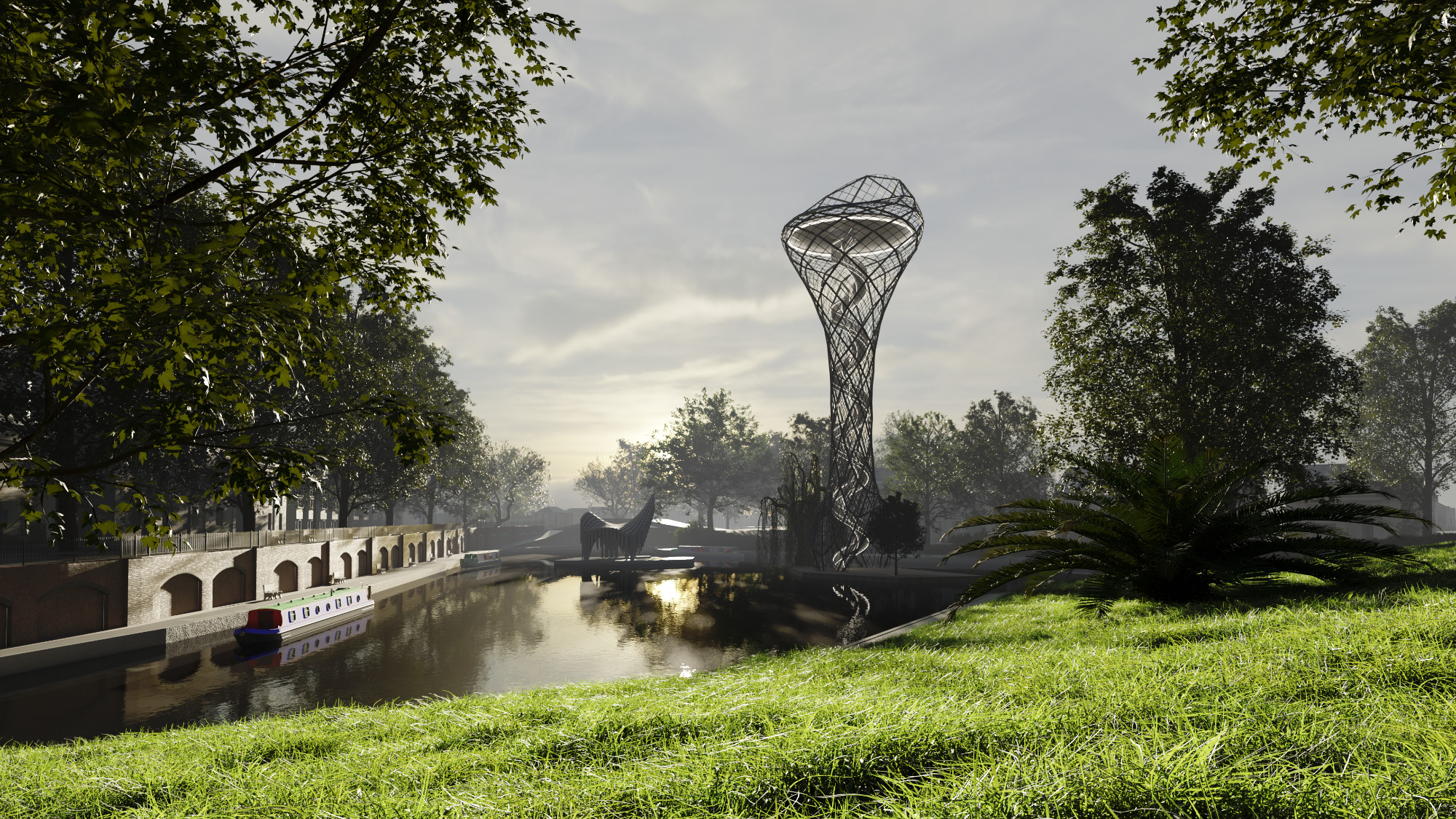
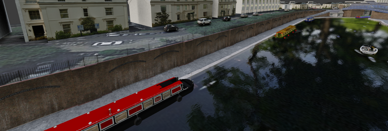
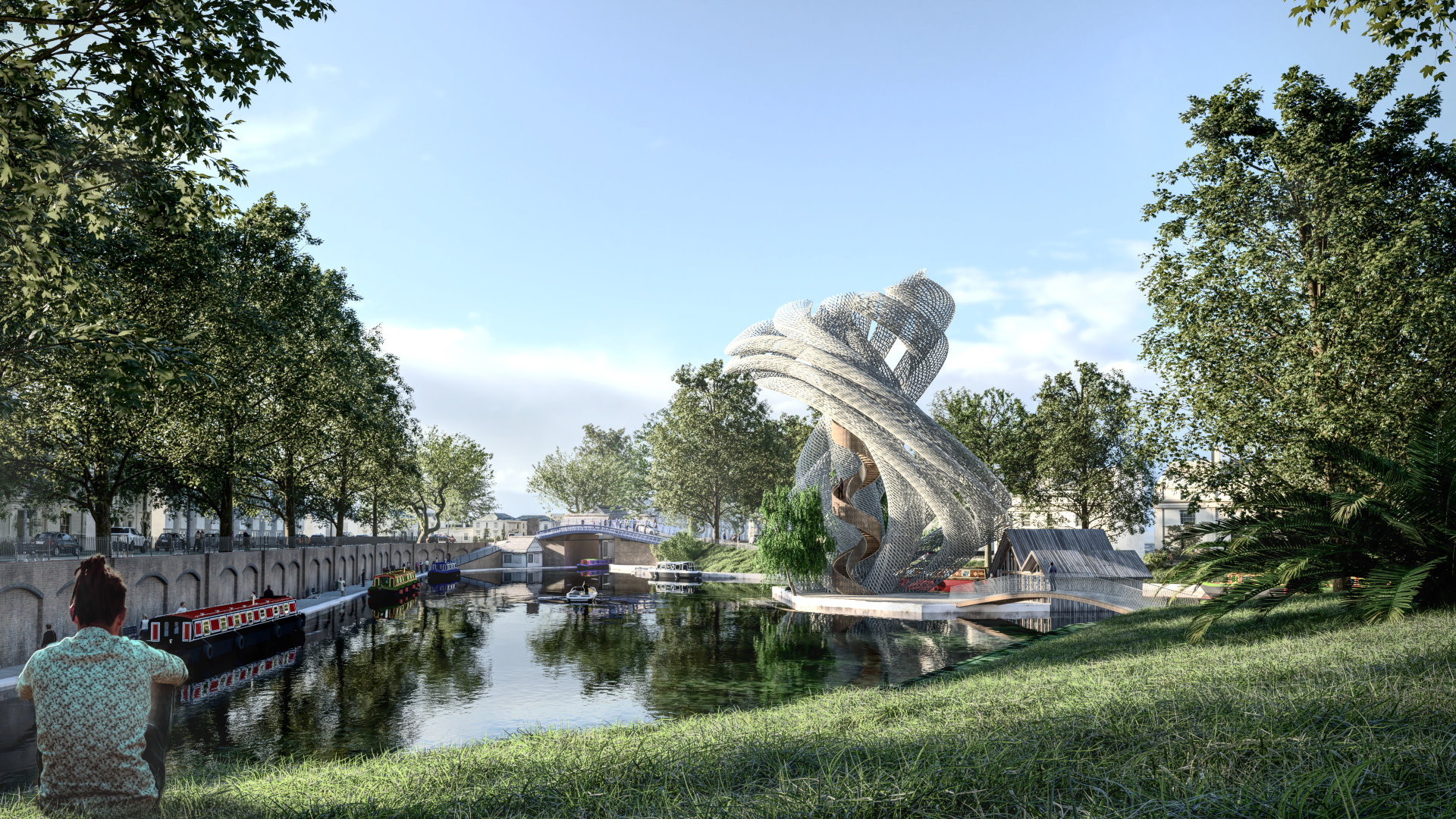
Once most of the adjacent context buildings were done, it was time to create a convincing camera angle and lighting conditions. The first step was the camera angle. I wanted to show the tower comfortably fitting into the context as opposed to dominating it. For this purpose, the tower is off to one side of the image, and the large expanse of water is within the centre of the image.
It is also important to show and be able to perceive how to access the tower island from the image via the bridge. So I moved the camera around until I was happy with the position, capturing a nice foreground, midground, where the tower sits, and background.
Lighting
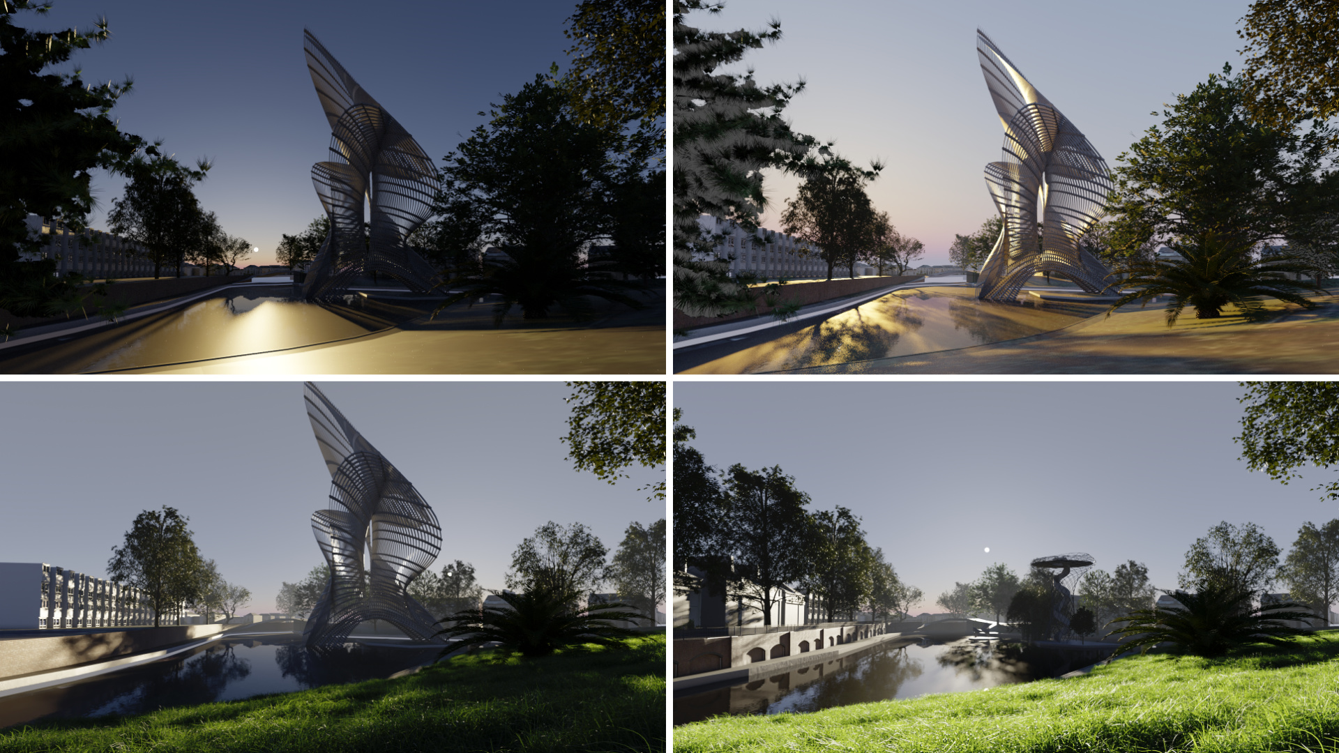
Once the camera was set, then it was time to experiment with the lighting. This step always takes a long time—3x longer than I think it will take. I first experimented with the HDRIs from Blender Guru’s Pro-Lighting: Skies addon, but wasn’t satisfied. Then, I tried HDRIs from HDRI Haven but in many cases, they tend to have too many objects in the background for the HDRIs to be useful for this type of context, where only sky is needed. I also played with the Sun Position addon and the Atmospheric Sky addon, but although I can get the lighting in the position that I want, there is no sky with clouds. In the end, I settled for an HDRI from 3dcollective.es that a friend of mine recommended. I used the Real Light HDRI 071, in case you are interested.
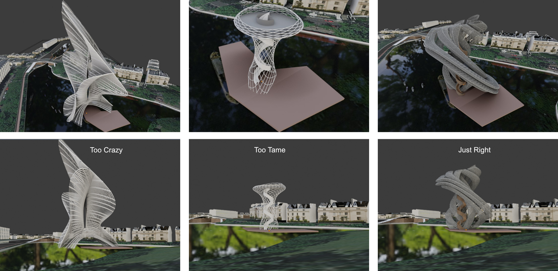
Here are some examples of the light setups with different tower iterations.
Modeling the project
The tower
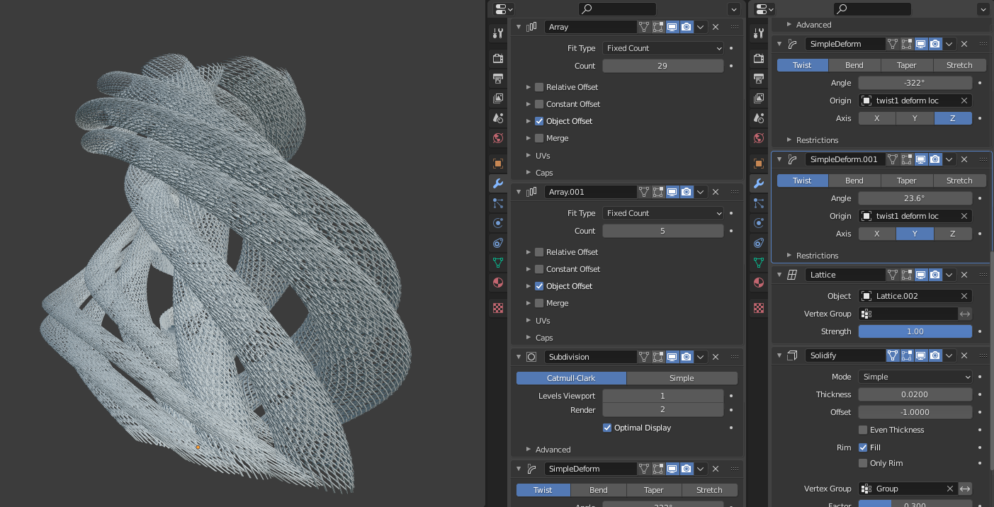
With the context, camera, and the lighting set, the next item on the list is the tower. I initially had a fairly simple tower design in mind that I wanted to cover with hanging plants and ivy, with the tower well nestled within the existing Weeping Willow trees on the island. However I knew in the time I have available, I wouldn’t be able to generate the type of image that I wanted. Instead, I opted to experiment with modifier-based workflows to generate a six super-column twisting tower, deformed by a lattice. The model is completely non-destructive and has been inspired by Alex Pi’s usage of simple deform modifiers. I must say, this video was an eye-opener as I had never previously tried using the simple deform modifier for architecture.
The idea with the woven columns was always to have a spiral narrow stair go up to the top. The stair is modifier-based, spiraling as high or as low as needed. The tricky bit was to make sure the stair and the tower twists didn’t intersect, so this necessitated some back and forth tweaks in order to get the composition right.
Here is the full modifier stack to generate the shape:
The bridge and cafe pavilion
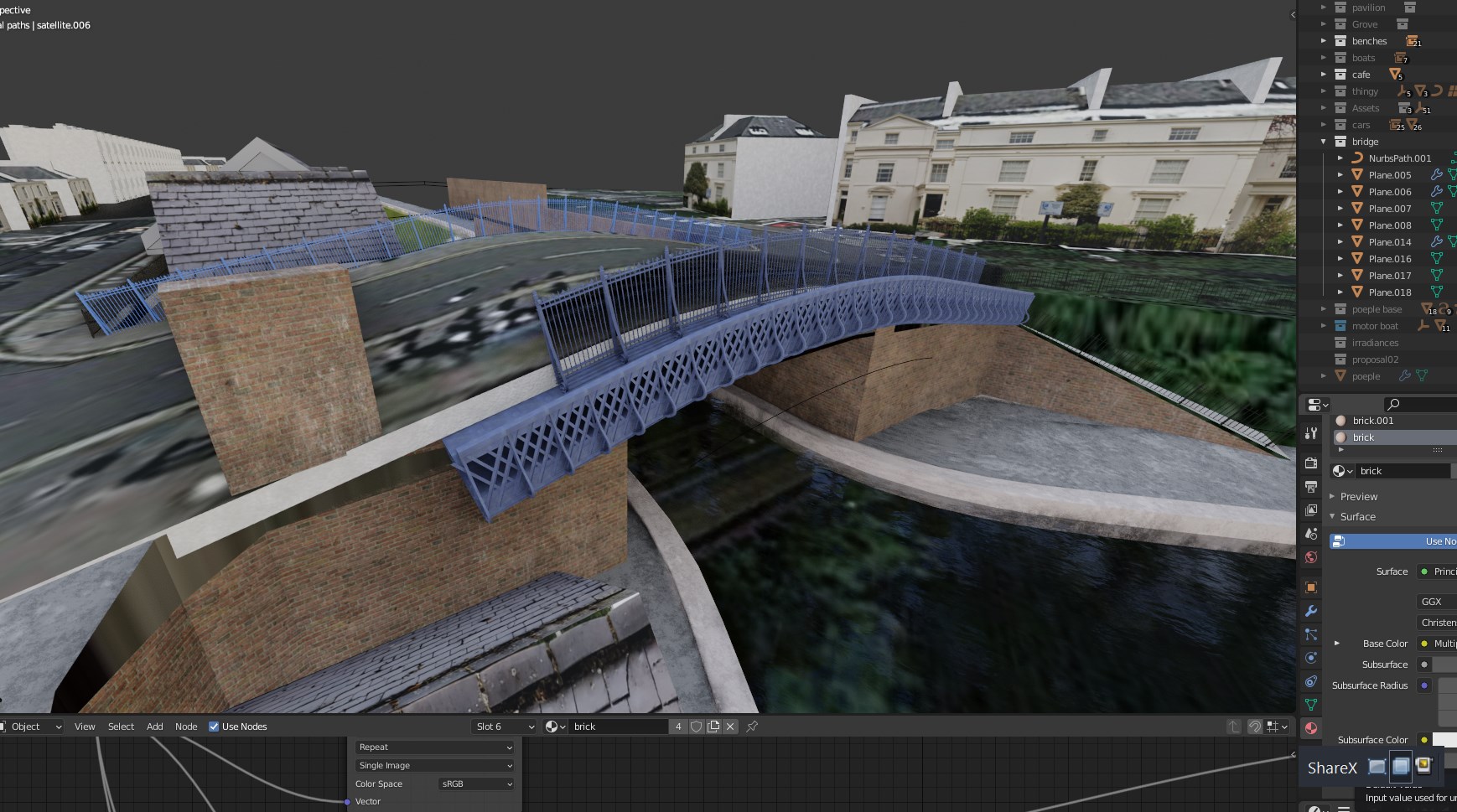
The bridge is modelled procedurally, starting with one small chunk, mirrored, arrayed, and deformed with a curve. If you are interested more in this process, check out this video that I’ve made on generating procedural bridges.
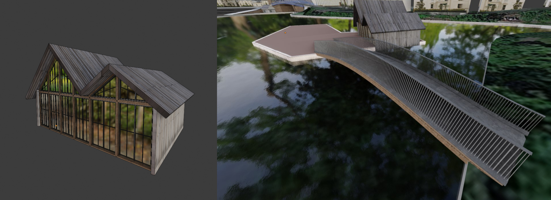
The cafe is a simple building made from walls, a roof plane, and front glass facade. The glass was modelled with insets to get the right look on the front. I don’t have a video about modelling this building, but if you are interested, let me know and I would be happy to make one.
Refining the context
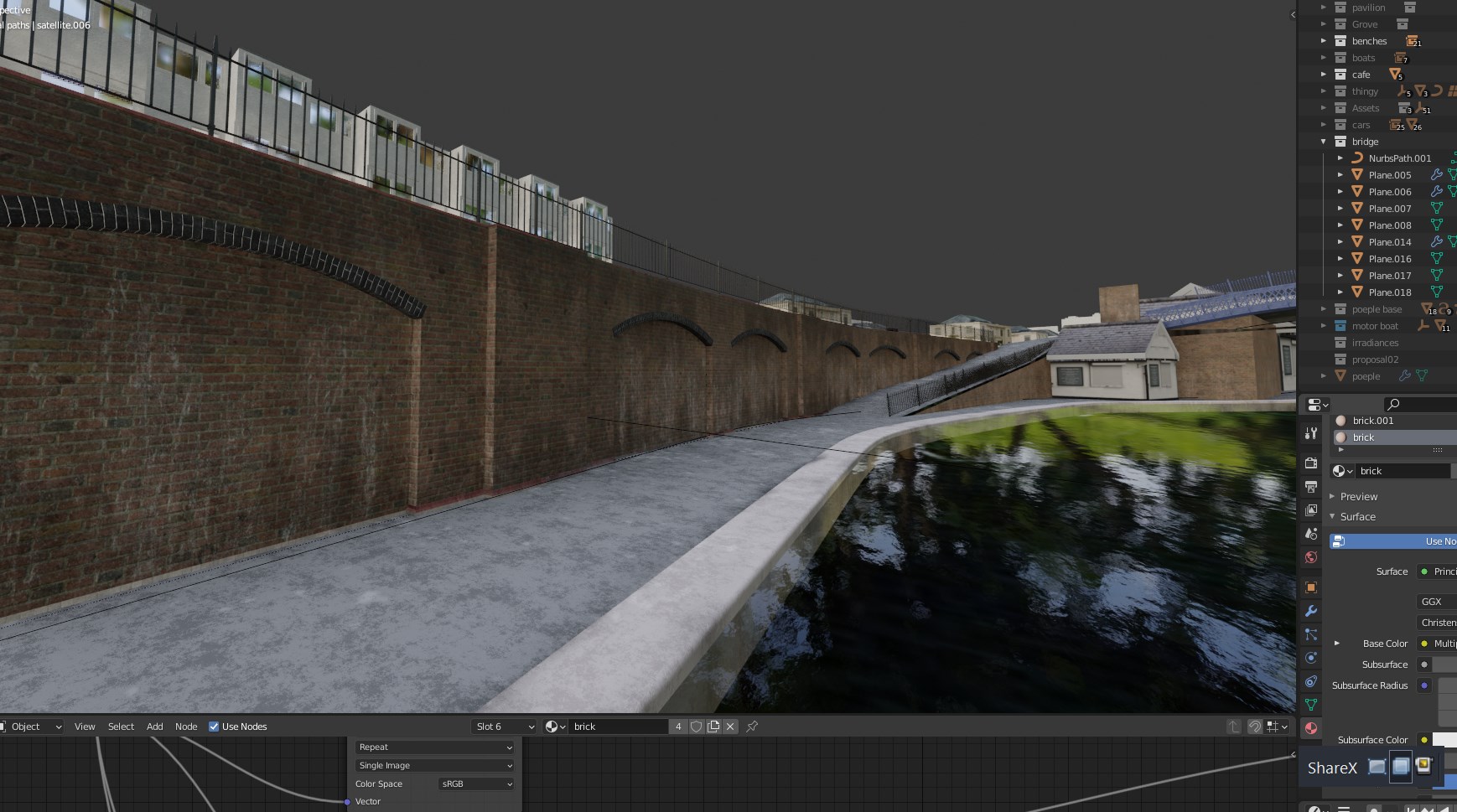
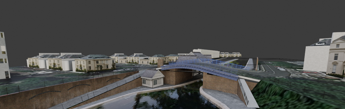
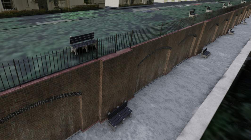
Once the tower was in place, it was time to start refining the context by adding detail to the Victorian canal walls, modelling the blue-painted Paddington Bridge in detail, and other bits and bobs. I pass this bridge daily, so I may have gone a little overboard in order to get it to look right, but it’s important to make sure the model is sitting well in the context. I also added fencing throughout.
With the midground detail in place, it was time to add more context to the background to make sure that the view doesn’t have any blank areas on the horizon from the camera vantage point. I duplicated some of the buildings until the horizon line could not be perceived.
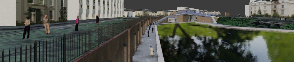
Populating the scene with assets
The next step was adding assets—trees, plants, people, cars, boats, and grass. Most of the assets come from paid addons or products that speed up the workflow. However, they are by no means necessary. They allow me to populate the scene much faster. If you have time and don’t want to spend money, you can spend time searching the web for the right assets and build up your own library. If you have some money and no time, then I recommend getting some libraries of assets or purchasing individual assets to populate your scene.
Plants & grass
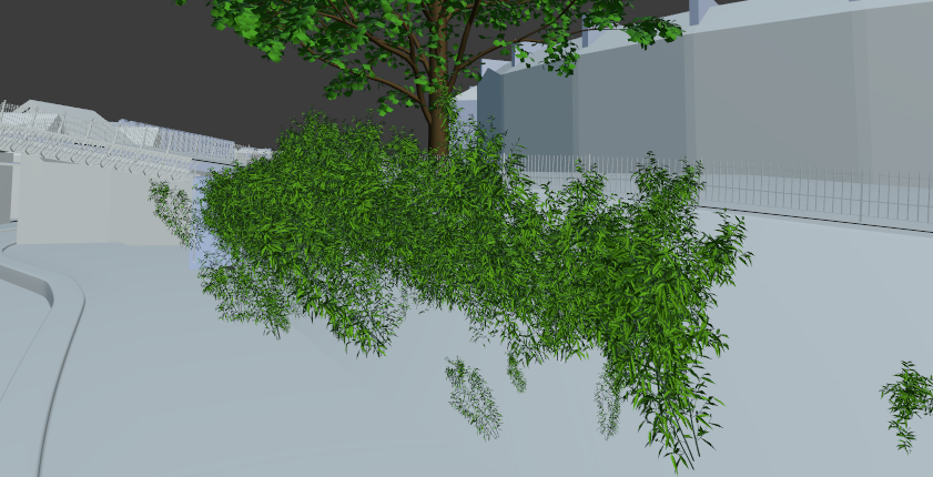
London is famous for the London Plane trees. They are somewhat related to Maple trees, so I opted to use large Maple tree models from the Botaniq addon. From all the various tree sources, the Botaniq addon trees are one of the better examples of quality-to-geometric-complexity balance for having multiple trees in the scene. The palm plant also comes from Botaniq. The addon also has a random transform tool that helps adjust trees so they don’t look 100% the same.
The grass in the foreground and the background was generated with Graswald. I also use Scatter, but in this instance, since the grass is mainly in the foreground, the grass geometry in Graswald tends to be a bit more useful for close-up shots.
I also used some shrubs from Botaniq near the far end of the grass to add a more natural appearance.
Cars and boats
Most of the cars are from the Traffiq addon, then there are some from the Transportation addon, Blendswap, and others purchased separately. I wish there were good quality lower poly car models with baked textures available to populate a scene well, as the detailed cars ate up a huge chunk of memory that prevented me from rendering the image on GPU, but more on that later.
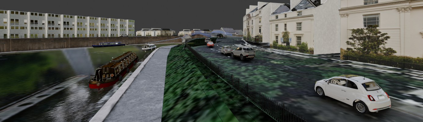
The canal often has narrowboats specific to the UK. There are some models available on Sketchup Warehouse but I didn’t have the time to refine the models and the materials, so I purchased a canal boat pack from TurboSquid that came with an OBJ and the material textures. The textures are baked so, unfortunately, I can’t edit them as much as I want, but they are nevertheless decent base models.
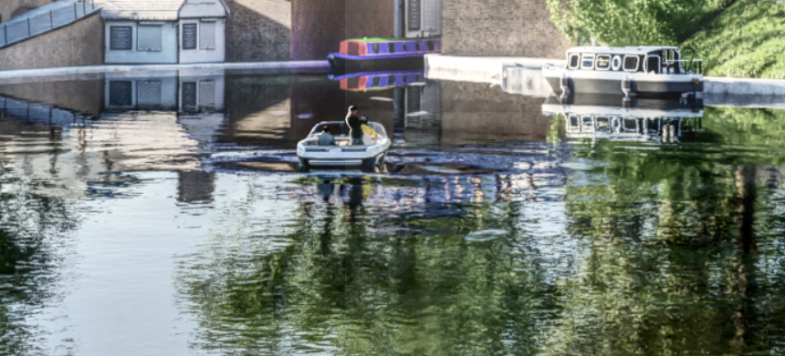
After I thought I was done with the image, I decided to add a moving boat. I bought a boat from Evermotion, but the materials required quite a bit of refinement to work well with Cycles. Once I was happy with the boat texturing, I placed a few people inside and duplicated part of the hull to use as a boolean to subtract from the water plane. To create ripples, I used dynamic paint, which I learned just for this image with the help of topchannel1on1’s video here. I had a few issues where the boat’s hull’s normals were facing the wrong way and dynamic paint didn’t work. Once the normals were adjusted, I added a few keyframes, baked the dynamic painting on the water and picked a frame that I liked. The water ripples required some adjustments, mainly to have a denser and more subdivided mesh. I baked 250 frames, and picked a frame in between.
Benches
The bench comes from BlenderKit initially, but I modified the original by adding boards. They are placed manually around the scene.
People
I have made my own collection of people found through different free and paid sources online, keeping them fairly low poly, with some higher poly examples for closeups. Similar to cars, people need to be quite low poly when you want to have more than a few lurking around the scene. I used a particle system to scatter the people and made a video on the topic, if you are interested to learn how to populate people with a particle system.
Texturing
With the scene set up and the assets in place, it was time for texturing. In reality, the process is never linear and I started with basic textures and kept refining them as the model progressed. However, a big push was done when most modeling was complete. I used textures mostly from Poliigon and Textures.com as bases, and lots of dirt, smear, and grunge maps to add variations to the surfaces. Overlays are essential to get rid of tiled pattern effects.
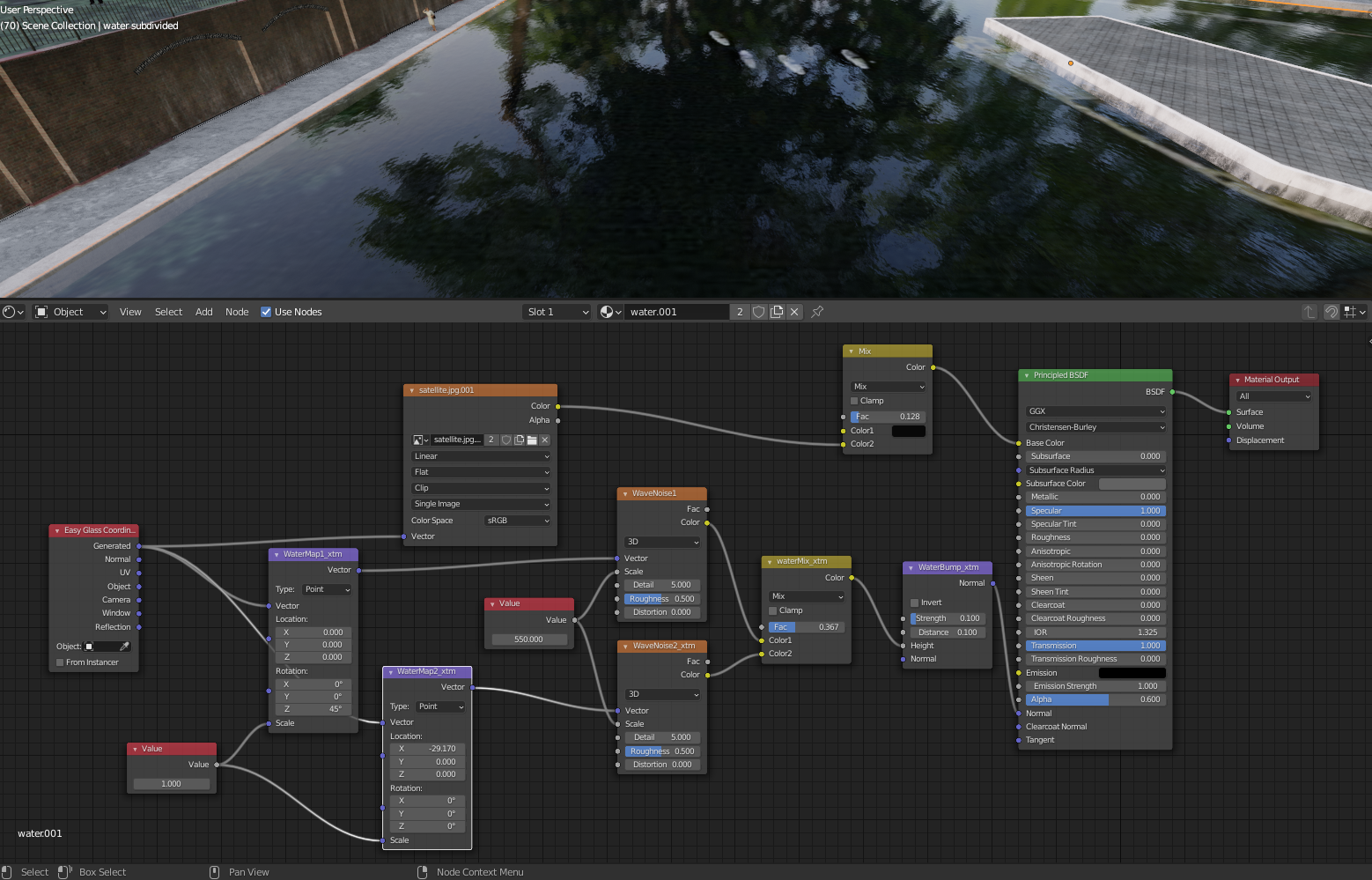
The water colour comes from the satellite image, separated from the rest of the context. The material uses the Materialiq base water material, which is essentially two noise modifiers at different scales used to drive the material normal to represent ripples.
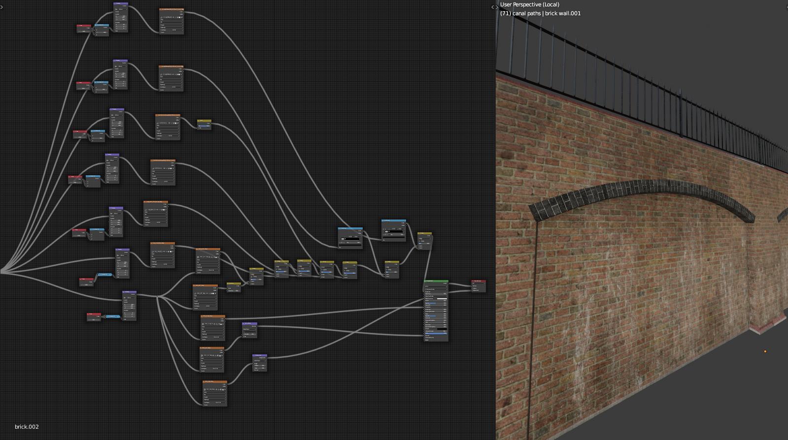
The brick wall was quite fun to texture! As it is an arrayed object, it should not look arrayed, so I used lots of dirt and grime overlays at different scales. Some have been added as multiply (darken) some as screen (lighten) to get the overall effect.
I also painted dirt within Blender by generating new UV maps where needed, creating a blank image, and hand-painting on the 3D model the dirt texture I wanted. This process is perhaps one of the least user-friendly areas in Blender to me, but it may be because I do it so infrequently that I have to relearn how to do it whenever I need to paint again. In case you are interested in the process, Jayanam has a useful short video explaining the topic. There are also numerous addons that claim to solve the problem. I’ve used more than a few of them, but in my experience, they only tend to add another layer of complexity to the already complex and convoluted process of painting textures in Blender. Bpainter, though, seems the best of the bunch.
Instead of using a stencil to paint directly, I used a simple paint brush mostly in the viewport and then used the painted image as a mask for a texture overlay.
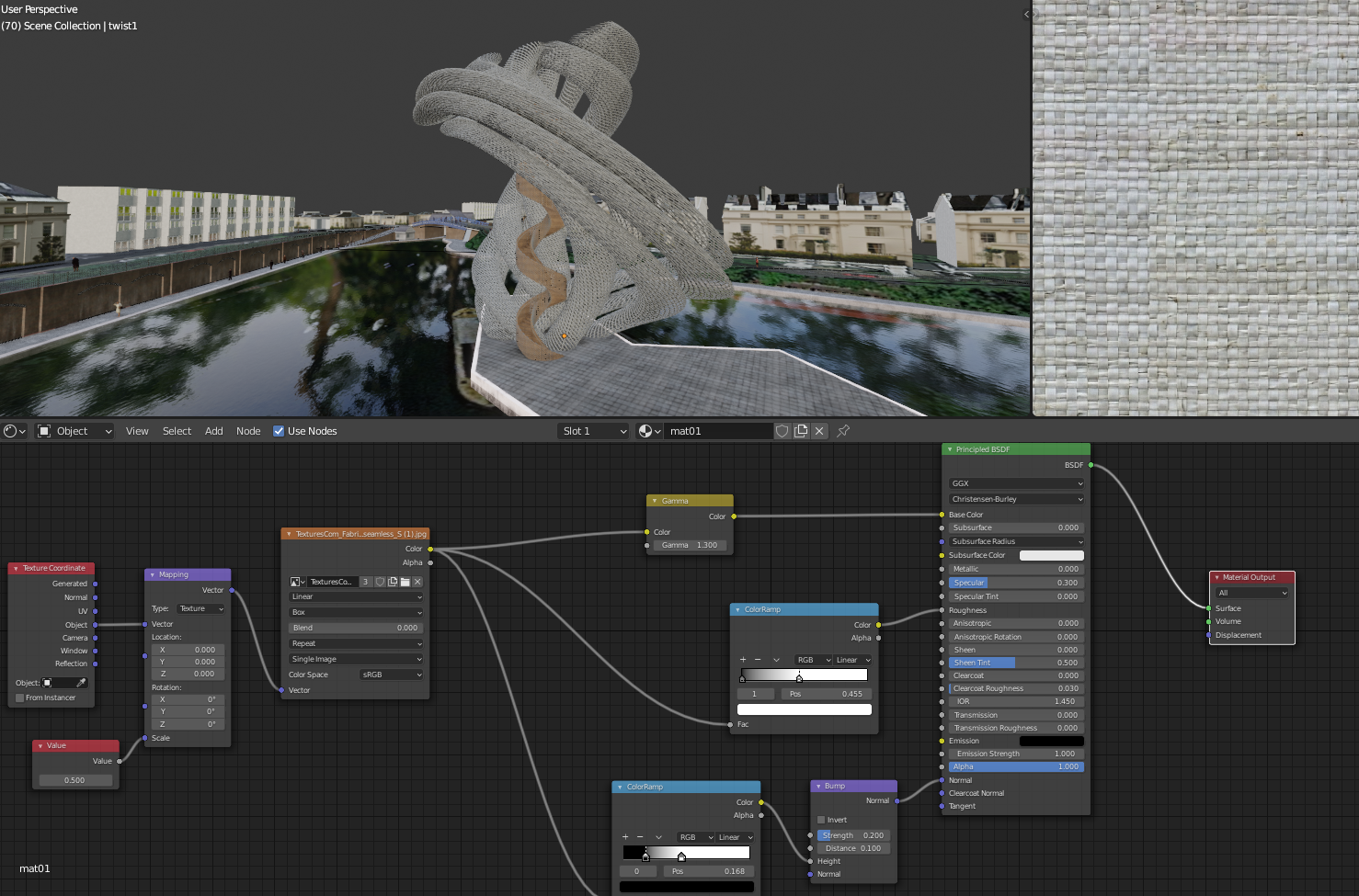
The tower’s texture is fairly simple. I tend to find that complex shapes do quite well with simple textures where simple shapes require much more texturing work so the textures don’t look too patterned. And always, if in doubt, add some noise!
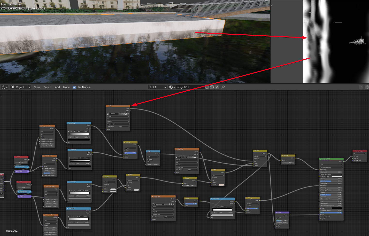
Here is an example perfectly illustrating how a noise or grunge map can make the difference. The tiles in the centre island are from Poliigon. Without some overlays, the texture looks dull and highly tiled.
Add in a grunge overlay and it significantly reduces the tiling effect. To remove it further, more grunge/noise would be needed. However, since I knew that the texture wouldn’t be visible much from the camera view, I decided that I didn’t need to go further than what’s shown here. Most materials, even if they come from nice material packs of full PBR textures, require grunge/noise overlays for architectural visualisation to reduce the tiling effect.
A general note about texturing: less is better. Most of the time, in order to save memory, there is no need to have a full PBR set of textures for each material. It’s fairly easy to have the albedo/diffuse map and then use color ramps to get roughness and normal out of it. 2k resolution should suffice in most instances, unless the objects are quite close to the camera.
Rendering
With everything in place, it was time to render. Ahh, sounds so simple. The render settings are fairly straightforward, the adjustments being the number of samples increased to 550, making sure we are getting the mist pass out, and increasing the HD default image resolution to 4k.
I had been able to render this image on a test laptop with RTX 2080 Super when I did a video collaboration with Nvidia, but when I tried to render the image recently, it didn’t work with either OptiX or CUDA on a desktop RTX 2080. It may have been because I duplicated a number of cars to have more of them in the scene, and added the narrowboats. I rendered with CPU, and luckily I’ve built my old trusty electricity-guzzling desktop (based on CG Geek’s recommendation video from 2016) with decent dual XEON CPUs that used to be quite fast before the RTX 20 series was available. It is still a useful fallback solution for scenes requiring more RAM or when the GPU fails for some other CUDA error.
Blender has two options to enable denoising now—the first in the render properties enables it globally. The second, in the render passes, enables a new pass. With open image denoise, when enabling the denoising pass, it took twice as long, but for some reason the results look better than compositing with the pass. The base render took about 1 hour and 40 minutes, and the denoising took another hour.
Once the image was done, I exported an 8-bit PNG version with Filmic Medium contrast profile and then exported an Open EXR file with a flat Filmic LOG profile and all the render layers for further adjustments.
Post-processing in Affinity Photo
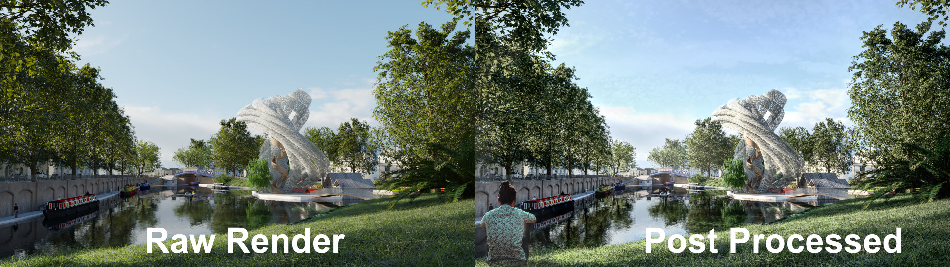
The Open EXR was then taken into Affinity Photo. It’s important to set the 32-bit preview in Affinity to ICC managed, so the 8-bit export matches what’s displayed in the program. I took the combined RGB pass from the .exr into the tone mapping persona. It is destructive editing, but it’s quite rich in its options and is able to output great results, actually absolutely amazing results. For a long while I used to try to do light-touch post-processing in Blender, but the tonemap options in Affinity allow me to refine the detail to a much better extent.
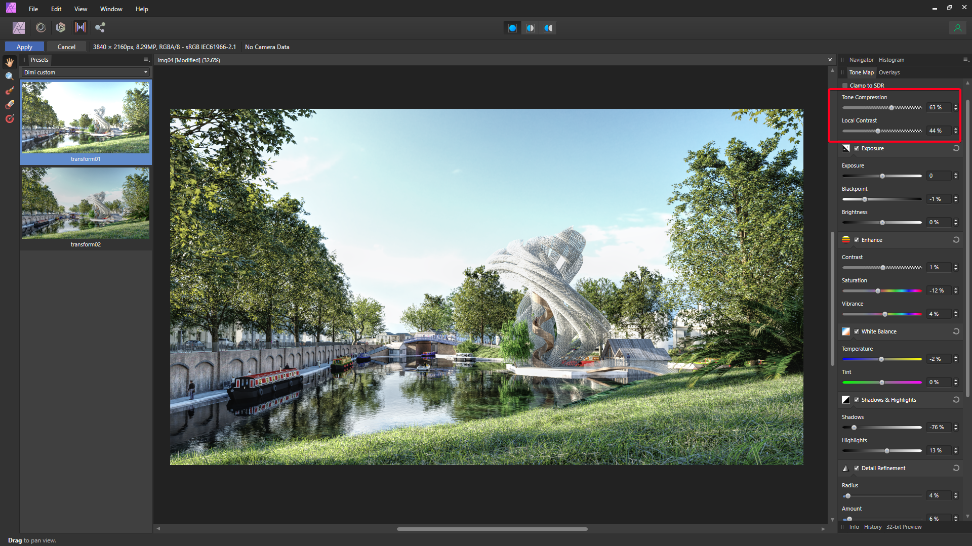
In particular, the Tonal compression and Local Contrast adjustments may be the only requirements for post-processing and turning a dull render into a lively image.
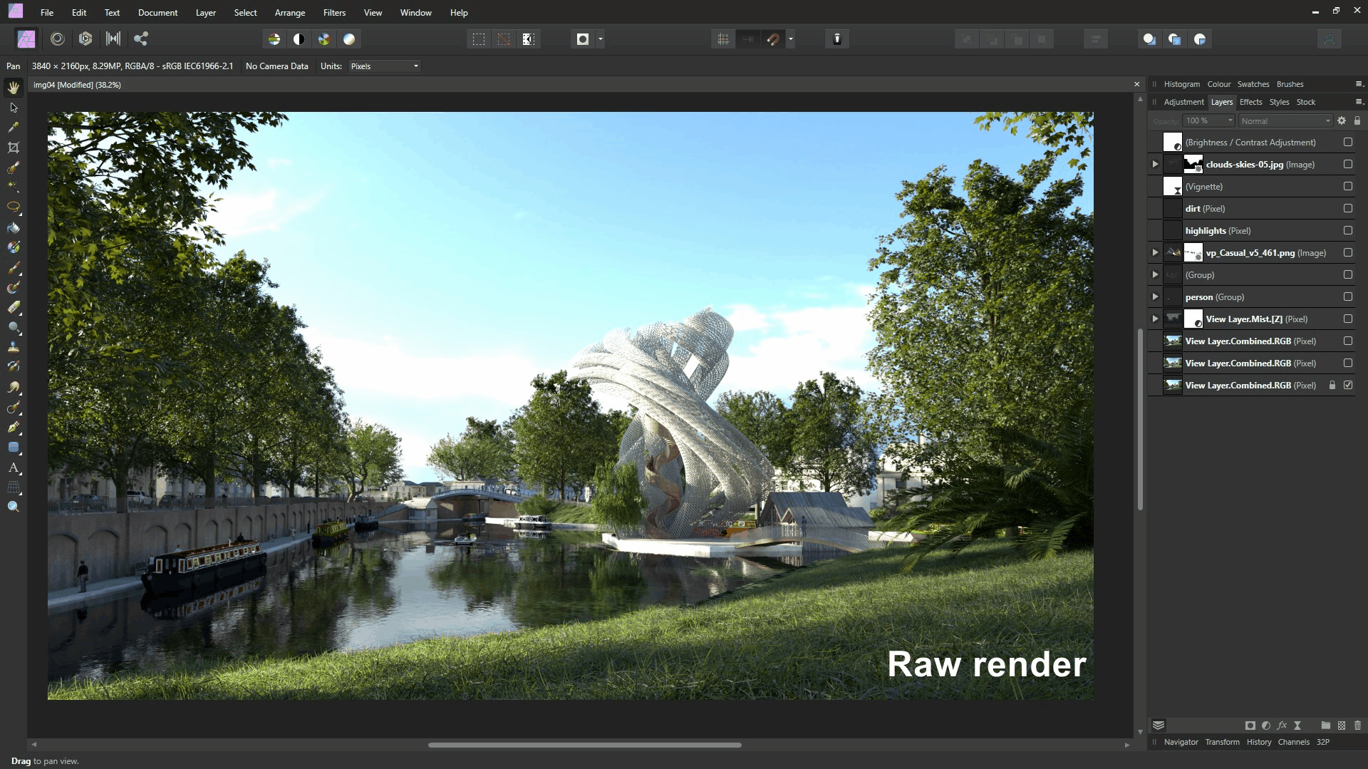
Once satisfied with the base image, the file is converted into 8-bit and/or the image exported as an 8-bit png. Then in a separate file, time for a few final tweaks like the mist layer, adding more people, adding a bit of light and dark overlays and the image is done.
About the Author
 Dimitar is an architect working on medium-to-large projects in the UK and across the globe, frequently with the help of Blender.