Behind the Scenes: FlynnEastwood’s Inktober 2020
Greetings everyone!
My name is Antoine but some might know me as FlynnEastwood. I’m a 3D artist from Montreal, Canada and graduated in the field of 3D creation using Maya/3ds MAX. Soon after, I made the switch to Blender when working in a small studio and since then, I never looked back. I’ve worked for a few years but now I am teaching students how to use Unreal Engine for films and games and I’m Blending full time.
Because I love freedom, I exclusively work with free and open source softwares. In this article, I will show you my process and workflow around making my Inktober entries using Blender and Krita. For an overview of the whole process, I’ve made timelapses of each of the artworks on my YouTube channel. Check them out right here!
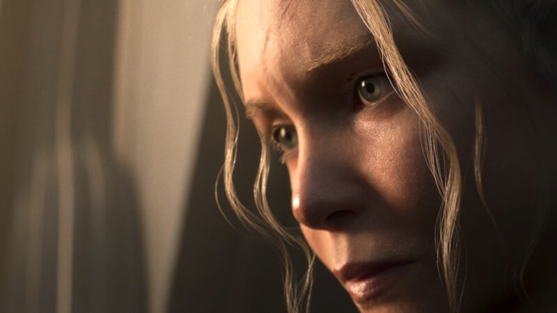
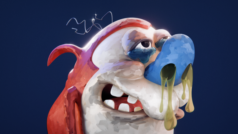
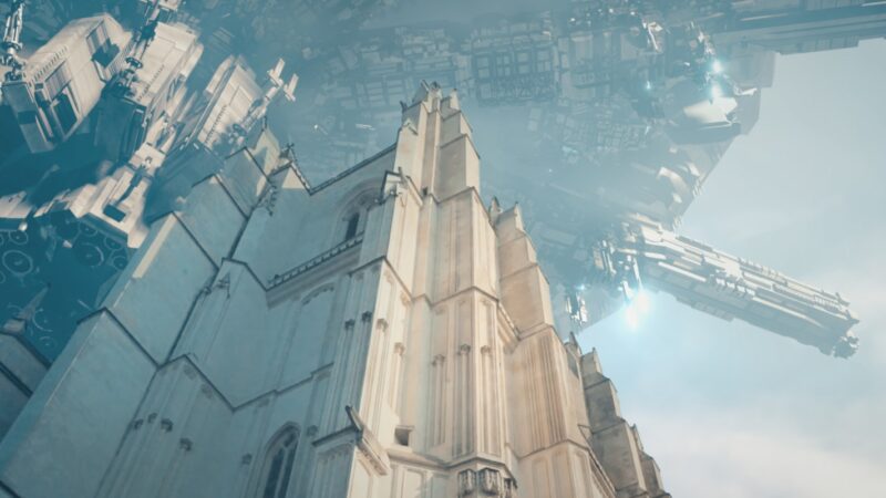
The Inktober challenge is great for trying out new things. Since there will be many artworks to do and publish, it’s an opportunity to get over your ego because, let’s face it, not all of them will be a masterpiece. I participated in the past using traditional ink drawings but this time I wanted to do a 3D version of it, mainly to practice stylized looks.
[sponsor id=’qarnot’]
Process
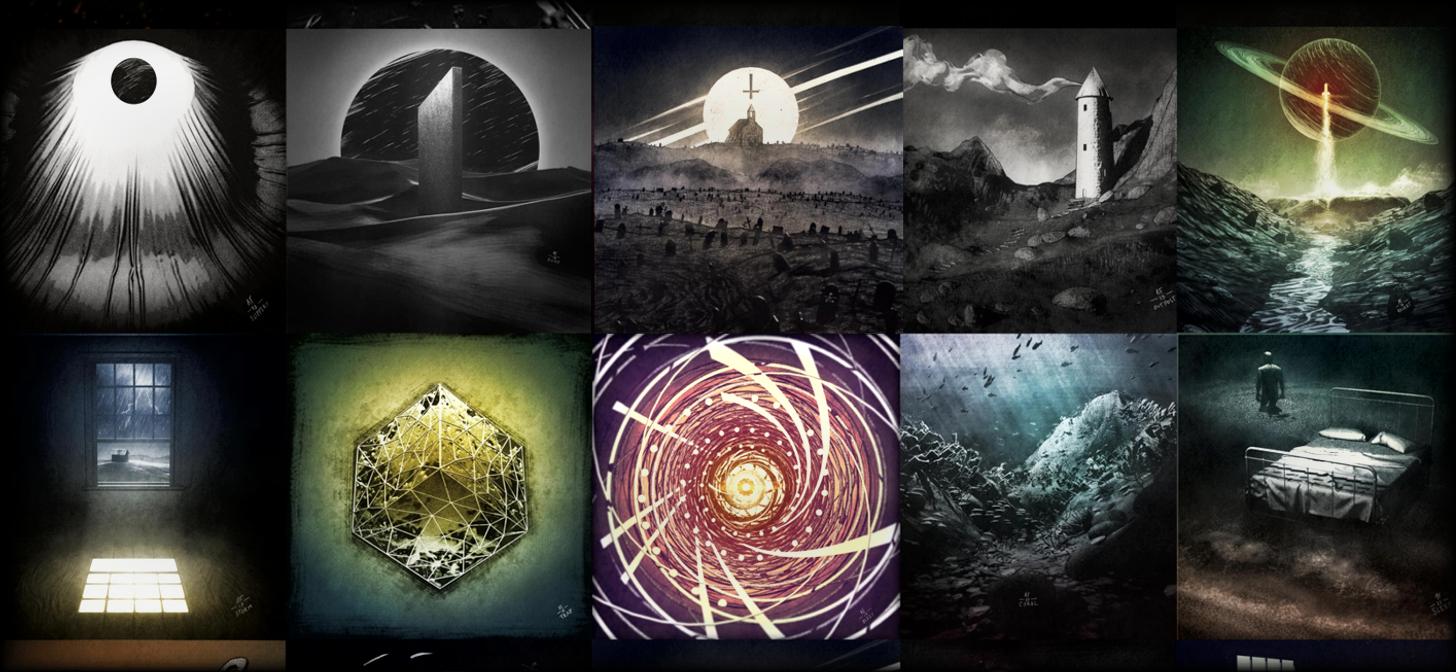
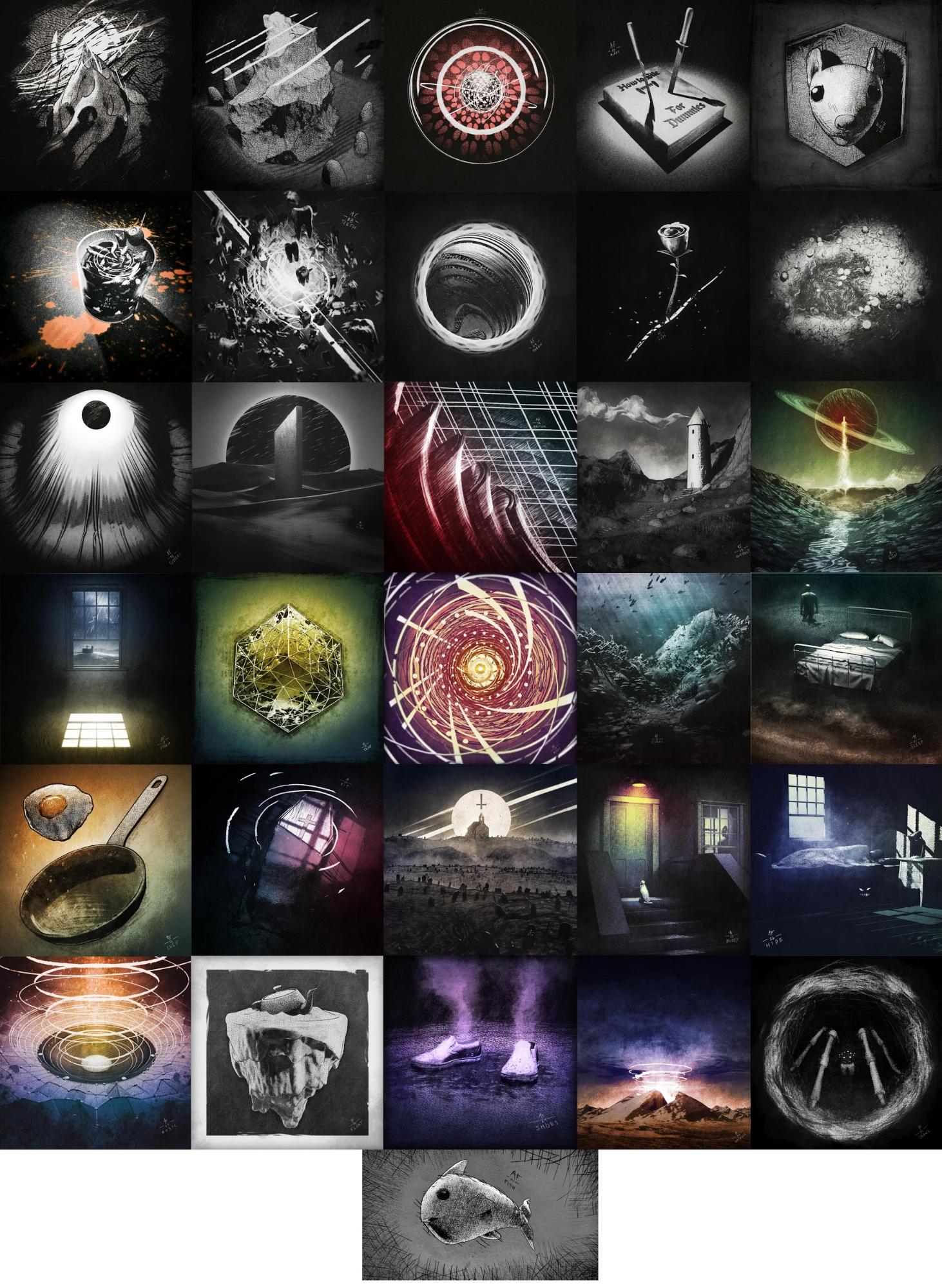
To create an artwork a day, you gotta be fast and so I chose a procedural approach. I also went for EEVEE as the renderer for speed and ease of work. These artworks ranged from more abstract and procedurally generated to landscapes and environment scenes. I did not have specific inspirations while doing any of these pieces as I would look at the prompt just before beginning a piece and improvising.
Modeling
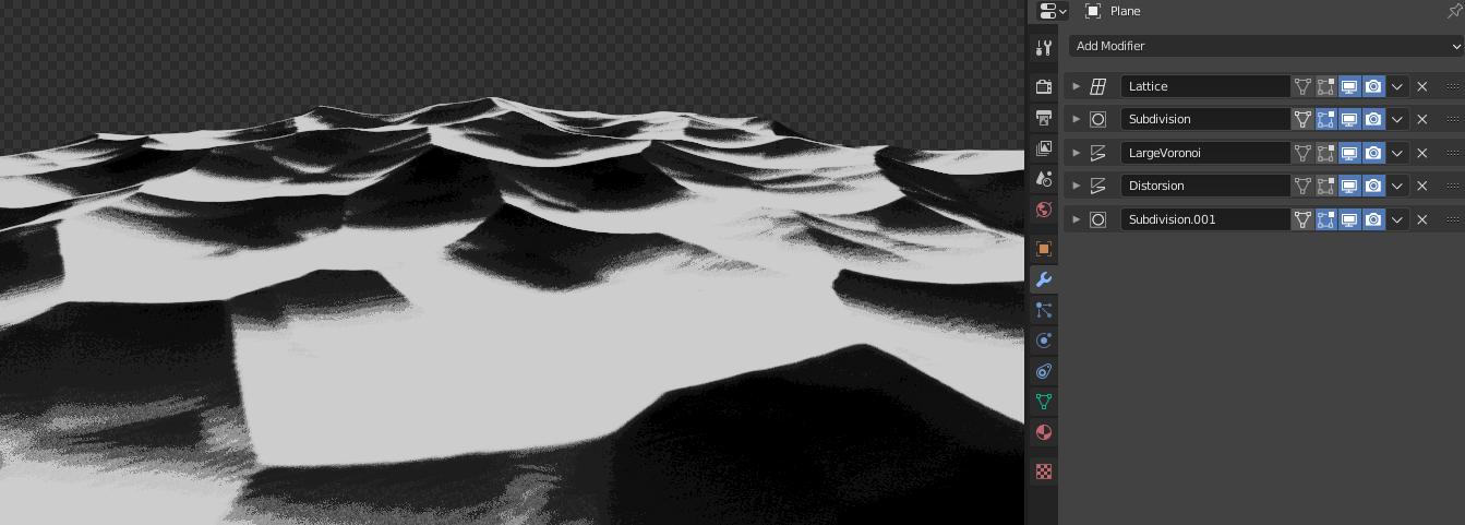
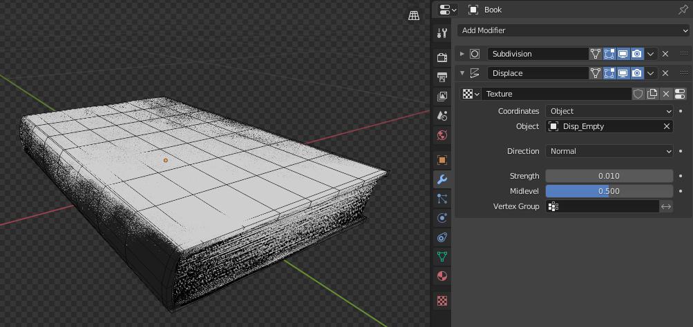
Generally, the process is broken down into two steps. Basic shapes first and then improving with modifiers. My main modifiers were subdivision, then some SimpleDeforms based on nulls position, adding booleans to cut or add, displacing with a noise, and sometimes bevelling the whole thing when edges were too sharp.

I certainly used the displace modifier quite a lot. Inktober is a marathon and you will run out of ideas eventually. Thankfully, one important advantage of displacements is the random results you get when using clouds, voronois, and such. I would sometimes zone out and let the displace do the art, getting inspired by what was created.
For artworks representing objects, I would generally make a simple model, refraining from adding details and again make extensive use of modifiers. Simple Subdivision, deforming, beveling, and displacing. Combinations of modifiers quickly sell the illusion of complexity without spending much time.
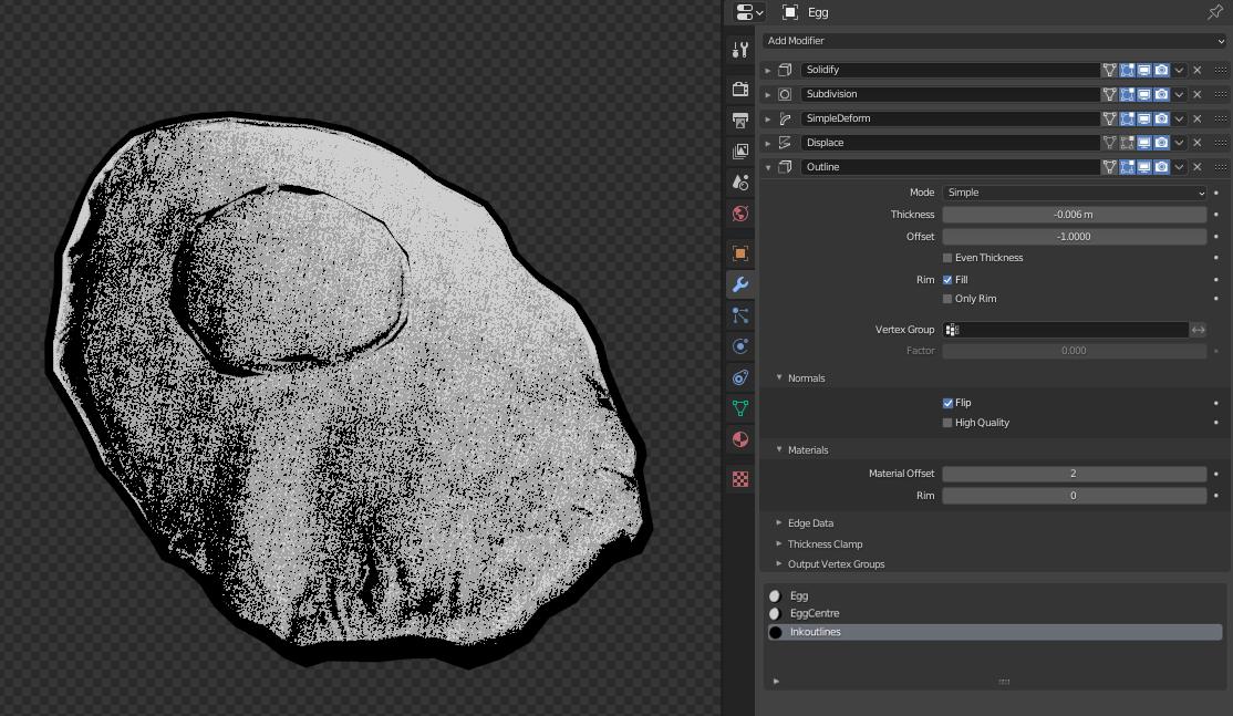
For an outline effect, I used the good old trick of the Solidify modifier using flipped normals. Combined with another displace modifier, it will create jagged edges for more interesting results.
Another tool I used quite a lot for exterior scenes is the A.N.T. Landscape add-on. It comes with Blender by default and will give you decent results combining different types of noises and fractals. For adding extra details to the scene, I relied on particle systems to scatter objects around. Again, because time was short, I would make really simple models but each time would make at least 5 to 7 variations. This helped to hide the repetition of similar objects.
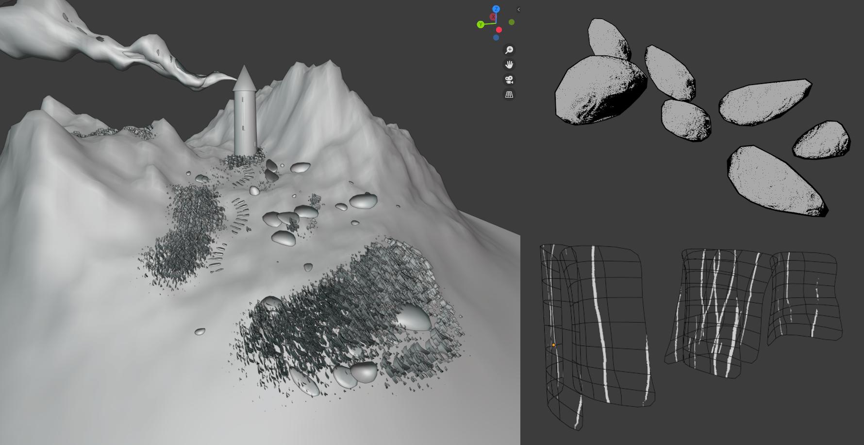
The particle instancing technique was also used in abstract pieces. I used it to scatter models in an invisible volume or on model vertices for extra details.

Materials
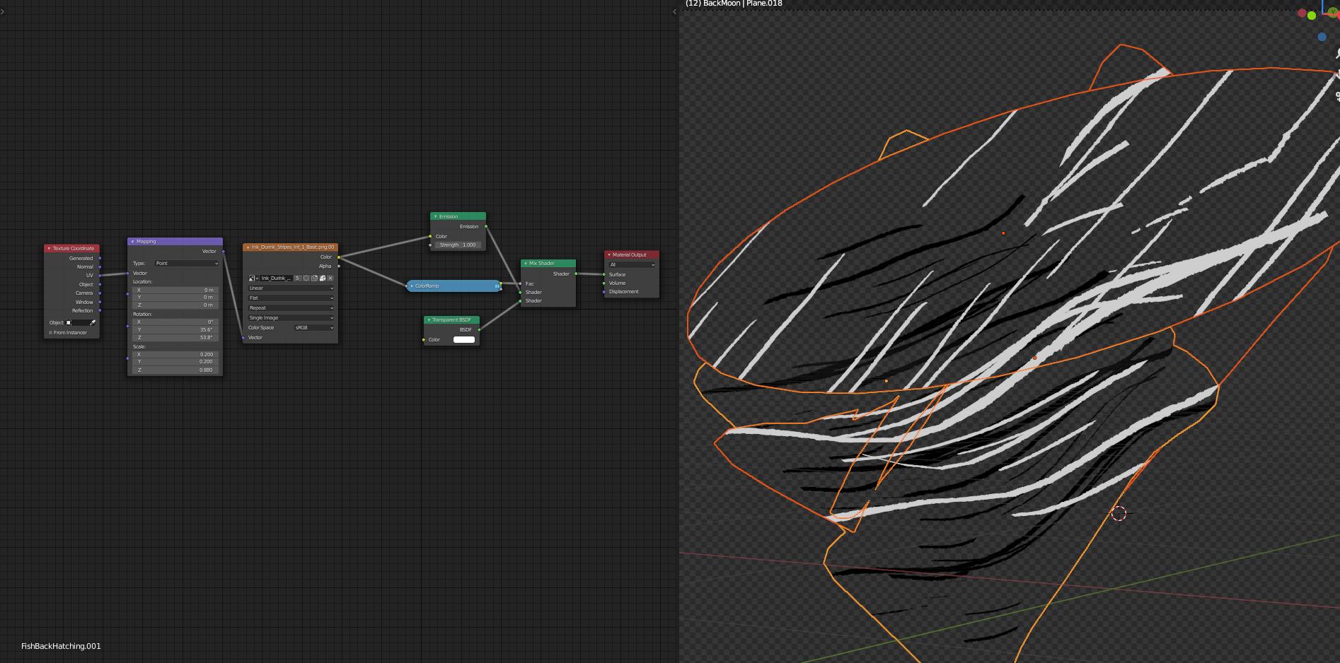
The material is a big part of the style I went for. I won’t take any credits for it as it was made by DarthShader (check it out!). It’s an ink drawing material for EEVEE that can emulate water-ink, etching, comics, and more. In a nutshell, it’s a toon shader that uses etching texture patterns to blend between light and shadow. I would sometimes mix the different styles of the material to create a whole new look and give more variations in shades.
Another important part of the materials was to add bump displacement to my surfaces. I would always use a subtle noise or voronoi to simulate surface imperfections. I had great fun doing this step and sometimes got caught into making procedural wood planks for floors or angle-based displacement to blend different types of surfaces on landscapes.


Some artworks featured bold etching patterns. This was simply done with light-emitting planes, using etching textures as masks. This would help greatly to add a more stylized look to the whole piece.
Rendering
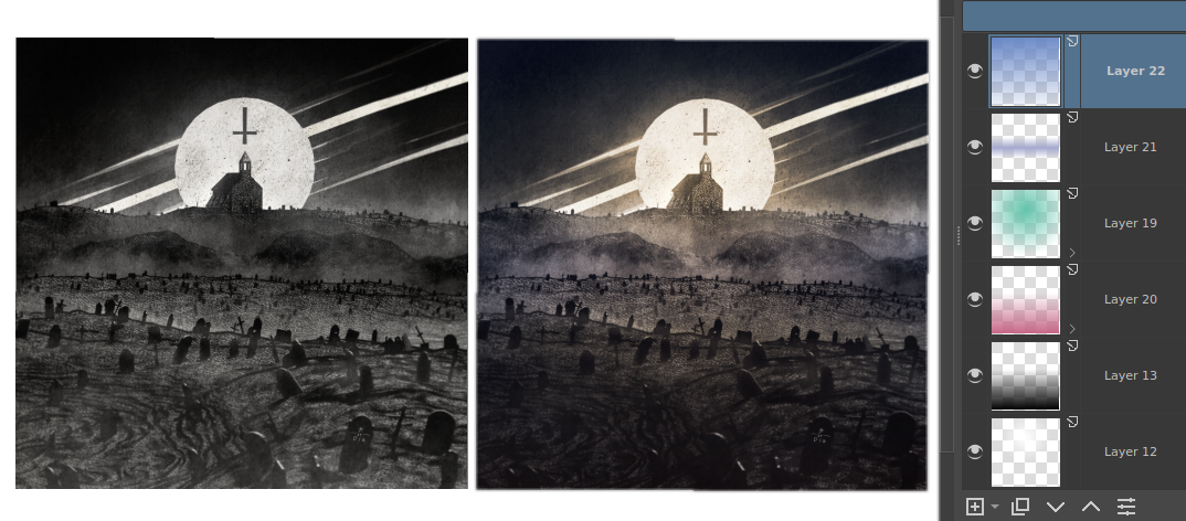
The rendering process was a breeze with EEVEE. I would sometimes render the whole image at once without separating objects but eventually used my collections to split layers, giving me more control in post. I mostly rendered my pieces on alpha backgrounds but I always tried a few ideas with a plane right in the scene to preview the final artwork.
All images are rendered to a square format of 2000*2000 to better fit Instagram. Even with an aging computer, (i7-4790K, GTX 980) most of my images would render in less than 3 seconds.
Post-processing
All post-processing was done in Krita, a free alternative to Photoshop. For that stage, I would use the same steps for all my artworks. The first step was to add a paper texture to the whole canvas. I would re-use the same texture in a single artwork multiple times to get the correct blend of details in shadows and highlights.

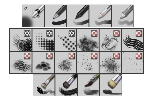
The next step was to level my values. Instead of using a single contrast filter as a whole, I would use many contrast layers and blend between them using hand-painted masks. Speaking of painting, most of the brushes I use are the default ones that come with Krita. It offers a wide range of painterly looking brushes, pencil and ink ones, and some textured brushes. When I felt the models lacked in details, I would hand paint on top of the render until I felt satisfied. Other times, I would erase the edges of my layers with a paint brush to break the perfect look of a 3D render.
An important aspect of my work is the atmosphere. For this, I overlayed multiple layers painted with a smoke looking brush. Then, I would add dust particles with a dotted brush, and some god rays with a soft airbrush. Adding many subtle layers goes a long way.
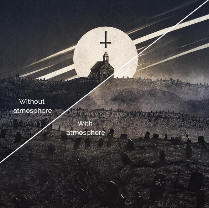
As final touches, linear and radial gradients of colors were overlayed on top, giving unique vibes. I would add a subtle lens blur on the edges of the screen and saturate the center to enhance focus on the image.
And that’s pretty much it! I hope you enjoyed this read and got inspired to try out new things and techniques. You can follow my work or ask me questions on Instagram, Twitter, or BlenderArtists.
Peace out!
About the Author
 Antoine Flynn, @flynneastwood, Montreal teacher and digital content creator, Blender evangelist, living the free and open-source way of life.