
Behind the Scenes: Simon Stålenhag’s Parking Lot Scene
Intro
Hi everyone.
I’m Chris from Germany and go by the internet handle Toxic Tuba. As with everything related to art, the meaning of that nickname is open for everything you want to interpret into it. I have been using Blender for 4 years now. At first, I rarely found time to overcome that learning curve of Blender but for around 2 years the available tutorials for Blender have been increasing so much, both in quality and in quantity, that there is no way around learning more tricks and shortcuts within that great piece of software. With that, naturally, comes more time spent within the software and doing more digital art. And the digital artwork I want to go in-depth about in this article is this short animation I made together with Edwin Montgomery as the musician/SFX Artist with a Simon Stålenhag painting as concept art.
“Concept” Art
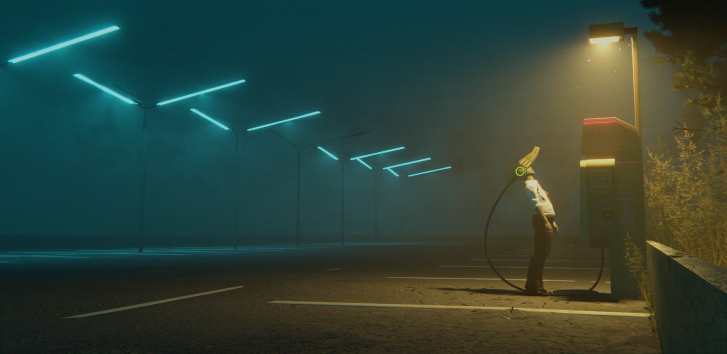
First of all, let me tell you about the concept artwork I used: the parking lot scene by Simon Stålenhag. It is one of my favourite artworks by Simon Stålenhag, so naturally, it was great fun recreating it in Blender and a very good exercise for moody lighting in EEVEE. Making it come even more alive with animations was a great challenge. I hope it makes it even better than just the still image.
[sponsor id=’qarnot’]
Most of Simon’s paintings have great lighting and a dark mood supported by the lights—all his paintings are excellent lighting studies. The total emptiness and vastness of space with the one person being as alone as you can be but still being content, hypnotized, and trapped in some weird virtual reality, is a gloomy prophecy in itself. He didn’t even take a car to get there and zone out! The classic but really well executed warm /// cold, orange /// cyan contrast framed by simple plants and just darkness works so well that it can’t get better. And even Simon Stålenhag realized that moths add realism to anything! The original artwork that this animation and all still frames are based on—and that I cannot praise enough—can be found in the book “The Electric State”.
Making that in Blender
So how did I even start to recreate that scene in Blender?
First of all, I loaded the concept art image into fSpy, which is a good tool to recreate a photograph. You basically align some lines internally to the program along straight lines in the picture and fSpy determines the camera angle and position relative to the ground in the photograph (or wherever you put these lines if not on the ground), as well as the lens used in the photograph. Then with the fSpy add-on, you import that data into Blender and have the scene set up easily with the appropriate camera position and lens. Very handy for recreating photographs.
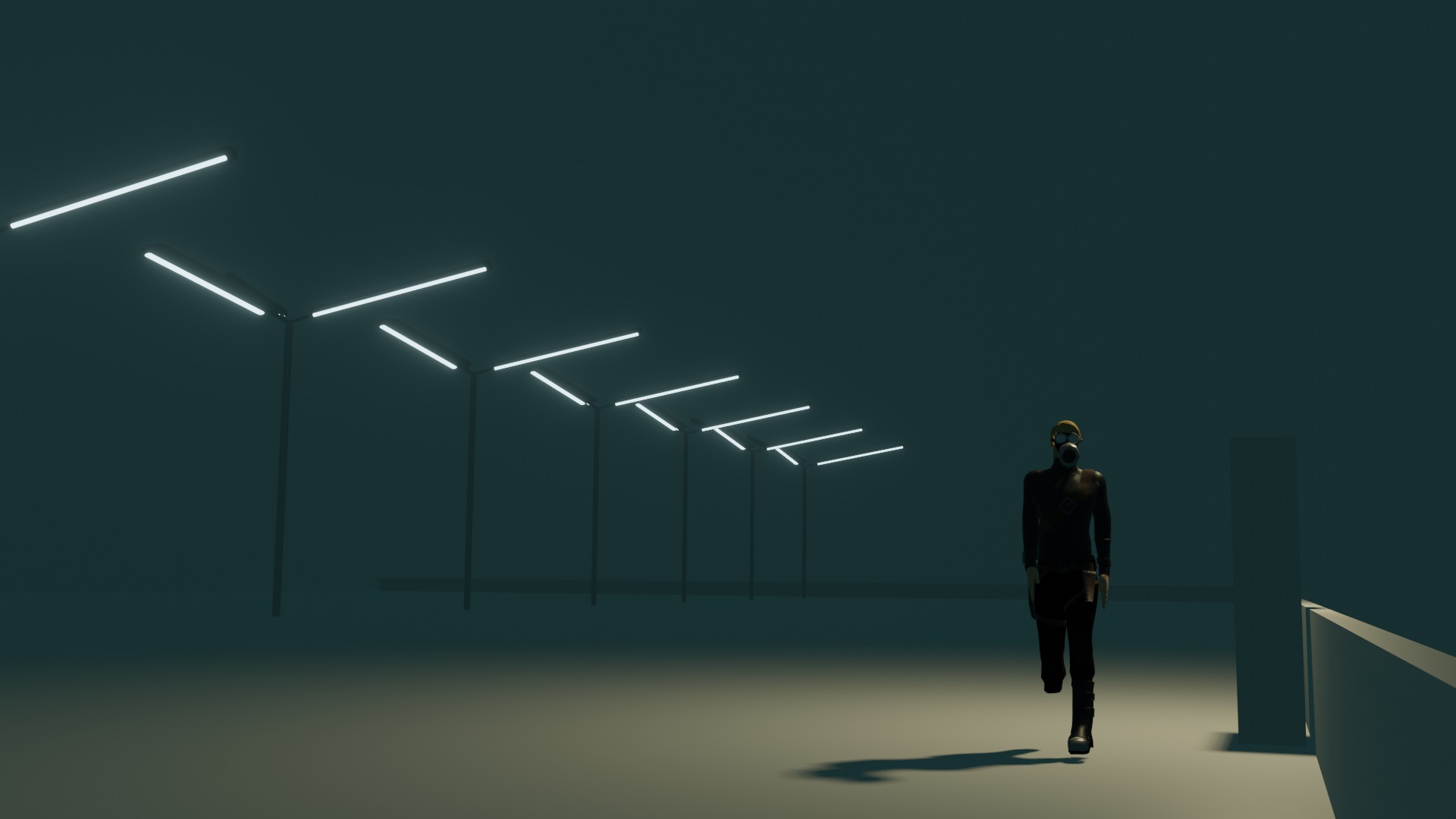
Blocking in elements
For painted artworks, this is a bit fiddly as painters have more artistic freedom than photographers or us 3D artists, it seems. The wall towards the Cyber-VR-Booth on the right in the source image would expand totally differently behind the booth, it would cross deeper into the picture towards the middle of the image. But that would not look as good as it does. The wall corners are painting some pointers towards the booth, which is a very important element in the composition, so naturally, I decided to cheat in 3D too and keep the framing and pointing wall and have it end behind the booth where you cannot see it ending and then just model the back wall to the parking lot and leave it like that. Having the wall on the right expand across the picture would draw attention away from the booth and character.
Then I just modeled the lanterns (with an array modifier, of course, it fits really well to Simon’s artwork, he constructed the position of the lantern going into the depth really well!) and gave the lanterns an emission material. Then I added a giant cube and added a volumetric shader to it to create some fog, added a point light in EEVEE roughly where the yellow lamp above the booth is, and added a character for size comparison and to see how the light works. The booth by now was only a blocky resized default cube but in the correct position.
Random fun fact: The dummy character was actually used before as the player character in the game “Sabotage on Noegato-Bas“.
Better lighting and materials
After that rough blockout, I added some basic metallic material for the VR booth and some simple asphalt texture on the ground to see how it would look in the correct light. Getting this right took the longest time. Adding a volume to the scene added the foggy effect but getting the light right was a challenge for my patience. EEVEE lights look great in foggy environments but sadly EEVEE does not allow for light emission from surfaces (with an Emission shader) to light anything but itself.
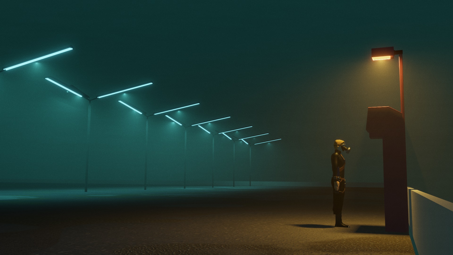
It took a lot of tweaking and moving of light sources and sliders to get it right. But after some time I managed to make the spotlight shining down from every lantern look like it was really emitted from the long neon tube and not from a single point source (Eevee actually does emit light only from a point light source, though). I can’t give you any advice to achieve that look except what I already wrote; tweak a lot and then some more. And I used a really huge angle for the light cone of the spotlight.
Giving the image character
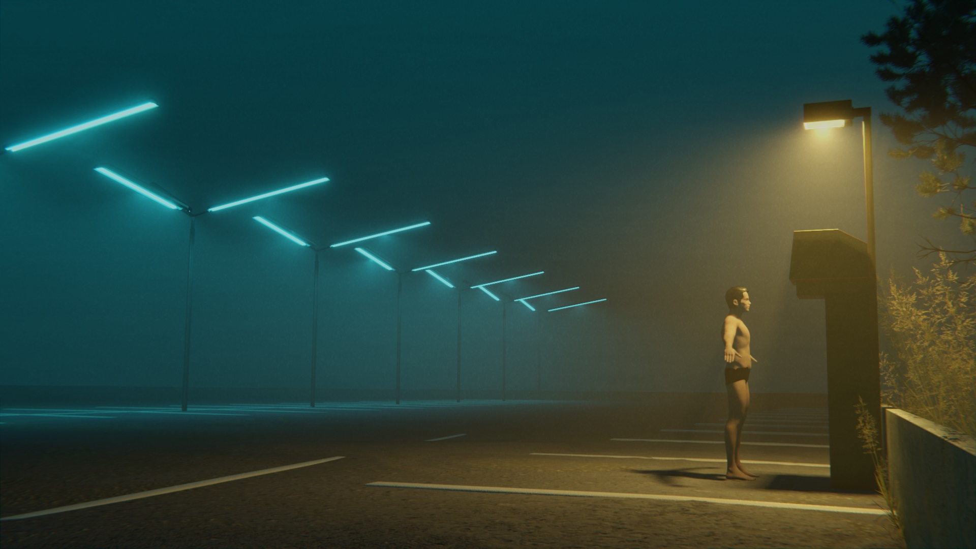
After the light beams from the lanterns and from the light above the booth were adjusted to my liking (even the shadows of the booth look like they do in the source painting), I added a person mesh with the help of the free MB-Lab add-on for Blender to see him in the light already.
From this point on it was basic modeling and texturing the phonebooth. I was surprised how accurately Simon Stålenhag painted the booth and the shadow resulting from it. Maybe he modeled it in 3D himself and painted over it, or he is just a really great artist. :)
I wanted to have the top of the booth be as shiny as in the drawing, so I made the orange light so bright that the top of the booth reflects and shines like in the original painting. Sadly, I totally missed that this made the shadow of the booth almost non-existent. If I could change one thing after releasing the finished artwork it would be to turn down the orange light to not have so much of a shiny reflection on top of the booth as more interesting shadows under the booth.
Final touches
What can I say, I basically jumped from modeling to texturing to lighting, to modeling to texturing, and so on. Most people would probably recommend that you first model your assets, then texture them and then light the scene, but, as you see, a bit of chaos also works out.
To create the S for “Sentre” on the booth, I made a special texture for it in Krita. The sticker with the Toxic Tuba logo on it on the booth, of course, is not found in the original painting but actually found around my town in real life on all kinds of public spaces and walls—it’s faster and less destructive/ugly than tagging public spaces. This is like subvertly tagging a Simon Stålenhag painting by leaving my alias in the world of the painting.
Then the person needed a VR helmet. I made it with some rather simple metallic meshes. The long connecting line is made with a bezier curve and a bevel to it. The person’s clothes are just meshes from his body duplicated in shirt and trousers form and given a cloth material.
To frame the whole scene just like in the “concept art”, I added the vegetation with the help of the Graswald and The Grove add-ons. Both do an excellent job at what they are made for and are really recommended. These are commercial add-ons but worth every cent.
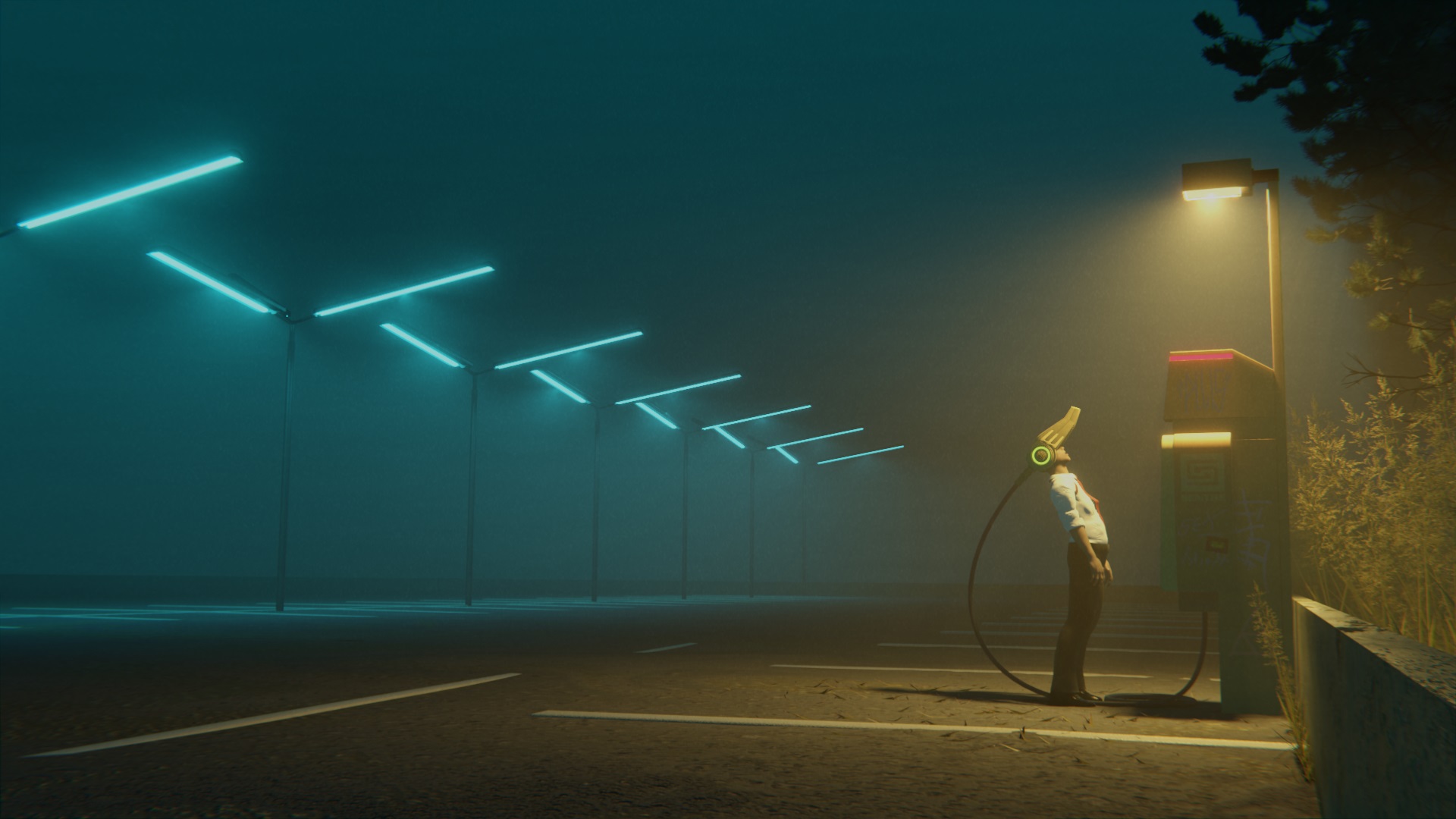
Final touches to the static image artwork are the moths under the front lantern. Simon Stålenhag and Ian Hubert know what is going on—moths add a lot of life.
Animation
Speaking of adding life, animating the moths and the fog and the grass and the camera movement you see in the embedded video at the beginning of the article took quite some time. Explaining everything I did for the animated version would fill another one of these making-of articles. To sum it up I basically just expanded the world outside of the painting a bit more just like I imagined it, constrained a camera to a bezier curve, and let it fly through the scene, made everything move a bit (that is the tricky part), and hit Render Animation.
Normally after the render is finished I see one small mistake and 1 more thing to change and improve, do that and hit render animation again and repeat the last 2 steps a dozen times while having filenames like “final render 12” and after some more iterations and even longer render times, the animation is done. And having a moody soundtrack makes the whole thing work, thanks to Edwin Montgomery who scored the animation spectacularly well.
About the Author
 Chris / ToxicTuba, 3D Artist
As a huge fan of Simon Stålenhag I read this with great interest. It was a good read. I will look at a couple of the plugins that were helpful as I’m always interested in what tools accomplished artists think are good.