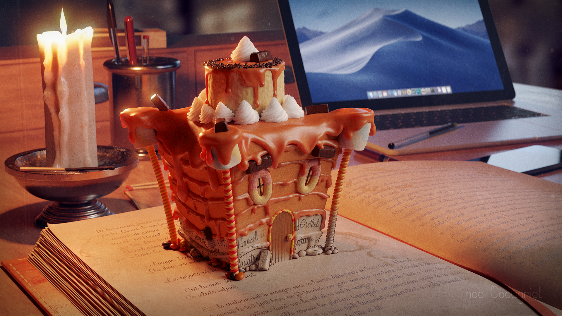
Behind the Scenes: Hansel and Gretel
Background
I had never considered the possibility of becoming a professional 3D Artist. I worked on an Audiovisual Technician’s degree in 2014, that is to say shooting with cameras and lighting cinema/TV sets in Roubaix, France, to become a cameraman. I had the opportunity to develop multiple skills related to this domain, by learning editing and VFX softwares such as Adobe’s Premiere Pro or After Effects. At this time, my use of Blender was very limited, it was just a hobby without real ambition. Moreover, I didn’t have a good level, I only used seamless, tileable textures for almost each of my models, and didn’t spend more than 15 minutes on an asset.
It was when my future employer, Canasucre Productions, introduced me to it in 2017 I had the chance to practice Blender for professional matters. There, I met wonderful people who taught me a lot in almost all audiovisual areas: camera shooting, editing, post-production, audio editing, and of course, 3D. We worked on a 3D short-movie, The Butterfly Cage, which was the perfect project to work on and improve photorealism. This movie is currently being sent to multiple film festivals throughout the world. Unfortunately, the full-length movie is not available online, yet.
When I started working on the artwork Hansel and Gretel, I had a little more than 3 years of professional experience in 3D.
The Idea
The idea of Hansel and Gretel started with a small, French community contest. Every month, a theme is given and every participant has 15 days to create an artwork related to the theme on Blender. In March, the theme was “Grimm’s Fairytales”. I decided to participate in a 3D contest for the first time ever and dive into this project.
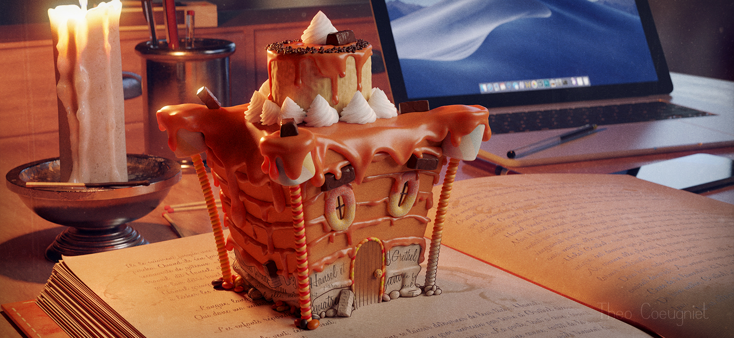
I almost immediately thought about the Hansel and Gretel tale. I think the candy house described in the tale is a very interesting topic to develop, because it is entirely open to interpretation, we can give it the shape and the colors we want. Used to photorealistic rendering, I also thought it would be a good exercise to explore other graphic styles. I then had the idea to cross two universes: the real universe and the tale universe. It allows me to create an opposition, thanks to the colors, the shapes, and the graphic styles chosen—photorealism in opposition to the fantasy, the bizarre.
On top of that, I used metallic, and overall cold materials to depict the real (phone, laptop, pencils) and generally warm and organic materials to illustrate the tale (book, candle, wood, and, of course, the house) to reinforce the contrast between the universes.
The Process
I started working on camera placement after I modeled a few assets. I tried to imagine how the final image would look even though there was no house at that time, and decided to place some lighting elements, which is a terrible idea when you only work with rather flat objects. I modeled some common assets as it’s something I’m comfortable with. I wanted to push back the house creation as far as I could because I honestly was quite worried about modeling it; I’m more of a hard-surface modeler than an organic modeler.
After some time, I had to model the house, it was the key asset of the scene and I couldn’t work the lighting and the composition of the image without it, so I started with the structure which was not less than an elongated cube. The house, organic, was also meant to feel alive. I added a door and windows as if it were a face.
I think the longest part of the project was to create this dripping caramel. I honestly had no idea how I could achieve a convincing look without spending too much time on it, so I headed right to a Donut tutorial on YouTube (Blender Guru, we all know!) to create the coating. Well, it didn’t convince me at all. I went in another direction where the coating was completely sculpted, by using Blender’s Dyntopo and Draw/Inflate brushes, which were extremely useful. However, I had to spend a lot of time to get a nice-looking result; it was a long and repetitive task.
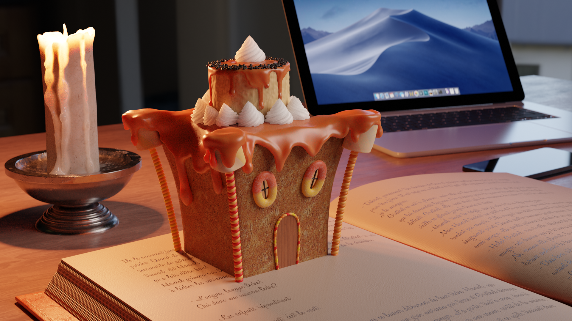
I changed the structure of the house because it was quite boring, and way too flat. But I ended up with a… “flabby, stacked up pile of bread slices”, which was awful. I hid the seams with more dripping caramel.
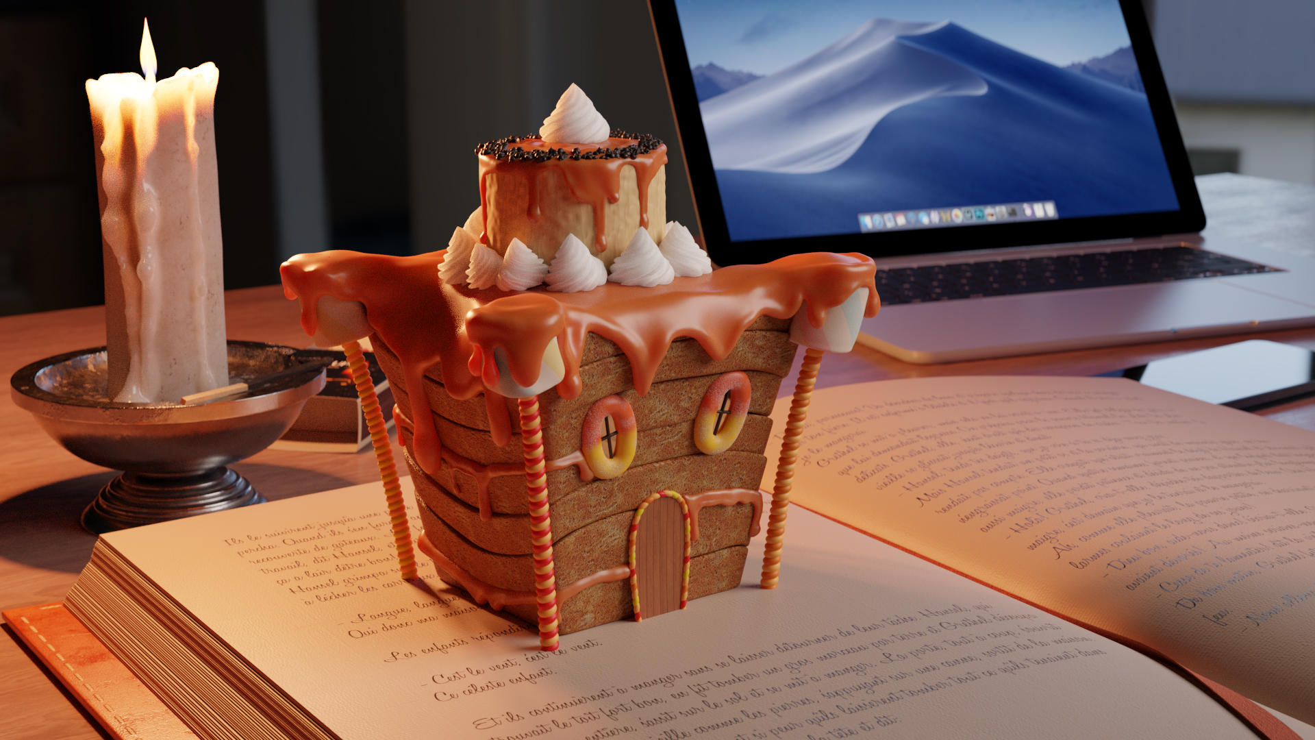
The next difficulty I had was to find the right texture for the house’s walls. It is very hard to get realistic food textures, even more when you’re looking for a gingerbread-like one. I tried multiple other textures until I decided to use a plain color, combined with Blender’s noise to add some bump. The next step was to model more assets to decorate the house and to add verticality and volume to the image (pencils, drawers) and there, I had my render.
The Post-Process
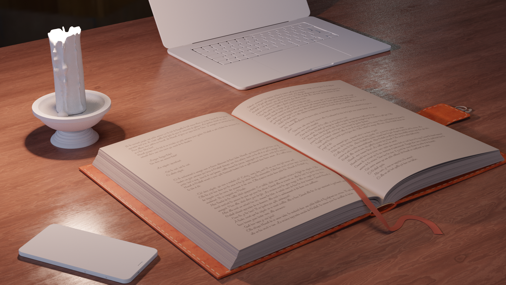
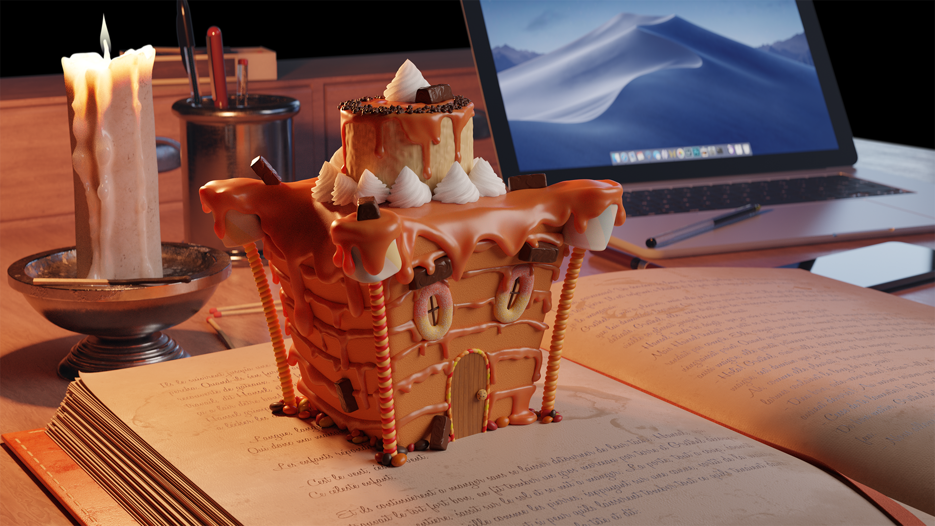
Because I wanted the house to come up from the book, as if it emerged from the tale universe to have an anchor in the real universe, I had to find a transition between the book’s pages, and the house, to avoid the feeling that the house has just been dropped there. I had the idea to use the same material as the pages for the house, then to blend them in Photoshop to achieve the look you can see on the final render of the Artwork.
I made two different renders to create this look, with the house blending into the book. A first one where the house has its own textures, and a second one where every part of the house has the page’s material and some Freestyle.
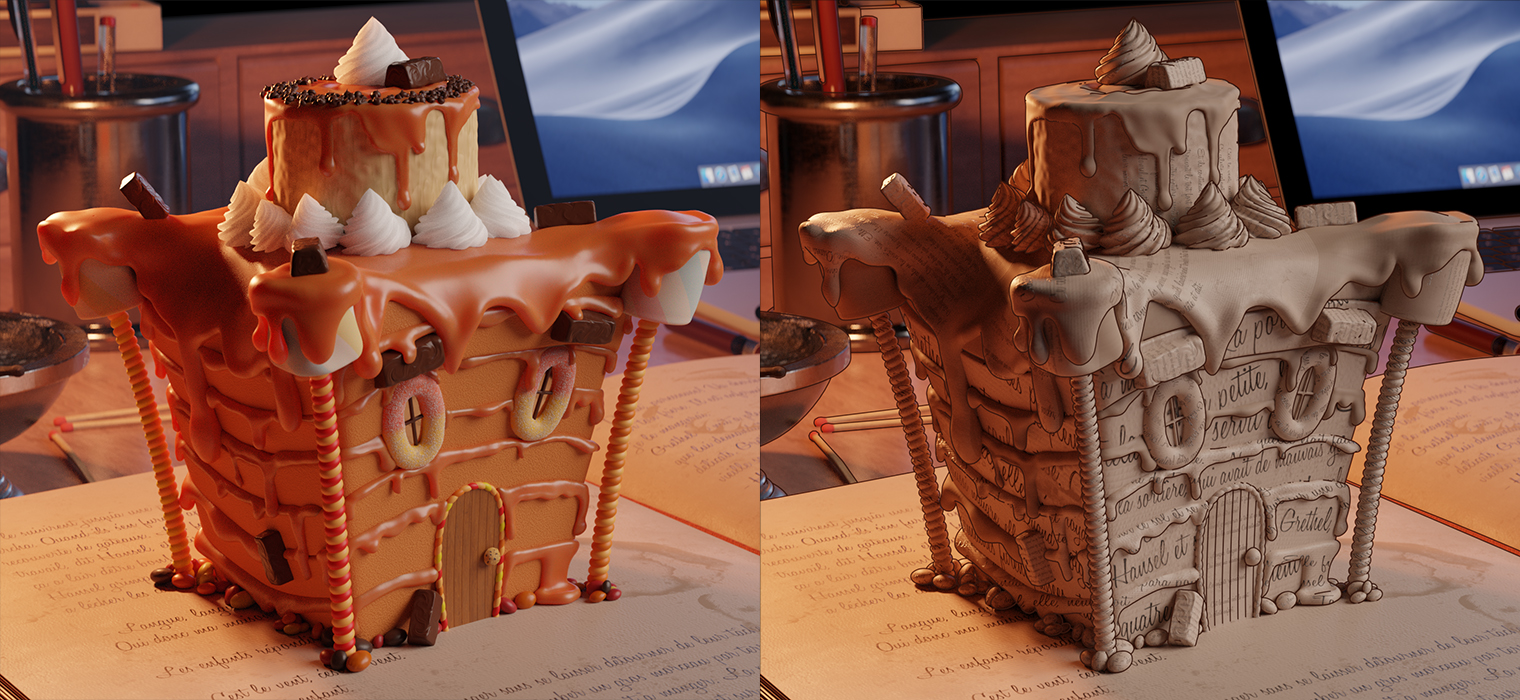
It was then fairly easy to blend them in Photoshop, using a painted mask.
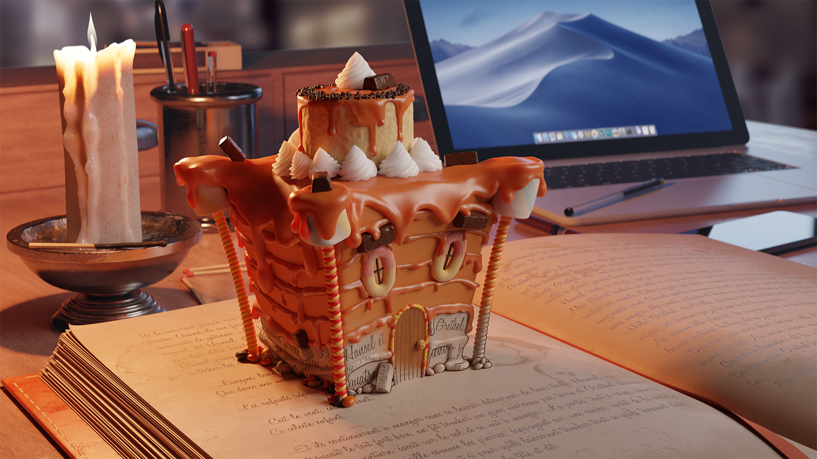
As you can see, I also added a background image; that is because the HDRi I used in the main scene had appropriate lighting, but not an appropriate look where you could see people in the background (I think it was a kitchen HDRi).
Even though I was getting more and more satisfied with my artwork, something was missing to add an extra pop. I applied something my technical manager taught me when I was working for Canasucre Productions; to make a render “less CG” and pleasant to the eye, add real photo sources, such as flares, grain, lens distortion and other camera-related artefacts. So, I painted a vignette, added Glare, film grain, and a grunge texture in Photoshop to give the image this worn look, adding realism. And ta-daa! Here is the final render.
I would like to thank the Blender Community for making this wonderful software thrive and 3D artists for giving us exceptional artworks which inspire us all. Thanks to Blenderartists and BlenderNation for featuring me on their respective websites. And thanks to my girlfriend for helping me translate this article from French to English. ;)
You can also check the ArtStation Project in which I included an AO Pass and a wireframe render.
Render Infos
The scene has been rendered in Cycles, Blender 2.81a. The main render has a resolution of 2880×1620. If I remember correctly, the render took about 3 hours at 3000 Samples. It took so long because of SSS, which is on the caramel, on the whipped cream, and on the candle. I didn’t use denoiser as I wanted to keep the grain and the overall sharpness of the image.
I used Blender for the whole scene, from modeling to rendering. Texturing has been done in Substance Painter, and compositing has been done in Photoshop.
My Specs
- Windows 10 x64
- CPU AMD Ryzen 7 1800X , 3.60 GHz
- GPU: NVidia GTX 1060 6GB
- RAM: 16 GB
About the Author
 Théo Coeugniet, After working for 3 years in audiovisual (Shooting, editing, VFX, 3D), I’m looking to develop my 3D skills even more!
Wow Theo! What a beautiful image! I love the design, well of everything, but the house!!! and the way it comes up out of the book – it’s like something from Inkheart!!! The dripping candle is beautiful too – oh I think all of us grapple with drips at some stage but you mastered it with that caramel… Your background in camera/lighting really shows too – the warm fairy tale assets vs the cold light of reality…but because of the candle light it makes logical sense that the fairytale assets would be in warm light – I love it!