Behind the Scenes: Escape Velocity
Hey, I’m Andrzej and I’ve been doing various CGI-related jobs for almost 12 years now. Modeling, texturing, but gravitating more and more towards lighting. I’ve also been focusing more and more on strange, stylized projects—the crazier the better. Also, harder—but those strange ones are never boring. In recent years I’ve been doing things like supervision and even some art directing.
Origins of the Project
What I’ve not been doing for years is personal work. I was growing more and more unhappy with that, but, at the same time, I didn’t want to do the same stuff I did at work. Since the time I can dedicate to personal work is both limited and fragmented (usually it’s an hour or so squeezed in whenever I have some downtime), I was, and always am, looking for tools and workflows that will make it easier and faster to get the ideas on the screen. But most importantly, I want to focus on story, composition, shapes, and not on the technical stuff. I don’t want to spend ages sculpting skin pores. Been there, done that.
This is where Blender comes in. In a fortunate timing, I stumbled upon 2.80 Beta. The main draw was EEVEE. But I was wary—I had not been compatible with previous versions of Blender. The interface, selection methods, just not compatible. But 2.80, this was a different animal. It just worked as I would expect a 3D package to work. Sure, there is a learning curve, but working it out felt actually exciting and satisfying. And when the excitement about new tools coincides with a new and exciting project, that’s a great feeling.
Since I wanted to focus less on the technical stuff in my work, I’ll do the same here. Escape Velocity is something of a series—I definitely want to do more in this style and with those characters. But for now, let’s focus on the first image, and let’s talk about composition.
Composition
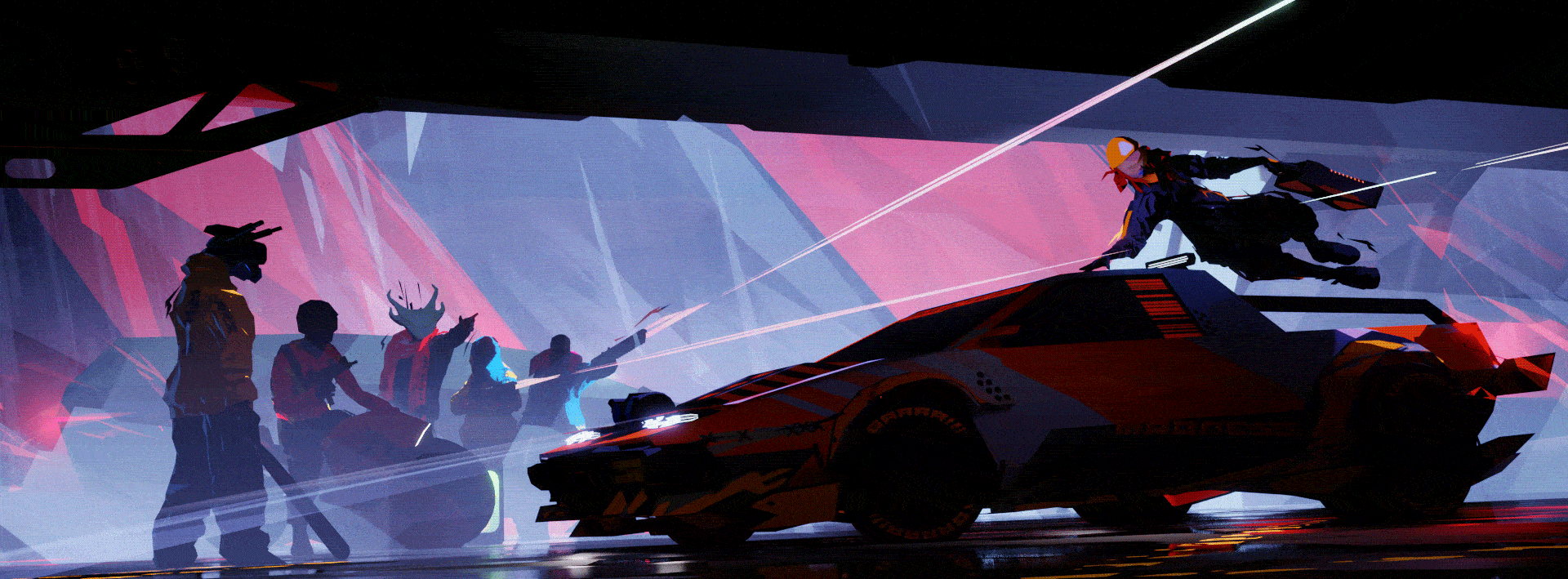
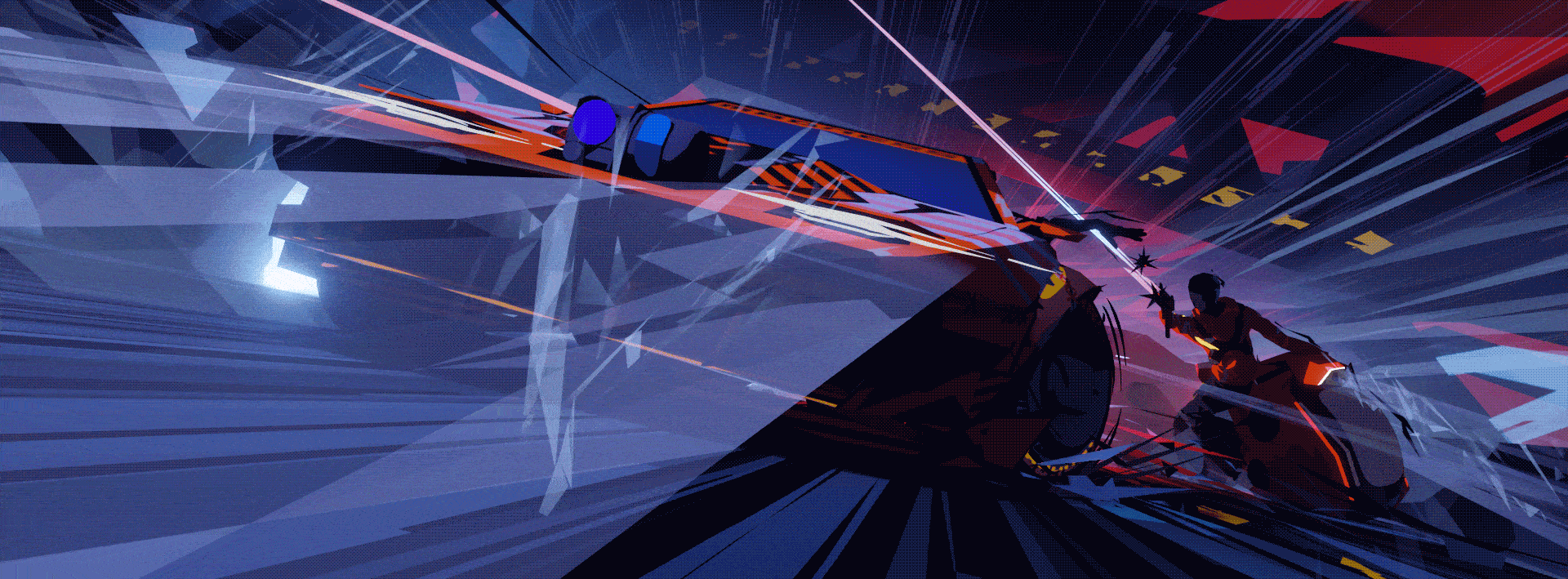
As you can see from the progression GIF [Img 1], I had a pretty good idea of my composition from the beginning—this image had been sitting in my head for a while. At the same time, finding the right composition is not always a linear process—some important features are actually quite late additions. But let’s break down some of the decisions I’ve made here:
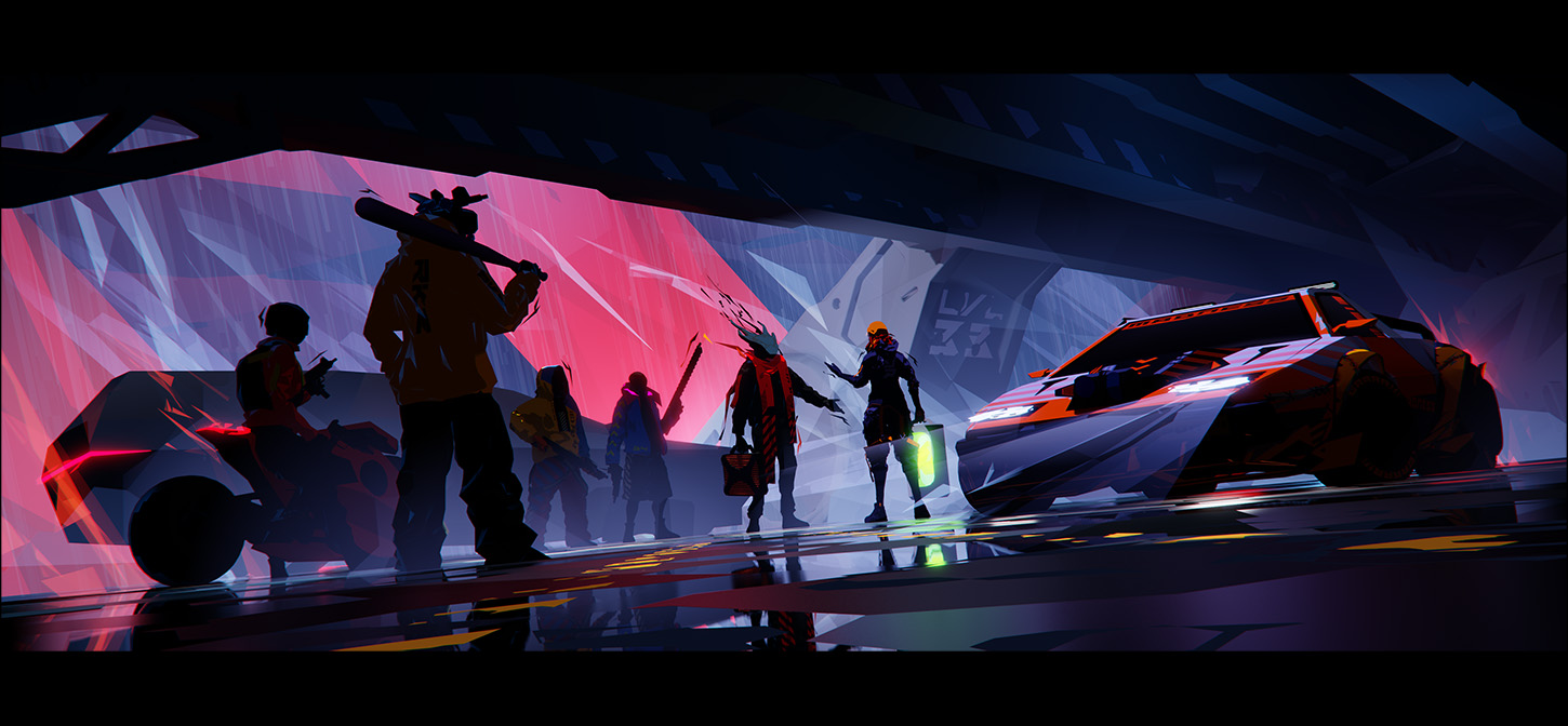
Wide (65×24) aspect ratio—on the one hand, I like the cinematic feel. But the main reason for this aspect ratio is Hasselblad X-Pan—it’s an old school film camera capable of capturing a kind of panoramic image on 2 frames of a standard 35mm film. I like the esthetics of those images very much. Panoramic images, due to the way they are usually made—by stitching together many images—are not well suited to working with characters, and even less for action. X-Pan approach, by capturing a panoramic image in one go, makes this much easier. So you can have the character in close-up, with a wide view of the environment behind, without having to stitch and deal with motion-induced artifacts. I’d love to have such a camera someday, but they are rare and, being Hasselblads, quite expensive. But I can take what I like about X-Pan images and try to apply it to my 3D work.
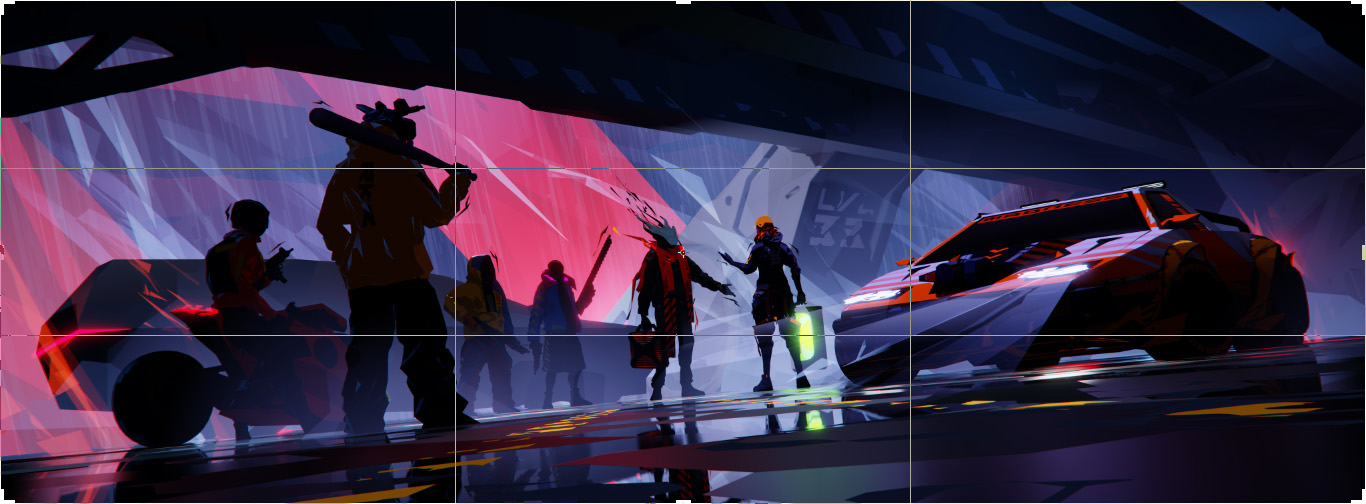
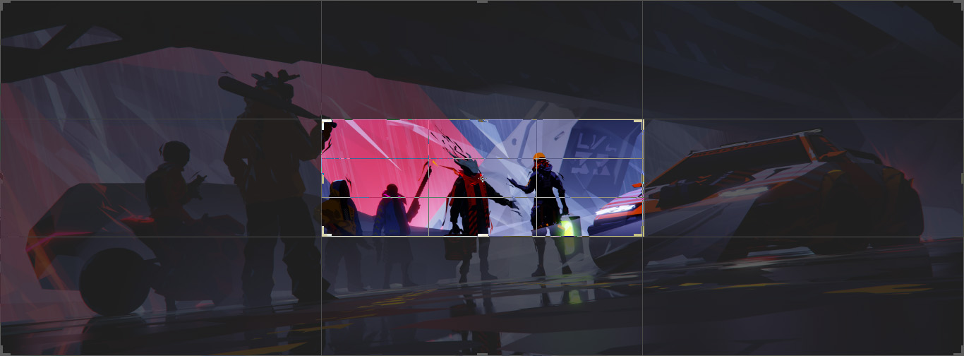
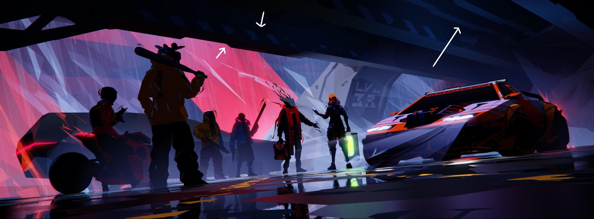
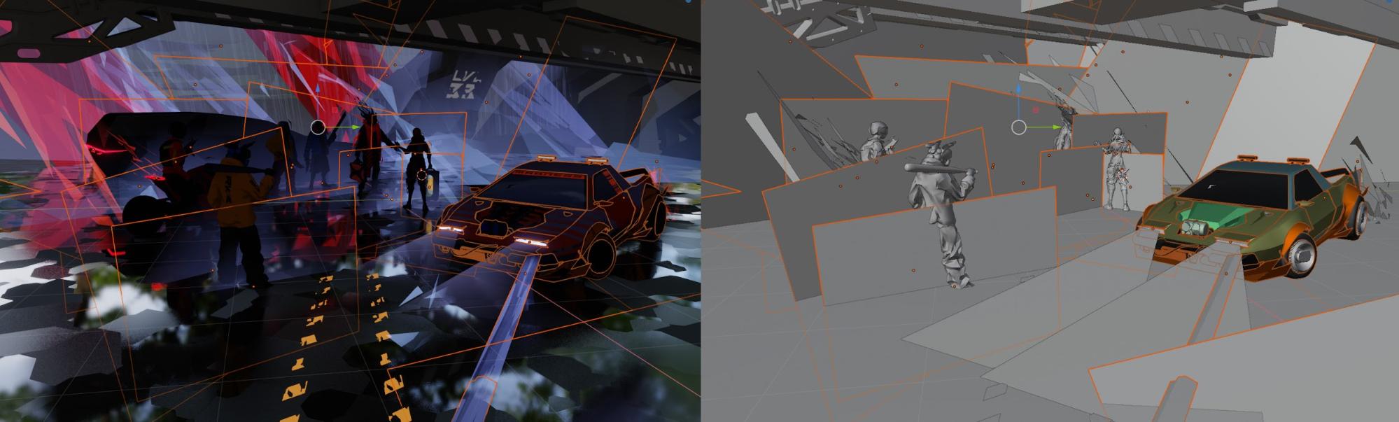
The composition, at the most basic level, is almost centered [Img2]. Almost, but not quite—it’s offset, but, hopefully, balanced. At the center, we have the area of biggest contrast—that’s where the main characters are and the main action happens. This is all very straightforward and would be boring if there was nothing more going on.
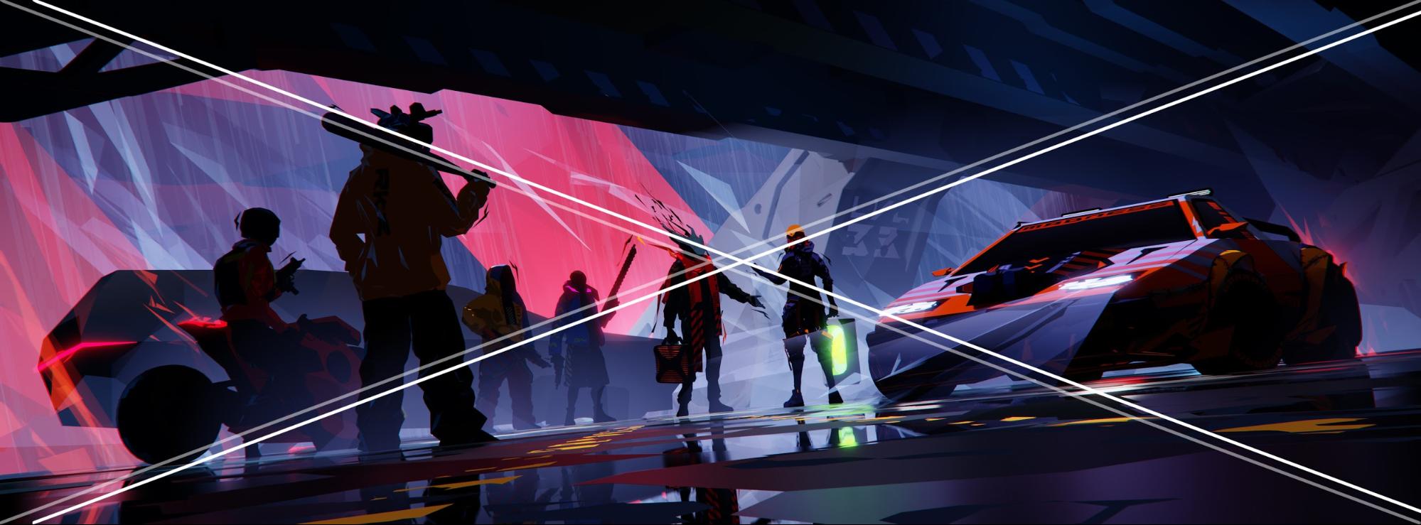
The diagonal overlay [Img 5]—this one works in a more straightforward way. This was actually accidental—I was not checking diagonals consciously. I just got to this point using different tools; it’s a byproduct of that central composition I mentioned earlier.


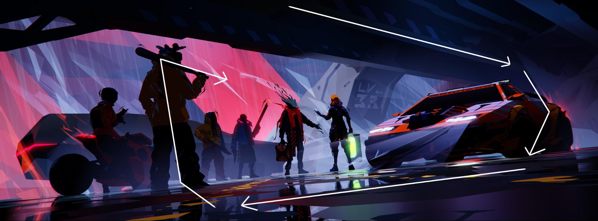
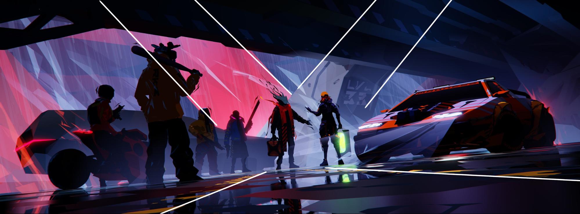
The spiral frame is not the only leading line we can find. There’s also an X pattern in the center, with those 2 dotted yellow lines, pointing back at the center, in case we got lost in the bottom part of the image [Img 9]. And there are some 7 and Z shapes in there as well, which, when placed right, can add some dynamism, and keep the eye where it should be.
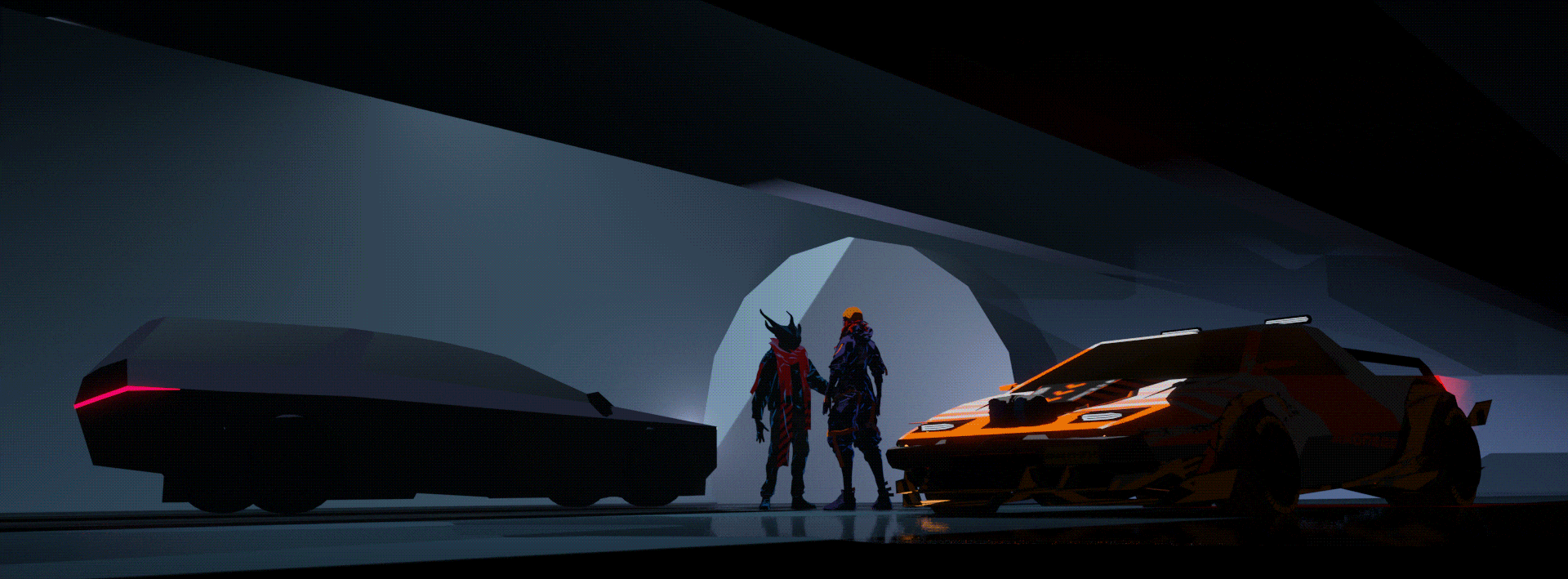
The tilted horizon, known as a Dutch angle in the film/photography world, is a common way to introduce tension or a feeling of danger and unease. It works well here, too [Img 10].


Detail
Another tool, often used by painters, and really hard to use in 3D, is detail, or rather, the amount of detail. Our eyes are naturally drawn to the areas of higher detail—but for this to work, we also need areas of low detail, of rest—this is contrast again. We notice all kinds of contrast. Value contrast, color contrast, shape contrast (round/pointy), level of detail contrast, and so on. If we use those contrasts to reinforce each other, we can have a complex, but a quickly readable image. And readability is always a good thing.
Conversely, we could use those different contrasts to tell many different stories in a single image—this may be something worth exploring further. But back to 3D—especially in realistic 3D, lack of detail rarely looks good. In stylised 3D, however, this is much easier to control. If we compare our main character’s car, with the bad guys’ car—we clearly know which is important. Bad guys’ car is a nondescript black mafia SUV, big, sort of imposing, and angular… and that’s all we need to know about it. Hero car is important to the bigger story, and if you look closely has a lot of details, scrapes, scars, and mods that tell a bit more about the owner. But all those details, while there, are not something the viewer should see first. So they are mostly low contrast.
There’s another painterly technique I’m using here: implied detail. Again, this is hard to do in realistic 3D. But here, with a few skewed planes and some edited boxes with broad speculars, it’s just enough to convey that this is a somewhat complex structure, without actually having to create all that complexity [Img 13].
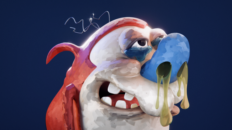
Characters
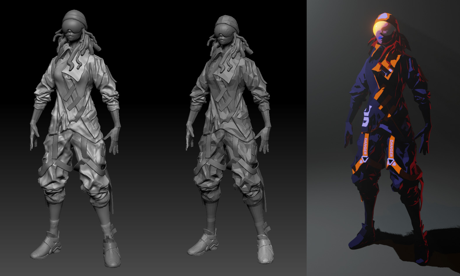
Characters are sculpted in ZBrush, in low detail. Primary/secondary forms mostly, done quick and dirty. No need for more, since they will be decimated severely anyway. So they look like this: [Img 14]
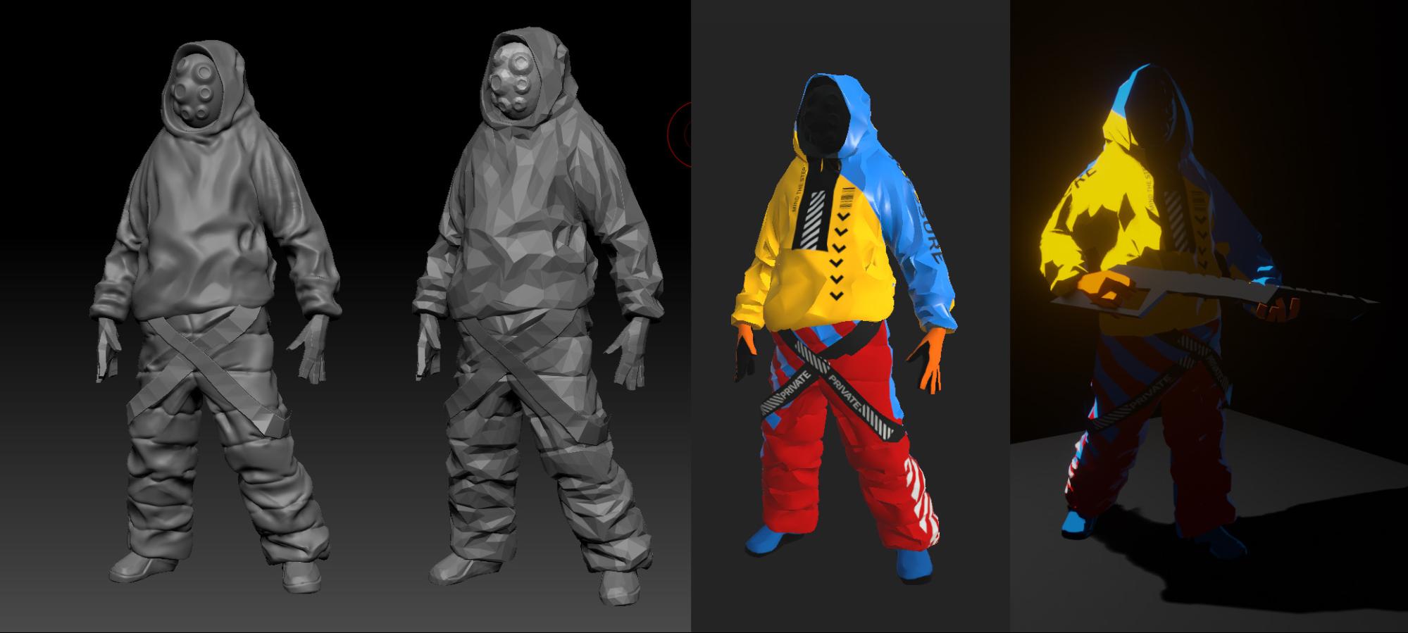
The textures, done in Substance Painter, are very simple…. Just flat colors and some symbols, maybe a tiny bit of gradients, and that’s it.
The design of the characters is inspired by a trend called Techwear (look it up…), but mixed with crazy colors and some hip-hop/gangsta looks…
For the main character, I was a bit torn between the so-called ‘gray (wo)man’ stealthy look and something with more self-expression and colors [Img 15]. But it actually fits the character well, being involved in both shady activities like this image depicts, and in a much more vibrant, racing/drifting world I hope to explore further later on.
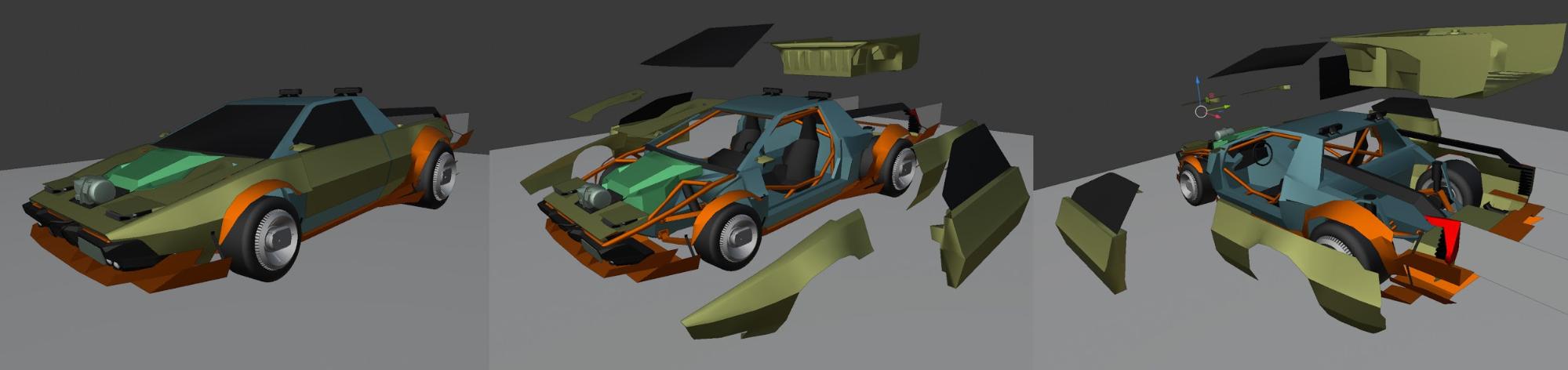
The Car
The main car [img 16] is a funny story—I started with the intention of doing the most hacky job possible of turning an old Lotus Esprit into a pickup truck. If you know anything about the Esprit, you know just how stupid this idea is, because of the way the car was built (rear engine, fiberglass body, etc.). This idea sort of spiraled out of control, and I found myself working out how I would build this car in real life—and that found its way back into the model. So carbon monocoque, tube frame, electric motors in the wheels, active suspension, Kevlar body panels, all roughly Lotus-shaped. I think, with the right amount of time and money this could actually be built…. And along the way, I found some more ideas for further images, involving workshops, welding, and so on. Also, doing damaged states would be easy now. So while this is all overkill, it’s sometimes worth doing. And it’s fun, so, again, why not?
Rendering
Now, let’s move on to shading and rendering. Here the magic of EEVEE starts to show. I was able to work with lights and atmosphere from the very beginning—and this influenced what I actually had to model (which is not much), and what I did have to build was very simple.
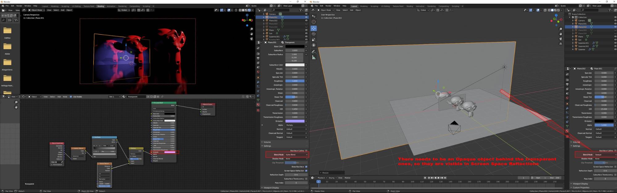
At the start, I wanted to use the Principled Volume plugged into the world texture as my main atmosphere. But this proved …difficult, because, at least in EEVEE (I don’t know if it’s possible with Cycles) I couldn’t have the lights influencing only the atmosphere. It was frustrating at first but led me to some creative solutions. The first was accepting the limitation, and thinking about how a real-world DP would work with the haze (this is very common in movies). The second was very simple—just using Planes with opacity mapping, placed in between the other objects [Img 17]. This led to a very fun and rewarding workflow, again, in a painterly way—instead of thinking about 3D objects, I thought about dark/light shapes. And the third solution was actually limiting the Volume to the background of the scene, mostly (using near/far range). I’ve included a node tree preview for the planes [Img 18]. The whole thing is different now, in 2.81 onwards, than before (I was using 2.80 RC versions for this), because the handling of the opacity mapping changed. The thing worth remembering, and this had me stumped for a while, is that in order to see Alpha Blended planes in Screen Space Reflections, there needs to be something Opaque behind them. Not sure if this is a bug or expected behaviour, but that’s how it works for now.
Also, currently there’s a known bug concerning handling of the Alpha Blending and Volumes, which makes all of this much harder—basically, even if something is 100% transparent, it still shows up in the Volume… That’s the dark side of using rapidly developing software.
Shading
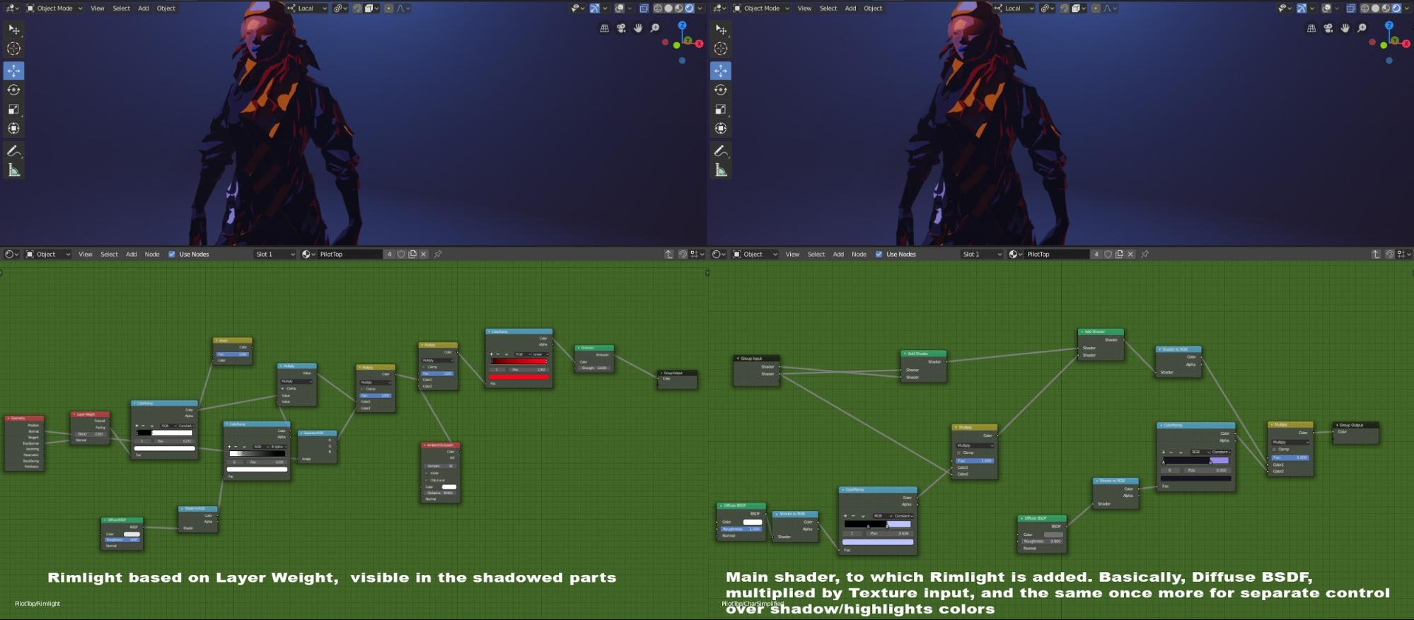
And the final piece of the puzzle—the shader. Most of the objects use a node group I built, which uses Shader to RGB and some ramps to mix light, darks and fake rim lights, in a hard-edged way [Img 19]. This works in tandem with the way models were built—those visible polygons work really well with hard-edged shading. But some things use typical Principled Shader, and this still mixes well. I tried to avoid any sort of noisy/grungy bitmaps, and ended up using Voronoi texture almost everywhere—I found it surprisingly versatile, and the pattern it produces mates well with the polygonal structure of the models. I used it for rain, puddles, smoke…best texture ever.
Conclusions
Looking back at it now, I noticed that while my models are low-detail, I still found myself simplifying them further. Either by using Decimate (Decimate Planar is great, it can keep UVs and produces a nice looking result), or just by keeping them out of direct light. So I can probably start with even simpler models next time, which is great, as it will take even less time :).
Working on this was a great experience for me—thanks to EEVEE, being able to see my image in a final form all the time—this is a game-changer for me. And it makes for a painful shock when the time comes to go back to Maya/Arnold at work ;).
There’s also an unexpected and unplanned side effect of all this—just for a test, I made some gifs with moving cameras [Img 19]… and it seems, surprisingly, that this works in motion. And it seems viewers like these little anims quite a lot. So this opens some new avenues to explore—and, since it’s EEVEE and fast, playing with motion is not as painful as it used to be ;).
About the Author
 Andrzej Sykut, lighter, supervisor, etc. at juice.pl. Photographer when possible.
Andrzej, this breakdown is S U P E R interesting.
Thanks a lot for sharing and very cool piece of work!
That’s a really cool piece – I love your unique style!
Thank you for sharing this with us!