
Behind the Scenes: Spaceport
Who am I?
Hi!
I am Lino Thomas (“Linolafett” online), 28 years old and living in Germany.
Blender has been an addictive part of my life for over 10 years now and this will probably not get better in the coming years ;)
I learned to use Blender via the official documentation, discussions in now defunct and forgotten forums, lovely people I met on the way and video tutorials on YouTube.
As an everyday job I work as a 3D Artist at “Egosoft”, a small German game studio. Creating sci-fi spaceships and stations is one of the things I do there.
Why I Created this Scene
In the pursuit of increasing my speed in modeling, I was searching for better ways to quickly create large scenes and fill them with detail, without having it look generic and losing control of the assets. In addition I needed to work on my visual storytelling skills.
How I Created this Scene
Before I jump to the “Spaceport” I should iterate on a project before “Spaceport” to show how I managed to create the assets used in the Spaceport scene.
“One hour of greeble”
To push myself to be much quicker in modeling, I set myself a goal to create a scene in a very short amount of time.
The result was the “one hour of greeble” project in which I give myself only a single hour to model all the geometry and arrange it in a scene.
Two of the resulting projects looked like this:
Modeling workflow
How did I manage to create these scenes in such a short amount of time, you might ask.
For this I will just show the two key tools/workflows I used:
Mirror modifier with the “bisect” function enabled.
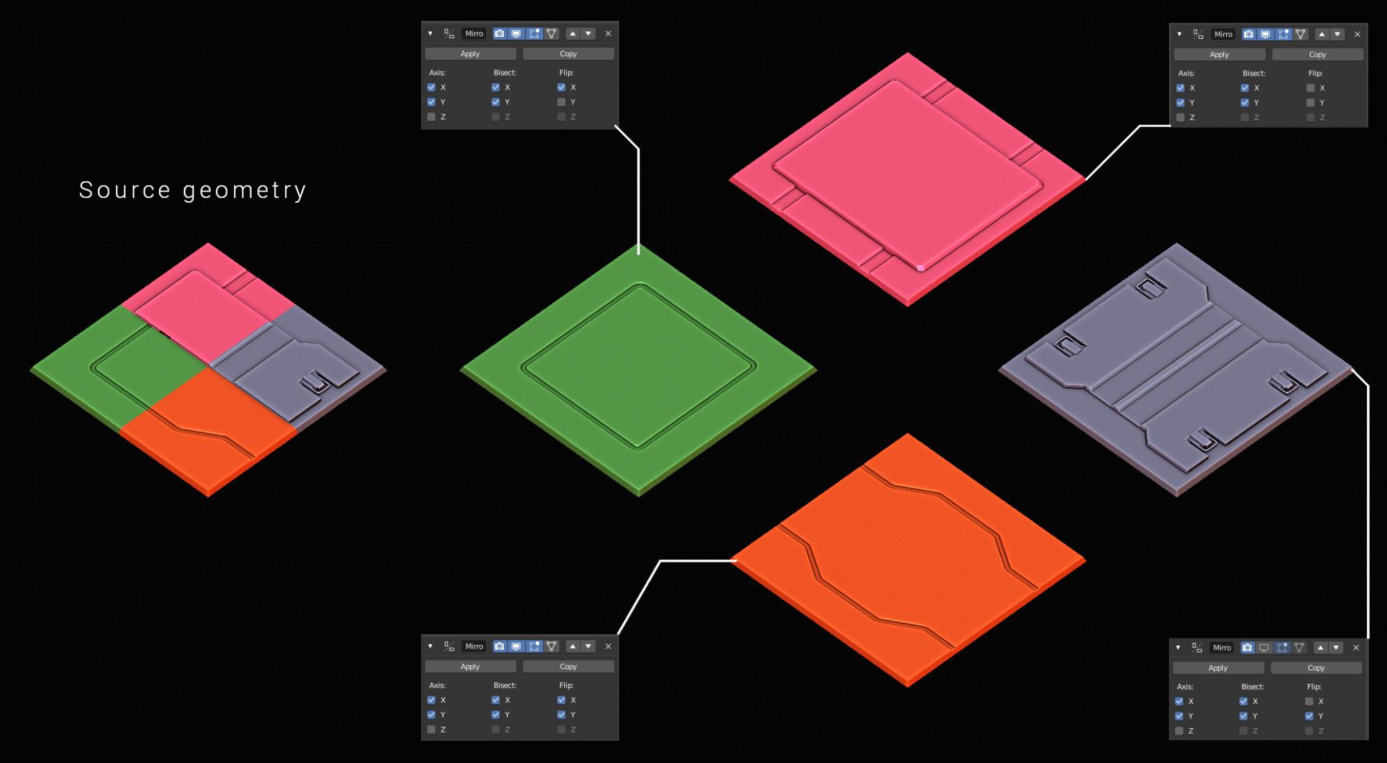
This allows me to have one source geometry look entirely different dependent on which axis I mirror on.
Linked duplicate geometry and collection instances.
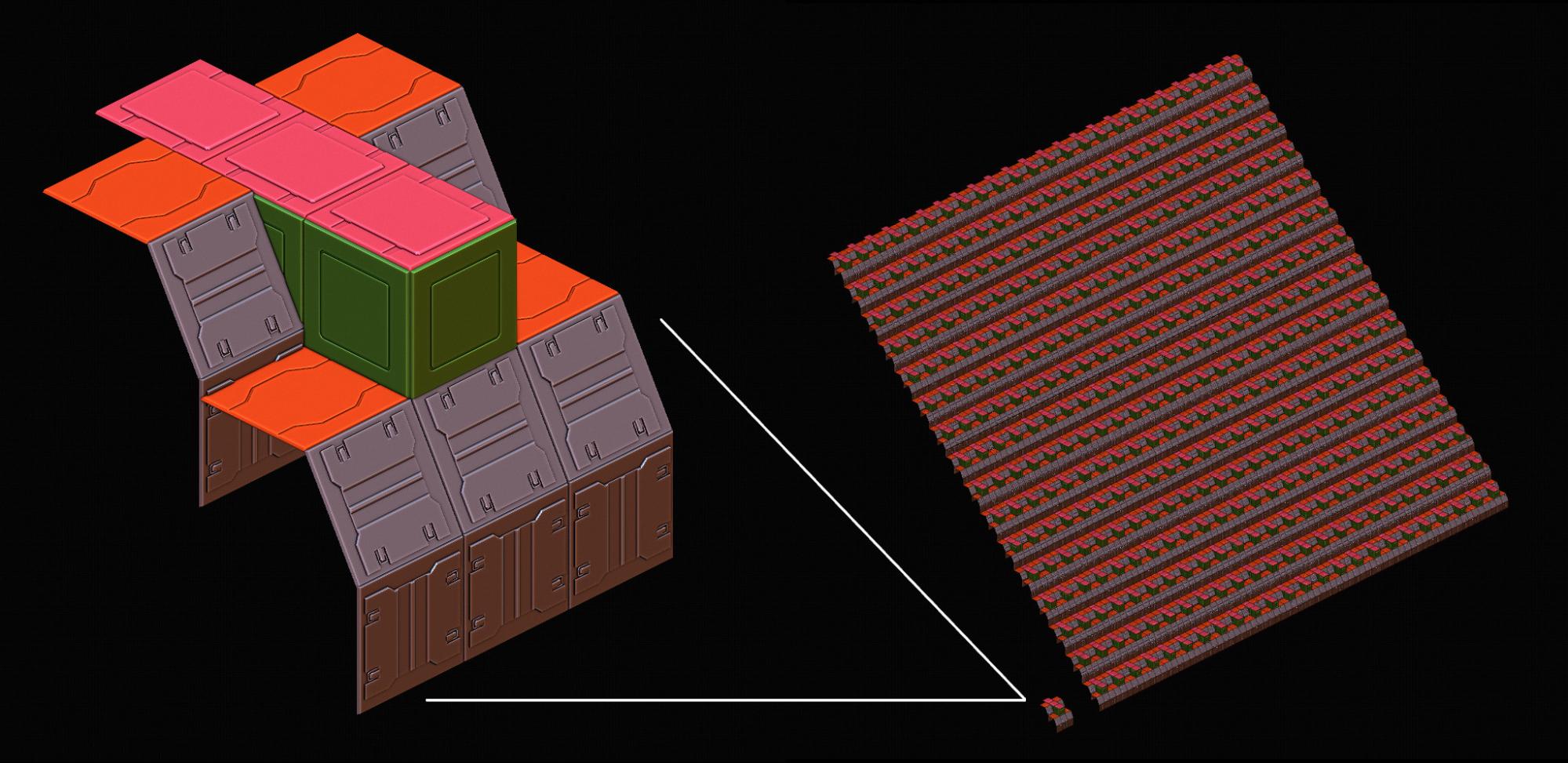
This allows me to create a large amount of objects without losing control over each and every model.
I created linked duplicates of my source geometry tiles via “alt+d” and placed them how I needed them to build my scene.
After I had created a “building block”, I moved all the objects of it into a separate layer.
Now I could create an instanced copy of this collection.
For this you need to search for it in Blender.
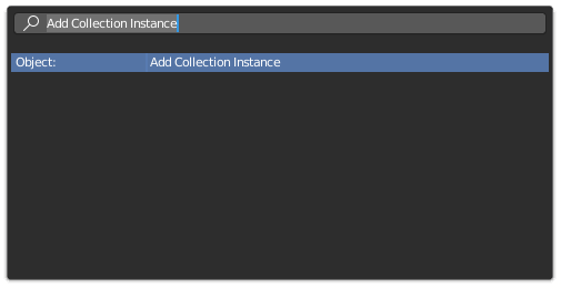
This will add an empty, where the collection is instanced.
You can transform this empty how you want. I simply duplicated these collection instances a lot and built my scene with this workflow.
Why Collection Instances?
The huge(!) advantage of the instances is that the overhead of managing many objects in the scene gets reduced to a single empty.
If my “building block” contains 25 objects and I duplicate this block 100 times, the scene will end up with 2500 objects. The more objects Blender needs to visualize, the worse the performance of the viewport gets.
By using collection instances, I will have a source collection which contains the 25 objects and will only tell Blender that it has to transform this collection 100 times instead of having to define the locations of 2500 objects.
A bonus advantage is that instances will have a much lower memory footprint when rendering.
Note: This is an artist’s understanding of the system, so it is simplified to the bare minimum and will be incorrect in many regards, sorry!
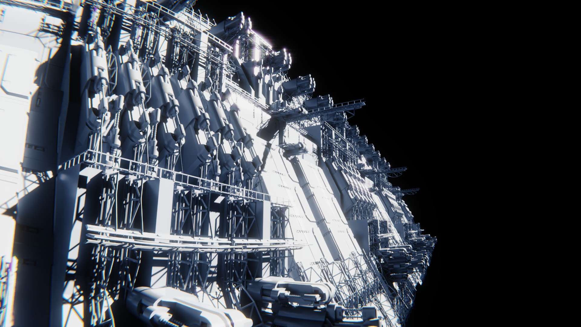
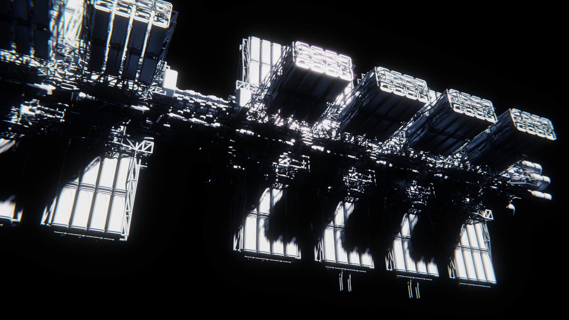
In the shown use case above, there are about 9000 objects visible, represented via roughly 400 collection instances. I can fluidly move around in the viewport and do not experience any slowdowns. Neat!
These “one hour of greeble” projects made me better at modeling, but the scenes had a huge flaw: They don’t tell a story, they were not well crafted when looking at them through a cinematographers eye. This is an area I always struggled and still struggle with.
Therefore I tried using the assets created in the “one hour of greeble” project to create a scene that captures the viewer’s attention for a longer time.
Composition

Let’s take a look at the scene and what I tried to do.
Blocking the scene
A thing I always struggle with are the values in the final image.
I usually put lights everywhere in all different kinds of colours without guiding the viewer through the scene via the brightness of the scene.
Therefore I approached this project differently.
An image can be broken down to a bare black and white thumbnail.

I created a few different thumbnails like this before I even knew which assets I would use.
This was done to force me to stick to this very simple basic layout and build my set around it.
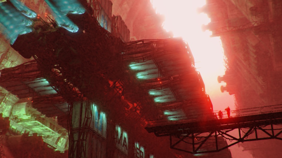
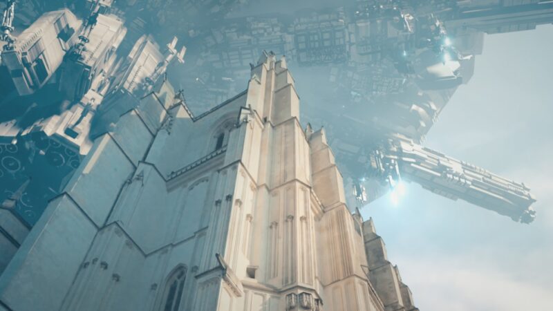
I wanted to make a scene that looks big, that dwarfs the viewer. Therefore I chose a low camera position looking upwards.
The large dark areas and a thin line of brightness cause the viewer to feel walled in. It’s great to funnel the attention into this area of the image first. So whatever will be placed there will be seen first.
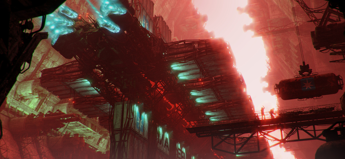
With this in mind I chose the assets from the “one hour of greeble” which contained a long large wall.
In addition I picked the spacecraft from these projects and placed it in the scene. I would dress it as a large container freighter to support the industrial look the scene already offered.
At last I placed a walkway with characters into the lower third of the bright area. They would be working on some stuff in the scene, to have them do something more than just observe the scene.
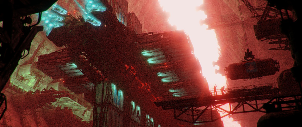
The first test rendering looks like this:
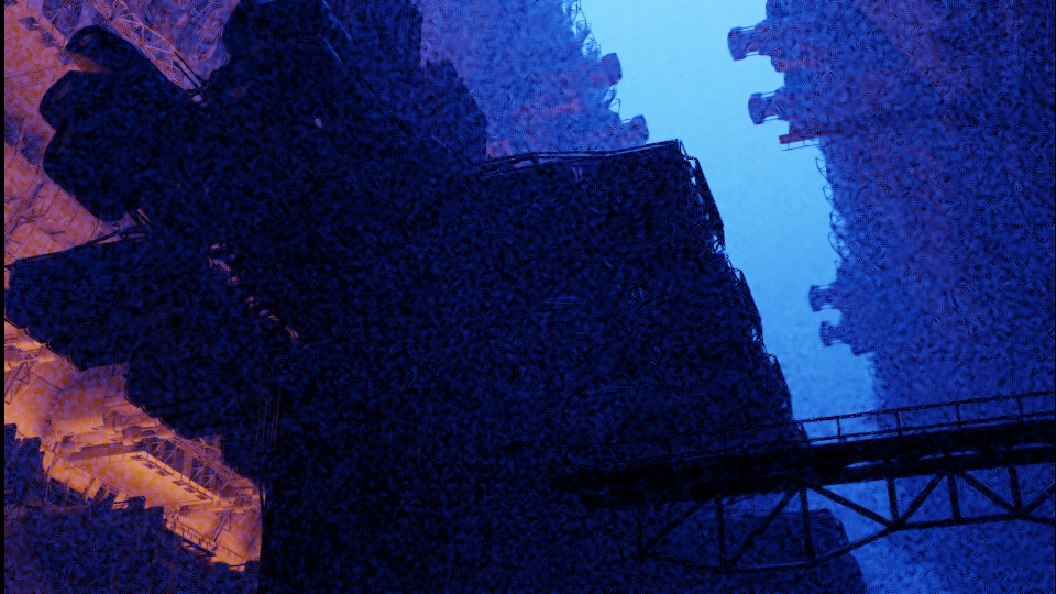
I went already with the colours and caught myself again ignoring the values. The supposedly bright area is actually a medium bright area. The walkway was bleeding into the spaceship, not good!
In addition I was already bored with the common/orange contrast. I went into GIMP with this rendering, played around with the hue slider and settled with a much more rare contrast. A reddish/green tint.
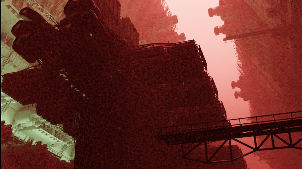
This gave me the possibility to explain the setting better. We are now in a heavily polluted area or even on mars!
I then continued to dress the scene with more lights on the ship and also textured the greeble assets via procedural texturing in the shader.
At this stage I was actually super happy with the result. It looked attractive to me, had nice colours and contrast. I then showed this image to some friends and got valuable feedback.
First: I am too far off the rule of thirds! This is just a guideline, but you can feel here, that the “canvas” is too tight for the image. The characters are too close to the border of the screen and the ship is cut off.
Let’s fix that!
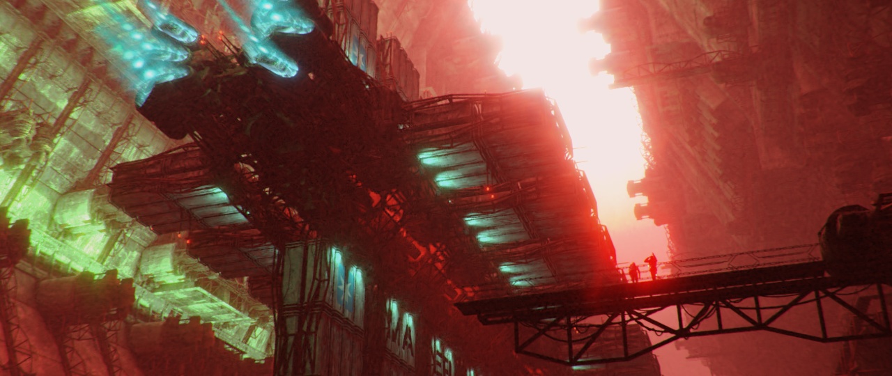
Much better, the scene now can “breathe”.
The second and very important thing I learned: Framing.
The image is “open” to the left hand side, and also not closed on the right hand side completely.
It feels much more comfortable to have a walled-in image, so that the eye doesn’t want to wander off the sides, but stays inside of the image.
Looking at the values, I also somehow missed that the fog in the scene killed the bright stripe going through the scene. I solved this by adding a light emitting volume at the end of the scene, to brighten up the area behind the characters.
At last I made the characters interact with the scene by working on some cargo transport container. That way they are not mere spectators, but are interacting with the scene.
You might interpret their actions as they are currently unloading the last few bits from the delivery of the cargo ship.
Job done, just hit render and wait half a day for it to get rid of the noise from the volumetrics ;)
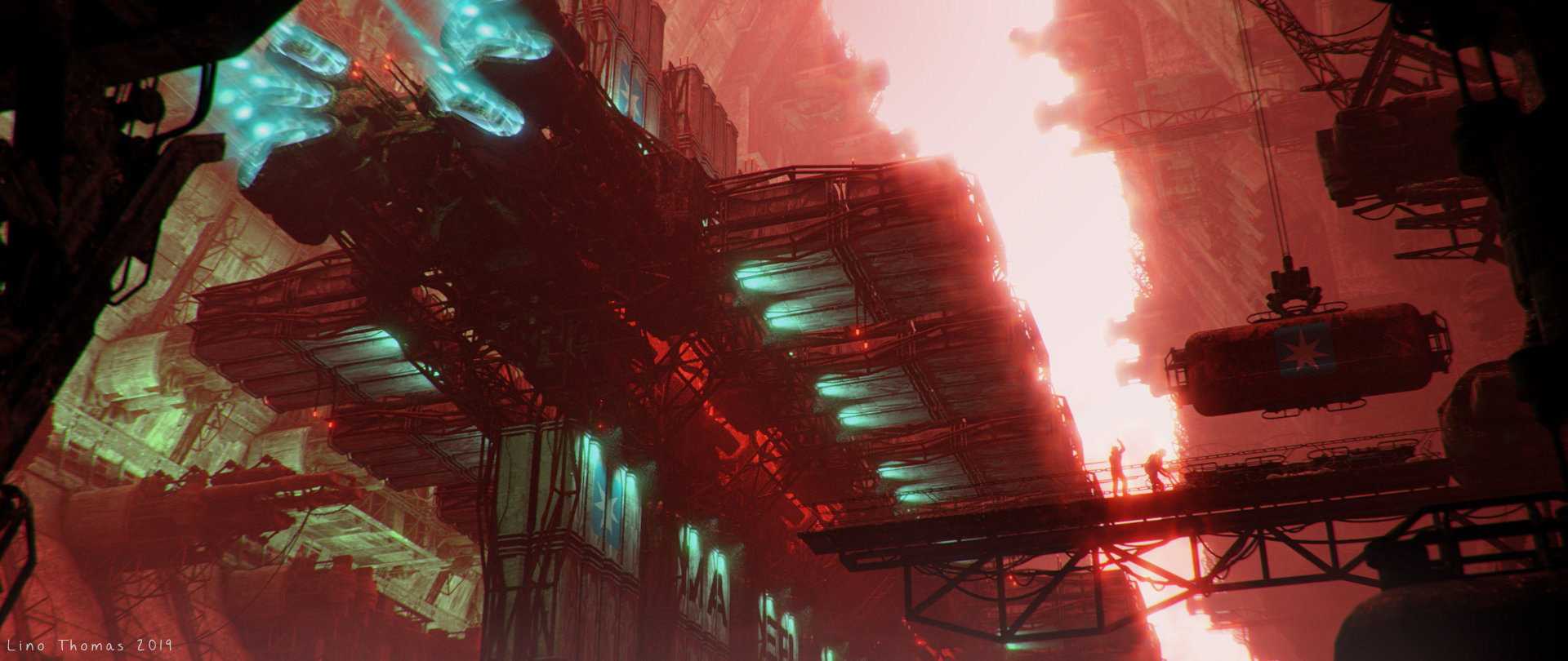
This is then the final result, an image which offers something to look at at first glance but has many details to explore.
I am happy with my visual exercise and have learned quite some bit with this project. I hope you did too! :)
Have a great day and keep on blending!
About the Author
 Lino Thomas, a self taught 3D artist from Germany. I loved to learn Blender over 10 years ago and am now using it full time in the games industry.


Really nice project and a cool break-down, you managed to tell a story with it, but there is something that breaks all your efforts… the engines are running while the ship look static relatively to its environment (the facility and the two guys with the cargo), that little detail breaks all the storytelling
For me the big and heavy ship just started undocking and is trying to maneuver out of the area.
Its slow, because it is heavy, therefore it doesn’t accelerate fast. This does not break the immersion for me.
Unfortunate that it makes the wrong impression to you.
Großartig! :D