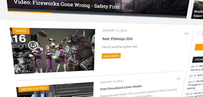
Hey folks! As I was fixing the issue with pagination on the homepage today, I was wondering about the layout of the homepage. There's been a bit of debate in the past - some people find the current two-column layout confusing and would prefer a more 'traditional' blog layout as it would make scanning the content easier.
So as I was working on it anyway, I figured I'd collect your input. In fact, I'm throwing in another option: 'infinite scrolling'. This removes the paging widget - just browse to the bottom of the page and you'll automatically get a new list of stories. An endless firehose of Blender news!
I've set up a new version of the homepage, which you can access here.
The two questions I'd like to ask you are:
- Do you prefer the current two-column layout, or the 'traditional' blog layout?
- Do you like 'infinite scrolling', or not?
You can answer those two questions on this form (with live results). For other feedback, please use the comments.
Enjoy! :)


17 Comments
Here's a format I like:
http://www.pcgamer.com/news/
* clean 3*3 grid layout (header/bigger news take up more grids)
* associated text is bundled along with the image in the grid square
* infinite scroll
I'll check it out, thanks!
It wouldn't solve the complaint of such 'grid' layouts being harder to scan for new content though. Although to be honest, I don't really understand that much - for me, it's about equal in usability. What do you think?
Its way easier to scan for content when you have small packed groups of content such as in grid. You should make grid have 3-4 elements by row and remove the whole sidebar. Nobody uses it anyway.
If you wanna spare some of the elements in sidebar just code them to show after news posts in some full width element. Then you could also just continue scrolling and it would load more news under those sidebar elements
Please make it
a. 1 column (easier to scan for new posts)
b. fixed number of posts per page (can see header & footer easier) else the footer will be useless.
True. However, do you actually ever use the footer? I could replicate that information in a sidebar, or somewhere else. And the footer is still on article pages.
there are 2 cases here...
1. 1 column means more immersive reading, text and image can be big, distraction only on footer & header. Kinda like Medium. Ads always put middle of post, easier to spot.
2. 2 columns, content area will be smaller, distraction to the right, smaller images, smaller text size. With ads it will be too much distraction already.
Are you now talking about the homepage only, or also about article pages?
both
How about both? Maybe default to current layout, but have a link that just gives you latest 10-20 posts regardless of category. :)
-Marc
Yeah I was thinking about doing that - let people set their preferred layout. I'd still want to know the best 'default' layout though :)
Don't slip and drop the donkey off the bridge because someone told you to carry it Bart... but I appreciate the thought and effort:)
I'm not 100% sure what that means :) But yeah, I typically don't listen to the vocal minority - hence the poll. Seems the preferences are pretty much drawn so far. Maybe I should throw in some more alternatives and see what happens!
I was referring to Aesop's fable the man the boy and the donkey.
http://www.pagebypagebooks.com/Aesop/Aesops_Fables/The_Man_the_Boy_and_the_Donkey_p1.html
i voted traditional blog but i don't mind the current layout either.
that said, i hate infinite scrolls. eventually the page slows down to a crawl if you keep going... that's likely to happen faster if images or videos are in pretty much every post.
i also don't like small numbers of posts on a page... that just makes it a hassle to look through old content when you have to constantly load the next page.
One column is nice, we get more information.
I prefer infinite scroll, making navigation smoother
is it only me or comment count is now gone on post listings pages?
Yes, it disappeared after I updated my theme. It's on the todo list.