Blender Theme: Graph 1.3
Vitor Balbio shares a subdued, professional looking Blender theme.
Vitor Balbio writes:Graph is my first try to make a cool and professional UI Theme for Blender. It’s a complete rewrite of Blender Theme and Startup file (Workspaces) and is designed for Blender 2.7x releases. It’s inspired by many works of the UI mockup thread and feedback from Blenderartist users.
Hope you like it, suggestions and feedback for new versions are welcome!
Link
I like it better than the default theme.
The lighter viewport becomes the focus (better, in my opinion), and I’ve always like the gradiant.
Maybe I’d use orange where green is used, unless more colors are necesary and create, with the blue, an analogous color scheme instead of my intended complementary.
Still, I’d prefer something like this as a default theme.
Like it – my new theme
Thanks! Hope you enjoy. keep in touch with the blenderartist thread, i’m updating it constantly based in the community feedback =)
Before I try it myself, may I ask you guys how much it was tested for consistency between the many tools of Blender?
I mean, did people verify it to guarantee that, for instance, the group highlight color doesn’t resemble too much the general outlince color of a selected object, etc, etc, etc…
It is not the case that I’m being lazy to test it myself, it’s just a major concern, value information not only to me, but to those who might use this theme henceforth. I had this problem a couple of times with GIMP, when I installed some cool themes, only to find out later that the tooltips had the same color of the background, which made them unreadable. This kind of problem may actually hinder one’s workflow, specially considering the inherent complexity of blender projects.
By the way, the theme looks awesome!
Hi!
As you saw Graph is under development, but it’s stable and usable since last update. In fact me and my studio members are using it in productions already. My first feedback report came from that usage. About consistence, Graph is not finished yet. I’m current working more in it and in visibility for all components for a future 1.4 version, what i think will be finished in a few days. But you can download Graph 1.3 today. Try it all feedbacks are welcome in Blenderartist Thread :)
Oh, so your studio is involved as well?!! Great!!! As I said, your initiative was already very good, but knowing that you’re actually working on a team makes it sound even more promising! You know, it is not that a single person couldn’t handle that, it is just that it would be a much less optimistic scenario. Please, as you guys further develop the theme take into account what I just pointed out in my last comment. Thanks for the info!
Actually working on it (editing) is just me. But i have the feedback from people of my company, designers friends, and of course from blenderartist thread. I know what you talk about when you say that it is not a task for one man. I have some experience with UI design for many apps and i developed some techniques for edit it faster. I’m using adobe Kuler for make the start pallet and variations, i did too a big search in others UI 3D softwares ( Maya, 3DMax, Modo, Softimage, Mari, UE4, Unity… ) and i got lots of good concepts from UI Mockup thread. So it’s yet a big task for one guy, but it’s keep going ok until now =)
Nice subdued theme. Makes the work more the focus than the UI and background. Useful.
Installed. Saved as my new default theme for Blender 2.70 (and beyond). Feels pretty nice.
Perfection. This could well be the default theme.
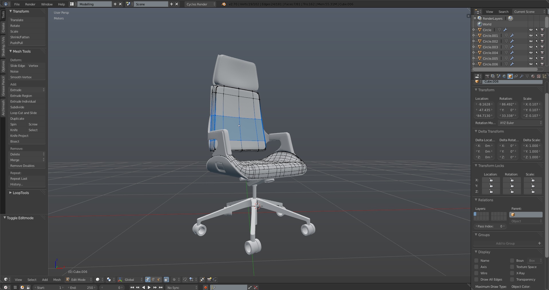
I think the interface colors lack contrast
the 3D view area is great!
Indeed. I’m working exactly on it (and much more) for the next version. To balance a more contrasted but yet subtle UI interface… is a big deal but i think next version it will be better than actual =)
Cool. Looks very similar to Amaranth
Hi guys
I know I am lazy, so can someone provide a direct link to the theme itself? What I have seen on the thread looks promising!
The theme looks nice but I can’t for the life of me understand why people persist in having the verts black in edit mode. It is the worst possible choice, with complex meshes it is so counter-productive when you can’t see what you are editing. Of course I know that this isn’t a problem for experienced users who can easily change it in the user preferences but for complete beginners it is not good. I hope at some point the Blender foundation addresses this issue with the default theme that ships with Blender.
I think it can be a personal opinion not such a design rule but we are open to suggestions. Actually the Black verts in Graph are no based in the default blender UI, it’s based in some concepts from UI Mockup Thread. Looks like some others softwares like Modo use it too. I’m ok with that until now, but if you have other suggestions please share in BlenderArtist thread =D
I’m not really sure that it is personal opinion. I’ve been using Blender and other 3d software for 10 years and the majority of my time is spent in edit mode, manipulating verts, faces and edges. When the change was made in the 2.5 series (I think?), I did try and work with it but it made life very difficult when working with high poly meshes, especially in wire frame mode. It is just so difficult to differentiate between points when you have all black edges, faces and vertices.
Perhaps you are right, that it is just me because I don’t understand why many more modellers don’t mention it. Again, maybe it’s because it is so easy to change in the preferences. For new users I think it must be a big but not entirely obvious issue when learning how to model. More so, I would think than many of the complaints I read about the Blender UI which on the whole I have very few problems with. In terms of themes, I personally use the Elsyiun preset with light yellow/orange verts but I will check out your graph theme, with the verts changed!) Thanks, both for the effort and replying to feed back.
it is almost the same theme i’m using (hexagon) with less color saturation and flat buttons, but i need to see the other parts of it and see if i like it more :)
http://37.media.tumblr.com/58bb411ec7f5836aa407cd96009b50b8/tumblr_n481bp0Xhn1tz7cy0o7_1280.jpg