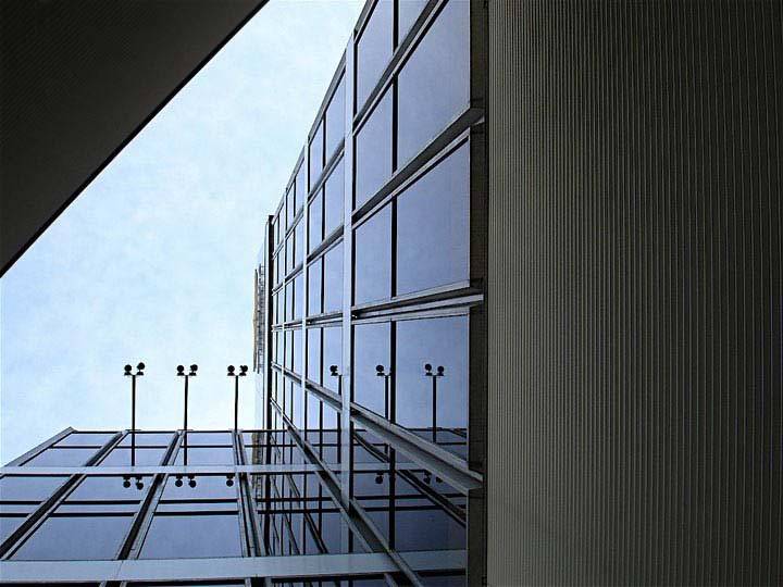
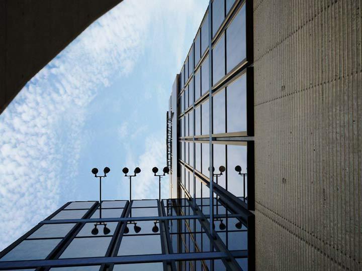
Which is the photo and which is the render?
 See if you can guess which image is a photo and which is a scene modeled in Blender.
Sonix has created a scene modeled in Blender and rendered with Maxwell Renderer v1.1. The final composition and tweaks were done in Photoshop. The modeling, texturing, and lighting are done well enough to make it rather difficult to tell the photo from the render. Can you tell the difference?
Get more details (including a wireframe screenshot) from the discussion thread found here. Great job Sonix!


The first foto, which is called No. 2 [to confuse us] is real. No. 1 the 2nd foto] is the render I bet ;)
i think the first is the render and the second is real,because the sky looks more realistic and you can see the clouds. And when you take a look at the wall on the right, you can see many lines in picture 1 and in the second picture its more realistic.
The first one is the render. The telling point for me was the cement pitting on the second photo. :)
But, that’s a great render. Good show!
I think the 2nd one is the real thing. The render looks really good (great job Sonix!)
but the real thing has more detail (e.g. the concrete wall).
Just so you know, I’m not criticizing you.
skyscraper01.jpg(…01,jpg) is the photo! (I think!) I get my assumption from there being even cloud cover in ..02.jpg image and also the cement wall in …02.jpg has no variety or no sub-details like …01.jpg has. (There is no sign of the weather on the wall.) Not to mention that the main light in …02.jpg is the wrong color for sun. It has too much blue. I could be wrong and I wouldn’t be surprised if I was. Then again I wouldn’t be surprised if I was right either. Still, that is a awesome job. Its really hard to tell, had to look really hard.
-Geckoman
Here’s a hint – the photograph has imperfections caused by taking the picture with a real camera.
You can see clearly that the first one (picture 2) is the original because of the jpeg compression,
And you can see that the second one is rendered because of the sky.
Apart from that sky detail I just have got one thing to say… WOW! Great job indeed! The window joints are nicely simplified. Sweet.
Radial distortion gives it away if I’m right – straight lines are straight in the second photo but curved in the first (due to radial distortion), and I’ve never met a renderer that can simulate radial distortion. (Yet!)
I think this is what Chris was alluding to…
(The interesting thing is that the render is zoomed in, almost as a concious choice to make its lack of radial distortion harder to spot. Of course, zooming in with the lens on a real camera will usually make the radial distortion worse.)
the first one ist the photo and the second one the rendering, even it is looking more realistic then the first one.
the way to the solution is the typical distorsion. you can see it on the photo (first one), if you look onto the windows on the bottom.
You’re all wrong. They’re BOTH renders; the top was a WIP and the second is the finished one with all the little details. hahahahah…no, wait…maybe they’re both real….
I think the second is real, because of the defects in the concrete wall, even though the sky looks more realistic.
I give up! I never was good at reality anyway….
Who’s gonna tell us the final answer?
will we ever know the answer?
no.
IMO the first one is a render too. But anyways, its a great render! Howgh
The lower picture is the real one. no question.
1. concrete wall is dead giveaway. in top photo banding is too close together to be realistic, also lighting and texture is too flat and even.
2. parallax issues already mentioned show the lens distortion with the building curvature although that could be added in photoshop.
The Official Answer:
The second image is the Blender scene. The only way I was able to tell the difference is that the area in the top left portion of the image has some segmenting along the curve. If Sonix had use a higher resolution mesh or used subsurf on that part, I don’t think I would have been able to tell the difference. IMO, it’s the only “flaw”.
BTW, I wasn’t able to actually tell the difference. After I found out which one was the Blender scene, I then looked for any possible indicators.
it’s an unbiased renderer. It’s a camera simulation. There is no difference. But… The bottom render is the real one i’m betting. (displacements (too uniform in top image), vignetting, detail in the sky, curvature of the corner).
I’d have to say the procedural texture is a dead givaway though. Nothing beats a photo texture IMO.
ps: I forgot to mention: great image.. love the composition on the bottom image.
The window frames gave it away. It took me a minute or two to figure it out, though. Nice image.
well, the concrete pattern of the bottom picture destroys the illusion for me (there is the same round pattern twice and the “holes” of the texture are repeated in the same pattern)
if it wouldn’t be the big round spot on the concrete i would have thought the first one would be the render because of the simpler concrete structure but you have to know where you have to look.
but thats such a small error, during an animation or without a compare it would not be spotable for me.
Very very very great work!
The answer is in the thread. Most people have been wrong ;-)
Actually, I was fooled too. This is an awesome job.
I was fooled as well :)
I think the sky gives it away. Awesome job!
Wow. According to the thread the one with more clouds is the render. I was almost certain that one was real….
The Maxwell renderer costs a lot of money. Apparently there is a similar free renderer called Indigo, and their website has a photo library which is absolutely stunning. The level of photo-realism is jaw dropping. The penalty is speed. Each frame takes like 2 hours. Also they don’t have a Linux version, but apparently the Win version runs fine in Wine.
at this point in time indigo is just as good as maxwell (except for a couple of small features related to textures). its supposedly just as fast if not faster although i have never had a chance to benchmark them myself. but indigo realy is awesome, it even has sss. btw the “realistic” brightened distinct colors from renders, along with the radial distortion, and PERFECT reflection from the windows in the second one are dead givaways that the second one is the render. in the first one if you look hard enough you can see lines from stuff behind the windows, which is much more realistic. plus in a scene like that with a camera the brightened clouds dont make much sense with the brightness of the building
This thread is sooooo funny!
It had me fooled for a moment until I thought, “Hangon, that concrete wall has a repeating texture on it.”
Well done though – it would of made a good April fool.
Wow… and again I say WOW. Great work as always sonix, The final render on the thread just makes me want to grab a seat of maxwell…
When I’ve seen the clouds, it didn’t look very natural to me. But the repeating texture was the proof.
Well done. Next time, try to not add more details than reality and I’ll be fooled.
Im sure it was the second!
Or is it the first? now m confusede…
its the second.. wee :D
I love how after the answer was found most everyone is pointing out which one is the render :)
Before someone pointed it out everyone was guessing the wrong answer for the opposite reasons they are now.
The repeating texture is a comon feature in many concrete buildings.
Copme on guys don’t say things like “dead givaway”. You could not tell and we all know it :)
LOL
I would say astonishingly that skyscraper01.jpg is the render. Edges of the windows are too clean, even if he fooled us with a nice concrete texture.
In skyscraper02.jpg, there is traces of wear and dirt on the windows edges. A detail that lack in the 02. Admitted the concrete looks really nice, but the dirt on the windows btrayed the render. Plus the render has a low res object on the far left… you can see some angles…
To be perfectly honest, I only had a doubt at first. Then I looked at the forum and got confirmation. Yay to me.
It looked pretty obvious to me to. The sky looks wrong (looks like it’s sideways), I noticed the tessellation problems on the curve and the concrete texture. The biggest thing for me though was the aliasing on the far edge of the roof just below the lamps.
Here’s what I don’t get about these type of contests. Why pick an obscure photo that people would question if it was real anyway and try and make a render of it? Here’s a real challenge, pick a photograph that we would recognise e.g the eiffel tower and try and recreate that.
The room that Sonix did was good but this I don’t think so.
Andrew is right this picture isnt one that looks real !!!
not that sonix didnt make it so.
Very well done.
I like the: “Is this real or a photo” better then these “which is the photo”.
It was pretty obvious which one was a photo (sun on building, reflection of sun in glass, irregular concrete, irregular clouds) but not so obvious that the render is a render.
Don’t think that real concrete walls can’t have a pattern of repeated large circles. Most of them do. The circles are caused by where the forms are held in place. My university was all concrete and the repeated circle was everywhere.
what exactly does refurbished mean?
i think the top photo is the render
bottom photo is real :)
Top is real, bottom is render. You can tell because the top has a crappy jpg compression tipical of cameras, and the bottom is perfect. Also, the bottom one has a rough surface with the black curve against the sky, due to polygon modelling. The top is perfectly smooth. Clouds could easily be an image.
you can tell because you can see the edges in the second one and also because blender’s mirror reflection looks fake
The second one is false.
you could see face edges, and there was a repetitious texture. But awesome render though.
Second one is real. The clouds were what “gave it away”. I spend way too much time being inspired by clouds (they are fractal in nature) and it was obvious which one was “real” and which was a render. The wall is also too perfect – but its still an amazing job. Besides, that’s what I love about rendering. You can make stuff more perfect than it actually is!
Without looking at the CLOUDS, I think the render looks very convincing. I would just give a suggestion to the guy behind the render. Don’t save the image as a JPEG, That takes away noticeable quality.
look at the wall part on the top right.
AND hover your mouse above the VERY first pic, that doesn’t enlarge and look, how it’s called :P
….um…
look at the first post on the thread. It tells you that the bottom image is the render and the top image is actually the source art.
So for everyone who’s complaining about the clouds in the top “rendered” image… that’s the real thing. oops. :)
The first one (2.jpg) is the photo, the second is the render, you can tell by how “perfect” it is, ie: lacking dirt on the windows, and the imperfections in the windowframes.
However it IS a very very nice image!!
Maxwell does cost money, but Indigo should be able to produce just as convincing results!
Clouds: don’t know what he used here, but it is just too easy to take a photo of clouds and use it as a texture, so that’s not what differentiates a render from a photo.
One more thing: the very top of the building (with the billboard) in the top picture, the photo, looks more realistic, as you can tell it is further away: lighter, blueish, less saturation: ie: “air volumetrics”. This is sort of lacking in the Maxwell render: does it have volumetrics?
What I do to simulate this is just use a Z-buffer as mask, and make the farther parts of the final render a bit blueish and less saturated.
Anyways: very good render!!!
Pointless post, both jpg are too compressed to judge. Anyway in the second shot i can see macroscopic antialias problems on the edge of the glass building, hence that must be the render: the fact that the author put more elaborate textures fooled most of the people, imho, and he did that on a purpose :)
at least the second is rendered, the reflections on the windows look pretty “computer image” to me :-)
Also, the skybox looks strange, and its aligned black border top-left. Plus, I think I’ve spotted texture repetitions on the concrete.
oh, and all this glass/frames on the windows look too flawless.
Well – I couldn’t actually tell until I read the answer! – I did notice the segmentation on the area in the top right actually but I happen to know that it is also possible with real cameras too (usually only when zoomed right in with more expensive cameras) it can be caused by the fact that the (normally closed) hole where the light enters a camera looks hexagonal when open… I’m not sure whether this is only possible with film cameras or digital cameras as well but I think that some of NASA’s space pictures show the effect quite well – unless they’re really just fakes as some people would have lol!! The only other thing is the lens distortion on the window ledges at the bottom of the top image – but I think that it was just caused by a slightly different perspective since maxwell renders lens distorsion correctly anyway!!
It’s amazingly real though and I see that most people got it completely wrong having read all of the comments – and even gave reasons for it lol!! maybe you should do a poll next time!!
-epat. :)
It’s the first image,because the clouds of the second
I guessed right, one thing that differs is the lamps – they are not straight in the photo, but are in the render. The modeler hasn’t spotted it…