
 Jimmac has designed two alternative Blender Icon Themes based on Freedesktop.org's Tango Style Guidelines. The result is a refreshed, more modern look that many people seem to like, but it also raises a number of new questions.
*EDIT: You can find a Windows build with the new buttons here.
Jimmac writes:
I've been occasionally working on a blender icon theme that follows the Tango Style Guideline. Not that Blender actually follows any interface guidelines on any of the platforms it runs, I just felt the default icons are somewhat 1990. I don't have complete coverage yet, but the most exposed icons are themed.
[...]Where these don't work so well is the button context header. The lower opacity makes them a bit unclear. I'd prefer the current button context was highlighted differently than making the other contexts semi-opaque.
If you read the thread on BlenderArtists, the most frequent request is to allow for a 'drop-in' icon file that allows everyone to choose their own icon theme. This makes a lot of sense to me; many people like the bright and colored look but others would choose for a more subdued and simplified set of icons.
In the comments, there is also a mention of a GUI redesign for Blender 2.5. While I haven't been able to confirm this yet, it did get me thinking about GUI consistency: does it make sense to redesign only a part of the GUI (i.e. the icons) without looking at the whole? Even if you think the current icons are outdated, they are an integral part of the entire GUI design and look-and-feel of Blender. Can you redesign one without the other, or would that lead to a broken, inconsistent result? I'd like to hear what interaction designers have to say about this.
Anyway, regardless of how wether you like Jimmac's theme or not, I hope you do agree with me on one point: instead of complaining about something, he simply put in some work and posted the result. I think that there are way too many people who talk the talk but don't walk the walk and they should take an example to Jimmac's approach.
To use the theme, you'll have to follow his instructions and recompile Blender. Maybe someone can drop a compiled version on Graphicall.org for the rest of us to play with?
42 Comments
nice
That looks really good giving blender some new icons would defineatly make it look way more sofisticated. I think that they should make those icons standarad.
And prehaps change some of the other icons as well.
Wicked. They look great.
And yes, I don't think this messes anything up in terms of UI. All this does is add consistency in the icons - gives them a consistent style. Love it.
I'm all for these to be added in Blender CVS.
I like this Jimmac’s iconset very much!
It Ñould be an option of Blender interface.
But loot at Adobe's apps GUI
it's decolorized and get colored only on mouseOver
It's not archaic it's proffesional and not revulsive.
I say if they allow us to customise the icons by a couple of settings within Blender and an Icon file then we can chose ourselves what icons scheme we each prefer. Granted this may dilute the consistency of the look and feel of blender but it's not going to break it entirely.
It looks nice. Although I like the current theme too. Because it scares little girls ;) (ôooooooh that must be sooooooo complex to use, you must be clever
First, those new icons look very nice! I agree it should be an user-option, with at least two sets availabe (a simple, easy-on-the-eyes look, and a more colourful variety).
On interface design, I wouldn't call changing the icons GUI-redesign, not by a long shot. GUI redesign would be things like
- changing menu style and behaviour, eg. radial-menus (pie)
- rearranging drop-down menus and the buttons window, eg. using the 7+-2 principle of cognitive ergonomics more
- context-based behaviour of windows, buttons,
- window interactions, mouse behaviour, and so many other things.
Changing the icons is just a cosmetic and not a structural change, and imho can be done seperately. Like themes, or skinning in so many apps, independent of the GUI structure. My 2 (euro)cents.
And thank you Jimmac!
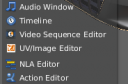
About this icon set, I like some of them but others are rather confusing, like Sequence Editor icon... what is it ? I think current icon is much more clearer.
Regards
malefico
It's a really nice idea to change Blenders iconset, it's something I've played with myself from time to time.
However, there are some huge readability issues here. The icons in the buttons window (Material, world, texture etc..) are virtually invisible with light interfaces such as the one I use. So a mixed bag then, because some of the others are pretty nice.
I vote for not making these default until they are a hell of a lot more clear.
cool
I'm gonna give them a try :) They look pretty nice.
Looks very great;).
I'd also vote for a GTK+-2 interface to a blender engine, using a cairo interface modeled after GIMP;)
I like the Widget hand icon, but some of them are just too colorful :)
i love most of them
nice work, i would suggest a couple of revision but it is a good start imho
I don't see much of a difference, but if it makes things look more professional and helps Blender to be taken more seriously then I say do it. I'm sure people who have been using blender will adapt quickly. I, personally, don't mind one way or the other.
yeah! Tangoooooo it all!
Really nice icon set, I think blender need's some new icons for the UI, because they are a little outdated as well not clearly representing the features under it. Maybe he should also design a few new icons and replace them with the old ones.
unsettlingsilence said: but if it makes things look more professional and helps Blender to be taken more seriously then I say do it
If you think blender's not taken seriously... take a look in a loooot of 3d portals..... when a while ago blender even was as an option... now has its own section
Yay. Tango is very nice & colorful.
But it should be really custimizable - I hate this brown GNOME-like
folder icon.
Next step would be removing the inbuild file browser. Windows or KDE
(2 I know) have much better ones by default.
I would build one for Mac OS X if i could find some decent compiling instructions. I can't find any anywhere on how to build blender on a mac. : ( otherwise the buttons are awesome!
I really enjoy the look of a facelift concerning Blenders little old icontheme. Why not for next version?
to Bart:
I think you should write BlenderArtists and not Elysiun, since namechange.
:)
I think it´s really time for an optical change - nice done !
@sten: sheesh! I can't believe I wrote that! :) That's what you get from writing an article in the train to work with far too little sleep ;-)
Looks great! Tango was my favorite icon set, before switching from PC/Ubuntu to a Mac.
+++ I vote for GTK-Theme based icons and MacOS X styled icons in future blender versions +++
Add: Michael Nischt:
It would be better to have a non default OS icon theme, just a custom one, because the Blender is crossplatform it would be strange to add everywere in Blender OSX looking icons or Linux or windows ones. I would prefer just non Default OS icons.
@Bart: hehe I guess !!
This should definitely be included in the christmas release, unless you've begun feature freeze.
ive build it, am gonna upload on graphic all for linux64, they are cool too.
I say - include it - Anything that makes the blender colour themes a little bit more varied is good in my book - I think the icons are not only more clear but also help blender to feel less dull and more inspiring (and if some people don't like it, I say they should stop expecting programs to look grey just to make them less strainful to look at for long periods when they could just as easily turn the contrast down on their monitor and get the same effect!)
-epat.
That is some really nice work, it complements my theme perfectly. Excellent work.
Very nice, it's a good user-option (specially for new users), but I have a while with blender, and for me it's a little strange and confusing view new icons, so I prefer the default theme.
But great work Jimmac :P
can't wait to see it in the next official release!!!
Some comments here are really sick...
@Alexander: would you care to explain that? You can't really say something like that without clarifying what you mean :)
The icons change is a pretty cool thing. I'm liking it already. :)
As for a GUI change I wouldn't mind it so much if they changed it to look somthing like that screenie. That's an awsome GUI.
In general I like them and would be happy to see them replace the existing set.
Im sure any that arnt up to scratch will be fixed..
Then again Im not esp unhappy with the existing set. - These just seem nicer.
I like the look of the new icons, very smooth, a good change to make the UI more friendly, inviting to newcomers and cute!
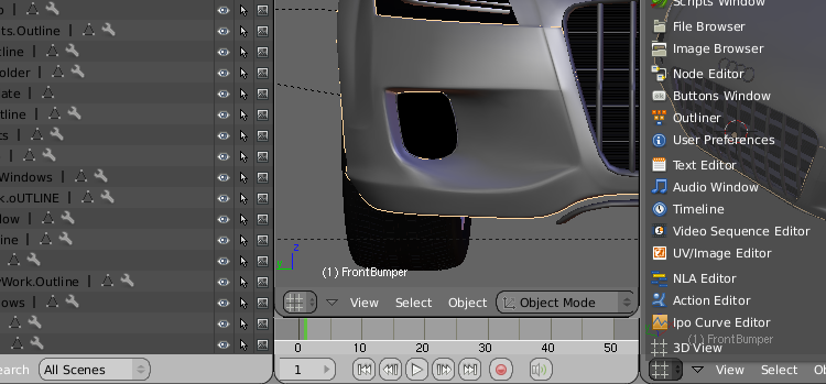
My suggestions is this; since you're already moving in that direction wouldn't it be a lot prettier if the "Window type" (3D view, IPO, Outliner etc) icons were actually BIGGER, say at least twice the current size. Kind of like opening a Windows start menu. It makes a UI much friendlier belive me. Think how MacOS X does it!
Think about it...
I think it'd be nice as an option, but if there all sorts of iconic layout options, than it can start to confuse people, especially those just starting out on blender. Personally I like the existing layout, "90s" or not. It has a "down to business" look to it that I like. It gives blender a professional look to it, much like Lightwave has, as oppose to the "videogame" look that apps like Max and Maya have (especially Maya, REALLY annoyingly sophomoric).
This is the wrong direction.
Icons do not have to be modern. If an icon is unclear, it should be refined or redone. By reducing it. Not by making it more colorful or just different. Good icons work in monochrome. Think about traffic signs. The only way, the current icon set should be improved is by making it timeless instead of modern. No chewing gum. In a few years, this proposal will look just silly.
@Varheit:
I agree with you I think there are another thinks more importants that the icons and the actual set of icons (the default icons) are very comphrensible.
Sorry my english.
Here is a build for Mac OS 10.4.9: Click Here.
New icons are wery important by them Blender is more friendly :D