
Image: Cherry Blossom Flowers, by Andrew Price
Kyriakos Tsilavis was the clear winner last week with his MC Escher interpretation 'Relativity'. His choice for the topic this week is "Spring"
Kyriakos writes:
I am very happy to win this contest, especially with Relativity, because MC Escher is one of my favorites Artists and he has inspired me a lot.
I am living in the beautiful Freiburg im Breisgau in Germany, almost in the heart of Black Forest. The weather these days here is amazing and you understand that sping is here from the colors of every tree and flower. So the next weekends Contest will be "Spring"!
Low poly or not, colorful, flowers, trees and what ever can come to your mind about this word, try to make it 3d.
Post your work below (attach an image and a screenshot if you like), and vote for your winner. The winner will get a post on monday, and will get to pick next weekend’s contest theme. Have fun!
83 Comments
Here is my entry. I created this image for my next tutorial that I will be doing soon. Thank's!
I see palmate coltsfoot and horsetail. The horsetail might not be quite as open this early on, but it's still very convincing. Good work
"Awakening"
Here is a low poly image I tried to make the image feel cold with a little bit of life. I hope you enjoy!
Maybe I misunderstood.....
Well-played, sir.
Dang! You beat me to it.
Was wondering who was going to be That Guy. :p
a "painted style" image of forest spring scene
Nice :) Can you share your settings please? I'd really like to see...
this is the blender scene, and the node setup for oil painting effect :)
it's ladybug time ^_^
The ladybug in the back must be a manbug with some love song records playing in his head. Hahaha!
Indeed =)
Welp, time to spring into action...
A first attempt...
Here is my entry for this week(end), "Humble Bee"
and here is a screenshot of the Blender Scene
This really is a lovely image. I am most curious as to how you achieved the effect on the flower, Is that done with textures, or is there some fancy compositing going on?
Hi Eric,
No fancy compositing here, the texture is actually just a simple ramp. The trick is to uv unwrap the petal in an unusual way, which you would not do if you wanted to use an image texture. I will post images of the setup later this evening.
Hi Eric,
Below I've added a screenshot of the node setup for the petals as well as the model and the UV Layout. The trick was to straigthen out the brim of the petal and add a ramp texture to it. The result is then added to the velvet base shader, which is not physically correct but creates the bloomy, intense look. The Glossy Shader is only needed to show a bit of the self painted petal cavities, which are to be honest barely noticeable.
So even though the topology of the petal is awful, all petals are the same and there is only procedurals and one simple black and white texture used, the result is still quite appealing.
That is a really interesting approach, thank you for sharing, it turned out really nicely :)
This is incredible! I love how you did the flowers. :)
thx, it's basically a mix of a velvet shader with a few other nodes and translucency. And by the way, there is only one petal modelled in the scene, the rest is done with arrays and displacement.
Here's my entry.
The flowers are unrealistic, becouse I like this colour and texture
I'm not very good
Neither was (or am :P) I! Don't be discouraged. You just need to keep practicing, and these weekend contests are the perfect way to do that!
May I suggest you also take a look at using some compositing nodes? Effects such as glare, depth of field, vignetting, etc. are great ways to
help your image be more realistic. Also, try using sculpting and various modifiers to get the effect you want for the leaves.
In my opinion, this image sort of reminds me of Super Mario 64, with the treetops made of spheres and the vibrant neon color palette you chose.
So, long post short, don't give up, you're doing fine, and keep up the good work! :)
Thanks for the advice.
Is this better?
much better, i'm sure with everyday bit learning and practice you will be soon much better
I can honestly say that what helps is Practice,Practice,Practice! My first creations, I can now see, looked terrible, but now I'm getting into sculpting and even some animation and rigging. Just keep working at it, you will find your niche. I might also recommend some tutorials on Youtube, Blender Guru, Blender Cookie, and Blender Tuts are all good one to watch. You can always just search for "blender tutorials" and youtube and look for the videos with high views on them. There is a wealth of information out there for you to learn basically anything you would like to about blender. But in the end, it comes down to one thing... Practice! Practice! Practice! Keep up the good work! You are already well on you way to being able to make great things! :)
Trust me, none of us started good. The important thing is if you enjoy it, keep doing it and you'll start getting better. I know some of us here have years of experience and probably still don't think we're very good. I think that's one of the best things about doing 3D work though, there is ALWAYS more to learn, and improve on! :)
This is my entry. The beginning of spring.
Simple, elegant, beautiful. That is a really interesting approach to doing rain, and I think it turned out splendidly!
Thank you :)
This my other entry.
Reminds me of those flower lollipops you see in some candy stores :P
Good job! I'm curious, what did you use for the water? Is it cloth?
I just sculped the water. Wanted to make the landscape bumpy.
Aah. Perhaps you could use a displacement modifier on the land with a Musgrave texture, then use a cloth simulation to make it look a bit more realistic?
Anyway, nice sculpting job! :)
My Contest Entry, greetings from Switzerland and have all a nice spring.
Really nice job on the rocks :)
Thanks a lot
Here is my entry called "Spring in Japan". Rendered at 1500 samples in cycles. Composited in Blender
Here is the full resolution image at 1440p.
http://imgur.com/bzaaHug
I had ment to add that thoughts, suggestions, and critique are absolutely welcomed! :)
Just a thought, but I never get used to the fact that Japanese people see the sun as red. I am an aussie living in Japan, and every time I draw a yellow circle they all say "the moon!".
Good low poly trees, and nice grass too. I think the clouds work quite well with the rest, but could be blurred in the compositor for better effect. I would, however, put more a little more detail into the mountain/volcano (I assume it is Mt. Fuji) to make it feel 'more farer away'.
How did you do the grass?
あなたは日本に住んでいるかな?
Yeah, I had trouble getting Mt. Fuji to look like it was far away. The grass is done at 15000 particles, if i remember right, and its got a thin base set at either .1or .01(I don't remember) and a tip set to 0. Main thing it to make sure that the grass doesn't leave any bald spots on the ground when its so thin, hence the high particle count. Thanks for the suggestions, they are always welcomed! :)
And I'm not Japanese btw. ;)
If you can use the compositor you can put stuff in a separate render layer and blur it for effect. I would try upping the poly count and blurring Mt. Fuji just a bit.
With the grass, it looked possibly hand painted to me, which is why I asked. If you have no zero weight points you should have no bald patches in the grass field. try a weight range of 25% to 100%, with a lower particle count. That should reduce render times, but might change the 'smooth' look that you achieved here.
Yeah, I think I had Mt Fuji set at 5 to 6 sides. I probably should have done it at like 12 or 15 sides instead, and yeah I should have blurred it a little. I didn't use any weight painting with the grass, I just let it naturally generate from the faces of the plane, and render times are not really an issue, I have a power iMac, with both a powerful i-7 processor with 4 cores (8 simulated) and a GTX 780m gpu.
As well as blurring the mountain like Sean suggested below, something else to consider is Atmospheric Perspective, where the further things are away the more they will become muted and shift towards blues and purples. You could do this with volumetrics and a lot of rendering time, but it might be even easier to just fake it in the compositor, and have a little more control over it.
I have seen this effect done before, but how would i achieve it in the compositor? I know the Z level part can be used to effect the blur (what I should have done), but I'm not sure how you would go about doing that with color?
Here so I did a quick test here because I was curious how it would work. Its really simple, a little more complex here just so I could show all the steps. I did it two ways, really just how you're more comfortable working with color. First was with curves, second with color balance. You basically want to do two things, one is decrease contrast, and two is shift towards the blues. On both I'm using the Z values put through a map value node to decrease the effect, and plugging that into the factor.
Thats really cool! I can't say I ever knew you could do a color shift based on distance, I knew you could do a fog effect, but not color. This is really helpful, I saved the image as a reference for next time and so maybe if I get some free time, I can fix up this image as well. Thanks for the help and suggestions! Suggestions, help, and critique are always welcome! :D
Here my try.
Hi!!! Here's my spring-entry. "Welcome Spring". Hope you like!!
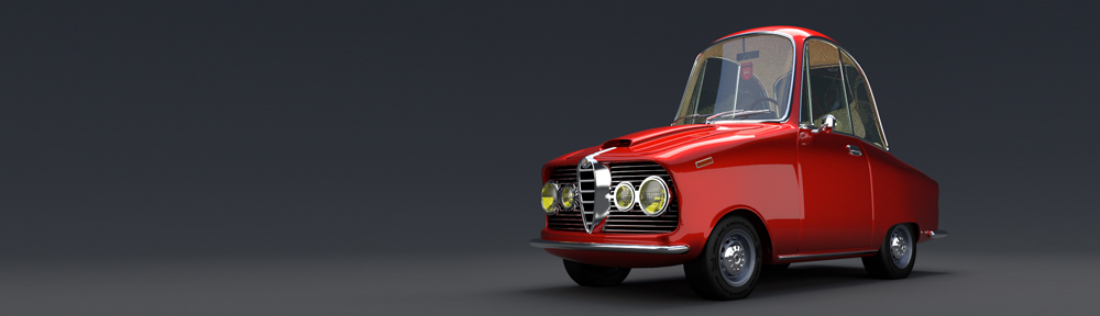
Hi, here`s my entry. There`s always too less time on the weekend... so I used some models from Blend Swap:
The 2cv was made by David Norman, I changed some details and Materials.
The gras was made by Ben Amendand and the trees are fom Andrew Price.
The driver was inserted in Photoshop, because it looked so empty inside:-)
"The Glow of Spring". Enjoy :)
The Blender scene:
Here is mine: "Spring(s) in the dark Forest"
Amazing piece, Läderlappen!
Thank you! :) Humble Bee is one of my favorites!
Very nice work! I really like the way the light hits the butterfly and highlights it from the rest of the image!
Your welcome!
Good job for being That Guy, but also making a really beautiful on topic piece. :)
haha yeah couldn't resist ; )
Nice take on the word "Spring" with both the season and the coiled object being used. I can agree with Eric, you are in fact, "That Guy". :D
Here is a higher resolution version with some better glow:
Hi all!
So, as you can probably see, I've become addicted to using the low-poly style, haha. Anyways, here is my entry, "Spring Storm."
This includes the final product, as well as a render with NO compositing, and two screenshots of my blender setup.
In addition, I, too, decided to be a wise guy and had to put both implications of spring into my picture somehow. :P
Enjoy! Comments and critique appreciated!
I am glad you got done so soon. If you didn't it would be a dirt path in the spring.
LOL! This is the Spring I know quite well.
Humble bee and dark forest are awesome
Here is my entry.
Trying a new style out this weekend, also hair particles. Calling this one "Wait for Me!"
Nice, I like the effect of the wet feathers! Quack! Quack! :)
Very simple setup this time.
Thats really cool, and quite simple really. I would be interested in what settings you used to achieve the "wet feathers" look with the clumping and what-not. I still feel the need to say "Quack! Quack!" :)
Whoops, could have sworn I put that in the panel on the side, that was my intention anyways...
Anyways very subtle effect, just a little bit of clump, with just a little bit of noise.
They do not have wings.
Haha, I was hoping nobody would notice...
"On April 4th 2029, after 9 Years of nuclear Winter, Josh Ruben took this Image at Miami. This photo was distributet all over the world. It helped people carry on.
In 2030 spring really came trough. Children born after the war realised, that their parents storys about that "spring" was more than a corny fairy tale.
For these children it was strange to realise that not only the good things have an end - but also the bad ones.
This photo demonstrates what superpower really is."
Ok, I am late and I cheated: Snow material is from Kaluura (http://www.blendswap.com/blends/view/66029), post is in Photoshop with some clouds i shooted. But at least some fireflies i composed back in are from Blender. And the rest of course.
Where is the image? and I'm intrigued by the back story!
Here it is again