 Since I switched to the new layout with the artwork in the header, many people have asked me if I could provide an archive of the images. Well, here it is :) And even better: you can now comment on each image as well. Just click anywhere on the header to go to the comments page. Use the Art > Headers menu at the top of the screen to visit the archive.
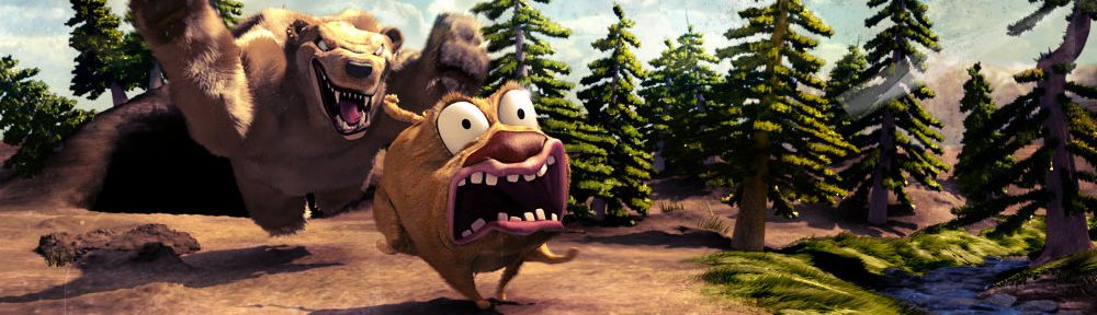
And remember: I'll need new artwork every day! If you think your work is the 'best of Blender', then submit a 1000x288 image to 'bart@ this site'.
Oh yes, and before I forget: it only too me close to 7 years, but now there's a logo on the site! With thanks to Virgílio Vasconcelos for helping me with this. Here's some background information on the logo, in case you're interested. (The font was updated recently, the rest is still accurate).
Note: if the BlenderNation logo is covering the entire header, reload the page to get the new stylesheet.
20 Comments
Sorry, but the image above the header looks terrible.. Okay don't know what was wrong but its fine now..
You're right - I didn't compress it right. Try now?
tha panel in the top(the one with the logo) is not that bad, but for the logo itself it would be better if you blurred it a bit because at the moment it looks pixelated... and maybe even change it because those circles, I'm not sure what they stand for !!! use perhaps a blender logo with an rss icon in it ... just saying ;)
Could you send me a screenshot of how the logo looks for you? It certainly shouldn't be pixelated.
Some of the pages give different header from today "red lake", instead its the "sunshine"
Also i kinda remember more headers, i think there are quite a few missing from the list, unless u are manually adding them and they just havent been added yet...
I cleared the caches - all pages should be the same now.
And as far as I can tell, these are all the images I've used so far!
Yeah now i see them all too, i guess it took some time to update them all x)
I uploaded a PDF with information on the logo design: http://www.blendernation.com/wp-content/uploads/2011/10/BlenderNation_Logo2.pdf
This is a good idea. I've been really enjoying the various banner images in the new layout. Thanks, Bart.
Awesome, thanks!
Hmm...
While the idea of the logo, e.g. which thoughts it was designed with, is really nice, I don't like the visual look of it.
I see how the colors are inspired by the Blender but for some reason, I think it might be the Blender logo's whitespace, the connection doesn't work well for me.
Also, the previously mentioned pixelation is, I guess, due to the extreme contrast between the orange and the blue. No matter how much AA you use on it, sub-pixels can't really (re)solve an extreme contrast like that...
I do like the Blender 2.x(+?) logo a lot (as opposed to the Blender 1.0 one) but that proposed BN logo just doesn't fit well...
Either way, I really don't have a better proposal so if it'll stay like that, I guess I'll get used to it...
Also wondering on your blog headlines on the redesignie. Awesome idea. I love this initiative. Bravo for the idea.
Definitely still pixelated...
please mail me a screenshot so I know what's going on.
The color gradients layering of the sphere object itself are more reminiscent of Firefox than Blender. Specifically, the main body containing no white pushes it to a look more similar to Firefox. Also, I do notice it getting a bit pixel-y on 45deg angles; see N. Maybe an anti-aliasing issue or just that the image is such a small scale? Maybe try an .svg instead if you can?
I do love the new headers. :)
All looks fine to me (Firefox 7.0.1, IE 9, Chrome, screen 1920x1200).
Yep, I agree with Nicholas, orange and blue are not blended in the Blender logo (muah, pun intended :) ).
Anyway, Bart, you are doing a great work, thanks a lot. I really enjoy coming to the new site every day.
Awesome work Bart. Thanks for keeping this site continually fresh. Keep up the good work!
Looks great! Good job Bart!
Did you change the typeface of the "slogan"? The description of logo states that the pay-off should be Rockwell (a serif) but in the logo displayed here it's the same Franklin Gothic typeface.
Yes. Like I wrote in the post ;-)