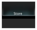
 The Blender Store or 'E-Shop' has just had a major makeover. Now its looking more pro than ever!
After exactly 9 years, it was time to refresh the shop design! Lots of thanks to Pablo Vazquez for design, css and php magic!
The new dark theme is very easy on the eyes, and the store is much better to navigate now, with everything split into 3 sections (see the image below) We now have a section for Books, DVD's & Training and 'Be cool' for shirts and other misc items.
Link to the Blender E-Shop - http://www.blender3d.org/e-shop/

37 Comments
Very cool; I'm a big fan of dark colors for websites. Only thing is that I think they should use some cool buttons as the links to the different sections versus the current 'text-link'...my two cents.
Nice! I've made a purchase today. Works! :)
Very cool. good work.
Well Done guys! Congrats once again to Pablo as well, by the way... This morning I recieved Venom's Lab! THAT'S GREAT!
Sorry for the offtopic and for the scream :)
You know whats weird? I was wondering about why they hadn't changed that ugly shop site for so long the day before it got changed. It is SOOO much better than before!
Wow! This looks awesome! Soo much better than the old e-shop. Two thumbs up to the blender guys XD
The HTML and the CSS all have a lot of errors, but good work nonetheless!
Looks nice and clean - much better than the previous version. Though as Tynach says - has a lot of errors. But good stuff.
Tynach: Wish ones ? What type of errors ? Why not post them, so he can correct them? :)
Anyway, your website doesn't look that cool, you know :S
http://www.qso.com/carlautta/colin/Beta/
Just playing with you :D
Hey pablo, do you make again!
nice look
saludos
Please change that header!! The Store is really nice, but that header ...
Jahmaica:
There are 76 errors, and 12 warnings when parsing the HTML using the official W3C Markup Validator.
There are 40 errors when parsing the CSS using the official W3C CSS Validator.
http://validator.w3.org/check?verbose=1&uri=http%3A%2F%2Fwww.blender3d.org%2Fe-shop%2F
http://jigsaw.w3.org/css-validator/validator?profile=css21&warning=0&uri=http%3A%2F%2Fwww.blender3d.org%2Fe-shop%2F
Gah, my comment is awaiting validation because I posted 2 links...
I post the results of the validators. Altogether, there are 128 errors and warnings on that site (76 HTML errors, 12 HTML warnings, and 40 CSS errors).
Usually, when you're working with CMS, there's loads of errors when you validate.
He's using a table in the store, tables are deprecated, the CSS errors, maybe fixs
for IE exploder;
The site is working just fine in mozilla and IE. If someone can provide the time to
help clear those errors, please leave your comment, I guess, Blender F will let you
work it :) who knows =D
He's not using tables. Look at the source code.
Actually, scratch that.
He has one opening table, and two closing tables in various spots. No idea what is going on there, and I am sure I could replicate the page easily.
The table seems to be how to select the currency. The other closing table tag is just... There. At the bottom, for no reason.
Yeah, send them a message then if you have the time and knowledge to help! ;)
I might, actually. And a note about my website... I haven't updated it in 2 years. And it's XHTML and CSS are perfect.
Very nice design!!
I have a request. Please Add "ALL" section. I want to see all items at a time.
Am I the only person who *doesn't* like white text on a dark background? I find it very tiring to read (the Blender wiki is particulary bad) - after a couple of minutes rerading, when I look away from the screen I have white lines etched into my eyeballs! This is probably because the dark background causes your eyes to overexpose, so the white text burns-in... just like it does on a TV monitor.
Congratulations! It looks awesome, and it resembles the home page too.
One request:
Can you please make BlenderNation look more or less the same?
Atm there is nothing wrong with it, but the white background kills my eyes, and it looks a bit...non-artistic :p
Just my 2 cents, and keep up the great work guys. Really appreciate the site.
Reaction: Nope, you're not the only one! I also get the burn-in... Some sites I wind up hitting Select All to read the text. Don't have too much trouble with the Blender Store though; you might have the contrast on your monitor dialled up a little high?
Ianvdl: Non-artistic or not, I find it black-on-white much easier :) - I wouldn't mind having the font size upped by a couple of points though. Web-designers have a weird fascination with 8-10px for some reason...
Okay, it seems white on black bothers people, so why not blue on dark grey, like the blender home page?
For my eyes, the darker the better :D
I actually have my monitors on low and gentle contrast and brightness settings. I also have to do the text-selection trick just so I can read the Blender Wiki pages with any comfort. In this case, cool is not clever.
Dark backgrounds are fine for software interfaces (like Adobe's and the dark Blender themes), because you are not required to read several closely packed lines of (tiny) text, only single word captions etc. A dark background is NOT suited to long text reading (such as the Blender Wiki). If it was, then all those eBook readers (Kindle, Sony etc.) would use white text on black backgrounds too!
Yep yep!!! A vast improvement!
The design is really cool! I wish Blender website, were also redisigned by him with that layout :)
BY THE WAY... Google is going to release a new operating system called CHROME OS! Based in
Linux ?! hummm =)
http://googleblog.blogspot.com/2009/07/introducing-google-chrome-os.html
"Very easy on the eyes... "
hahaha.... yeah sure for all the late night computer zombies.
For daytime production park workers its all a bit glommy and dark.
Youll find that daytime sellers use white with dark letters.
( amazone, apple, dell to name a few insignificant web shops )
Okay... but looking good guys, I guess the target market is the lonely after hours nerd.
As for interaction design I figured the site out in 15 seconds so it must be good.
( I do think the "be cool" should be changed to "Be cool" to make it more like a menu item like the others. )
O and is this where I promote some software release?
funny, all those people complaining about dark backgrounds not being suitable for long reading. i think that about light backgrounds. so much light radiating my eyes all the time. in fact i even turned my screen brightness so far down that all images look like shit on my computer.
i guess having an option so people can choose for themselves is the best thing to do. :P
Blender takes some hughes steps forward this year.
Great work. :)
Congrats on the redesign! It fits very well with the reat of blender.org. Great work!
Having said that, I'm also one of those people who can't read light on dark background for long. I still hope for the theme option getting back to the wiki especially.
I calibrated my monitor (more or less) correctly, so I guess it's not overbright settings or so. Must me me, then...
Oh, and Jahmaica, html tables are nor deprecated, they are for marking up tabular data, like they were always meant to be. Using tables for layout is strongly discouraged, though.
Sweet design, very nicely done! It's a vast improvement over the previous version.
@joeri67: Apple used to have black Mac Pro pages. I do agree that light colored designs are more commercially oriented. Even though I personally prefer dark designs
https? This has stopped me from buying anything from the blender shop. I have tried to use the shop several times, but it looks like it is far behind any normal 90s web shop.
Basic functionality before anything! Blender rocks, but the web shop is just sad.
Martin: Unless, I'm not remembering something about the eshop, I supose, there's no direct payment trough Blender (from what I recall, I didnt slept this night too, studying hard, but anyway). I supose, the most critical data on this case, would be your financial details, unless you've got some sort of issue, problem, with entering your personal details while shopping? This kind of details happen to be the same has your login, in mather of fact, similar in most websites.
So, from what I see here, critical data (financial details), are only given or treated by your Bank (when wire transfering), or trough Paypal (Https for sure).
I supose, you're not interested in purchasing anything and you're using a excuse for it. Just my 2 cents ;)
Jahmaica: We do not have to agree. I never use any web site where I have to login without https. It is both cheap and easy to set up. It should be done in 30 min including testing.
I respect your opinion. I have no problems with login in without https, tough. Probably there's someone else, using my ID details, planning a terrorist attack, thanks to eshopblender :D
Hello, I found your blog in a new directory of blogs. I dont know how your site came up, must have been a typo, Your blog looks good. Have a nice day.